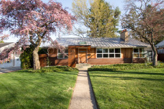
The Two Faces of Homes
Often proper in the front and more private in the back, modern and contemporary homes lead a double life

In the excellent book Body, Memory, and Architecture — now 35 years old — authors Kent C. Bloomer and Charles W. Moore discuss Frank Lloyd Wright's Winslow House (1894) in terms of the contrast between the formal street front and the asymmetrical back. They quote Nathanial Hawthorne: "The greater picturesqueness and reality of backyards ... as compared with the front which is always fitted up for the public eye." A contemporary term for the latter would be "curb appeal," but the front is still formal and public, while the back is informal and private.
This ideabook collects varied examples of how the front and back of a house are expressed differently, though not always as discernibly as with the Winslow House. The focus is on modern and contemporary dwellings, but the same idea can be applied to residences of any style.
This ideabook collects varied examples of how the front and back of a house are expressed differently, though not always as discernibly as with the Winslow House. The focus is on modern and contemporary dwellings, but the same idea can be applied to residences of any style.
This house by Houston's Content Architecture presents an asymmetrical yet very staid face to the street. The front door is found below a canopy at the corner of an otherwise flat wall with regular, checkerboard-like openings. The impression is that the house is a solid cube.
At the rear of the house, Content is more playful with both the volume (L-shape) and the surfaces (terracing in brick and wood). The articulation of the brick and windows is consistent with the front, but the patio and the terraces put the emphasis on enjoying the outdoors.
A house front can be playful as well, as this residence in British Columbia by Randy Bens attests. A slatted sunscreen shades the top floor and, combined with the set-back plan and freestanding concrete wall, announces the front door.
Yet again the volumes at the rear of the house are looser. Outdoor space is also important in this house, with both a patio and a raised terrace. Also, the composition of the windows points to the rooms, driving their size and placement, not an exterior formal appearance; it's a jumble that is not the least self-conscious.
Trick question: Is this photo or the next one the front of the house?
Answer: Neither. The elevation in the previous photo used to be the front of the house, but when A Parallel Architecture renovated the duplex into one single-family house, it relocated the front door to the side. Yet the formality of the former front prevails in the windows flanking the vertical opening in the center.
This elevation was the back of the house and is now the side. It expresses a new component of the interior: a double-height living space.
This elevation was the back of the house and is now the side. It expresses a new component of the interior: a double-height living space.
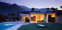
In many modern houses, the difference between front and back is a matter of transparency. Lots of glass is a mark of the modern dwelling, but not all lovers of modernism want to live in glass boxes. What results are designs like this one by Ruhl Walker Architects, where one side is predominantly solid ...
This house in Ontario, designed by architects Robert Markovits and Gary Lichtblau, also presents a more solid face to the street. The three-story volume is almost symmetrical in terms of the openings in the dark two floors, a balance that is violated by the cantilever over the driveway and garage.
The rear of the house is even more rigid in terms of symmetry and a grid pattern, but the increased transparency makes it appropriate for this private side of the house.
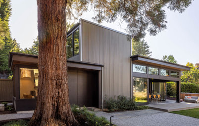
As I've mentioned, not all distinctions between front and back are so easy to discern, at least in terms of architectural form. Such is the case with this house designed by Abramson Teiger Architects. This approach to the front of the house reveals a complex, irregular composition of folded roof and wall planes, continuous along the length of the house.
The rear of the house presents the same ribbonlike folds defining the roof, walls, and floors. Yet some of the materials on the front of the house — concrete, wood — give way to more glass and orange stucco, a more playful composition that opens up to views and the sun. A focus on the pool is also apparent in the articulation of this elevation.
This mid-1930s house in Minneapolis, expanded by Peterssen/Keller Architecture, clearly shows the International style/art deco leanings of the time. The asymmetry, planar walls and curving accents give it an informality that is like a rear. Yet the solid with void and the landscaping create a hierarchy that clearly locates the front door.
The rear of the house is more open and therefore less hierarchical about entry. Instead, all of the rooms open up to views and sunlight, many with terraces.
More:
Extraordinary Roofs Have High Design Covered
Home Design: Living La Vida Linear
More:
Extraordinary Roofs Have High Design Covered
Home Design: Living La Vida Linear