


Houzz Tour: Period Home Gains Color and Character
Before-and-after photos show how a bold palette and restored features bring warmth and personality to this English house

The owner of this Victorian house in Surrey, England, had downsized and squeezed the contents of a much larger previous home into this smaller one. She loves Victorian style and had lots of period pieces in her collection, but she didn’t know which to keep and which to move on — nor quite how best to inject era-appropriate character into her new home while giving it a fresh, modern twist.
Enter the interior designers at Slightly Quirky, whose specialty is all about that elusive twist. Over a 12-month period, and working alongside the owner’s architect, they reinvented the downstairs layout, adding a bathroom, a laundry room and a 16-foot addition. Throughout the house, they also added color — including a pink kitchen — and pattern. And they found good spots for the owner’s antique furniture and many artworks.
Enter the interior designers at Slightly Quirky, whose specialty is all about that elusive twist. Over a 12-month period, and working alongside the owner’s architect, they reinvented the downstairs layout, adding a bathroom, a laundry room and a 16-foot addition. Throughout the house, they also added color — including a pink kitchen — and pattern. And they found good spots for the owner’s antique furniture and many artworks.
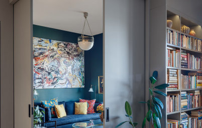
After: Although the designers’ work on the home was extensive — “There’s barely anything left of the original house,” Nicholls says — they reused much of the homeowner’s furniture, accessories and artwork, which the team helped her position. The dining chair, candlesticks, mirror, lamp, artwork and clock here in the living room all belonged to the homeowner. The piano and a lamp seen in the “before” photo were used elsewhere in the house.
Many other pieces in the home were purchased secondhand. The reclaimed fireplace is decorative.
Find a designer near you
Many other pieces in the home were purchased secondhand. The reclaimed fireplace is decorative.
Find a designer near you
Before: The rooms were all previously very full, as the owner had kept most of her things from the bigger house. Nicholls and the team did a thorough edit, retaining as much as they felt fitted into the smaller home.
After: “We replaced all the flooring and wall colors, swapped door handles for traditional beehive ones, installed brass sockets and switches, and changed all the lighting, as well as put in two new bathrooms, a new kitchen and a reclaimed fireplace,” Nicholls says.
Here in the living room, the designers selected the William Morris-style wallpaper for a heritage feel, Nicholls says. “The color was chosen to tie in with the sofa.” They removed the carpets and replaced it with engineered wood flooring.
Wallpaper: Sanderson
Here in the living room, the designers selected the William Morris-style wallpaper for a heritage feel, Nicholls says. “The color was chosen to tie in with the sofa.” They removed the carpets and replaced it with engineered wood flooring.
Wallpaper: Sanderson
Before: The house had a typical Victorian layout, with a dining room in the middle between a living room and a kitchen at the back.
After: In the renovation, a 16-foot addition pushed the kitchen further into the house. Where the dining room had been, the team put in a laundry-mud room and a guest bathroom. This meant the former powder room could go. Nicholls and the team replaced it with what the owner has called her “book cave.”
The hallway is narrow, so Nicholls wanted to make it dramatic. “Blue can be all-encompassing in a hallway, but painting a dark color below the dado rail is very traditional.”
The two-tone door has been painted so that the far vertical edge (out of sight) is blue, while the near vertical edge matches the living room woodwork. “So when the door is open, it still works,” Nicholls says. “People often ask us what the rules are around painting doors two different colors.”
The owner wanted a tiled hallway that nodded to a traditional period one without going all-out. “We chose something with a pattern and a hint of Victoriana,” Nicholls says. “It’s also more forgiving when she comes in with the dog.”
As Nicholls has already mentioned, artworks often inspire colors and here you can see that in practice with the artwork in the hallway.
Before: Previously, the staircase wasn’t vastly different, but in the next photo you can see how well the use of color pulls everything together and crisps up the design.
After: The staircase features brushed brass stair rods for a traditional feel. The runner is edged in a blue to match the walls.
Here, you can also see the homeowner’s gold-framed mirror from the first living room “before” photo.
Wall paint: Hicks’ Blue, Little Greene
Here, you can also see the homeowner’s gold-framed mirror from the first living room “before” photo.
Wall paint: Hicks’ Blue, Little Greene
On walking through the doorway next to the stairs (seen ajar here), you arrive in this luscious blue hallway. Tucked under the stairs is the book cave where the powder room had been.
“We could have taken away the loo and basin and just left it as closed storage, but the owner wanted storage for books, not just another cupboard space,” Nicholls says. “This option also makes it less corridor-y by opening up the space and making it feel wider. We put in the archway to make it feel a bit more period — rather than like just the space under the stairs with the door taken off.”
“We could have taken away the loo and basin and just left it as closed storage, but the owner wanted storage for books, not just another cupboard space,” Nicholls says. “This option also makes it less corridor-y by opening up the space and making it feel wider. We put in the archway to make it feel a bit more period — rather than like just the space under the stairs with the door taken off.”
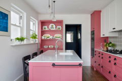
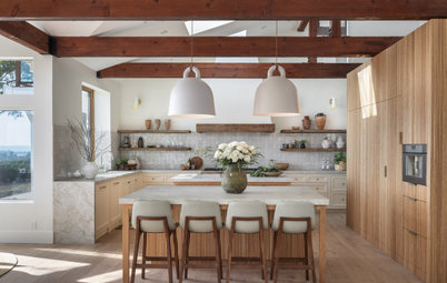
At the end of the hallway you reach a dazzling pink-and-white kitchen.
“It’s a gorgeous shade of pink, isn’t it?” Nicholls says. “When we showed the [owner] our moodboard images, she saw a picture of a pink kitchen and loved it instantly. In fact, it became one of the starting points for the whole house.” The color may not be typically Victorian, but the cabinetry is in a traditional style, complete with cup handles.
The island contains the sink, a dishwasher and a little storage on each side, as well as legroom for the bar stools.
The flooring has been color-matched to the engineered wood in the living room, but the planks are porcelain for durability.
Kitchen cabinet paint: Fitzrovia Red, Dulux
There’s also a custom cupboard in here. “The crockery set has been with the owner since she got married. She uses it frequently and likes to have it on display,” Nicholls says. There are discreet grooves on the shelves to stop the plates from slipping off.
The windows, which overlook the side yard, were already there, but Nicholls and the team made the sills wider so they’re handy for pots of herbs and installed partially obscured glass for privacy.
The owner didn’t want to extend into her side yard, partly because she wanted to retain a separate entrance from the garden into the laundry room (the home has rear access).
The upper cabinets are the same color as the walls. “It almost makes them disappear, which opens up what is a relatively narrow space,” Nicholls says.
The middle cupboard hides a range hood.
Shop for kitchen and dining products on Houzz
The middle cupboard hides a range hood.
Shop for kitchen and dining products on Houzz
The team designed a pantry at the far end of the kitchen as part of the adding.
“[The owner] wanted a traditional Victorian pantry, with adjustable shelves and a small window you can leave open safely to keep your supplies cool,” Nicholls says.
“[The owner] wanted a traditional Victorian pantry, with adjustable shelves and a small window you can leave open safely to keep your supplies cool,” Nicholls says.
At the back of the house, and open to the kitchen, is a cozy seating space. The owner has three sons and a grandchild living nearby and wanted an informal family-friendly space with views of the garden where everyone could sit around, as well as a dining area.
She already owned the chair and sofa (seen in the second living room “before” photo) and Slightly Quirky had them reupholstered. The team also had curtains made for the French windows.
She already owned the chair and sofa (seen in the second living room “before” photo) and Slightly Quirky had them reupholstered. The team also had curtains made for the French windows.
Before: The original dining room now contains a bathroom and a laundry and mud room.
After: There’s a bench between the dining table and seating area that faces the kitchen. It also provides a solid surface against which to push sofa behind it.
The piano, seen in the first living room “before” photo, has found a home in here.
The piano, seen in the first living room “before” photo, has found a home in here.
The laundry and mud room is behind the kitchen. A door to the left leads out into the side yard, so the owner and her dog can head straight in here after walks.
\
New to home remodeling? Learn the basics
\
New to home remodeling? Learn the basics
“[The owner] wanted a big sink in here for washing the dog,” Nicholls says.
The white appliance on the wall is a hair dryer for the dog and there’s a shower attachment over the sink. The cabinets above the sink contain towels.
“It’s a really functional space,” she says.
The white appliance on the wall is a hair dryer for the dog and there’s a shower attachment over the sink. The cabinets above the sink contain towels.
“It’s a really functional space,” she says.
Next to the laundry room, a new guest bathroom was built in.
Before: The original landing was in need of a refresh.
After: Here’s the new landing, seen from the opposite direction. Through the archway is the owner’s craft room and, on the right, the bathroom. The middle room on this side of the arch is a guest room.
“We chose the lights to give the space a Victorian feel,” Nicholls says. “They’re also practical and keep the space, which is quite dark, feeling open.”
The landing window needed some thought — it overlooks a very close brick wall, so isn’t very pretty. The custom-made shade allows ventilation when the window is open while still hiding the view.
Before: The upstairs layout hasn’t changed much from this original plan. But if you scroll down you can see how the bathroom has nudged into the back room.
After: The first floor as it looks now with a slightly enlarged bathroom.
Before: The main bedroom is at the front of the house. This is how it looked before Nicholls and the team got to work.
After: Now it feels brighter and fresher. “[The owner] wanted a calmer, more restful look up here,” Nicholls says.
Green bedspread, Heal’s. White bedspread, Zara.
Green bedspread, Heal’s. White bedspread, Zara.
Before: The old curtains have been replaced by Roman blinds (see below,and the furniture and artwork moved around.
After: “[The owner] really wanted a kidney-shaped dressing table like her grandmother used to have,” Nicholls says. They sourced this vintage one online and added the fabric and glass top.
Before: The old bathroom was slightly than it is now. Nicholls stole a little space from the back bedroom to expand it.
After: The room now has a traditional feel.
“[The owner] saw the scalloped tiles in our first meeting and wanted them by hook or by crook,” Nicholls says. To keep costs down, and also to let them shine, they used different pink tiles around the bath (not pictured).
Scalloped tiles: Ca’ Pietra
“[The owner] saw the scalloped tiles in our first meeting and wanted them by hook or by crook,” Nicholls says. To keep costs down, and also to let them shine, they used different pink tiles around the bath (not pictured).
Scalloped tiles: Ca’ Pietra
In the guest bedroom, a shelf goes all the way around the room to allow the owner to display lots of her things. It’s painted in the same color as the guest shower room downstairs, which is a nice link.
The owner absolutely loves her new home, saying she couldn’t have managed such a major project — which included quite a lot of building work — without Nicholls and the team.
“They helped me every step of the way and came up with gorgeous ideas for the color schemes, curtains and carpets, furniture and lighting … [helping] me to interpret my ideas in a fresh, modern way,” she says. “They were also very empathic when it came to deciding which pieces of existing furniture would work in the redesign, and which — sadly — had to go. I am very grateful they held my hand through that process. I was almost sorry when the project ended, as by then they felt like old friends!”
More on Houzz
Read more stories about homes around the world
Find design and remodeling professionals near you
Shop for home products


House at a Glance
Who lives here: A single woman and her spaniel
Location: Surbiton, Surrey, England
Size: Three bedrooms and two bathrooms
Designers: Caroline Nicholls, Deborah Moor and Katie Minney of Slightly Quirky
Before: “She’d only recently moved in when we first visited,” designer Caroline Nicholls says. Here in the living room are pieces the owner brought with her. “It’s always lovely for us when clients have existing artworks — it gives us inspiration for color palettes, and clients will often ask us where best to show off pieces,” Nicholls says.