


Kitchen of the Week: White, Wood and Blue With Cottage Charm
A 181-square-foot kitchen in a 1920s Atlanta bungalow gets a light and airy makeover filled with small-space ideas

Interior designer Jaime Dupes works for a firm that specializes in renovating old houses, so she knows a thing or two about returning character to tired interiors. Since old homes often have relatively small kitchens, she’s also adept at making a compact space feel bigger than it is. So when repeat clients asked her to make over the kitchen in their 1920s home in Atlanta’s historic Virginia Highland neighborhood, she was squarely in her element. Below, see the kitchen’s dramatic transformation and learn a few of Dupes’ design strategies along the way.
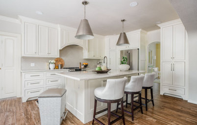
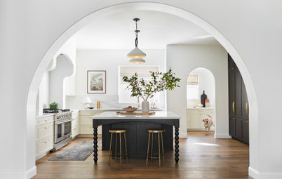
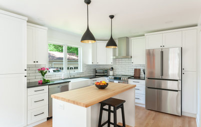
After: This photo was taken from the same angle as the “before” shot. The Copper Sky remodeling team turned a full bathroom behind the wall on the left into a powder room, which allowed them to increase the kitchen’s width sufficiently to install a 3-foot-wide island with about 3½ feet of walkway on either side. They laced in red oak floors to match the existing floors and refinished them.
The door leading to the dining room moved a few feet to the left. Not only did that allow the cabinetry and appliances to wrap onto the back wall, but it also aligned the opening with the kitchen’s path of travel instead of smack into the island. And the refrigerator, which used to impede traffic to the dining room, moved to the space next to the window. Now the whole cooking zone is on the right side of the kitchen, buffered from the travel zone by the island.
These changes allowed Dupes to install shallow cabinetry — a storage zone — along the entire left wall, which was key to her design. “Whenever I have a kitchen that is going to live in a smaller footprint, there are a couple of tricks that I do to make it feel larger than it is,” she says. “One of those is you always want cabinetry on at least three walls.”
On this kitchen’s third wall, two tall cabinets designated for food storage flank narrower cabinets used for both storage and display.
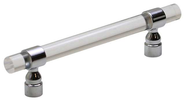
Perimeter cabinetry and pantry paint: Pure White, Sherwin-Williams; island base paint: Mt. Rainier Gray, Benjamin Moore; countertop: Carrara Lumos quartz, MSI; cabinet pulls: Kara in Honey Bronze, Top Knobs
Shop for bar and counter stools
The door leading to the dining room moved a few feet to the left. Not only did that allow the cabinetry and appliances to wrap onto the back wall, but it also aligned the opening with the kitchen’s path of travel instead of smack into the island. And the refrigerator, which used to impede traffic to the dining room, moved to the space next to the window. Now the whole cooking zone is on the right side of the kitchen, buffered from the travel zone by the island.
These changes allowed Dupes to install shallow cabinetry — a storage zone — along the entire left wall, which was key to her design. “Whenever I have a kitchen that is going to live in a smaller footprint, there are a couple of tricks that I do to make it feel larger than it is,” she says. “One of those is you always want cabinetry on at least three walls.”
On this kitchen’s third wall, two tall cabinets designated for food storage flank narrower cabinets used for both storage and display.
Perimeter cabinetry and pantry paint: Pure White, Sherwin-Williams; island base paint: Mt. Rainier Gray, Benjamin Moore; countertop: Carrara Lumos quartz, MSI; cabinet pulls: Kara in Honey Bronze, Top Knobs
Shop for bar and counter stools
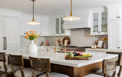
When it came to the kitchen’s finishes, the homeowners were familiar with Dupes’ work and trusted her design eye. They shared a Houzz ideabook filled with style inspiration too. The aesthetic they landed on was “cottage,” and everyone agreed: This shouldn’t be a cookie-cutter kitchen.
“In historic homes, you want to have a lot of character,” Dupes says. “So even though we wanted [the kitchen] to be light and airy, we knew we wanted it to have interest with contrast. The question was, ‘How do we get that interest in a white kitchen but make it feel elevated and custom?’”
They did it by layering in texture and introducing wood elements, including the maple-stained white oak mixed with the painted white wood on the pantry wall.
Details like preserved and replicated original millwork and an ogee edge on the island’s marble-look quartz countertop helped lend personality to the space as well.
Not sure where to start on your home project? Learn the basics
After: Removing the peninsula and reconfiguring the furniture in the adjacent family room gave Dupes enough open space to install a breakfast area. It shares a new white, wood and gray-blue palette with the kitchen that’s soft and pleasing. But lighter color isn’t the only thing easier on the eye.
“Another thing I do when we are working in a smaller footprint is I always panel the appliances,” Dupes says. The refrigerator and dishwasher are paneled, and a speed oven-microwave tucked into the island is paneled too. That helps the eye travel around the kitchen cabinetry without stopping at appliances. “It really helps the space feel larger,” she says.
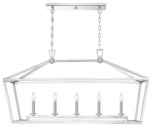
A third trick Dupes uses to make a small kitchen feel open is to choose clear glass globes on pendant lights. Here, the pendants have a pretty, slim brass rod that coordinates with the cabinet hardware.
Pendant lights: Cafe in natural brass, Coastal Living collection, Regina Andrew; cabinet organizers: Rev-A-Shelf
“Another thing I do when we are working in a smaller footprint is I always panel the appliances,” Dupes says. The refrigerator and dishwasher are paneled, and a speed oven-microwave tucked into the island is paneled too. That helps the eye travel around the kitchen cabinetry without stopping at appliances. “It really helps the space feel larger,” she says.
A third trick Dupes uses to make a small kitchen feel open is to choose clear glass globes on pendant lights. Here, the pendants have a pretty, slim brass rod that coordinates with the cabinet hardware.
Pendant lights: Cafe in natural brass, Coastal Living collection, Regina Andrew; cabinet organizers: Rev-A-Shelf
The range hood is cerused wood, which means it has a whitewash treatment that brings out the grain. Zoom in to admire the hood’s pretty routed detail as well as the marble mosaic tile range backsplash. “I think the actual scale of the pattern helps it feel more updated and fresh and not just like a typical accent tile behind the range that you’ve seen time and time again,” Dupes says.
Tile: Eveningstar mosaic (accent), Seaport in Arctic White (field) and Thassos marble pencil liner in white (trim), Tile Bar
Tile: Eveningstar mosaic (accent), Seaport in Arctic White (field) and Thassos marble pencil liner in white (trim), Tile Bar
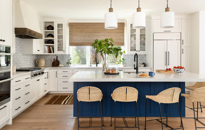
One of the homeowners’ design goals was to clear the countertops of clutter, including the coffeepot. So to the right of the new sink, Dupes created a coffee station that sits on the countertop and has a pocket door.
To leave some countertop to the right of the sink, the tile reveal around the window had to be asymmetrical, so Dupes installed a sconce to create balance and, at the same time, break up the wall of white with a fun, unexpected detail. A soft, striped cafe curtain is a sweet finishing touch.
Sconce: Ariel, Coastal Living collection, Regina Andrew; Artesso pull-down faucet and beverage faucet by Brizo, Delta
Before: In this floor plan of the previously existing kitchen, you can see the full bathroom on the right. Notice how the peninsula divided the kitchen from the family room (at the top) and cut into the path of travel from the family room into the dining room (at the bottom).
If you’re feeling disoriented, imagine that you are standing on the far side of the peninsula looking into the kitchen. That’s the perspective you’re seeing in the story’s first picture.
If you’re feeling disoriented, imagine that you are standing on the far side of the peninsula looking into the kitchen. That’s the perspective you’re seeing in the story’s first picture.
After: Here you can see how stealing square footage from the bathroom created enough space in the kitchen for the island. You can also see how there’s now a straight shot from the family room to the living room that doesn’t interfere with the cooking zone.
More on Houzz
Read more kitchen stories
Browse kitchen photos
Hire a kitchen remodeler
Shop for kitchen products
More on Houzz
Read more kitchen stories
Browse kitchen photos
Hire a kitchen remodeler
Shop for kitchen products


Kitchen at a Glance
Who lives here: A couple with three young daughters
Location: Atlanta
Size: 181 square feet (17 square meters); 14 by 12 feet, 11 inches
Designer: Jaime Dupes of Copper Sky Design + Remodel
Before: This view of the existing kitchen is from the home’s family room looking toward the dining room. Note there’s a short peninsula in the foreground.
The homeowners’ complaints were primarily aesthetic: They felt the 1990s-era kitchen was dark, dated and out of sync with the style of the adjacent rooms. It also had scant storage space, along with small appliances cluttering the counter. And while they did like that their three kids could eat breakfast at the peninsula, it blocked flow between the narrow kitchen and the family room.
Dupes’ directive was to turn it into a bright and open kitchen with an efficient floor plan and more drawer space and food storage. The clients really wanted an island too — though how one might squeeze in wasn’t immediately obvious.
Scroll to the “before” and “after” floor plans at the end of the story, which have the family room and peninsula positioned at the top, to get oriented.
Find kitchen remodelers near you