


Kitchen of the Week: Rich Color and Style in a 19th-Century Condo
A 160-square-foot kitchen in a Chicago three-flat gets a traditional look with dark green cabinets and authentic details

A young couple’s Chicago condo had gorgeous details dating to the late 19th century, including a coved ceiling and mahogany-inlay floors in the dining room. But its kitchen was a different story. “Whoever did whatever they did in the 1990s with that pink countertop and the maple cabinets did not pay attention to where they were living, that’s for sure,” says Heather Pino of Metro Design Build, who took on its transformation. Keep reading to see how Pino saved the good and replaced the bad in an efficient new kitchen that respects the building’s architecture as well as the homeowners’ color-loving sensibilities.
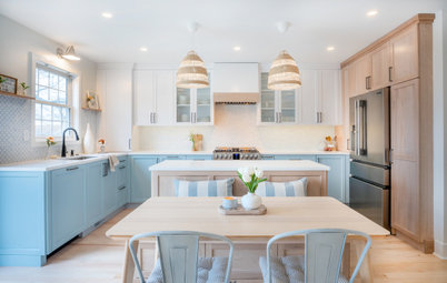
After: The homeowners, a young couple who were first-time remodelers, wanted a modern, open kitchen that would have as much storage as possible. They preferred natural materials and wanted to preserve the original oak floor, with its beautiful mahogany inlay, in the dining room. Beyond that, they trusted Pino’s vision for a design that would respect the building’s architecture.
This photo, which was taken from a few steps back compared with the “before” image, shows the new, opened-up kitchen. The renovation team installed a ceiling beam in order to remove the dividing wall, being careful to preserve the dining room’s original molding and flooring.
The dining room floor was actually the jumping-off point for the design, Pino says. Other contractors the couple consulted had deemed it unsalvageable, but her team was able to preserve it, covering a spot where it was damaged beyond repair with the new peninsula.
The existing maple kitchen flooring was added in the 1990s renovation. Not only was it in rough shape, but sections were missing where the dividing wall was removed. Instead of trying to match the dining room floor, Pino decided to use a different but still natural and period-appropriate material: a 4-by-12-inch tumbled Carrara marble tile laid in a herringbone pattern. The inspiration was the building’s Carrara marble entry staircase, which had been worn down by more than 130 years of residents coming and going.
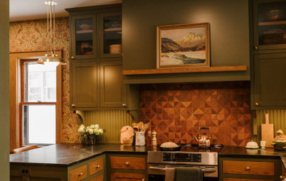
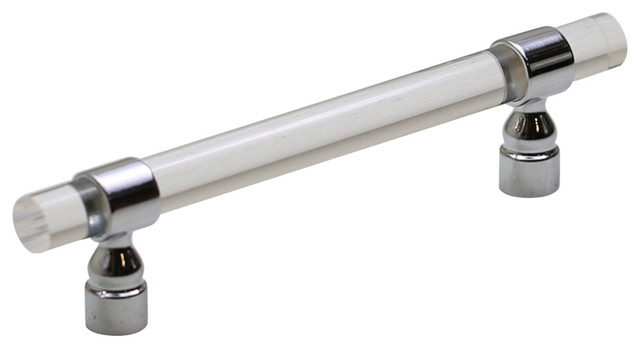
The wife, who at the time worked at the Art Institute of Chicago, loved color, Pino says. After going through the color wheel, she and Pino decided on a dark green paint —Vintage Vogue by Benjamin Moore — for the cabinetry to complement the floor border’s rich, reddish mahogany tones. The lower cabinets are slab-front while the uppers are Shaker-style, the latter of which has slightly more detail that draws the eye up, Pino says. (The variation also means there are no little corners to collect dust on the lowers.) Bronze cabinet hardware adds a warm gleam.
The dining room wall paint, Benjamin Moore’s Cashmere Wrap, glimpsed on the right side of the photo, was inspired by the clients’ love of pink. “Her husband would show up in pink shirts all the time, and it was just kind of the perfect complementary color to the kitchen,” Pino says. “When clients are open to color, we dive in.”
Cabinet hardware: Northport knobs and pulls in brushed bronze, Schaub; floor tile: tumbled Bianco Carrara marble field tile, Artistic Tile
This detail of the wall next to the window captures the kitchen’s material and color palette up close. “We wanted to focus on materials that were a modern version of what you would find in a home of this age,” Pino says. “It was important to have all natural stone on the floors, countertops and backsplash.” The countertops are honed Marquina quartzite and the backsplash is Italian white Carrara marble, topped by a small marble shelf.
The wood accents, including this open shelving near the window and the back of the glass-front cabinet to the left of the range hood, are quartersawn white oak stained in a nutmeg color that matches the dining room floor. Along with the marble shelf, they were perfect for displaying the wife’s decorative objects.
Find a local countertop pro
Before: The previous kitchen cabinetry stopped several feet short of the ceiling. The wall opposite this one, where the island is now, had a radiator sandwiched between the lower cabinets and the wall. A refrigerator sat forlornly in the corner.
At the kitchen’s far end, a small pantry with a low header housed a washer and dryer and a few shelves.
Scroll to the bottom of the story to compare the old and new floor plans.
At the kitchen’s far end, a small pantry with a low header housed a washer and dryer and a few shelves.
Scroll to the bottom of the story to compare the old and new floor plans.
After: While the kitchen’s aesthetic and materials were chosen to be consistent with the building’s architecture and age, its storage capacity and floor plan needed to suit a modern lifestyle. Most of Metro Design Build’s projects are in smaller Chicago homes and condos like this one, so they’re adept at figuring out how to maximize every square inch.
“I always set my appliances first with the homeowner based on how they cook,” Pino says. “The whole kitchen triangle thing is something I’ve kind of flown out the window for a lot of my clients. And we rarely use islands. We [more frequently design] peninsula or galley kitchens even, because they just get more storage that way.”
The new layout has an unobtrusive 30-inch panel-front refrigerator to the left of the new vintage-look range.
Range: 30-inch Classic in matte black, Big Chill
Shop for counter stools on Houzz
Another of Pino’s tricks to maximize a small room is to take advantage of vertical space. Here, the team built the cabinets to the 10½-foot ceilings and added a custom sliding, removable oak ladder that makes it easy to reach everything stored up high.
The pantry now has a taller header and built-in narrow shelving on one side. The ladder fits neatly inside and can either hang from the top bar when not in use or from the bottom bar to reach the pantry’s uppermost shelves.
Opposite the narrow shelving is a small drinks station with a countertop and microwave drawer. It was styled for the photo as a small bar, but Pino originally designed it for the husband’s espresso machine.
After: Pino wanted the homeowners to be able to look out to their large backyard, so she moved the sink to beneath the window and chose a dark basin so it blends into the countertop.
Because of an original radiator (painted black) and exterior door directly to the right of the sink cabinet, Pino put the dishwasher at the end of the peninsula, which is still easy to reach. The peninsula also holds the trash can and storage cabinets.
Sink: 30-inch Precis in Anthracite, Blanco; sink fixtures: Kohler Artifacts kitchen faucet with side spray and Kohler Wellspring beverage faucet in Vibrant Brushed Moderne Brass
The couple discovered they were pregnant during the renovation, and the new design would have been perfect for watching the kids toddle around outside. In fact, they intended to live here for at least five to 10 years. But a year or so after construction was completed, they jumped on a rare opportunity to purchase a historic mansion just a couple of blocks away. Now a professor rents the condo and enjoys this new kitchen while Metro Design Build and the couple are busy redesigning the new (old) dream home for the growing family.
The “after” floor plan
More on Houzz
Read more kitchen stories
Browse kitchen photos
Hire a kitchen remodeler
Shop for kitchen products
More on Houzz
Read more kitchen stories
Browse kitchen photos
Hire a kitchen remodeler
Shop for kitchen products


Kitchen at a Glance
Who lives here: A young couple
Location: Chicago
Size: 160 square feet (15 square meters); 16 by 10 feet
Designer: Heather Pino of Metro Design Build
Before: The two-bedroom, two-bath, first-floor condo is in a classic Chicago three-flat (three stacked units) built in 1892 in the storied Hyde Park neighborhood of Chicago, which is also home to the University of Chicago, the Obamas and several properties on the National Register of Historic Places.
While the building and the condo itself retain many original elements, the kitchen had been renovated a century later and, as Pino noted, was much less illustrious than its surroundings. In addition to having worn-out finishes, it had an inefficient floor plan, little storage space and a load-bearing wall cutting it off from the dining room. It also had some less-than-charming original details like knob-and-tube wiring hidden in the walls. Here, you can peek at the old cabinetry and see the transition from the dining room into the kitchen as it originally appeared.
Find kitchen remodelers near you