


10 Paint Colors Ready to Take Over in 2024
Blue is huge, but dark hues and warm tones also find favor among major paint companies’ 2024 Color of the Year picks

Every year we track and profile the various Color of the Year selections made by major paint brands. Usually there’s little consensus on what the hip hue for the new year will be. But every so often there’s a bit of agreement. And this is one of those times.
Clearly, blue is about to have a big year in 2024. Six out of the 10 companies featured in this article chose a shade of blue for their 2024 Color of the Year selections. The remaining colors run the gamut from dark and moody to warm and welcoming. Let’s take a closer look at the paint colors you’re about to see a lot more of.
Clearly, blue is about to have a big year in 2024. Six out of the 10 companies featured in this article chose a shade of blue for their 2024 Color of the Year selections. The remaining colors run the gamut from dark and moody to warm and welcoming. Let’s take a closer look at the paint colors you’re about to see a lot more of.
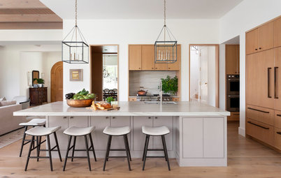
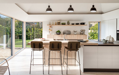
2. Thermal by C2
Here’s another pretty, soft blue, this one a touch darker than the previous pick. As you can see, it works really well on kitchen cabinetry. It infuses color into the space but remains soft and tranquil.
I could also see this working well in a bathroom, whether on the walls or for cabinetry. Or consider using it as an accent color on just the ceiling. It’s a trick that can visually enlarge and open up a room, especially if it has low ceilings, as the color mimics the sky on a clear, sunny day.
3. Renew Blue by Valspar
Valspar’s selection is one of my favorites here. Watery blues are my go-to hues when I want to inject vibrant color into a home. It has a tropical “on vacation” vibe that plays well with warm or cool neutrals.
Learn about Houzz Pro software
Valspar’s selection is one of my favorites here. Watery blues are my go-to hues when I want to inject vibrant color into a home. It has a tropical “on vacation” vibe that plays well with warm or cool neutrals.
Learn about Houzz Pro software
5. Skipping Stones by Dunn-Edwards
This medium blue shade reminds me of summer afternoons spent at the pool. It’s a cool blue, so it’s a great color choice for those residing in hotter climates. It can bring a soothing, cooling vibe to a bathroom, bedroom or sunroom.
7 Color Trends for 2024 at Maison & Objet
This medium blue shade reminds me of summer afternoons spent at the pool. It’s a cool blue, so it’s a great color choice for those residing in hotter climates. It can bring a soothing, cooling vibe to a bathroom, bedroom or sunroom.
7 Color Trends for 2024 at Maison & Objet
Dunn-Edwards’ Skipping Stones would also make a terrific front door color for those residing in any climate. As shown here, it injects a lovely dash of color to this otherwise all-white exterior.
I recently specified a similar hue for a homeowner’s interior doors and it really dressed up the indoor spaces nicely.
I recently specified a similar hue for a homeowner’s interior doors and it really dressed up the indoor spaces nicely.
6. Blue Nova by Benjamin Moore
The chilliest of the blue selections, Blue Nova is a medium-dark shade with purple undertones. Similar to Skipping Stones, I think this color works best if you need to visually cool off a space.
I’d use this color a bit more sparingly since it’s rather dark. But it would be lovely for a front door or as an accent in a bedroom or bathroom.
The Houzz Pro 3D Floor Planner allows pros to quickly create accurate 3D images of room designs to give clients a realistic and easy-to-understand view of those designs. Pros can choose from thousands of Benjamin Moore paint colors to customize the walls in their plans.
7. Limitless by PPG and Glidden
For those looking to infuse homes with warmer hues, PPG and Glidden’s selection of Limitless might be the right selection. This soft champagne hue works well as a backdrop to darker wood tones, as well as warm metallics.
Sunny shades such as Limitless can be called upon to help lighten and brighten a space, so if your clients have a dark, cramped room in their house that needs an infusion of luminous warmth, this could be the hue for them.
How Designers Are Using Warm Neutrals Right Now
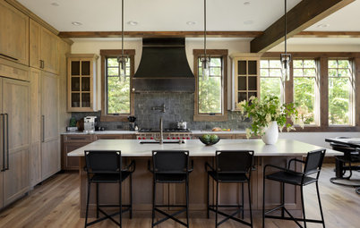
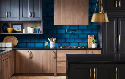
8. Persimmon by HGTV Home by Sherwin-Williams
While warmer shades might be in the minority here, this one really stands out to me for its soft yet spicy quality. Persimmon is a lightened shade of earthy terra cotta, shown here on a kitchen island.
It’s an appetizing hue that lends itself well for use in a kitchen, dining room or other spaces in a home where people regularly gather for meals and conversation with family and friends.
9. Cracked Pepper by Behr
I’m a longtime fan of Cracked Pepper. It’s a neutral dark gray that sits on the color spectrum just a tiny hair from black. In fact, I like to use it in place of pure black, as the latter can often appear too harsh or intense in and on a home.
Cracked Pepper is a true neutral in that it has neither warm nor cool undertones, so it can work well as an accent or trim color along with any other color or colors.
See how Houzz Pro can help your business
10. Ironside by Dutch Boy
Dutch Boy also went for a deep and moody hue, this one a dark olive green with ashy brown undertones. This is a shade I’m seeing more and more of lately, typically used on cabinetry and millwork. It gives a cozy, intimate vibe to a space, making it a great choice for bedrooms, living rooms and dining rooms.
Your turn: What do you think of the 2024 Color of the Year selections? Which would you pick? Share your thoughts in the Comments.
More for Pros on Houzz
Read more stories for pros
Learn about Houzz Pro software
Talk with your peers in pro-to-pro discussions
Join the Houzz Trade Program
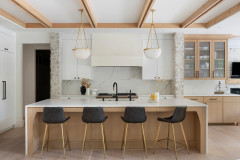
Taking inspiration from the sky above, Sherwin-Williams has selected this breezy, tranquil light blue as its selection for 2024 Color of the Year. Upward has a touch of gray in it, which makes it a sophisticated alternative to a more pastel baby blue.
This is an excellent blue paint if you’re looking to add color but want to keep the space light and bright. For instance, while dark navy blues have been popular recently for kitchen cabinets, this lighter shade might be a better option if your client’s kitchen is on the smaller side or lacks abundant natural light. I can also see this color working well as a haint blue option for a porch ceiling.
You can help clients visualize their planned home with Houzz Pro Mood Boards and 3D Floor Plans. You can also share photos, files, estimates, proposals and more with clients using Houzz Pro.