


How Designers Are Using Warm Neutrals Right Now
Design pros share how they are layering neutral color schemes to create comfortable, refined spaces

Beige is back big time, and it’s anything but boring. That’s because designers are using it as part of layered neutral color schemes that provide comforting warmth. “Neutrals shouldn’t equate to boring. Rather, they should produce a luxurious, refined space that feels warm and textured,” interior designer Samantha Stathis says. Here designers share their favorite approaches to layering warm neutral hues in a room right now.
2. Layering Textiles
Stathis notes that she keeps a warm neutral palette from falling flat by layering textiles with different tones, textures and patterns. For example, here she used a mix of florals, stripes and small-scale prints in varying materials including linen, cotton and wool. “This ultimately led to a more cozy and homey room,” she says.
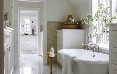
Designers also appreciate the way a warm neutral palette can give a room seasonal versatility. For example, the use of warm neutrals instead of crisp white gave this room a subtle coastal feel instead of an overtly nautical and summery look. While the painting and navy sofa nod to the bayside location, it’s a home that feels inviting year-round.
Stathis notes that she keeps a warm neutral palette from falling flat by layering textiles with different tones, textures and patterns. For example, here she used a mix of florals, stripes and small-scale prints in varying materials including linen, cotton and wool. “This ultimately led to a more cozy and homey room,” she says.
Designers also appreciate the way a warm neutral palette can give a room seasonal versatility. For example, the use of warm neutrals instead of crisp white gave this room a subtle coastal feel instead of an overtly nautical and summery look. While the painting and navy sofa nod to the bayside location, it’s a home that feels inviting year-round.
Angela Grace Design gave this Northern California bedroom refined, cozy comfort by using a wide variety of textiles. A patterned warm gray rug grounds the room, and the range of textures goes upward from there. Meanwhile, white paint on the walls and ceiling lends an airy feel.
You can help clients visualize their planned home with Houzz Pro Mood Boards and 3D Floor Plans. You can also share photos, files, estimates, proposals and more with clients using Houzz Pro.
You can help clients visualize their planned home with Houzz Pro Mood Boards and 3D Floor Plans. You can also share photos, files, estimates, proposals and more with clients using Houzz Pro.
3. Choosing the Right Background Color
Choosing the right wall color is an important part of layering warm hues. To create a cozy backdrop that allows layered neutrals to shine, Curtis recommends choosing a warm taupe or creamy beige. “Right now I’m loving Neutral Ground by Sherwin-Williams,” she says.
For this home in the Minnesota woods, interior designer Emily Pueringer recommended Benjamin Moore’s Swiss Coffee. It provides a warm yet airy backdrop for a variety of books, art and other favorite objects displayed on the white oak built-ins.
Beige is Back: Designers Share 10 Beautiful Warm Paint Colors
4. Natural Materials Add Depth
Designers also know that while textiles are important, other textures play a big role in layering warm neutral palettes. Stathis notes that she uses natural materials including wood, marble and clay when accessorizing to add dimensionality to a space.
“Personally, I find inspiration in natural textures and earthy elements,” Curtis says. Using wooden accents is one of her favorite ways to add warmth and depth to a warm neutral palette.
5. Inspiration From the Earth
“I think earthiness is a factor in the trend we’re seeing with warm tones currently, whether it’s through color alone, through natural materials or through something made by hand,” Pueringer says. “All these layers are factors of the warmth brought into a project for me. When designing a project lately, I am always thinking about how I can bring an earthy vibe to it.”
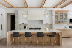
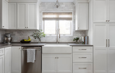
A neutral palette gives this kitchen that Pueringer designed all the warmth of a giant group hug. Lots of sunlight from the room’s many windows streams onto all its layers — varied wood tones, reflective glass, creamy natural stone finishes, patinaed brass, deep brown leather stools, terra-cotta tiles, a variety of textiles on the throw pillows and ivory paint.
“I think earthiness is a factor in the trend we’re seeing with warm tones currently, whether it’s through color alone, through natural materials or through something made by hand,” Pueringer says. “All these layers are factors of the warmth brought into a project for me. When designing a project lately, I am always thinking about how I can bring an earthy vibe to it.”
A neutral palette gives this kitchen that Pueringer designed all the warmth of a giant group hug. Lots of sunlight from the room’s many windows streams onto all its layers — varied wood tones, reflective glass, creamy natural stone finishes, patinaed brass, deep brown leather stools, terra-cotta tiles, a variety of textiles on the throw pillows and ivory paint.
With regard to specific colors, Pueringer looks to the earth beneath her feet — terra-cotta and clay tones are favorites. The texture, colors, uses, history and possibilities of terra-cotta clay have inspired several of her recent projects.
“Earthy terra-cotta or clay tones speak to me and will remain timeless,” Pueringer says. “Terra cotta also has a global vibe, as this material is used for so many things worldwide. Seeing the clay properties peek out at you, the variation in the hand-painted glaze and the imperfections bring a human warmth.” A perfect example: the hand-painted terra-cotta tiles she used in the kitchen, handmade by Tabarka Studio.
“Earthy terra-cotta or clay tones speak to me and will remain timeless,” Pueringer says. “Terra cotta also has a global vibe, as this material is used for so many things worldwide. Seeing the clay properties peek out at you, the variation in the hand-painted glaze and the imperfections bring a human warmth.” A perfect example: the hand-painted terra-cotta tiles she used in the kitchen, handmade by Tabarka Studio.
6. The Role of High Contrast
Of course, current trends don’t dictate limiting the color range of the palette. Curtis appreciates the drama that high contrast brings when layering warm neutral tones. “To achieve high contrast in a pleasing manner, balance is key — juxtapose light and dark shades to create depth without overwhelming the senses,” she advises. For example, here she added black and graphite tones on thinner elements like furniture frames, drapery rods and window grilles, with a few larger dollops of deep tones mixed in via the floor lamp and pillows.
Of course, current trends don’t dictate limiting the color range of the palette. Curtis appreciates the drama that high contrast brings when layering warm neutral tones. “To achieve high contrast in a pleasing manner, balance is key — juxtapose light and dark shades to create depth without overwhelming the senses,” she advises. For example, here she added black and graphite tones on thinner elements like furniture frames, drapery rods and window grilles, with a few larger dollops of deep tones mixed in via the floor lamp and pillows.
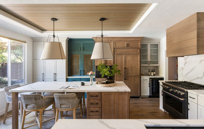
In this Montana lake house, Pearson Design Group grounded rooms with dark-stained oak flooring. Along with the blackened-steel accents of the architecture, it provides dark contrast to the light warm neutrals.
“Playing with different colors and finishes within a space is the key to layering,” project architect Justin Tollefson says. On the left, the designers continued the exterior’s reclaimed barnwood onto the kitchen walls. In the adjacent living room, they covered the walls in pine boards with a semitranslucent white paint that reveals the knots and graining patterns of the wood. Overhead, they painted the ceiling boards white, which provides a contrasting cleaner look by covering up those characteristics.
“Playing with different colors and finishes within a space is the key to layering,” project architect Justin Tollefson says. On the left, the designers continued the exterior’s reclaimed barnwood onto the kitchen walls. In the adjacent living room, they covered the walls in pine boards with a semitranslucent white paint that reveals the knots and graining patterns of the wood. Overhead, they painted the ceiling boards white, which provides a contrasting cleaner look by covering up those characteristics.
7. Layers of Warm Patina
In this transitional Oak Park, Illinois, living room, designer Jessica Moran created a refined, eclectic look by mixing styles and contrasting crisp white with patinaed pieces. She accomplished the successful layering by finding the right balance between old and new and dark and light.
“I love layering vintage art and furniture into my designs to keep spaces from feeling too precious,” Moran says. “And I especially love layering worn vintage pieces against the crisp and clean backdrop of white walls. In this case I used Sherwin-Williams’ Pure White. The client’s vintage art and furniture collection brings warmth to the otherwise stark white walls. It’s vintage yet somehow modern and fresh.”
The worn leather of the armchairs, the aged wood on the trunk and the sepia tones in the artwork show that these pieces have history and have been well-loved. There’s really no better way to express warmth than that.
Your turn: Do you have a favorite strategy for layering warm neutrals? What are some of your favorite inspirations, hues, paints, textiles and textures right now? Please share in the Comments.
More for Pros on Houzz
Read more stories for pros
Learn about Houzz Pro software
Talk with your peers in pro-to-pro discussions
Join the Houzz Trade Program
More for Pros on Houzz
Read more stories for pros
Learn about Houzz Pro software
Talk with your peers in pro-to-pro discussions
Join the Houzz Trade Program

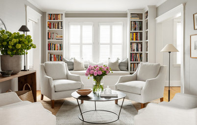
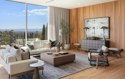

When layering warm tones and textures, designers agree that one selection can inspire a room’s entire color palette. This jumping-off point can come from just about anywhere, such as a wall color, the veining pattern in a natural stone or a favorite object. “Often a starting point emerges organically, such as a captivating piece of art or a unique rug, setting the tone for the room’s palette,” designer Ginger Curtis of Urbanology Designs says.
Stathis notes that she often uses a rug as her jumping-off point, as she did in this Oceanport, New Jersey, living room. “In this particular space, we opted for a one-of-a-kind vintage piece in varying shades of taupe, beige and blue,” she says. She then pulled in those colors throughout the room.