


6 Wonderful New Wood-Filled Kitchens
Designers incorporate wood features and details to create warm and welcoming kitchens

The quickest way to create warmth in a kitchen? Just add wood. And if these kitchens are any indication, the more the better. Here, designers share the approaches they took in adding wood features and details to create kitchens with a wonderfully inviting atmosphere.
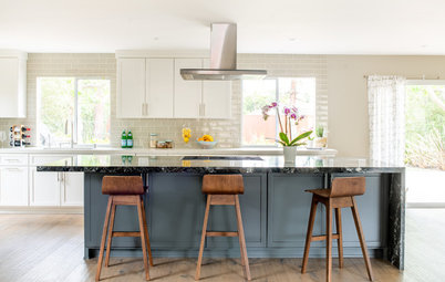
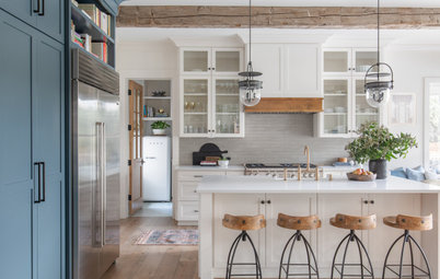
2. Wrapped in Warmth
Designers: Tom Lenchek, James Efstathiou and Taylor Proctor of Prentiss Balance Wickline Architects
Location: Copper Harbor, Michigan
Size: 186 square feet (17 square meters); 12 by 15½ feet
Homeowners’ request. “The owners wanted a simple, streamlined kitchen with open shelving rather than upper cabinets and a functional island for entertaining,” project architect James Efstathiou says. “Having the sink face the view was important.”
Wood details. “To keep the material palette simple, we used maple veneer cabinets that were a very close match to the Baltic birch plywood walls and ceilings,” Efstathiou says.
Other special features. The countertops and short backsplash are Europly plywood with black laminate covering and exposed edges. Blackened-steel hardware, shelf and range backsplash. Black stainless steel appliances. “I think the lack of variety in materials is what makes this kitchen stand out,” Efstathiou says. “The materials are veneer plywood walls, ceilings, cabinets, concrete floors and steel accents — that’s it.”
Designer tip. “With open shelving and no upper cabinets, you have to be committed to organization,” Efstathiou says. “It can turn into visual chaos quickly.”
Lighting: Cylinder adjustable Monopoint in black, Recesso Lighting; faucet: Purist in black, Kohler; project photos: Kes Efstathiou
10 Kitchen Island Features Pros Always Recommend
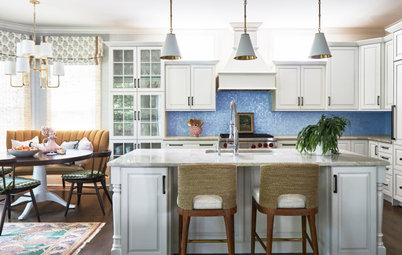
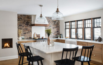
3. Family-Friendly
Designers: Danielle DiVittorio Malloy of DiVittorio Architecture & Design and Janet Marena of JTM Interiors
Location: Los Altos, California
Size: 289 square feet (27 square meters); 17 by 17 feet
Homeowners’ request. “The homeowners were looking for a functional kitchen that the adults and kids of the home can use,” designer Danielle DiVittorio Malloy says. “A large island was desirable for the family to use when cooking and baking, also for hosting parties with family and friends. Natural light was on the family’s checklist, so we designed narrow skylights aligned with the exterior wall to fit between the first and second floor, adding extra natural illumination.”
Wood details. Custom-made and custom-stained rift white oak cabinets. White oak flooring and window.
Other special features. Green-and-gold stone island countertop and backsplash inspired by a sunrise photo of Bridal Veil Fall and Cathedral Rocks in Yosemite National Park. A built-in pullout step gives kids better access to a customized drop-down kitchen sink. Handmade backsplash tiles. Bronze light fixtures.
Designer tip. “The homeowners like to have some of their kitchen things stay in the center of the island,” DiVittorio Malloy says. “To accommodate island decor or kitchen tools sitting on the island, we maximized the island space. That way even with decor staying on the island, there was plenty of preparation space.”
Paint: Gray Mist (walls) and White Dove (trim), Benjamin Moore
Shop for bar and counter stools
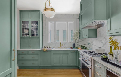
4. Custom Creation
Designer: Kirby Foster Hurd of Kirby Home Designs
Location: Edmond, Oklahoma
Size: 195 square feet (18 square meters); 13 by 15 feet
Homeowners’ request. “This is a new-construction home,” designer Kirby Foster Hurd says. “This was built as a spec home and was also featured in the Spring 2023 Central Oklahoma Parade of Homes. We collaborated with the builder, MassaRossa Luxury Homes, who allowed me full design creativity to create a space that would appeal to the masses.”
Wood details. “The entirety of the kitchen cabinets are stain-grade maple wood,” Hurd says. “We created a custom stain by combining various stain colors together to get a light stain color. And we finished the cabinets with a matte finish.”
Other special features. “I balanced the stained kitchen cabinets with Bianco Aurora marble countertops and backsplash, black windows, honey-bronze-and-white pendant lights, honey bronze cabinet hardware and a bronze kitchen faucet,” Hurd says.
Designer tip. “When adding large windows to your kitchen, you could forfeit upper cabinet storage by doing so,” Hurd says. “To maximize storage in this scenario, try adding towers of cabinets. They can be visually appealing to the overall look of the kitchen and provide tons of extra storage.”
“Uh-oh” moment. “When I walked in to check in on the staining process, the cabinets were extremely dark,” Hurd says. “I had a panic moment for sure. We go through a very detailed process of stain samples on the same species of wood we are using in each particular project, so I was absolutely shocked when I saw the kitchen cabinets and how they were not representative of the prior stain sample I reviewed and approved. Unfortunately, the custom stain color had been matched incorrectly at the paint store. Luckily, we work with very talented painters. They sanded the original cabinet color off and we started the whole process over again. Second time was a charm.”
Home stager: Amanda Layton, Layton Staging and Redesign; wall paint: White Dove, Benjamin Moore
Find a local general contractor
5. Light and Lofty
Designers: Frank and Megan Lin of co(X)ist Studio
Location: Austin, Texas
Size: 368 square feet (34 square meters), including a dining room; 16 by 23 feet
Homeowners’ request. “The homeowners preferred open-floor-plan concepts, but it was crucial that the kitchen and dining room retained their distinct identity while still being visually connected to the living room,” designer Megan Lin says. “To achieve this, we designed a kitchen and dining wing that is connected to the family room through a large opening. The kitchen is positioned to face the dining room, as well as the outdoor kitchen and patio beyond, providing a stunning view.”
Wood details. “The homeowners for this particular project requested a minimalist, soft, neutral palette with a few contrasting elements,” Lin says. “To achieve this, we incorporated light-toned wood features to connect all kitchen functions and create a cohesive ambiance. We used French white oak flooring together with Native Oak cabinets to achieve unity and harmony between the different wood features.
“A wood beam at the vaulted ceiling pulls the wood across the ceiling and expresses the structure. The plaster above the cabinets brought in the warm tones of the wood while adding texture. Half-round painted wood trim was used on the underside of the island. This smooth finish, in combination with a textured Calacatta-look porcelain backsplash tile, provides visual interest to the space.”
Other special features. “We like to install long, horizontal windows above our countertops to bring in more light and to avoid staring at a wall while doing dishes,” Lin says. “And the open shelving visually connects the kitchen corner and displays dishes.”
Designer tip. “When designing a space on a budget, it’s essential to identify the focal point of the area and allocate your funds and efforts toward enhancing that feature,” Lin says. “For instance, incorporating plaster details on a section of the main wall in the kitchen may add an extra expense, but it can also create a significant impact and transform the overall look of the room.”
“Uh-oh” moment. “We wanted to create a thick countertop profile at the kitchen island, which would resemble a large slab of stone,” Lin says. “However, this additional thickness posed a problem, as standard appliances would not fit in the kitchen island. To avoid any issues, we reviewed shop drawings in advance of fabrication and discovered the potential problem. We had to relocate one of the kitchen appliances to an alternate location. This demonstrates the importance of the adage ‘measure twice and cut once’ in every project.”
Countertops: Symphony Grey (perimeter) and Montblanc (island), Caesarstone; island lighting: Alpha linear suspension in black, Kuzco Lighting; plaster paint: Stone Hearth, Benjamin Moore
New to home remodeling? Learn the basics
6. Barely There Beauty
Designer: Oonagh Ryan of ORA
Location: Los Angeles
Size: 120 square feet (11 square meters); 8 by 15 feet
Homeowners’ request. “The original 880-square-foot home had good bones with many of its original features still intact, but it was in need of updating,” designer Oonagh Ryan says. “The goal of the renovation was to capture the spirit of the original home on a tight budget. With a few simple moves, including removing a wall separating the kitchen from the main space and enlarging an existing window opening in the kitchen, the home was transformed into an airy, light-filled space, strengthening connections between the living spaces and the garden outside.”
Wood details. “With the kitchen as the focal point of the living space, care was taken to create a design that did not overwhelm the space,” Ryan says. “The kitchen cabinets are Ikea boxes that have been wrapped in Douglas fir plywood. The cabinet door edges have exposed plywood edges and the original 1950s cabinet hardware was cleaned and repurposed. Open plywood shelves lined with green plastic laminate — to pull the outdoor colors in — float in front of a new frameless glass window, framing garden views and providing a display for the owner’s ceramic collections.”
Other special features. “A new island serves as the main inside gathering area,” Ryan says. “The quartz waterfall-edge countertop detail was selected for function and durability. A stainless-steel-back countertop with an integral sink fabricated by a local metalworks company is both cost-effective, functional and highly durable.”
Designer tip. “Food storage, a refrigerator and the trash are relegated to a small pantry tucked behind the white door,” Ryan says. “This keeps a small-footprint kitchen as open as possible and saves money on expensive built-in cabinets.”
“Uh-oh” moment. “The budget did not anticipate the need to upgrade the plumbing supply and waste pipes and electrical service, both of which were at the end of their serviceable life,” Ryan says. “This necessitated a redesign of what started out as custom cabinets to Ikea boxes wrapped in plywood and creating a small pantry for food storage, the fridge and trash, which reduced the amount of cabinetry required.”
Wall paint: Simply White, Benjamin Moore
More on Houzz
Read more kitchen stories
Browse kitchen photos
Hire a kitchen remodeler
Shop for kitchen products
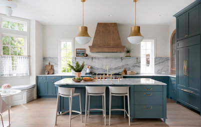
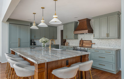


Designers: Adam Steiner of Grey Architecture + Design and Sara Barney of Bandd Design
Location: Austin, Texas
Size: 235 square feet (22 square meters); 11½ by 20½ feet
Homeowners’ request. “They wanted to bring together their traditional style and add a contemporary yet beachy twist to the space,” interior designer Sara Barney says. “It needed to feel warm, layered and inviting.”
Barney uses Houzz Pro business software for proposals, invoices and purchase orders.
Wood details. White oak cabinets. Wood beams and flooring. Rattan-wrapped counter stools.
Other special features. Light blue lower cabinets (De Nimes by Farrow & Ball). Quartzite countertops and backsplash. Aged brass pulls. Custom plaster vent hood cover.
“Uh-oh” moment. “The hardest element in this kitchen was getting the giant slab backsplash just right,” Barney says. “It was so complicated to take it to the ceiling by the range that we almost stopped it at range hood height. But the fabricator stepped up and adjusted the stone to make it work with the application and veining to run it up.”
Island lighting: Gale large pendants, Visual Comfort; cabinets pulls: Patton in aged brass, Rejuvenation; sconce above sink window: Glenn, Savoy House; Roman shade fabric: Sierra in Indigo, Schumacher
Find kitchen remodelers near you