


Kitchen of the Week: White and Wood Refresh With a Stylish Pantry
A design-build couple create a light and airy space with white finishes, warm accents and improved storage solutions

Designer Naomi Hummel and her builder husband, Todd, know a thing or two about remodeling kitchens. They’ve helped other homeowners tackle challenges and choose features. So when it came time to remodel their own dated kitchen, they pretty much knew what they did and didn’t want.
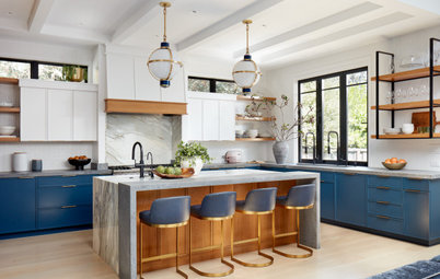
They knew taking down walls and rearranging the main components would add cost, time and stress, so they decided to work with their existing layout, which they felt functioned well for their lifestyle. But everything else had to go — the dated honey oak cabinets, dark granite countertops, aging appliances, beige travertine backsplash tile and beige tile flooring. In their place the couple brought in clean off-white custom cabinets, creamy white zellige backsplash tile, marble-look quartz countertops and white oak flooring and other wood details to create a fresh, bright style. Plus, a reimagined pantry offers improved storage and a dose of moody green-black color that’s echoed on one side of the new island.
They knew taking down walls and rearranging the main components would add cost, time and stress, so they decided to work with their existing layout, which they felt functioned well for their lifestyle. But everything else had to go — the dated honey oak cabinets, dark granite countertops, aging appliances, beige travertine backsplash tile and beige tile flooring. In their place the couple brought in clean off-white custom cabinets, creamy white zellige backsplash tile, marble-look quartz countertops and white oak flooring and other wood details to create a fresh, bright style. Plus, a reimagined pantry offers improved storage and a dose of moody green-black color that’s echoed on one side of the new island.
After: The couple stripped the kitchen back, removing the appliances and reach-in pantry.
New Shaker-style cabinets in a clean off-white with gray undertones (Frost 57 by Behr) brighten the room and improve storage. “We wanted that light and airy feel,” Naomi says. “Being that we lived in this kitchen for a couple years, the wood felt so dark and dingy.”
Marble-look quartz countertops also lighten the look. “We have three kids, so we wanted something that was durable and not consistently something I had to worry about,” Naomi says. The island features waterfall edges that showcase the wispy gray veining.
New European white oak flooring with a light wire-brushed look adds warmth and coordinates with the wood on the island back, wood shelves and the slatted wood detail seen at right. The slatted wood introduces warmth and texture to what would have been a blank white surface.
A new storage wall wraps around the new built-in stainless steel French door fridge and holds a new microwave. A cabinet below the microwave holds food storage containers. The cabinet above holds mugs and snacks. “It’s sort of like a coffee bar,” Naomi says. “That refrigerator wall has a cleaner look and more purposeful feel. There’s intention behind it.”
Wall paint: Simply White, Benjamin Moore
Find kitchen remodelers near you
Before: In the former kitchen, upper cabinets flanked the window over the sink, creating a heavy feel.
The couple wanted to keep a sliding glass door, just out of view on the left, that connects the kitchen to the backyard.
The couple wanted to keep a sliding glass door, just out of view on the left, that connects the kitchen to the backyard.
After: Custom white oak floating shelves on one side of the window enhance the airy look. “I wanted to take out that boxy feeling right next to the window, open things up and be able to display nice dishes,” Naomi says. She added 1-by-8-inch white oak paneling on the back side of the island to tie things together and “balance the eye,” she says.
Terra-cotta pendant lights over the island offer task lighting and a touch of warmth. “The island felt insignificant before,” Naomi says. “I wanted to add those lights there to make it a focal point. The terra-cotta pendants also coordinate with the terra-cotta tiles we used for the backsplash.” (The kitchen also includes new LED recessed ceiling lights that were digitally removed from these photos by the photographer to avoid distracting from other design elements.)
Shop for kitchen lighting
A large fireclay apron-front sink offers a classic look with lots of function. “Having a family of five with three kids, a large sink is ideal for us,” Naomi says. “The kids like to wash dishes together, so having the double bowl is nice so they can complete the task.”
A brass pull-down faucet with stainless steel finish has two spray functions and a swivel spout that makes it easy to clean all areas of the sink. The long drawers to the lower left of the sink hold pots and pans. A vintage area rug found on an online auction site adds a touch of pattern and softness. Black cabinet pulls introduce contrast.
Sink: Nantucket Sinks; faucet: Greenwich, VIGO; cabinet hardware: Princetonian collection in flat black, Top Knobs
The 10 Most Popular New Kitchens Right Now
To the right of the sink, a 24-inch dishwasher has a custom panel front that coordinates with the surrounding cabinetry. The slim cabinet to the right of the dishwasher has dividers for baking pans and cookie sheets.
The backsplash is handmade glazed and weathered white zellige tile with soft white grout. “They technically don’t recommend grout for these tiles from Morocco, but I have used grout before with these tiles and I liked it,” Naomi says. “These tiles have uneven edges and an imperfect feel, which I love, but using grout makes it easier to line them up and gives the tiniest bit of contrast. To my eye, they stand out even more.”
The backsplash is handmade glazed and weathered white zellige tile with soft white grout. “They technically don’t recommend grout for these tiles from Morocco, but I have used grout before with these tiles and I liked it,” Naomi says. “These tiles have uneven edges and an imperfect feel, which I love, but using grout makes it easier to line them up and gives the tiniest bit of contrast. To my eye, they stand out even more.”
A slab of the same marble-look quartz used for the countertops forms the backsplash behind the new 30-inch slide-in front-control stainless steel gas range.
A custom drywall range hood features clean lines and a subtle look. “Todd actually built something different with white oak but didn’t like what it added,” Naomi says. “We built this one to the ceiling, which I liked because it helped create an illusion of height.”
A lower cabinet to the right of the range has shelves that hold tablecloths, place mats and towels. The drawer above holds cooking utensils. A lower corner cabinet to left of the range includes a lazy Susan for organizing small appliances.
This photo also partially shows the drawers on the interior side of the island, which are painted a deep green-black (Black Pool by Dunn-Edwards). “In the photos it sort of looks muted out, but it’s really a rich dark green-black,” Naomi says.
Backsplash tiles: Zellige Weathered White Square, Cle
The reimagined pantry just off the kitchen includes both open and closed storage, with cabinetry painted the same deep green-black as the interior side of the island. “I decided on the pantry color first, before the island,” Naomi says. “I wanted the balance of seeing that color in different places. It also makes the pantry feel like part of the kitchen and not an afterthought.”
The lower left cabinet is actually a false front that conceals a pullout trash and recycling center. “The kitchen is such a small space,” Naomi says. “If we did that inside the main space, it would take away functional storage. That’s what we came up with as a solution.”
How to Get Your Pullout Waste and Recycling Cabinets Right
The pantry has white oak shelves behind reeded glass doors. “I wanted to create a china cabinet,” Naomi says. “The goal was to make it functional and a place to display things. The doors are functional, but I often keep them open on one side. It offers a way to display beautiful dishes.”
New to home remodeling? Learn the basics
New to home remodeling? Learn the basics
Before: In the former kitchen, the couple liked the general layout of the sink (middle left), range (top center), fridge (center right) and pantry area (top right).
After: The updated kitchen features more efficient storage and a brighter look and feel. “We spend the majority of our time in there, and what we wanted was to feel good in the kitchen,” Naomi says. “Now when I walk in or walk through the main house and see the kitchen, it feels so like us. It’s just warm and inviting.”
More on Houzz
Read more kitchen stories
Browse kitchen photos
Hire a kitchen remodeler
Shop for kitchen products
More on Houzz
Read more kitchen stories
Browse kitchen photos
Hire a kitchen remodeler
Shop for kitchen products


Kitchen at a Glance
Who lives here: Todd and Naomi Hummel, their three sons and their Great Pyrenees
Location: Austin, Texas
Size: 154 square feet (14 square meters)
Designer-builder: Naomi Hummel (design) and Todd Hummel (build) of Reveal Build Studio
Before: The Hummels felt their former kitchen layout worked fine, but all the basic, dated finishes and appliances needed a refresh. Plus, inefficient storage resulted in a lot of clutter on the countertops. “There was no way to hide things,” Naomi says.
A standard reach-in pantry closet stood to the left of the refrigerator in a short hallway off the kitchen and next to a door that opens to the laundry room. But it wasn’t enough to handle the family’s storage needs.