


9 Ways to Layer Warm Neutral Colors for Comfortably Refined Rooms
Design pros share advice for building an inviting palette, introducing high contrast and mixing textures

Beige is back big time, and it’s anything but boring. That’s because designers are using it as part of layered neutral color schemes that provide comforting warmth. “Neutrals shouldn’t equate to boring. Rather, they should produce a luxurious, refined space that feels warm and textured,” interior designer Samantha Stathis says. The examples shown here illustrate different ways designers have layered and balanced warm neutral palettes, accompanied by expert advice on how to get the look.
2. Find the Right Background Color
When layering warm tones, the color on the walls is key. To create a cozy backdrop that allows layered neutrals to shine, Curtis recommends choosing a warm taupe or creamy beige. “Right now I’m loving Neutral Ground by Sherwin-Williams,” she says.
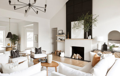
For this home in the woods of Minnesota, interior designer Emily Pueringer recommended Benjamin Moore’s Swiss Coffee. It provides a warm yet airy backdrop for a variety of books, art and other favorite objects displayed on the white oak built-ins.
Beige is Back: Designers Share 10 Beautiful Warm Paint Colors
When layering warm tones, the color on the walls is key. To create a cozy backdrop that allows layered neutrals to shine, Curtis recommends choosing a warm taupe or creamy beige. “Right now I’m loving Neutral Ground by Sherwin-Williams,” she says.
For this home in the woods of Minnesota, interior designer Emily Pueringer recommended Benjamin Moore’s Swiss Coffee. It provides a warm yet airy backdrop for a variety of books, art and other favorite objects displayed on the white oak built-ins.
Beige is Back: Designers Share 10 Beautiful Warm Paint Colors
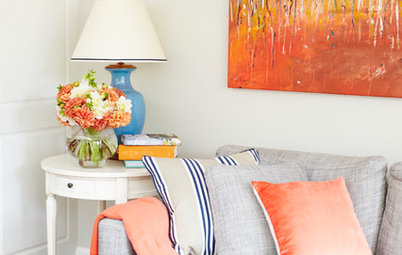
3. Use a Variety of Textiles
“Whenever you’re working with a neutral color palette, it’s important to incorporate different tones, textures and patterns to create a more layered look that doesn’t fall flat,” Stathis says. For example, in her Oceanport project, she used a mix of florals, stripes and small-scale prints in varying materials including linen, cotton and wool. “This ultimately led to a more cozy and homey room,” she says.
Warm neutrals also give a room seasonal versatility. For example, the use of warm neutrals instead of crisp white gave this room a subtle coastal feel instead of an overtly nautical and summery look. While the painting and navy sofa nod to the bayside location, it’s a home that feels inviting year-round.
Shop for pillows and throws
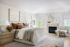
Angela Grace Design gave this Northern California bedroom refined, cozy comfort by using a wide variety of textiles. A patterned warm gray rug grounds the room, and the range of textures goes upward from there. Meanwhile, white paint on the walls and ceiling lends an airy feel.
4. Find Inspiration in Natural Materials
Designers also note that while textiles are important, other textures play a big role in layering as well. “Using natural materials such as wood, marble or clay in your accessories adds further dimensionality to the design without having to compromise on the scheme’s neutral colorway,” Stathis says.
“Personally, I find inspiration in natural textures and earthy elements,” says Curtis, who designed this Dallas family room. “When infusing warmth into a room with neutrals, consider incorporating different textures like soft throws, wooden accents and plush rugs.”
Hire a local general contractor
5. Think Earthy and Organic
“I think earthiness is a factor in the trend we’re seeing with warm tones currently, whether it’s through color alone, through natural materials or through something made by hand,” Pueringer says. “All these layers are factors of the warmth brought into a project for me. When designing a project lately, I am always thinking about how I can bring an earthy vibe to it.”
A neutral palette gives this Minneapolis kitchen that Pueringer designed all the warmth of a giant group hug. Lots of sunlight from the room’s many windows streams onto all its layers — varied wood tones, reflective glass, creamy natural stone finishes, patinaed brass, deep brown leather stools, terra-cotta tiles, a variety of textiles on the throw pillows and ivory paint.
Browse kitchen lighting in the Houzz Shop
With regard to specific colors, Pueringer looks to the earth beneath her feet — terra-cotta and clay tones are favorites. The texture, colors, uses, history and possibilities of terra-cotta clay have inspired several of her recent projects.
“Earthy terra-cotta or clay tones speak to me and will remain timeless,” Pueringer says. “Terra cotta also has a global vibe, as this material is used for so many things worldwide. Seeing the clay properties peek out at you, the variation in the hand-painted glaze and the imperfections bring a human warmth.” A perfect example: the hand-painted terra-cotta tiles she used in the kitchen, handmade by Tabarka Studio.
“Earthy terra-cotta or clay tones speak to me and will remain timeless,” Pueringer says. “Terra cotta also has a global vibe, as this material is used for so many things worldwide. Seeing the clay properties peek out at you, the variation in the hand-painted glaze and the imperfections bring a human warmth.” A perfect example: the hand-painted terra-cotta tiles she used in the kitchen, handmade by Tabarka Studio.
6. Use a Variety of Textures
In this Montana lake house, Pearson Design Group grounded rooms with dark-stained oak flooring. Along with the blackened-steel accents of the architecture, it provides dark contrast to the warm neutrals.
“Playing with different colors and finishes within a space is the key to layering,” project architect Justin Tollefson says. On the left, the designers continued the exterior’s reclaimed barnwood onto the kitchen walls. In the adjacent living room, they covered the walls in pine boards with a semitranslucent white paint that reveals the knots and graining patterns of the wood. On the ceiling, they painted the ceiling boards white, which provides a contrasting cleaner look by covering up those characteristics.
7. Take Cues From the Views
In this Baltimore home by Zen Associates, creating a calm environment was the goal. Large openings to views of the surrounding Japanese Zen gardens informed the interior color and texture palettes. In this lounge, the flooring and carpet closely resemble the materials outside. The cream and tan tones indoors complement the serene outdoor scene.
Check out more photos of this project to see how other warm neutral rooms relate to the beautiful surroundings.
Similarly, in this dramatic two-story space, ANA Interiors took organic inspiration from the Rocky Mountain landscape outside the windows. The expansive views of the trees and sky serve as art. Sculptural light fixtures, 3D patterns on the wall and the graining patterns in the wood panels are supporting players. The cream-colored walls and textiles, the range of wood tones and the pop of moss green on the furnishings create harmony with the views.
8. Balance High Contrast
Curtis appreciates the drama that high contrast brings when layering warm neutral tones. “To achieve high contrast in a pleasing manner, balance is key — juxtapose light and dark shades to create depth without overwhelming the senses,” she advises. For example, here she added black and graphite tones on thinner elements like furniture frames, drapery rods and window grilles, with just a few larger dollops of deep tones mixed in via the floor lamp and pillows.
Curtis appreciates the drama that high contrast brings when layering warm neutral tones. “To achieve high contrast in a pleasing manner, balance is key — juxtapose light and dark shades to create depth without overwhelming the senses,” she advises. For example, here she added black and graphite tones on thinner elements like furniture frames, drapery rods and window grilles, with just a few larger dollops of deep tones mixed in via the floor lamp and pillows.
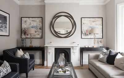
9. Embrace Patina
In this transitional Oak Park, Illinois, living room, designer Jessica Moran created a refined, eclectic look by mixing styles and contrasting crisp white with patinaed pieces. She accomplished the successful layering by finding the right balance between old and new and dark and light.
“I love layering vintage art and furniture into my designs to keep spaces from feeling too precious,” Moran says. “And I especially love layering worn vintage pieces against the crisp and clean backdrop of white walls. In this case I used Sherwin-Williams’ Pure White. The client’s vintage art and furniture collection brings warmth to the otherwise stark white walls. It’s vintage yet somehow modern and fresh.”
A midcentury-style sofa and coffee tables mix with traditional vintage pieces. The worn leather of the armchairs, the aged wood on the trunk and the sepia tones in the artwork show that these pieces have history and have been well-loved. There’s really no better way to express warmth than that.
Angela Grace Design
Your turn: Do you have a favorite strategy for layering warm neutrals? Does one of the strategies here resonate with you? Please share in the Comments.
More on Houzz
Tour more homes
Hire a local design pro
Shop for your home
Your turn: Do you have a favorite strategy for layering warm neutrals? Does one of the strategies here resonate with you? Please share in the Comments.
More on Houzz
Tour more homes
Hire a local design pro
Shop for your home
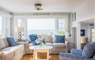

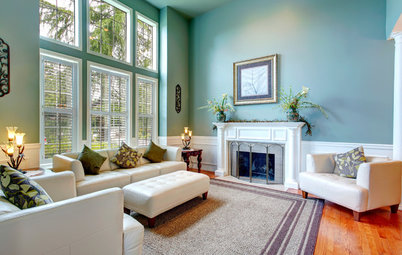


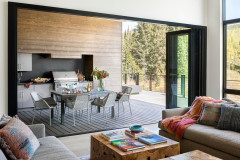
When layering warm tones and textures, an early selection can serve as a jumping-off point. This can come from just about anywhere, such as a wall color, the veining pattern in a natural stone or a favorite object. “Layering warm neutrals in interior design is an art that marries comfort with sophistication, and we love it,” designer Ginger Curtis of Urbanology Designs says. “Often a starting point emerges organically, such as a captivating piece of art or a unique rug, setting the tone for the room’s palette.”
Stathis notes that she often uses a rug as her jumping-off point, as she did in this Oceanport, New Jersey, living room. “In this particular space, we opted for a one-of-a-kind vintage piece in varying shades of taupe, beige and blue. We pulled those shades out via our textiles, window treatments and decor, which really rounded out the room,” she says. The design complements the rugged stones of the fireplace surround.
Hire a local kitchen designer