


Kitchen of the Week: New Layout and the Essence of Cape Cod
Fresh materials and more functionality help a family feel calm and relaxed in a 1920s Massachusetts kitchen

This young couple wanted the kitchen in their Reading, Massachusetts, house to feel like a coastal home on Cape Cod. At the same time, they wanted to respect the 1920s Colonial Revival architecture. Interior designer Liz Marchant Ourston helped them find that balance while creating a kitchen that functioned beautifully for them and their two elementary-school-age children.
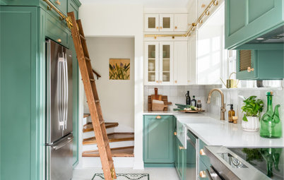
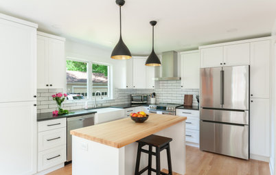
After: Ourston knew the first way to achieve a sense of calm was to gain some space. And she needed to accomplish this without enlarging the kitchen’s footprint. By removing the existing drop ceiling, she gained 6 inches of height, bringing the ceiling up to 8 feet. She also replaced the L-shaped basement staircase with a straight run of stairs. This left room for a walk-in pantry along the back wall. The wood French door opens to the pantry.
Ourston also got rid of the existing island, replacing it with one much more functional and attractive. The new island’s left side is part of the work triangle and contains the sink, the dishwasher and a microwave drawer. The right side of the island is open and has seating for the whole family.
The countertops have an era-appropriate soapstone look but are a more durable quartz. And the matte black finish on the island pendant lights adds a fresh touch, while their silhouettes nod to traditional style.
To the right of the pantry door is a cabinet wall that holds two wall ovens and the refrigerator. The fridge, just out of frame on the right, was fitted with panel fronts.
Shop for kitchen lighting
One of the homeowners loves to cook and bake, so a serious 36-inch cooktop was on her must-have list. “The new kitchen setup makes it easy for people sitting at the island or in the dining room to visit with her while she cooks,” the designer says.
Ourston custom-designed a range hood in matte black. She also added new casement windows flanking the range. These are easy to open when reaching across the countertops, unlike the existing double-hung windows.
The color palette is high-contrast, with oyster-colored cabinets and black countertops and accents. The designer plucked the cabinet color from the zellige-look backsplash tiles, which have subtle variations in texture and tone. Warmth comes in through champagne-colored faucets and hardware, as well as the natural wood on the pantry door. She tied some of the materials and colors together in the double sconces she installed above the windows. They’re a mix of metal and wood with white ceramic shades.
The backsplash and hardware illustrate the mix of old and new. The hardware leans transitional; while it’s fairly streamlined, it has some extra details that reflect traditional style. “My client really loved classic subway tile, but we wanted to give it a little spin to add flair,” Ourston says. That comes in via the basketweave pattern, and its zellige look is also an update on the usual white porcelain subway tile.
This photo also provides a peek into the new walk-in pantry. In addition to food, it houses small appliances atop quartz countertops.
Find a local tile professional
This photo also provides a peek into the new walk-in pantry. In addition to food, it houses small appliances atop quartz countertops.
Find a local tile professional
Before: This was the dining room before the renovation. The original floors needed replacing, so Ourston replicated their plank size in the new flooring. This helped maintain the architectural style of the older home.
She also matched new millwork to the original millwork, including baseboards and window trim. “The house was in bad shape, so we had to gut it. But matching these elements helped maintain the integrity of the architecture,” she says.
She also matched new millwork to the original millwork, including baseboards and window trim. “The house was in bad shape, so we had to gut it. But matching these elements helped maintain the integrity of the architecture,” she says.
After: The new white oak hardwood floor extends into the kitchen, which previously had a linoleum floor.
The dining room feels like a natural extension of the kitchen because of the wide opening and the similar material palette. At the same time, it also feels distinct. It has a lighter color palette — mostly white and wood with just a few small dashes of black. Soft curves dominate the room. And the chandelier in here is white and fully contemporary in style, unlike the kitchen’s transitional light fixtures. Its conical shapes tie in with the dining table’s sculptural base.
Browse contemporary chandeliers in the Houzz Shop
The dining room’s soft curves contrast with the hard lines of the kitchen. Meanwhile, a few squares pop up in the framed art Ourston hung on the wall — the artwork is composed of layers of paper.
The linen blend window treatments bring in additional softness. “With a bay window in here, it was easiest to go with Roman shades,” Ourston says. A sculptural shell vessel on the table nods to Cape Cod 80 miles down the road.
The linen blend window treatments bring in additional softness. “With a bay window in here, it was easiest to go with Roman shades,” Ourston says. A sculptural shell vessel on the table nods to Cape Cod 80 miles down the road.
Here’s a view of the dining room from the foyer. Black herringbone floors add deeper contrast in the entry space, and the ceiling light is a close cousin of the dining room’s chandelier.
The family room is also open to the kitchen, and Ourston redesigned it as part of the renovation. In addition to repeating some of the kitchen’s high contrast in here, she created another strong tie through the wet bar. Its countertop and backsplash match the kitchen. This area includes a bar sink and beverage cooler.
Now the flow of the first floor makes it easy to entertain. And the family enjoys an easy-breezy Cape Cod weekend feeling at home every day.
More on Houzz
Read more kitchen stories
Browse kitchen photos
Hire a kitchen remodeler
Shop for kitchen products
Now the flow of the first floor makes it easy to entertain. And the family enjoys an easy-breezy Cape Cod weekend feeling at home every day.
More on Houzz
Read more kitchen stories
Browse kitchen photos
Hire a kitchen remodeler
Shop for kitchen products


Sponsored
Columbus Area's Luxury Design Build Firm | 17x Best of Houzz Winner!
Kitchen at a Glance
Who lives here: A couple with two elementary-school-age kids
Location: Reading, Massachusetts
Size: 260 square feet (24 square meters)
Designer: Liz Marchant Ourston of Liz Marchant Interiors
Before: This view of the kitchen is from the dining room. The barely visible opening on the right leads to the family room. The existing kitchen had ceilings that were just 7½ feet high. There was also an L-shaped basement staircase that took up a lot of space at the back of the room.
An awkward L-shaped island with two counter heights occupied the center of the space. It was more of an obstacle than an asset. Overall, the room’s vibe was the opposite of the easy-breezy coastal feeling the couple wanted in their kitchen.
“While my clients wanted more of a Cape Cod house feeling, we didn’t do it overtly coastal because this isn’t a coastal home. Instead, we tried to capture the essence of Cape Cod,” Ourston says. This meant bringing a feeling of lightness, calm and relaxation to the house.
Hire an interior designer on Houzz