


Houzz Tours

Houzz Tour: Architects Bring Order to an 1,100-Square-Foot House
A remodel and new addition improve a Toronto home’s flow while adding storage and maximizing natural light

These Toronto homeowners liked their good friends’ remodel so much they hired the same architects, Brian Hagood and Charisma Panchapakesan, to work on their home. “They needed more natural light and organized spaces that made sense for their family,” Panchapakesan says.
The scope of the project included taking the first floor down to the studs as well as replacing a kitchen addition with a new two-story addition. On the second floor, they moved and remodeled the bathroom, added closets to the primary bedroom and completed cosmetic changes. They also finished the basement, which includes a home office, a playroom and a habitat for the family’s pet tortoise.
The scope of the project included taking the first floor down to the studs as well as replacing a kitchen addition with a new two-story addition. On the second floor, they moved and remodeled the bathroom, added closets to the primary bedroom and completed cosmetic changes. They also finished the basement, which includes a home office, a playroom and a habitat for the family’s pet tortoise.
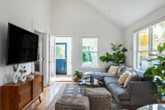
After: The architects took the first floor down to the studs to open up the plan. They flipped the living and dining room locations so the dining room would be conveniently located next to the kitchen. They also removed the vestibule and replaced the existing window with a new glass door, seen at the back left of this photo. This not only let in light, but also freed up valuable space for cabinetry and countertops in the kitchen where the door to the vestibule had been. The new kitchen addition begins past that glass door.
“It’s challenging to get light into these types of houses,” Panchapakesan says. “They are so close together that you aren’t allowed to add windows to the sides of the house.” A large new window in the kitchen lets in lots of natural light. Another way they made the space brighter was by using curved walls, like the one on the right side of this photo. “These walls help to wrap the light around and reflect it,” Panchapakesan says.
“It’s challenging to get light into these types of houses,” Panchapakesan says. “They are so close together that you aren’t allowed to add windows to the sides of the house.” A large new window in the kitchen lets in lots of natural light. Another way they made the space brighter was by using curved walls, like the one on the right side of this photo. “These walls help to wrap the light around and reflect it,” Panchapakesan says.
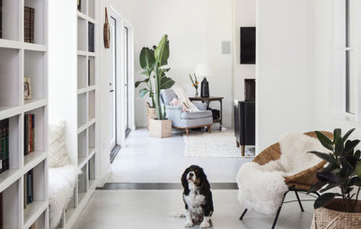
The house lacked a proper foyer, so the architects delineated an entry space by tiling the area and adding a shoe shelf that creates a boundary. “With our snowy winters, you need tile in the entry,” Panchapakesan says. They used black around the house to add contrast to the light finishes.
The black tile gives way to white oak floors in a herringbone layout. “This composition created a pattern, which works like a texture, “ Panchapakesan says. “These clients like things neat, minimalist and neutral, but we brought in a lot of warmth by using different textures.”
The black tile gives way to white oak floors in a herringbone layout. “This composition created a pattern, which works like a texture, “ Panchapakesan says. “These clients like things neat, minimalist and neutral, but we brought in a lot of warmth by using different textures.”
Space in the living room was tight, so the architects made the most of it with a long media console that they built into a new alcove. “This alcove camouflages some of the ductwork,” Panchapakesan says. “When you start a project, you have to think about the mechanical systems and how you can integrate them into the design in a way that looks intentional.” The architects used rift-sawn white oak for all the cabinetry on this floor, creating a cohesive feel.
Browse coffee tables in the Houzz Shop
Browse coffee tables in the Houzz Shop
In addition to the rift-sawn white oak, the architects tied the spaces together with the flooring and black accents. These elements create strong visual connections between rooms.
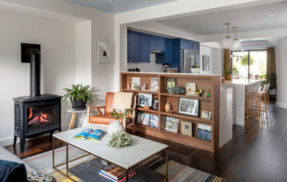
In the dining room, they used rift-sawn white oak along one side to warm the room and help delineate it within the open plan. The wall works hard too. The doors to the right are a coat closet just off the entry. The open shelves allow for storage and display. And the paneling on the left creates a thick wall look around the opening to the basement stairs. It also hides a new laundry closet, which is located off the kitchen. Previously, the laundry had been in the basement, which added an extra set of stairs to the chore.
Find a local cabinet pro on Houzz
Before: This photo shows the original kitchen addition. A door in the kitchen led to the entry vestibule on the right. The vestibule blocked natural light from coming through an existing window behind it.
After: The kitchen addition had to be rebuilt, and Hagood and Panchapakesan added a bedroom on top of it. They were able to reuse the original addition’s foundation, which saved money. They did not replace the vestibule. Instead, they put in the new glass door, seen here on the right, to let in light. The new addition added 140 square feet to the home but didn’t extend beyond the old addition’s footprint.
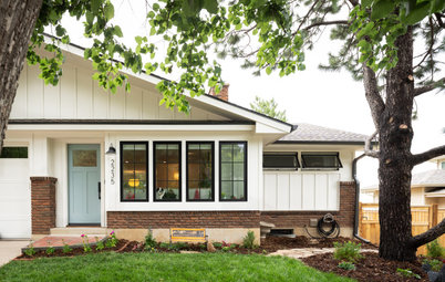
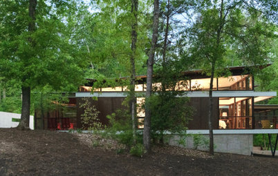
The exterior of the house is also marked by the contrast between wood and black. The architects clad the addition in untreated cedar bevel siding and the rest of the house in new prefinished black wood siding.
The exterior of the house is also marked by the contrast between wood and black. The architects clad the addition in untreated cedar bevel siding and the rest of the house in new prefinished black wood siding.
At the edge of the kitchen, a waterfall countertop on the left provides a lovely accent, and open shelves above it provide an airy feel. The countertop material is quartz that resembles mottled concrete.
Countertops: Primordia, Caesarstone
Countertops: Primordia, Caesarstone
The door to the vestibule had been approximately where the range is now. Removing it opened up space for a more efficient U-shaped kitchen. The large window is divided into two parts — the left side is a large picture window; the right side is operable. The size of this window was a game changer in terms of letting in light. “And it provides a huge, uninterrupted view you can see from the front of the house. It creates a strong connection to the green backyard,” Panchapakesan says.
“Our clients loved neutral and calm style,” Panchapakesan says. “By playing with elements like two-toned cabinetry, we were able to add more texture, life and vibrancy to the space.” The base cabinets are the same rift-sawn white oak used for the media console and dining room wall. The upper cabinets are painted a putty color, and they are inset, slab-front cabinets. “These sit within the cabinet frames. The extra lines give the room a little more texture than overlay cabinetry would have,” Panchapakesan says.
The countertop cabinet in the corner is a false cabinet that conceals a duct. “Once again, you have to figure out how to integrate these mechanical elements early on in the design process. Otherwise they can ruin the space,” Panchapakesan says.
The countertop cabinet in the corner is a false cabinet that conceals a duct. “Once again, you have to figure out how to integrate these mechanical elements early on in the design process. Otherwise they can ruin the space,” Panchapakesan says.
The architects incorporated open shelving in two spots in the kitchen for a lighter feel.
Using a microwave drawer maximized counter space. And the open shelves next to the window created another light moment in a room packed with storage. The cabinet to the right of the fridge is a pantry cabinet.
First-floor “after”: With the vestibule gone, there was room to install the new glass back door. The kitchen has more room for countertop and cabinet space along the wall where the door had been. Off the top right corner of the kitchen, you can see where the architects tucked in the new laundry closet.
Before: Upstairs, the paint color on the staircase walls darkened the space.
After: The architects lightened up the paint colors and replaced the existing stair rail with a white oak and black metal railing. “This railing lets more light through,” Panchapakesan says. It also adds texture and contrast.
The white oak flooring up here is composed in a straight, simple pattern. This was better suited than herringbone for the narrow hallway and helps create a calming feel in the bedrooms.
The white oak flooring up here is composed in a straight, simple pattern. This was better suited than herringbone for the narrow hallway and helps create a calming feel in the bedrooms.
The changes to the primary bedroom were mostly cosmetic. The architects borrowed space from the existing closet to relocate the bathroom. They installed new closets on another wall, put in new flooring and painted the room.
The bathroom is in a new, more central location to serve all three bedrooms. “The new spot did not have any windows, so we added a skylight,” Panchapakesan says. “They leave the bathroom door open when it’s not in use so the light spills into the hallway.”
The new vanity is rift-sawn white oak with a vessel sink and has a furniture feel. The architects also added a custom medicine cabinet that extends over the toilet for extra storage.
The new vanity is rift-sawn white oak with a vessel sink and has a furniture feel. The architects also added a custom medicine cabinet that extends over the toilet for extra storage.
The large shower niche in the family bath provides plenty of space for everyone’s products.
Many of these types of homes in Toronto lack a bathroom on the main level. This one has a powder room in the basement.
Check out our beginner’s guide to get started on your home project
Many of these types of homes in Toronto lack a bathroom on the main level. This one has a powder room in the basement.
Check out our beginner’s guide to get started on your home project
The new addition created space for a new bedroom-playroom. The large windows give it a treehouse feel. One of the homeowners picked out a celestial wallcovering for the ceiling. It’s perfect for their child to flop down on the rug and stargaze.
Second-floor “before”: The house had two bedrooms. The existing bathroom was at the top of the stairs, and it was very compact.
Second-floor “after”: The primary bedroom is on the right and the new playroom-bedroom is on the left. By reconfiguring one bedroom, the hallway and the primary bedroom’s closet, the architects opened up space for a larger family bathroom. They added new closets to the primary bedroom along the top right side of the plan to make up for the loss.
“All in all, the renovation gave the ground floor a better flow, and the rooms feel connected yet distinct,” Panchapakesan says. “Upstairs, everything is brighter, happier, and they got a little extra room in their bathroom.”
More on Houzz
Tour more homes
Browse photos of modern homes
Hire a local design pro
Shop for your home


House at a Glance
Who lives here: A couple and their toddler
Location: Toronto
Size: 1,100 square feet (102 square meters); three bedrooms, 1½ bathrooms
Architects: Brian Hagood and Charisma Panchapakesan of CAB Architects
Contractor: Darren Richer of Habitude
Before: The home’s layout was long and narrow, with the dining room at the front, the living room in the middle and the kitchen at the back. The kitchen was a previous addition, and it had a door located on the left that led to a small backyard entry vestibule. This door took up valuable real estate in the compact space. And the only view through the window in the back left corner of the living room was of the vestibule.
Hire a local architect