


Bathroom of the Week: More Is More in a Period Home
A designer found on Houzz honors the home’s architecture and her client’s style in this 67-square-foot bath

A spectacular stained-glass window was the star of this northern New Jersey primary bathroom. But the supporting cast around it was rather weak. The homeowner, a mother of two teenage daughters, found design-build firm KraftMaster Renovations on Houzz. The firm’s in-house designer, Kristina Asatrian, worked closely with her client to give the room the personal style and functionality it lacked.
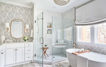
“Because this is her primary bathroom, I knew we should use sophisticated, elevated finishes,” Asatrian says. Elements like special mirrors and an accent tile composed of a marble mosaic with a gold inlay play off the window and the spirit of the Victorian-era home. More is more in terms of style and function. More storage. More room to shower. More room to get ready in the morning. Even more sleep (more on that in a minute).
“Because this is her primary bathroom, I knew we should use sophisticated, elevated finishes,” Asatrian says. Elements like special mirrors and an accent tile composed of a marble mosaic with a gold inlay play off the window and the spirit of the Victorian-era home. More is more in terms of style and function. More storage. More room to shower. More room to get ready in the morning. Even more sleep (more on that in a minute).
After: Asatrian did away with the hallway entry. This gave the room more of a “special, exclusive feeling,” she says. More important, closing off the doorway opened up much better layout opportunities. Asatrian also gained space for the vanity by replacing the radiator with a toe-kick heater underneath the storage tower. She redesigned the girls’ bathroom at the same time she did this one, and they’re very happy with it. This means their mother is no longer awakened by them flushing the toilet in her bathroom in the middle of the night.
As for style, the window and Victorian architecture of the house were the jumping-off points. “My client has eclectic style and likes to mix modern and traditional in a transitional way,” Asatrian says. “She has a lot of really cool items around her house, as well as plants throughout. It feels very homey. And that window is unique. It has pinks and blues and yellows — I’ve never seen anything like it. We knew it needed to be the main focus of the room.”
Shop for a bathroom mirror
Before: Given the locations of the existing doors and the radiator, there was only one spot for a vanity, and it was awkward. It butted right up to the tub, and the size was inadequate. “My client loved her products and there was nowhere to store them. This made the room feel messy,” Asatrian says. “There was a lot of space in the room that was underutilized and going to waste.”
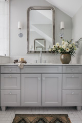
After: The new location for the vanity is where the hall door used to be. “When I suggested a single vanity with a stepped-down makeup vanity next to it, my client got starry-eyed,” Asatrian says.
A tricky challenge was placing two mirrors with different heights in a way that looked cohesive. The one above the sink needed to be at the right height for standing while brushing teeth, but the one above the makeup vanity needed to be at the right height for sitting. The designer searched for matching mirrors that were available in the sizes she needed. “I really lucked out with these,” she says. She lined up the tops of the mirrors for a pleasing look. The gracefully arched mirrors have matching ornate garland motifs that nod to the architecture of the house.
The faucet has a traditional look that also suits the home’s Victorian vintage. All the plumbing fixtures have the same vibrant brushed brass finish. The countertops are quartz with subtle Carrara-marble-like veining.
Find a local tile professional
Past the makeup vanity, Asatrian squeezed in a much-needed storage tower. The tower has pullout drawers and shelving at varying heights to house all of the homeowner’s products. As for the products that are on view, this is not professional photo styling, it’s how the homeowner lives every day. These items belong to her, and they show how the designer gave her plenty of space to add her personal style to the room.
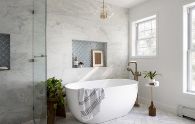
“At first my client was leaning toward blue for her cabinetry, but I talked to her about the classic touch that black is,” Asatrian says. She was on board. “With the high ceilings in here, the black really anchors the space,” the designer says. For the rest of the color scheme, she went for high contrast, using Carrara marble with light gray veining on the floor and in the shower. The black-and-white combination is another nod to Victorian style.
Cabinet paint: Universal Black, Benjamin Moore; custom cabinets: Modern Cabinet
Browse vanity stools in the Houzz Shop
“I knew the light fixture needed to be large to fit the scale of the room,” Asatrian says. She presented her client with a playful yet sophisticated globe chandelier. This fixture adds a modern touch to the eclectic transitional mix.
Cristol tiered chandelier, Visual Comfort; toilet: Kathryn 1.28 GPF one-piece elongated comfort-height, Kohler
Cristol tiered chandelier, Visual Comfort; toilet: Kathryn 1.28 GPF one-piece elongated comfort-height, Kohler
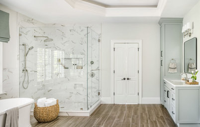
Opposite the stained-glass window, Asatrian replaced the tub-shower with a shower stall. The shower flooring is 1-by-1-inch Carrara marble mosaic tiles. But the stunner is the marble mosaic accent on the shower wall.
Check out our beginner’s guide to get started on your home project
Check out our beginner’s guide to get started on your home project
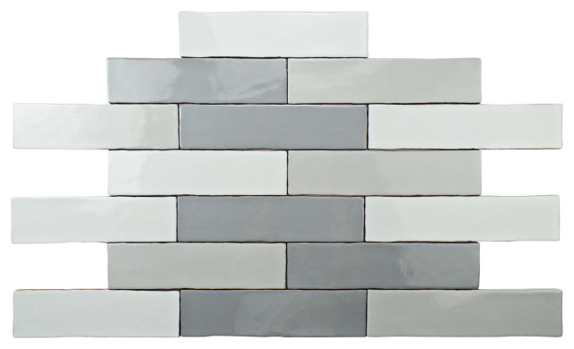
The accent tile is composed of Calacatta Gold marble, honed Thassos marble and brushed brass inlay. “At first we played around with an entire wall of accent tile here, but it felt overwhelming. Instead we tailored it, framing it like a picture,” Asatrian says. “The framing makes it feel like there’s a stained-glass window on either side of the room.”
The rest of the shower surround is composed of 4-by-18-inch Asian Carrara elongated subway tiles.
Accent tile: Simone Studio Line, New Ravenna
The rest of the shower surround is composed of 4-by-18-inch Asian Carrara elongated subway tiles.
Accent tile: Simone Studio Line, New Ravenna
The final touches in the shower are a built-in bench and a generous niche. Asatrian backed the niche in the same marble mosaic she used on the shower floor. The niche shelves and shower bench are in the same quartz she used for the vanity countertops.
“The homeowner loves her bathroom so much,” Asatrian says. “She told me that waking up and walking in here every day makes her feel like she’s living at a fancy hotel.”
More on Houzz
Read more bathroom stories
Browse bathroom photos
Find a bathroom designer
Shop for your bathroom
“The homeowner loves her bathroom so much,” Asatrian says. “She told me that waking up and walking in here every day makes her feel like she’s living at a fancy hotel.”
More on Houzz
Read more bathroom stories
Browse bathroom photos
Find a bathroom designer
Shop for your bathroom
Who lives here: A mom and her two teenage daughters
Location: South Orange, New Jersey
Size: 67 square feet (6.2 square meters)
Designer: Kristina Asatrian of KraftMaster Renovations
Before: The bathroom had a stunning stained-glass window, but clutter was taking away from its beauty. In an all too common scenario, the lack of storage had created a need for a rolling cart and baskets. “My client made it clear that she really loved products and she had nowhere to put them,” Asatrian says.
There were two doors that opened to the bathroom. The one on the right led to the primary bedroom, and the one on the left led to the hallway. “My client’s two daughters are teenagers and they preferred this bathroom to their own,” Asatrian says. “They’d wake her up in the night when they used this room and they’d use it to take their showers, in spite of having their own bathroom.”
Find a local design-build firm on Houzz