


Kitchen of the Week: Vintage Style for a 1900s Home
A designer combines historical William Morris wallpaper, olive green paint and soapstone counters in a Minnesota kitchen

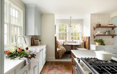
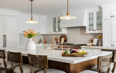
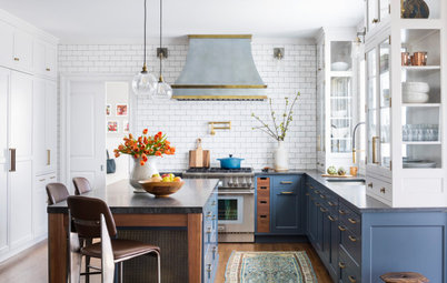
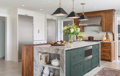
More often than not, kitchen descriptions are all about bright, white and light. But that’s not the case for this stylishly homey kitchen in St. Paul, Minnesota. A beautiful William Morris wallpaper full of rich color suits the early-1900s home, and designer Emily Pueringer completed the rest of the palette accordingly. A mix of white oak and green on the cabinetry, terra-cotta-colored tiles, soapstone countertops and nods to the home’s age give it a beautiful dark and moody feel. The renovated space also solved storage and traffic flow problems, making it a joy for the homeowners to cook and entertain in.
After: The window over the sink is in the same spot as the window in the previous photo. Pueringer wanted to create a kitchen that was in keeping with the historic home’s age. She added details like corbels under the upper cabinets, a wood mantel on the vent hood, a beadboard backsplash, an apron-front sink and light fixtures that lend a vintage feel. To illuminate the darker surfaces, the designer added lighting underneath the upper cabinets.
Shop for cabinet hardware
Shop for cabinet hardware
This photo provides a good look at the material palette. Pueringer’s clients knew they wanted something bold and that they wanted wallpaper. While the designer originally pulled some more monochromatic patterns, the homeowner found this one on her own. “She swooned over this William Morris wallpaper and knew it was the one,” the designer says. From there, soapstone countertops and two-tone cabinets in white oak and an olive hue were chosen to complement the paper. “Everything in here goes so well together,” Pueringer says.
The green paint on the cabinetry, corbels, beadboard and other details is Palm Leaf by Sherwin-Williams. “This paint has yellow undertones that work really well with the wallpaper,” Pueringer says.
The green paint on the cabinetry, corbels, beadboard and other details is Palm Leaf by Sherwin-Williams. “This paint has yellow undertones that work really well with the wallpaper,” Pueringer says.
Before: The range was squeezed into a corner next to the dishwasher.
After: The sink remained in the same spot, but Pueringer expanded the window to let in more light. She matched the wood and trim profile that other windows in the house had for a cohesive look.
The dishwasher is now to the right of the sink. Pueringer gave it a white oak panel front that fits in seamlessly with the cabinetry.
Find a local cabinet pro
The dishwasher is now to the right of the sink. Pueringer gave it a white oak panel front that fits in seamlessly with the cabinetry.
Find a local cabinet pro
Pueringer moved the refrigerator to the end of the kitchen to open up the room.
The bridge faucet is by Brizo and has a luxe gold finish. The faucet also has a pull-down sprayer. “The finish on the cabinet hardware is similar, but it’s a little more vibrant,” Pueringer says.
“My clients were really into the idea of soapstone, which is soft. They were excited about the idea of developing their own marks from using it and seeing it patina over time,” she says. This is Saratoga Black, the blackest soapstone Pueringer could find, but she notes that it has green undertones. She also says that because of its softness, which tends to show marks and patina over time, it’s not for everyone.
Browse white farmhouse sinks in the Houzz Shop
Little details matter: The sink’s soapstone backsplash matches the countertops and has concave corners. This lends a more traditional look than straight edges would have.
“I always try to use some glass doors when I can in a kitchen,” Pueringer says. “They feel kind of like windows and help open up the space. And they feel lighter and less bulky than solid doors. This is especially important in a small kitchen.”
The glass cabinet doors also give the couple some space to display pieces from their extensive pottery collection. The range hood is simple, painted to match the cabinetry. The wood shelf provides a spot to add artwork.
“They were also really into their coffee,” Pueringer says. The two counter stools at the peninsula give them a spot to enjoy it in the morning.
“They were also really into their coffee,” Pueringer says. The two counter stools at the peninsula give them a spot to enjoy it in the morning.
“We really wanted the range to create a focal point,” Pueringer says. For the backsplash, she recommended Fireclay Tile in terra-cotta tones plucked from the wallpaper. “This tile is called Antique and it has a lot of great variation in color,” she says.
Among the special pottery pieces is the butter dish on the right. The handle is in the shape of a morel mushroom and was made by local potter Emily Schollett.
Among the special pottery pieces is the butter dish on the right. The handle is in the shape of a morel mushroom and was made by local potter Emily Schollett.
A big issue in a small kitchen is storage, particularly for small appliances. Pueringer addressed the challenge in this kitchen with a large cabinet.
The doors of the cabinet are pocket style so they can be tucked out of the way when the homeowners want to leave them open. Inside there’s plenty of space for the microwave, mixer and blender, and the cabinet also contains outlets. Glass doors above keep the large cabinet from feeling too bulky.
Before: The back of the kitchen had a hodgepodge look.
After: This is the back of the kitchen space now. The edge of the small-appliance cabinet is just visible on the left, with additional pantry storage located in the adjacent green cabinet. “Originally the homeowners only thought they wanted wallpaper in this part of the kitchen. I said, ‘Let’s go for it and do the whole kitchen in this beautiful hand-printed paper,’ ” Pueringer says.
The homeowners wanted a desk for looking up recipes and as a homework area for the children they plan to have. The paint, wood drawer and cabinet pull on the desk allow the space to blend in with the rest of the kitchen.
The homeowners wanted a desk for looking up recipes and as a homework area for the children they plan to have. The paint, wood drawer and cabinet pull on the desk allow the space to blend in with the rest of the kitchen.
There’s another lower set of stairs off the entry that meets this set of stairs at the landing. Then another run leads to the second level. Pueringer chose a durable chevron-patterned runner that can handle lots of traffic.
New to home remodeling? Click here to learn the basics
New to home remodeling? Click here to learn the basics
For the old-home lovers who may already have been salivating over the six-panel door next to the desk, take a gander at this. Pueringer had the original radiator, which had been painted white at some point, repainted in an antique copper metallic finish. This suits the age of the home as well as the homeowners’ love of patina.
The wallpaper continues up the staircase, where the green trimwork provides a good stopping point. Pueringer used the same green paint on the trim, the railing and the baseboards that she used on the kitchen cabinetry.
Another small detail worth noting in this photo is the metallic switchplate cover. The designer used this finish on all the switchplate and electrical outlet covers. “Small details can have a big impact,” she says.
More on Houzz
Read more kitchen stories
Browse kitchen photos
Hire a kitchen remodeler
Shop for kitchen products


Kitchen at a Glance
Who lives here: A couple
Location: St. Paul, Minnesota
Size: 269 square feet (25 square meters)
Designer: Emily Pueringer
Contractor: Quality Cut Design | Remodel
Before: The long, narrow kitchen was chopped up, and the cabinetry felt bulky. There was a small eat-in area to the right, the fridge was on the left, and a small peninsula impeded traffic flow through the room.
“As soon as I walked in, I could see that these homeowners, a couple of young professionals, had amazing taste,” Pueringer says. “They had wonderful things, including lots of pottery by local artists, and another room in their home had a William Morris wallpaper.” They were ready to do something bold, personal and different from the norm.
Find an interior designer on Houzz