


Kitchen of the Week: Refaced Cabinets Transform a Room
Designers add beautiful finishes and custom elements to a kitchen to create a calm Scandinavian feel

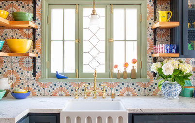
This Chicago-area homeowner was ready to remodel her 1990s kitchen in a way that suited her style, but she didn’t want to invest in a full renovation. “The layout worked really well for her and the cabinets and appliances were in good shape,” designer Stephanie Frees says. Frees had worked with her client on several other rooms in the house, so she had a great understanding of her style. “She always has a really strong sense of what she wants and has impeccable taste. But she also trusts me to push her,” the designer says. The result of this kitchen reface is a mix of warm wood and white, with beautiful millwork detailing.
After: Most of the cabinet work involved refacing, not replacing. This meant Frees was able to keep most of the existing cabinet boxes while replacing the doors and drawers, which cut down on the cost of materials and labor. Refacing is worthwhile when the existing cabinet boxes are high quality and will last for many years to come.
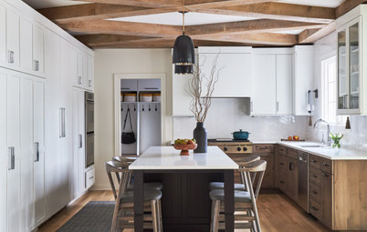
“We added cubbies and large crown molding to bring the existing cabinets up to the ceiling,” Frees says. This gave the room a streamlined, updated look that keeps the eye from jumping around. While most of the perimeter cabinet boxes were saved, the large hutch and island are new. “My client also really liked her range and her fridge and wanted to keep them,” Frees says.
Browse counter stools in the Houzz Shop
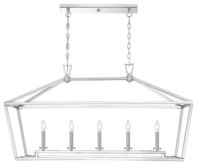
The jumping-off point for the palette was the beautiful quartzite used for the countertops. Not to be confused with engineered quartz, quartzite is a natural stone that has a similar look to marble but is harder and more durable. “My client knew from the beginning she absolutely had to have quartzite,” Frees says. The island countertop edge is twice as thick as the perimeter countertop edges, which gives it an appropriately strong presence in the center of the room. So do the large pendant lights overhead.
“My client is great at mixing antiques with things like modern art,” Frees says. “The goal was to mix modern and traditional elements. The reeded diamond details I suggested are a Scandinavian architectural detail and I felt like they brought in a bit of a vintage feel.” Meanwhile, the clean edges of the countertops add a modern touch.
The island and hutch are rift-sawn white oak. “Rift sawing gives wood a less busy, more linear graining pattern with less variation in the grain,” Frees says.
With cleaner lines in the new cabinetry, the room was ready for a focal point. Frees designed a beautiful new vent hood that has a reeded detail in the same rift-sawn white oak as the other new cabinetry pieces. “We call this the hood’s frieze, and it ties everything together,” she says.
Shop for a range hood
Shop for a range hood
The homeowner has a lovely china collection and the renovation gave her more room to store and display it. “She really liked having the glass cabinets in her existing kitchen so that she could see her favorite things. So we kept them glass, but these new doors do not have mullions,” Frees says.
Find a local interior designer
Find a local interior designer
Before: This photo shows why removing the mullions in the glass cabinet doors was a good idea. When the mullions don’t line up with the shelves inside the cabinets, there are too many distracting lines.
This also shows one of the kitchen’s existing assets: a lovely window over the sink that let in lots of natural light.
This also shows one of the kitchen’s existing assets: a lovely window over the sink that let in lots of natural light.
After: Frees replaced the existing cabinetry to the left of the sink with a beautiful new hutch. It has a furniture-like look and anchors the run of base cabinets. The dishwasher remained in the same spot, but Frees replaced it with a panel-front model for a seamless look.
One of the details Frees added during the cabinetry refacing was feet on the cabinet bottoms. This is another nod to vintage style, when kitchens were composed of different pieces of furniture.
The custom apron-front sink is crafted from the same quartzite as the countertops. This was a detail the homeowner had found in an inspiration image and wanted to include. The faucet is a model from Waterstone she had also seen and admired. The finish is classic polished nickel.
Another special detail the homeowner liked in an inspiration photo was a window boxed in by trimwork with recessed panels. The design added the opportunity to use the quartzite sill as a shelf. “This window is such a beautiful element in the room,” Frees says.
Before: The fridge was in a good spot — over to the side and out of view from other rooms but close to the island and range.
After: Frees kept the fridge in the same spot. However, she removed the microwave that was next to it and replaced it with a microwave drawer in the island. This appliance is also out of view from adjacent rooms.
Frees also replaced the existing open cabinet next to the fridge with white oak shelves. “This was a good spot to open things up a little,” she says.
Frees also replaced the existing open cabinet next to the fridge with white oak shelves. “This was a good spot to open things up a little,” she says.
The backsplash is zellige tile laid in a herringbone pattern. Zellige tile is glazed terra-cotta tile handmade in Morocco.
“The tile came in 15 different colors, numbered 1 through 15,” Frees says. “My client painstakingly labeled a group of them by number and played around until she found the perfect composition of the 15 different colors. Then she showed it to the tile installer and had him repeat her pattern all over the room.” The backsplash installation took five full days, but the resulting perfect balance of the various hues was worth it.
Check out our beginner’s guide to get started on your home project
The light fixtures and the hardware are brass. Glass-shade lights over the sink keep the view through the window clear, while the large metal pendants over the island add a combination of white and brass.
All light fixtures: Visual Comfort
All light fixtures: Visual Comfort
Before: This wall on the side of the kitchen had a desk that stuck out and had a clunky look. “My client never used the desk and it stuck out too far, blocking the flow from the mudroom,” Frees says.
After: Frees had a new console crafted in white oak and gave it the room’s signature reeded diamond details. She had it topped in the same quartzite she used on the countertops. “This serves as a new drop zone,” she says. The designers hung a piece from the homeowners’ art collection over it, adding an art light overhead to illuminate it.
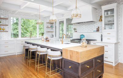
The kitchen is part of a great room that includes this dining area.
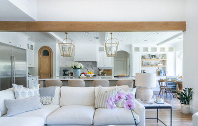
Beyond the dining area is this living area. This photo illustrates the cohesiveness between the kitchen’s new style and the rest of the house.
More on Houzz
Read more kitchen stories
Browse kitchen photos
Hire a kitchen remodeler
Shop for kitchen products
More on Houzz
Read more kitchen stories
Browse kitchen photos
Hire a kitchen remodeler
Shop for kitchen products


Kitchen at a Glance
Who lives here: A couple of empty nesters
Location: Hinsdale, Illinois
Size: 250 square feet (23 square meters)
Interior designers: Stephanie Frees of Plain & Posh and Amy Tausk of Swoon Interiors
Before: In the existing kitchen, the staggered cabinetry and large range mantel kept the eye moving without giving it anywhere to rest. And the finishes were a bit dingy.
Frees teamed up with a frequent collaborator, interior designer Amy Tausk. Frees’ main focus was the cabinetry, but the kitchen was a true team effort. “This design was a collaboration with Amy, the homeowner and me. We really worked everything out together,” she says.
Find a cabinet pro on Houzz