


Houzz Tours
Outbuildings
Houzz Tour: Craftsman in the Front, Party in the Back
A 1920s home in New York gets a sensitive but super-fun makeover that includes a party-perfect pool and carriage house

After a couple purchased a 1920s Craftsman home in the historic Hudson Valley village of Rhinebeck, New York, they hired Quatrefoil, a firm led by builder Michael Whitman and his wife, architect Kathryn Whitman, to design and build an addition that included a new carriage house as well as a backyard swimming pool. But while they wanted to introduce 21st-century amenities to the property and make it fun for their family, they also wanted to respect and preserve the home’s architectural integrity and soul, Whitman says. Keep scrolling to see how they met those goals by keeping many of the home’s original elements (including its footprint), channeling the playful spirit of its previous owner and giving its traditional style a modern spin.
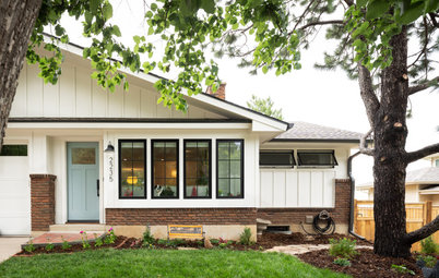
After: As you can see, the home’s silhouette and essential aesthetic are the same after the renovation. The team even kept the original beveled-glass front door and wavy single-pane windows (now paired with custom storm windows for energy efficiency). But there’s a new small dormer window upstairs (more on that later), which you can just make out behind the tree leaves. And a new color scheme, landscaping and standing-seam metal roof give modern curb appeal while hinting at the transformation that took place within.
Paint colors: Storm Cloud Gray (walls) and Black Beauty (trim), Benjamin Moore
10 Times to Hire a Design-Build Firm
Paint colors: Storm Cloud Gray (walls) and Black Beauty (trim), Benjamin Moore
10 Times to Hire a Design-Build Firm
Before: This small kitchen was in the house’s rear right, sandwiched between a closed-off living room and a porch that stretched across the back of the house.
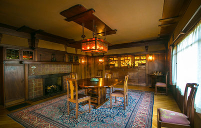
The colorful paintings on the wall were done by the previous owner, an artist named Ute who had lived there for many years. Ute passed away before the new owners bought the house, but Whitman says her clients felt a very strong connection with the woman. “During the design process, we’d often say, ‘What would Ute think?’ ” Whitman says.
The colorful paintings on the wall were done by the previous owner, an artist named Ute who had lived there for many years. Ute passed away before the new owners bought the house, but Whitman says her clients felt a very strong connection with the woman. “During the design process, we’d often say, ‘What would Ute think?’ ” Whitman says.
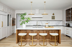
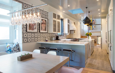
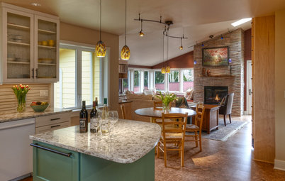
After: The new open-plan kitchen and dining space now occupies the full left side of the first floor, including part of what had been the back porch. Scroll to the bottom and compare the original and new first-floor plan.
Whitman and Quatrefoil maintained the home’s footprint but took down walls and reconfigured the layout to increase the usable living space. That included pouring a new foundation under the back porch and absorbing it into the house.
Behind the closed doors on the right are the refrigerator and pantry. The open door leads to the new rear entryway, which we’ll get to in a bit.
At the photo’s top right, you can see the efficient mini-split heating and cooling system.
Perimeter cabinet and door paint: Off-Black, Farrow & Ball; ceiling paint: White Dove, Benjamin Moore

Need a pro for your home remodeling project?
Let Houzz find the best pros for you
Let Houzz find the best pros for you
The new perimeter countertops and stove backsplash are black quartzite, a natural stone with a bit of transparency. The island base is painted in Benjamin Moore’s White Dove and is topped with walnut.
The trellis-inspired hardwood wall tiles, which have a scratch- and water-resistant finish, are by Mirth Studio. The hardware is unlacquered brass, which will develop a patina over time.
Shop for kitchen and dining products
The trellis-inspired hardwood wall tiles, which have a scratch- and water-resistant finish, are by Mirth Studio. The hardware is unlacquered brass, which will develop a patina over time.
Shop for kitchen and dining products
Here you can see the ceiling height transition where the porch wall used to be. This view also shows off the island’s open shelving and wine and beverage refrigerators.
The lighting from Color Cord is a good example of a modern-looking element rooted in tradition.
“In a kitchen of this period and type, you’d probably find a porcelain fixture with a bare bulb and a pull chain — like in Grandma’s house,” Whitman says. “We wanted that feeling but with more fixtures for modern light levels. We chose small brass fixtures that would go in the places you might see recessed lighting. For added interest, we dropped black-corded, bare-bulb pendants over the peninsula and in front of the windows.”
At the other end of the room is a dining table set up as the family uses it daily. For larger groups, the table is turned sideways. And above it is an ingenious shape-shifting chandelier, also configured using parts from Color Cord.
“We created the chandelier with the same corded, bare-bulb pendants, using an array of colored cords at varying lengths. We custom-fabricated a brass armature and wrapped and dangled the cords around it, mixing a variety of bulb styles,” Whitman says. “For holidays, when the table is turned 90 degrees to the banquette and chandelier, the cords can be unwrapped and extended to light the far end of the table.”
“We created the chandelier with the same corded, bare-bulb pendants, using an array of colored cords at varying lengths. We custom-fabricated a brass armature and wrapped and dangled the cords around it, mixing a variety of bulb styles,” Whitman says. “For holidays, when the table is turned 90 degrees to the banquette and chandelier, the cords can be unwrapped and extended to light the far end of the table.”
To the left of the dining table is the first floor’s central hall and staircase, which opens to the living room. (There’s also a glimpse of the small entry foyer.) The oak staircase is original, as are the doors and glass doorknobs. The framed opening in oak is new.
“One of the biggest challenges on the interior was what extent to keep the old woodwork,” Whitman says. To preserve the home’s character, they decided to keep as much of it as possible. But as the scope of the renovation expanded — and especially after the home’s plaster walls were removed to insulate the house for better energy efficiency — it became clear that replicating the woodwork was going to make more sense than trying to put much of the old, splintery wood back.
Fortunately, many of the doors and their hardware were salvageable, as were the original floors, which the team interwove with new matching wood as needed.
After: Now the wall that divided the old dining room and kitchen is down, and the newly open space is a living room. Looking toward the front yard is a built-in bench seat and shelving painted the same color as the kitchen cabinets. The other end of the room (not pictured) has matching millwork, a desk and a new gas fireplace with a tile surround. The walls between them feature wallpaper from Schoolhouse that looks like hand-drawn flowers on a field of black.
The wallpaper is a nod to Ute, who had painted the walls with various colorful motifs, including dragons. “We [tried] to capture the playful and adventurous spirit of those paintings with our wallpaper and fabric selections,” Whitman says.
The wallpaper is a nod to Ute, who had painted the walls with various colorful motifs, including dragons. “We [tried] to capture the playful and adventurous spirit of those paintings with our wallpaper and fabric selections,” Whitman says.
After: The new second-floor layout has two bedrooms with private bathrooms, including the primary suite seen here. The window to the right of the bed is the one you see in the previous “before” photo.
Above the bed, a cyanotype by local artist Julia Whitney Barnes continues the botanical theme that runs throughout the house.
Wall paint: Setting Plaster, Farrow & Ball
Above the bed, a cyanotype by local artist Julia Whitney Barnes continues the botanical theme that runs throughout the house.
Wall paint: Setting Plaster, Farrow & Ball
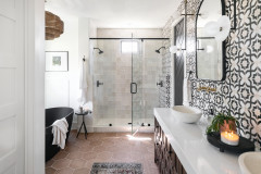
The primary bathroom is where the utility room once was, separated from the bedroom by double pocket doors. Its slanted ceilings led to some design challenges, but fortunately the height difference within the couple worked with the space.
“The sloped-ceiling side was perfect for the wife and the full-height side just right for the husband. We accentuated the difference by making a collage of mirrors resting on the marble ledge we created behind the vanity,” Whitman says. “We went through many options before settling on this large arch-top and small stand-mirror combination.”
The vertical grain on the mahogany vanity’s Shaker-style doors makes them look almost reeded, but the center panel is flat. The brass knobs are hexagonal, which matches the porcelain mosaic floor tile from Heritage Tile.
Whitman used colors you’d find in a traditional Craftsman house but mixed them in offbeat ways. For example, she trimmed the primary bathroom’s peachy-pink glazed ceramic wall tile (also from Heritage Tile) with navy instead of the more traditional black.
The blue tiles and the daisy-pattern mosaic floor tiles continue into the shower, which has a threshold that coordinates with the vanity countertop and shelf.
Across the hall is the teenage son’s bedroom (not pictured) and this attached three-quarter bathroom. His bathroom has a similar vintage vibe and tile design but in a mint-and-blue color scheme.
Shop for bathroom sinks
Shop for bathroom sinks
Another way the design-build team added living space without increasing the home’s footprint was to turn the attic into a bedroom, which is used by the teenage daughter.
A large sliding door at the top of the stairs gives her privacy from or connection with everyone downstairs, depending on whether it’s open or closed. Instead of walls, side-by-side doors with windows allow light to filter into the stairwell.
A large sliding door at the top of the stairs gives her privacy from or connection with everyone downstairs, depending on whether it’s open or closed. Instead of walls, side-by-side doors with windows allow light to filter into the stairwell.
At the top of the story, we mentioned a new small dormer window at the south-facing front of the house. This is the interior view — the daughter placed her desk there. Without the dormer, “we wouldn’t have had the minimum square footage of habitable space at the right head height to make it useful,” Whitman says.
To make the third story habitable, they also had to pop up the back of the house with what’s called a dog house dormer. It mimics the small dormers on the front of the house but on a much larger scale. (We’ll point it out when we get to the exterior shot below.) They also installed sprinklers.
To make the third story habitable, they also had to pop up the back of the house with what’s called a dog house dormer. It mimics the small dormers on the front of the house but on a much larger scale. (We’ll point it out when we get to the exterior shot below.) They also installed sprinklers.
The daughter has her own bathroom with a shower and bathtub, but her taste leans minimalist and modern. The designers used the same plumbing fixtures and fittings used in the downstairs bathrooms, but they opted for plain white floor tile and gray-painted walls rather than colorful heritage tile.
Wall paint: Gray Owl, Benjamin Moore
Wall paint: Gray Owl, Benjamin Moore
After: Now the angles are an asset, creating an inviting alcove for this soaking tub and its almost sculptural brass floor-mounted tub filler and handheld shower by Strom Plumbing.
Find bathtub inspiration and advice
Find bathtub inspiration and advice
After: Pouring a new foundation under and encapsulating the space allowed the kitchen to expand into part of it and the rest to transform into this gracious mudroom, which is the main entry to the home. Its black-and-white, daisy-pattern hexagonal tile floor flows into a small powder room with a pocket door at one end.
Paint: Green Smoke, Farrow & Ball
Paint: Green Smoke, Farrow & Ball
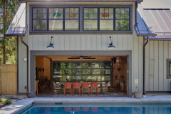
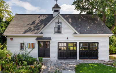
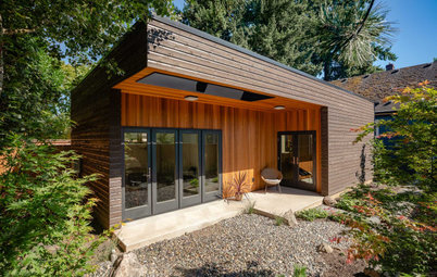
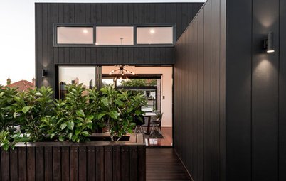
After: In this view you can see the attic’s dog house dormer that we mentioned earlier, the exterior of the mudroom and kitchen and the new carriage house-slash-garage.
Whereas the home is stucco, the 2,000-square-foot (186-square-meter) carriage house is all board-and-batten siding with pebble dash around the base. A parking court connects the two structures.
Whereas the home is stucco, the 2,000-square-foot (186-square-meter) carriage house is all board-and-batten siding with pebble dash around the base. A parking court connects the two structures.
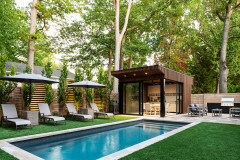
The carriage house has twin custom-colored, metal-and-glass garage doors, one of which opens to the driveway and the other to a new saltwater gunite pool. Throw open the doors and you’re ready for an indoor-outdoor pool party.
The small lot size (about a third of an acre) and a new septic system made it challenging to squeeze in all of the necessary utilities and clearances, so the pool ended up being only 5 feet from the back door.
Find more pool inspiration
The small lot size (about a third of an acre) and a new septic system made it challenging to squeeze in all of the necessary utilities and clearances, so the pool ended up being only 5 feet from the back door.
Find more pool inspiration
Venetian Bluff bluestone pavers surround the pool, which has an alarm system, and the manicured yard is surrounded by cedar fencing.
Landscape architect: Sam Sabin of Sabin Landscape Architects; pool: Scott Swimming Pools
Landscape architect: Sam Sabin of Sabin Landscape Architects; pool: Scott Swimming Pools
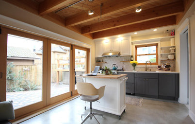
The goal was for the carriage house’s first floor to function as a finished garage that was adaptable for recreation. The interior is wood-paneled, and there’s a small kitchen inside and a grill outside.
Upstairs is party central. “It’s where the Super Bowl parties happen and the kids have all their friends over,” Whitman says. “For the photographs, we decorated the space as a playroom, but it has since been outfitted with a really large flat-screen TV.”
A few steps down from that room is a bathroom with a separate sink area. Like the main kitchen, that space’s walls are covered in colorful wood tile from Mirth Studio.
The shower and toilet room has red-patterned wallpaper from Schoolhouse and minty glazed ceramic tile shower walls. Black-and-white mosaic tile covers the floor.
The riot of colors and patterns and playful spirit of the space likely would’ve made Ute smile.
The riot of colors and patterns and playful spirit of the space likely would’ve made Ute smile.
This plan shows the carriage house’s second floor and the bathroom on the small landing between the two levels.
More on Houzz
Tour more homes
Get backyard ideas and tips
Browse photos
Find home design and remodeling pros
Shop for your home
More on Houzz
Tour more homes
Get backyard ideas and tips
Browse photos
Find home design and remodeling pros
Shop for your home


House at a Glance
Who lives here: A couple and their two teenage children
Location: Rhinebeck, New York
Size: 3,365 square feet (313 square meters); three bedrooms, 3½ bathrooms, plus a carriage house
Design-build firm: Kathryn Whitman Architecture with Quatrefoil
Before: The new homeowners were initially drawn to the warmth of the home, which had solid bones and nice original floors and trim. But it was in rough shape, Whitman says, with a kitchen and bathrooms that were nearly unusable.
Find an architect near you