


Kitchen of the Week: Zoned Layout and 4 Cabinet Finishes
A designer collaborates closely with the homeowners to create a kitchen with two islands for cooking and entertaining

While interior designer Andrea Lynn Orndorff was at her dentist’s office, she got an earful about how lost the good doctor and her husband were with a kitchen renovation they were about to start. She quickly sussed out that the couple had jumped to the construction planning phase with a contractor before completing a thorough design phase. “They were looking at floor plans that hadn’t considered how the kitchen would work for them long-term, and suddenly they had to make a lot of decisions very quickly,” the designer says. “I told her they needed to slow things down because design is a process that takes time.”
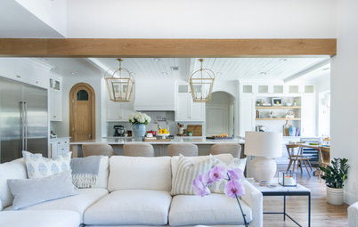
Before she knew it, she had moved from the dentist’s chair to the lead designer’s chair, taking her clients back to the start. “We needed to figure out what was important to them, what was working for them and what wasn’t, how they saw themselves in the space, how they function when cooking and entertaining and what inspired them,” Orndorff says. The result is a beautiful zoned layout with two islands, in a striking palette that mixes four cabinetry finishes: walnut, cherry, white and navy blue.
Before she knew it, she had moved from the dentist’s chair to the lead designer’s chair, taking her clients back to the start. “We needed to figure out what was important to them, what was working for them and what wasn’t, how they saw themselves in the space, how they function when cooking and entertaining and what inspired them,” Orndorff says. The result is a beautiful zoned layout with two islands, in a striking palette that mixes four cabinetry finishes: walnut, cherry, white and navy blue.
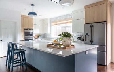
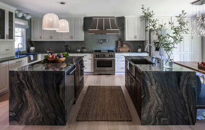
After: The homeowners and Orndorff talked extensively about function, and the resulting layout was a group effort. The designer pushed the kitchen footprint all the way to the back wall of the dining room, taking over that entire space. Because of the expansion, it’s a little tricky to compare this photo with the previous one. The tall blue pantry cabinet next to the opening is in the approximate spot where the white door is in the “before” photo.
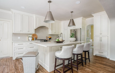
Karen and John both had strong ideas about what they wanted in the new kitchen. “We wanted the new space to have island seating for at least four, we wanted to upgrade our appliances to more of a chef’s kitchen, and we wanted more useful storage for our small kitchen appliances,” Karen says.
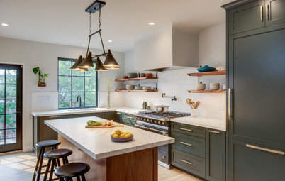
“This was a true collaboration with them,” Orndorff says. “John loved the idea of having two islands: a work island near the range and another one that would include seating. The main island is a real workhorse — it has the sink, the dishwasher, storage and seating.” The main island is cherry with a dark brown stain.
The designer also replaced the existing tile floor with quartersawn white oak with a light stain. The oak was installed throughout the entire first floor as part of the project.
Paint colors: Half Moon Crest (walls) and Blue Note (pantry cabinets), Benjamin Moore
Karen and John both had strong ideas about what they wanted in the new kitchen. “We wanted the new space to have island seating for at least four, we wanted to upgrade our appliances to more of a chef’s kitchen, and we wanted more useful storage for our small kitchen appliances,” Karen says.
“This was a true collaboration with them,” Orndorff says. “John loved the idea of having two islands: a work island near the range and another one that would include seating. The main island is a real workhorse — it has the sink, the dishwasher, storage and seating.” The main island is cherry with a dark brown stain.
The designer also replaced the existing tile floor with quartersawn white oak with a light stain. The oak was installed throughout the entire first floor as part of the project.
Paint colors: Half Moon Crest (walls) and Blue Note (pantry cabinets), Benjamin Moore
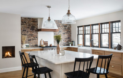
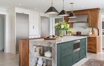
This walnut island was John’s baby and the couple refer to it as “the worktable.” “He thought of this island kind of like a butcher’s work island, and he loved the idea of an open feel to it,” Orndorff says. The refrigerator is located outside of this photo’s frame along the wall to the left of the range wall. This island helps form a work triangle between the fridge and the range. Orndorff tucked the electrical outlet on the side of the island.
Shop for kitchen lighting
Shop for kitchen lighting
The island is a rich walnut. “The walnut really kicked off the materials. The wood has such rich tones,” Orndorff says. “The design was a true collaboration between John, the cabinetmaker and me.” The hardware is matte black.
The open display shelving on the island wraps around three sides.
The island’s soapstone countertop is a departure from the rest of the counter surfaces in the room, playing beautifully off the custom blackened steel hood. It was crafted by local company AK Metal Fabricators.
“We wanted to add some brass accents but didn’t want it to be overkill,” Orndorff says. A simple brass band adds just the right amount of flash to the hood.
Also note that the pendant lights over this island are a different color and shape than the pendants over the larger island. Brass accents tie them together. “We wanted to give each island its own unique lights that would complement each other,” Orndorff says. “We went for larger scales because it keeps them from looking cluttered.”
Before: The stovetop was in the island and there were two wall ovens.
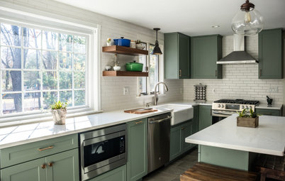
After: The new range combines the stovetop and oven in one spot. This wall’s white cabinetry adds some strong contrast to the rich wood tones and the blue cabinetry in the room. “John loved the movement in this quartz and loved the idea of continuing it up the backsplash,” Orndorff says.
Also adding to the contrast is the black range hood. Matte black hardware ties into the hood and soapstone. “Andrea always solicited our ideas and used those to direct us toward the final design,” Karen says. “She was instrumental in ensuring we maximized storage and removed any aesthetically troublesome design choices.”
Browse range hoods in the Houzz Shop
An appliance garage allows easy access to the toaster and blender while keeping the countertops uncluttered. This was an important aspect of the design for the homeowners. “Even when we are working and have our appliances out, it never feels crowded,” Karen says.
Hire a kitchen remodeler
Hire a kitchen remodeler
Orndorff crafted the pantry wall to stand alone as its own entity within the kitchen. The deep blue paint works well with the rich wood tones and white in the room. And honey brass hardware pops against the hue. The glazed ceramic tile backsplash is different than the backsplash on the range wall. The floating shelves are walnut and the countertop matches the perimeter and main island counters. “We sprinkled the walnut around,” Orndorff says.
The countertop cabinet doors pocket back so they can be tucked out of the way. The cabinet on the left is a bar cabinet and the one on the right is a coffee station.
“We would have been overwhelmed without Andrea guiding us in selecting the finishes and lighting,” Karen says. “We would have never thought of or been brave enough to choose a four-color cabinet palette. She had the vision and was spot-on with the decision.”
Before: This alcove sat between the kitchen and the breakfast room.
After: The designer took advantage of the alcove, transforming it into a wine storage area. She repeated the use of the deep blue paint and walnut to tie it into the cabinetry. “They like to collect wine and this was a great spot that’s convenient to the kitchen and the eating area,” Orndorff says.
She carefully crafted each part of the kitchen to stand on its own while working as part of a cohesive whole. “Each part of this room has its heyday — the hood, the worktable, the pantry cabinet wall and this wine station,” Orndorff says. “I’m so happy Karen and John took the time to have the focus and presence for us to get it right.”
She carefully crafted each part of the kitchen to stand on its own while working as part of a cohesive whole. “Each part of this room has its heyday — the hood, the worktable, the pantry cabinet wall and this wine station,” Orndorff says. “I’m so happy Karen and John took the time to have the focus and presence for us to get it right.”
Before: On the existing kitchen’s floor plan, the dining room is located along the right side, behind the wall ovens. The eat-in area is at the top.
After: Now that kitchen has taken over the dining room space, it has a much larger footprint. Note that later in the design process, the seating and sink locations in the main island were flipped. The breakfast room eat-in area, located at the top of the plan, now doubles as the formal dining space.
“We really love everything about the kitchen,” Karen says. “I love the farmhouse sink, open shelving, amount of storage and countertop space. John loves the custom ‘worktable’ and wine storage area that Andrea designed. Both are stunning. We are in love with the kitchen, it is the heart of our home. When we entertain, everyone congregates in the kitchen and around the island.”
Part of Orndorff’s job can involve tempering clients’ expectations regarding time. These clients are glad they took a pause and slowed down to complete a thorough design process with her. She’s happy that they’ve fallen in love with their home all over again. “Design is a process, and it takes time for clients to process what they need and what the proposed solutions could be,” Orndorff says. “They need to envision themselves in the space years down the line. This process requires some time. And by the way, it should be enjoyable!”
More on Houzz
Read more kitchen stories
Browse kitchen photos
Hire a kitchen remodeler
Shop for kitchen products


Sponsored
Zanesville's Most Skilled & Knowledgeable Home Improvement Specialists
Kitchen at a Glance
Who lives here: John and Karen Roschella
Location: Cooksville, Maryland
Size: 330 square feet (31 square meters)
Designer: Andrea Lynn Orndorff of A. Lynn Design
Contractor: Rich Judd of Glenwood Kitchen and Bath
Before: The formal dining room was located behind the kitchen. “They didn’t use their dining room. It was pretty empty because they had it set up as a yoga studio during the shutdown,” Orndorff says. The homeowners, Karen and John Roschella, note that the kitchen appliances were reaching their end of life, the design was a bit outdated, the cabinets and countertops were of low quality, the island didn’t have seating and the space felt cramped when everyone congregated there.
The angled island cut off the kitchen and made circulation through it awkward. The space to the left of the kitchen was a breakfast room. You may also notice the blue painter’s tape on the floor — Orndorff used this to give her clients an idea of how the space would be transformed after the renovation.
Find an interior designer on Houzz