


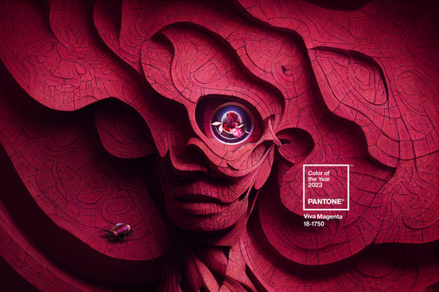
Pantone Chooses a Vibrant Magenta for 2023 Color of the Year
Viva Magenta is a bold, cool red hue meant to promote optimism and joy. See how to use it around a home
Jennifer Ott
December 1, 2022
San Francisco-based architectural color specialist and design writer. Jennifer's work has been featured in many print and online publications. Her recently-published book, "1000 Ideas for Color Schemes," is a beautifully illustrated and easy-to-navigate guide that takes the guesswork out of selecting the perfect color palette for your home or special event. For more information on Jennifer Ott Design, visit http://jenottdesign.com/.
San Francisco-based architectural color specialist and design writer. Jennifer's... More
As a color consultant, I find this time of year is one of my favorites. It’s when Pantone Color Institute, the color standards management company, chooses what it thinks will be the defining color for the coming year. And while many of the major paint companies selected a mix of soft neutrals, deep blue-greens and pretty pinks for their colors of the year, Pantone opted to go bold with a lively red called Viva Magenta. Here’s a look at how you can use Pantone’s 2023 Color of the Year in a client’s home.
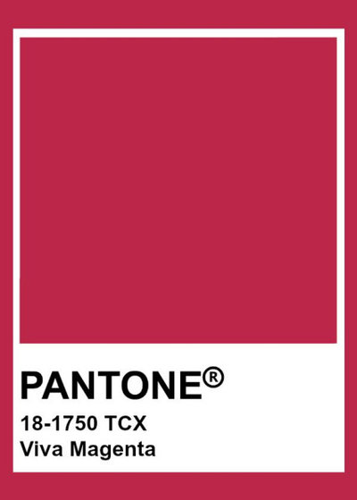
First, a little about the featured color and why it was chosen. Viva Magenta, shown here, is meant to play up the connection between natural and virtual worlds and to find optimism and joy within that tension. “As virtual worlds become a more prominent part of our daily lives, we look to draw inspiration from nature and what is real,” says Leatrice Eiseman, executive director of Pantone Color Institute. “Viva Magenta descends from the red family and is inspired by the red of cochineal, one of the most precious dyes belonging to the natural dye family, as well as one of the strongest and brightest the world has known. Rooted in the primordial, Viva Magenta reconnects us to original matter. Invoking the forces of nature, it galvanizes our spirit, helping us to build our inner strength.”
It’s important to note that Pantone’s Color of the Year selection isn’t intended exclusively for home design. Rather, the chosen color takes inspiration from — and has influence on — all areas of design, including fashion, art, technology and advertising, as well as interior design and decor.
If your clients are a fan of this spirited hue, you’ll likely find it easier to source for home decor in the coming months. And if they’re a big fan of the color, now’s the time to recommend they use it to paint a room or other elements in their home.
With that in mind, here are a few examples featuring similar bold pink-reds that can help give you an idea of how this color could work.
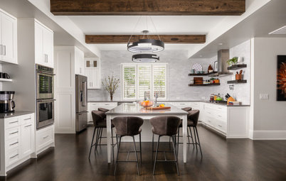
Attractive Accents
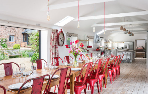
Viva Magenta is a dynamic hue that can easily dominate in a room. So if you’re a little wary of going too bold, it’s best to stick to small doses.
This farmhouse is a good example. Notice how the repetitive use of a Viva Magenta-like color on the chairs brings an energetic, fun vibe that remains airy and light.
This space also illustrates a good piece of advice when it comes to bold color: Use it for items that are relatively easy and affordable to change out, such as furnishings and decorative accessories.
You can help clients visualize their planned home with Houzz Pro Mood Boards and 3D Floor Plans. You can also share photos, files, estimates, proposals and more with clients using Houzz Pro.
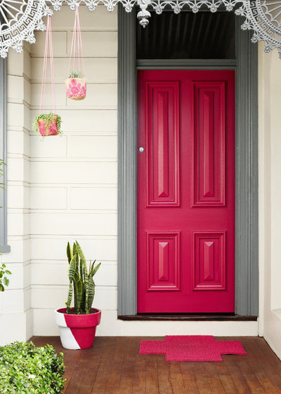
In my opinion, one of the best ways to use this hue is as a front door accent. It brings such a warm, welcoming vibe. This pink-toned red is a fresh and modern take on classic front door red.
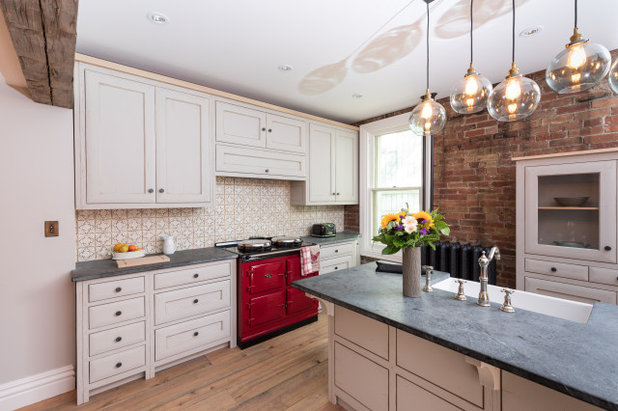
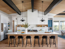
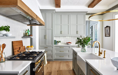
Colorful appliances are another great way to inject a small dose of a bold hue into a home. A deep cool red revs up a range and gives this otherwise neutral kitchen a nice punch of color.
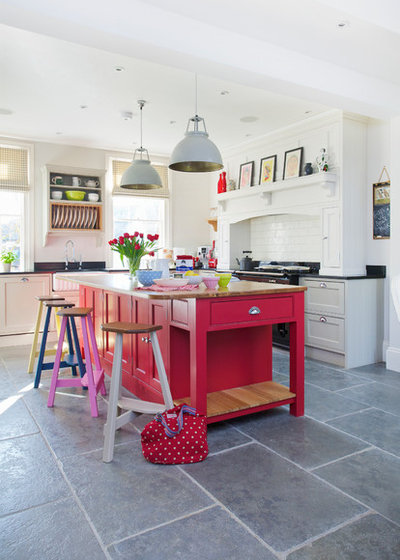
Meanwhile, a moderate splash of deep red adds a cheerful atmosphere to this English kitchen. Pairing the red with plenty of white and light neutrals creates a nice mix of color and white space. The lighter hues help frame and balance the saturated red.
An added bonus when decorating with visually assertive hues is that you don’t need to add many decorative gewgaws and knickknacks. The color provides the drama and spice.
An added bonus when decorating with visually assertive hues is that you don’t need to add many decorative gewgaws and knickknacks. The color provides the drama and spice.
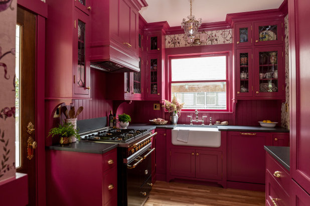
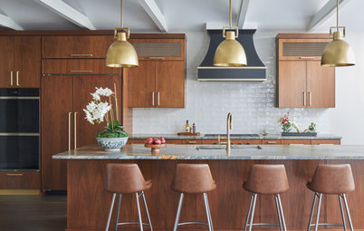
Going Big
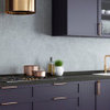
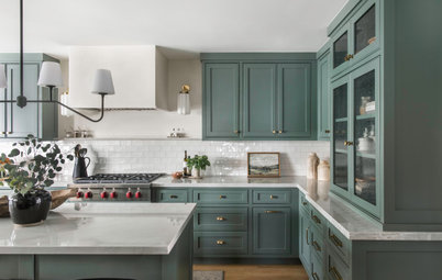
If you’re keen on going all-in with a big, bold cool red, the cabinets and millwork in this traditional-style Seattle kitchen by Sheila Mayden Interiors offers plenty of inspiration.
Find out how Houzz Pro can help you run your business and manage your leads
If you’re keen on going all-in with a big, bold cool red, the cabinets and millwork in this traditional-style Seattle kitchen by Sheila Mayden Interiors offers plenty of inspiration.
Find out how Houzz Pro can help you run your business and manage your leads
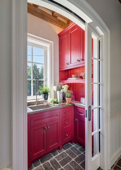
VanderHorn Architects used similarly saturated red cabinets and accents to energize this Connecticut mudroom. To keep spaces like this and the previous kitchen from feeling too dark and heavy, make sure the room gets a good amount of natural light from a window or skylight. And go with a bright white ceiling to help bounce the light around the space and allow the pretty color to dazzle.
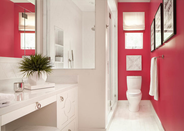
If you want to go big with Viva Magenta but with less of a commitment than cabinetry, consider painting accent walls in the color. That way it’s easy to repaint if you grow tired of it in the future. Again, consider keeping other elements as neutral as possible to cut down on the visual busyness.
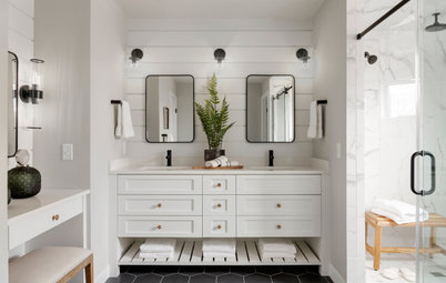
Notice how this San Francisco Bay Area bathroom has mostly white finishes and yet the vibrant red wall punches the room up to anything but ordinary.
Notice how this San Francisco Bay Area bathroom has mostly white finishes and yet the vibrant red wall punches the room up to anything but ordinary.
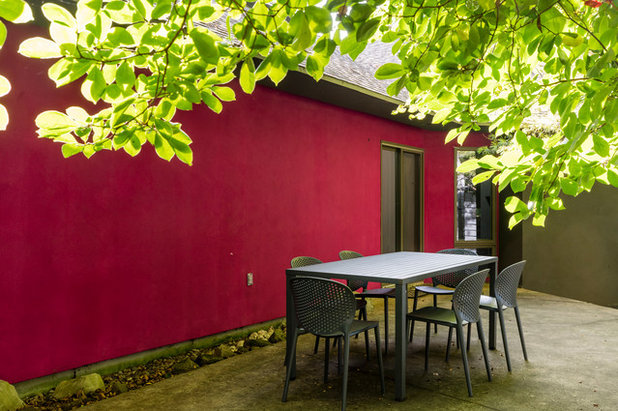
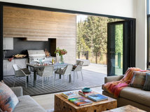
Viva Magenta and colors like it can work outside too. When possible, and when it works with the architecture and style of the home, I’ve been creating exterior accent walls for my clients, and magenta is an unexpected but striking choice, as shown here. It’s an especially lovely contrast with the natural greens in the landscape.
Your turn: What do you think of Pantone’s choice of Viva Magenta for its Color of the Year 2023? Share your thoughts in the Comments.
More for Pros on Houzz
Read more stories for pros
Learn about Houzz Pro software
Talk with your peers in pro-to-pro discussions
Join the Houzz Trade Program
Your turn: What do you think of Pantone’s choice of Viva Magenta for its Color of the Year 2023? Share your thoughts in the Comments.
More for Pros on Houzz
Read more stories for pros
Learn about Houzz Pro software
Talk with your peers in pro-to-pro discussions
Join the Houzz Trade Program
J.S.Brown & Co. is an award winning, full service Design / Build remodeling contractor with more than three... Read More
What are you working on?

Related Products
With over 8 years of experience serving the Columbus and surround area, Hoffman Exteriors, is your solution for... Read More
Related Stories
Latest News for Professionals
Pros Are Mildly Optimistic Despite Slowed Activity in Q2 2023
Expectations are restrained and construction pros report record-high backlogs in the Q3 2023 Houzz Renovation Barometer
Full Story

Latest News for Professionals
Houzz Launches Selections for Houzz Pro
The tool gives builders and remodelers a platform to choose and review products and materials with their clients
Full Story
Latest News for Professionals
11 Great Design Ideas From the Best of Houzz 2023 Award Winners
These popular photos earned pros praise from the Houzz community and offer design details worth considering for any home
Full Story
Latest News for Professionals
Houzz Launches Selections in Houzz Pro
The tool gives designers a visual workspace to create, share and discuss design concepts with team members and clients
Full Story
Latest News for Professionals
Houzz Barometer Shows Slowed Business Activity in Q3 2022
The design and construction sectors diverge in expectations. Project wait times for Q4 remain above pre-pandemic levels
Full Story
Latest News for Professionals
See What a Home’s Age Says About Remodeling Trends
Knowing some key details based on the year a home was built can help your clients plan ahead for remodeling projects
Full Story
Latest News for Professionals
8 Bathroom Features Homeowners Want Now
Get the latest ideas for vanities, materials and other popular details from the 2022 U.S. Houzz Bathroom Trends Study
Full Story
Latest News for Professionals
5 Big-Picture Bathroom Remodeling Trends Happening Now
See the latest styles, vanity looks, spending habits and more from the 2022 U.S. Houzz Bathroom Trends Study
Full Story
Latest News for Professionals
Houzz Barometer Shows Continued, Yet Slowed, Industry Growth
Wait times to start a new project are easing and have returned to previous-year levels for remodelers and designers
Full Story

Latest News for Professionals
Houzz Pro Learn Serves as a Resource Hub for Home Professionals
The site offers design and remodeling industry news, business advice, trend reports and Houzz Pro updates and tutorials
Full Story
Vibrant, energising colour, already used moderately in two rooms in my home. Modern asthetic, teamed with mainly white, ascented with yellow and blue. Been like it for about ten years now, haven't tired of it yet.
Vibrant, energising colour, already used moderately in two rooms in my home. Modern asthetic, teamed with mainly white, ascented with yellow and blue. Been like it for about ten years now, haven't tired of it yet.
There is simply no red of any kind in my home, not even the tiniest accent. Not red, not this dark “magenta.” It is the antithesis of relaxation. Color is very important to me and I embrace color so that my home feels like home to me. I like sunny yellow and yellow-y oranges as they are happy colors, and periwinkle and the yellow-green of new leaves, turquoise, and warm bright blues with lots of white. Even my holiday tree (which I posted as a comment on that story) reflects bright happy colors and includes a few bright warm pink balls for accent, but that’s it. When I find something with a color I like I keep it for many years so there is a color harmony built up over time.