


Before and After: 4 Entries That Make Great First Impressions
Check out how designers transformed unwelcoming spaces into inviting and high-functioning entryways

Entryways are tricky. They need to make a great first impression and function in a way that welcomes guests while stopping wet shoes and snowy boots in their tracks. Entry sizes from tiny to extra large each present their own set of challenges. Check out how these four designers transformed four very different entry spaces in ways that made them attractive and functional.
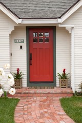
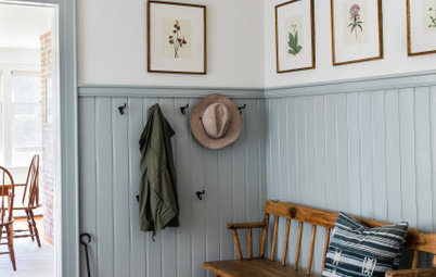
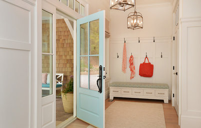
After: Kestenbaum took over the closet to create an entry area. She squared off the previously arched opening, and the space got a new front door, a tile floor and wall sconces that suited the home’s age. The tile floor has a black border that helps create a nice transition between the entry and the living room’s hardwood floors.
What to Do When You Don’t Have a Front Entry
What to Do When You Don’t Have a Front Entry
As luck would have it, the closet already had a window, which brings a lot of light into the space. The slot below it is the mail slot.
Kestenbaum had classic black-and-white hexagonal tiles laid on the floor, including “EST. 1928” in the composition (the year the charming house was built). She notes that this type of text is much easier to compose with hexagonal tiles than it is with penny rounds.
Take a full tour of this home
Kestenbaum had classic black-and-white hexagonal tiles laid on the floor, including “EST. 1928” in the composition (the year the charming house was built). She notes that this type of text is much easier to compose with hexagonal tiles than it is with penny rounds.
Take a full tour of this home
2. Tight on Space in Toronto
Before: In this family of four’s Toronto row house, every inch counted. And not spreading snow all over the house was also important. Architects Brian Hagood and Charisma Panchapakesan of CAB Architects gave the home a full remodel to make it suit the young family’s lifestyle, and they began right inside the front door.
“In winter we need somewhere with a tiled floor to take off boots and heavy coats as we come in, and it can make an adjacent living room space feel messy,” Panchapakesan says.
Find a local architect on Houzz
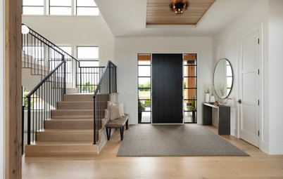
After: The architects enclosed the entry area, adding a door-sized opening to the rest of the house. The space measures 4 feet, 9 inches by 8 feet, 6 inches and conceals the view of coats and boots from adjacent rooms. The team added a colorful geometric tile on the floor that suited their clients’ tastes.
The wall at the right has a curved rather than sharp corner.
Browse coatracks and umbrella stands in the Houzz Shop
The wall at the right has a curved rather than sharp corner.
Browse coatracks and umbrella stands in the Houzz Shop
It’s easier to see the curve of the wall from the other side — the entry is in the back right corner of the photo.
“The challenge in these row houses is that daylight only comes in from the front and back. We wanted the rooms to feel distinct but also keep things open to share that light,” Panchapakesan says. “The curved wall wraps the light and takes it around the corner. It also helps to make the narrow space feel more dynamic.”
Take a full tour of this home
3. Cleaned Up in Colorado
Before: To get a better understanding of this project in Boulder, Colorado, check out its entry from the outside. The area to the right of the front door served as the entry. It was originally a porch that former owners had enclosed to become part of the interior.
The couple who live here, parents of three children, loved the midcentury architecture of the house — as well as its former owner — and wanted to respect it. But because it hadn’t been touched since it was built in 1966, they also wanted to freshen it up and make it work for their lifestyle. They hired interior designer Kate Van Sluyter of Kimball Modern Design + Interiors to help them.
After: The homeowners preserved the original brick trim but painted the siding and replaced the door and windows.
Find a home design and remodeling team
Find a home design and remodeling team
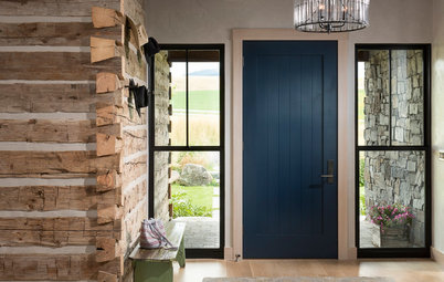
Before: The previous homeowners had enclosed the original porch to create a greenhouse-like space for plants. It was open to the living room, but the change in flooring and the awkward step didn’t make for cohesiveness between the two spaces. The step was also a trip hazard.
After: Van Sluyter and the builder created some separation between the two spaces with a half wall. They also raised the roof and added a skylight to bring in more natural light. A crisp coat of white paint on the walls and trim also brightened things up.
The new flooring is a pale gray hexagonal tile. The geometric pattern nods to midcentury style.
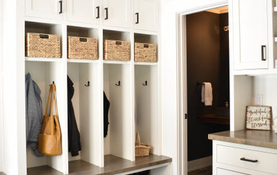
The entry space needed to function for a family of five and its dog. The white oak built-in bench and drawers help organize the children’s outdoor gear and backpacks, as do the coathooks. Plants along the windowsill honor the former owner.
Shop for wall and floor tile
The new flooring is a pale gray hexagonal tile. The geometric pattern nods to midcentury style.
The entry space needed to function for a family of five and its dog. The white oak built-in bench and drawers help organize the children’s outdoor gear and backpacks, as do the coathooks. Plants along the windowsill honor the former owner.
Shop for wall and floor tile
Before: The view from the living room was completely open to the porch-turned-entry.
After: Now the half wall conceals the coats and bench while still allowing both spaces to enjoy the light from the windows.
Take a full tour of this home
Take a full tour of this home
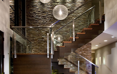
4. De-McMansionized in Virginia
Before: “There was a time when homes were built big and cavernous just for the sake of being big and cavernous,” interior designer Kirsten Kaplan says. Her clients’ entry in Fairfax, Virginia, was a perfect example of McMansion proportions gone wrong. The awkward scale of the entry did not lend a welcoming feel. And the ornate elements didn’t suit their transitional tastes.
Before: “There was a time when homes were built big and cavernous just for the sake of being big and cavernous,” interior designer Kirsten Kaplan says. Her clients’ entry in Fairfax, Virginia, was a perfect example of McMansion proportions gone wrong. The awkward scale of the entry did not lend a welcoming feel. And the ornate elements didn’t suit their transitional tastes.
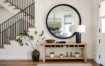
After: Kaplan knew she could mitigate the extra-high ceilings and provide more pleasing proportions with millwork and properly scaled furnishings. The long console table, high mirrors and tall lamps suit the scale of the space. The rug adds warmth and color, breaking up the large expanse of flooring.
Kaplan also gave the staircase a makeover to match the style of the millwork.
Check out our beginner’s guide to get started on your home project
Kaplan also gave the staircase a makeover to match the style of the millwork.
Check out our beginner’s guide to get started on your home project
After: Rectilinear columns are a better fit for the new style, and their proportions are a better fit the large-scale rooms.
Take a full tour of this home
More on Houzz
Browse more entry photos
Hire a local design pro
Shop for your home
Take a full tour of this home
More on Houzz
Browse more entry photos
Hire a local design pro
Shop for your home


Before: Interior designer Tamar Kestenbaum’s 1,700-square-foot Tudor-style home didn’t have much of a front entry. But it did have a coat closet near the front door. With Seattle’s frequent wet days, Kestenbaum’s family needed a more substantial spot to kick off shoes and hang up coats and umbrellas before entering the home.