


Before and After: 3 Kitchen Makeovers in White, Wood and Green
See how designers pair green with white and wood elements to infuse these kitchens with earthy, natural vibes

If you’re a fan of white-and-wood kitchens but prefer a little (or a lot) of color added to the mix, green might be the missing ingredient you’re looking for. In these kitchen remodels, designers used different shades of green — a moody gray-green, a soft green with blue undertones and a sophisticated, earthy green — to complement white and wood elements.
Check out the before-and-after photos of these three kitchen makeovers in white, wood and green, then let us know in the Comments which one gets the mix right for you.
Check out the before-and-after photos of these three kitchen makeovers in white, wood and green, then let us know in the Comments which one gets the mix right for you.
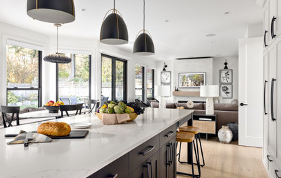
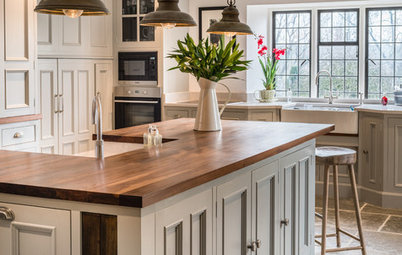
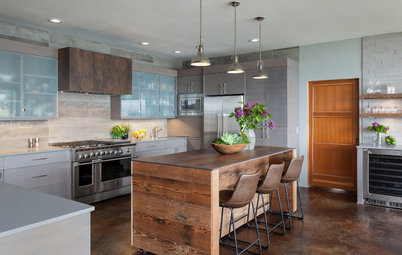
After: Roos incorporated white elements in the form of white-painted cabinets, white walls and white Sea Pearl quartzite countertops. She also brought in more natural light by taking down a wall separating the dining room from the hallway. (That’s a remaining structural post in the foreground of the photo; Roos built it out and wrapped it in white shiplap to make it look intentional.) The new fixed window over the sink also allows sunlight to pour in and opens up views to the lake.
Wood elements enter the mix through the island and some of the cabinetry. The new larger island with a quartzite waterfall countertop has a warm walnut breakfast bar. Walnut cabinetry also surrounds the new six-burner Wolf rangetop and hood.
Paint colors: Glass Slipper (walls) and Simply White (cabinets), Benjamin Moore
Shop for counter stools on Houzz
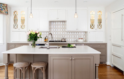
The subtle greens in the quartzite guided Roos’ choice of Benjamin Moore’s Dark Pewter paint on the island cabinets. Because of the way the sunlight was hitting them when these photos were taken, the color reads a bit brighter than it does in person, Roos says. It’s a dark gray with green undertones, which echoes the color of the lake.
The homeowners requested an easy spot to store and grab dishes, so Roos added an integrated niche into the quartzite at the end of the island. Though it was a pricey and tricky feature to build, Roos loves how “monolithic” it makes the island feel.
Read more about this kitchen remodel
The homeowners requested an easy spot to store and grab dishes, so Roos added an integrated niche into the quartzite at the end of the island. Though it was a pricey and tricky feature to build, Roos loves how “monolithic” it makes the island feel.
Read more about this kitchen remodel
2. Fresh Farmhouse Feel
Kitchen at a Glance
Who lives here: Empty nesters Lawrence and Isabelle Buhler
Location: Salt Lake City
Size: 285 square feet (26 square meters)
Designers: Nicole Zeigler and Lacy Green of Enzy Design
Before: These Salt Lake City homeowners loved their 1905 urban farmhouse and the established neighborhood it’s in. But they had a lot less love for their kitchen. For 20 years, they lived with its drab walls, dropped ceiling, laminate countertops, aging wood cabinets and lack of natural light.
The homeowners desired a new kitchen with a fresh farmhouse feel, so they turned to designer Nicole Zeigler for help. She eliminated a bathroom and a mudroom to expand the kitchen and create a more functional layout. Upgraded appliances, improved storage, a central dining table and a white, wood and green palette give the space a welcoming vibe.
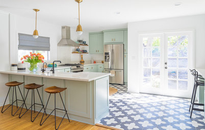
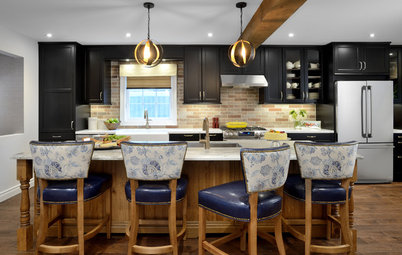
After: Zeigler created a larger and brighter kitchen by raising the ceiling about a foot and incorporating the bathroom and mudroom into the layout. Those moves added 85 square feet to the floor plan and allowed the designer to add a window above the sink to bring in natural light.
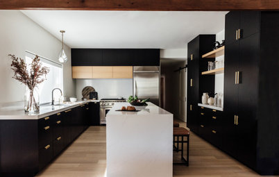
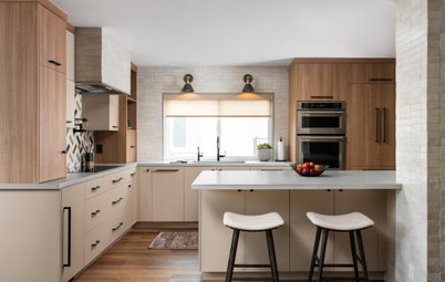
Green plays a major role in the room’s white, wood and green palette. New modified Shaker-style cabinets and a custom hood with vertical grooved paneling are painted in Jasper Stone by Sherwin-Williams, a green with blue undertones that adds a refreshing energy to the space.
Wood touches are worked in with nine floating cherry shelves on the walls and wood-look luxury vinyl planks on the floor. “It’s so low-maintenance and fits their simple, urban lifestyle,” Zeigler says.
New tiles, window trim and ceiling paint bring crisp white shades into the material palette. The zellige-style white ceramic tiles in varying tones form the backsplash, which Zeigler took all the way to the ceiling. “We liked their lightness and brightness and how the gloss finish reflects light,” she says.
Black bronze cabinet knobs and pulls coordinate with the matte black faucet, dark granite composite sink and graphite gray marble-look quartz countertops with pronounced white veining. “They were worried about having too much white and wanted contrast for the backsplash,” Zeigler says of the countertop choice.
Ceiling and trim paint: Pure White, Sherwin-Williams
Read more about this kitchen remodel
3. Cool, Calm and Collected
Kitchen at a Glance
Who lives here: A couple
Location: Sacramento, California
Size: 300 square feet (28 square meters)
Designer: Jada Gilbert of Design Shop Interiors
Before: These Sacramento, California, homeowners love to entertain, but their existing kitchen wasn’t giving off the warm and welcoming vibe they wanted. Since the kitchen is part of an open floor plan that includes the dining and living room areas, there was no way to hide it from guests.
The existing kitchen featured a sea of neutral colors, too many closed cabinets and a large vent hood that made things feel closed in. While the layout worked well for the homeowners, they were craving something that felt more open, warm and organic. They reached out to designer Jada Gilbert and asked her to create an inviting space with a white, wood and green palette and open shelves to showcase their collection of dinnerware.
“These homeowners are so much fun and they love to entertain, so it was important that their kitchen reflected their style,” Gilbert says. “They wanted it to feel casual, warm and comfortable yet elevated.”
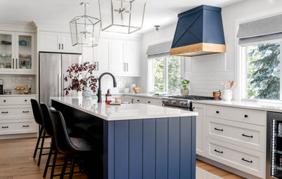
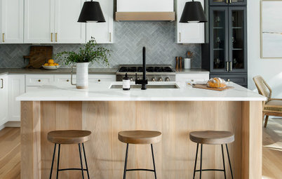
After: Because the kitchen is tucked into a corner of the open layout, keeping an angled island was the most practical decision. “Placing the island at an angle is unusual, but it made sense here because of the way the kitchen relates to the dining and living rooms,” Gilbert says.
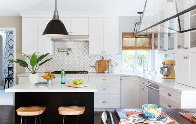
The new island introduces green with a sophisticated, earthy shade (Treron by Farrow & Ball) on the V-groove paneling. The island countertop and perimeter counters are soapstone, a living finish that will change over time. “My clients are choosing not to oil the counters to let the soapstone become more ash gray over time,” Gilbert says. “This soapstone also has green veining in it that works very well with the green paint on the island.”
Four wicker counter stools at the island add an organic texture that fits in well with the white, wood and green palette.
Warm whites come into play through the cabinets, wall paint (Wevet by Farrow & Ball), handmade zellige tiles and the focal point of the space, the beautiful custom plaster range hood that extends to the ceiling. “I worked with the carpenter on this — we drew different shapes on plywood to get it right,” Gilbert says.
The white oak open shelves bring in wood tones and make the room feel more airy and light. The homeowners use the shelves to store everyday items worthy of display. “It was another opportunity to add organic touches to the room,” Gilbert says. Many of the pieces are from iconic California company Heath Ceramics.
Read more about this kitchen remodel
More on Houzz
Read more kitchen stories
Hire a kitchen remodeler
Shop for kitchen products

Kitchen at a Glance
Who lives here: An empty-nest couple
Location: Lake Minnetonka, Minnesota
Size: 478 square feet (44 square meters)
Designer: Kate Roos of Kate Roos Design
Builder: Hamann’s Custom Carpentry
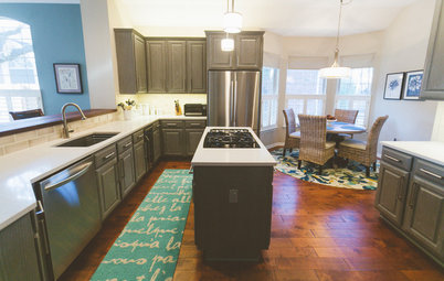
Before: Although the existing kitchen overlooked Minnesota’s Lake Minnetonka, the small windows over the sink broke up the view, the island felt cramped and the overall vibe of the space was unwelcoming. So the homeowners turned to Houzz to find designer Kate Roos and asked her to transform the kitchen into a bright, modern space with a new fixed window overlooking the lake, a larger island to comfortably take in the views and a stylish white, wood and gray-green palette.
“The old kitchen was very dated and ready for the remodel,” Roos says. The existing layout didn’t take advantage of the views. The original island sat only three people and faced a wall with a door to the family room. Abundant wood cabinets and a black island countertop made the space feel dark and heavy.
“They have a big family with lots of grandkids,” Roos says of the empty nesters. “They enjoy entertaining them and doing activities with them at the lake, and they all like to gather around and work together in the kitchen. So they just wanted a space that was going to really work toward spending that time together effectively.”
Find an interior designer near you