


Kitchen of the Week: Deep Green Cabinets and Mediterranean Flair
A designer updates an empty-nest couple’s 1980s kitchen with an improved layout and a modern Spanish-influenced style

After raising two daughters, these empty nesters were ready to update their aging 1980s kitchen. They particularly disliked the standard honey brown cabinets and small island with a large induction cooktop that left virtually no countertop space. They appreciated the way the terra-cotta flooring and Talavera tile countertops and backsplash complemented the Spanish Colonial home’s architecture. But the flooring was hard on their back and feet, and the tile countertops and backsplash gave the kitchen a busy look and were hard to clean.
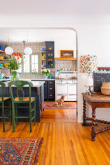
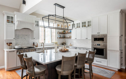
Wanting to maintain the Spanish Colonial flavor while improving storage, style and function, the homeowners turned to designer Joseph Rodrigues. He rearranged the appliance and cabinet layout to create a more efficient U-shaped setup with an island that has a continuous quartz countertop surface. A deep green color for the perimeter cabinets, a wood island base, rich wood flooring and an arabesque tile backsplash create an updated Mediterranean style that nods to the home’s roots.
Wanting to maintain the Spanish Colonial flavor while improving storage, style and function, the homeowners turned to designer Joseph Rodrigues. He rearranged the appliance and cabinet layout to create a more efficient U-shaped setup with an island that has a continuous quartz countertop surface. A deep green color for the perimeter cabinets, a wood island base, rich wood flooring and an arabesque tile backsplash create an updated Mediterranean style that nods to the home’s roots.
After: Rodrigues removed the old appliances, tile, island and peninsula. He also removed the tray ceiling and raised the ceiling about a foot.
The new U-shaped layout with an alder island helped add 10 square feet to the kitchen. The rotated orientation of the island, and the rounded gray quartz countertop, creates better traffic flow. “We pushed it out to the breakfast area,” Rodrigues says. “It also created more of a gathering space at the island.”
Deep pine green cabinets (Tarrytown Green by Benjamin Moore), arabesque backsplash tile and a band of handmade tile on the range hood make for an updated style that honors the Spanish Colonial home. “My feeling was to bring the lovely green to the cabinets, to make the kitchen transitional, without losing that Spanish or Mediterranean flavor,” Rodrigues says. “The home is Spanish Colonial but is very Mediterranean. It was important we brought the color element back into the kitchen.”
The homeowners chose the bronze-and-blown-glass pendant lights over the island. “We definitely wanted something that felt open and airy,” Rodrigues says.
Additional illumination is provided by new LED recessed ceiling lights and undercabinet light strips over task areas.
Pendant lights: Everly in Olde Bronze, Kichler
Find kitchen remodelers near you
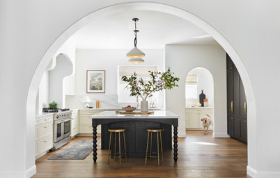
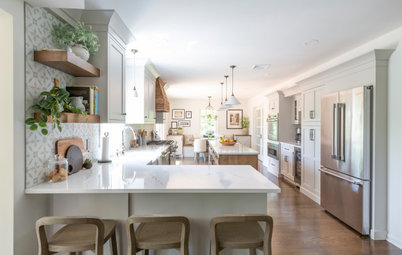
This pulled-back view shows how Rodrigues extended the kitchen. He gave the existing beam a custom coffee-brown finish. “It was important we had a custom finish that would bring all the wood tones together,” he says. “They’re not all exactly the same, but related.”
On the left, a 24-inch built-in, panel-ready refrigerator column has a premium stainless steel interior and hinges designed for a true flush look. A coordinating 24-inch panel-ready freezer column gives the homeowners ample storage for frozen food.
Engineered hickory hardwood flooring has a hand-scraped finish with rustic distressing. “There was an issue in the den with carpeting that they removed and replaced with this hickory,” Rodrigues says. “It has the warmth of the terra-cotta color and a nice texture. It was important to them to keep a warm tone to the flooring.”
Stools: Fritz, Palecek
Shop for bar stools and counter stools
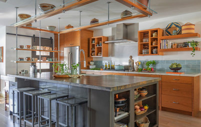
Rodrigues moved the new Wi-Fi-enabled 30-inch stainless steel double wall ovens to the opposite wall near the range, creating a more sensible appliance layout. A tall cabinet to the right is a food pantry with pullouts. Another cabinet stores an infrequently used microwave. “All of the appliances are hidden except for the major appliances,” Rodrigues says.
Before: A closer look at the former island shows the lack of counter space. Beyond that is the side-by-side orientation of the fridge and wall ovens that created a bottleneck. “When one of the oven doors were open, it would open very close to the island,” Rodrigues says.
After: With the new wall ovens on the other side of the room, Rodrigues used the former space to add an appliance garage and wine fridge. “That’s what she wanted, all the small appliances put away,” Rodrigues says. “We wanted to maximize that space and utilize that entire corner.”
8 Kitchen and Bath Trends for New Faucets and Fixtures in 2023
8 Kitchen and Bath Trends for New Faucets and Fixtures in 2023
Before: In the former kitchen, the dropped ceiling and banks of upper cabinets made the sink area feel closed in. Plus, the red enamel sink with three small basins sat off-center to the window. “It was also a very tight fit between the old island and the sink,” Rodrigues says. “It was offset to the left to create proper clearance, but it was still very tight.”
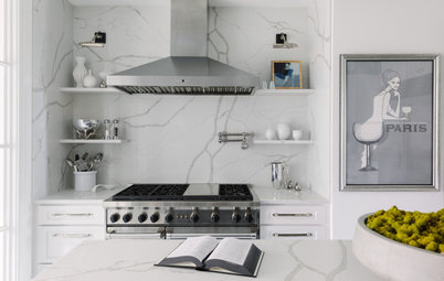
After: Rodrigues centered a new 34-inch single-bowl white fireclay sink in front of an updated aluminum window in a matte black finish that coordinates with a matte black pull-down faucet. “As much as I love a farmhouse apron-front sink, they’re not the most efficient when it comes to where the slab and cabinets meet,” Rodrigues says. “We wanted to create a watertight installation, and the undermount provides that.”
Upper cabinets flanking the window have glass fronts for a lighter look. “They break up that entire wall of wood,” Rodrigues says. “The glass makes everything feel more open.”
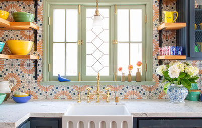
This view shows a closer look at the glossy handmade ceramic backsplash tile in an arabesque pattern. Custom oyster gray grout gives it an elegant pop. “Oyster gray is a very soft greige color,” Rodrigues says. “I wanted to give the tile more of an authentic and warm feel, to make the variation stand out more.”
He also encased the window with the same quartz used for the countertops, to create a waterproof seal and a clean look.
A paneled Wi-Fi-enabled dishwasher sits to the right of the sink. A paneled trash and recycling center is to the left.
Backsplash: Studio field ceramic tile in arabesque pattern, Arto
New to home remodeling? Learn the basics
Upper cabinets flanking the window have glass fronts for a lighter look. “They break up that entire wall of wood,” Rodrigues says. “The glass makes everything feel more open.”
This view shows a closer look at the glossy handmade ceramic backsplash tile in an arabesque pattern. Custom oyster gray grout gives it an elegant pop. “Oyster gray is a very soft greige color,” Rodrigues says. “I wanted to give the tile more of an authentic and warm feel, to make the variation stand out more.”
He also encased the window with the same quartz used for the countertops, to create a waterproof seal and a clean look.
A paneled Wi-Fi-enabled dishwasher sits to the right of the sink. A paneled trash and recycling center is to the left.
Backsplash: Studio field ceramic tile in arabesque pattern, Arto
New to home remodeling? Learn the basics
A pro-style range top replaced the island cooktop. “They didn’t even have proper exhaust before, so it made sense to move the cooking surface to that wall,” Rodrigues says.
A custom plaster hood features a band of decorative handmade tile. “It brings an emphasis to that space and draws your eye,” Rodrigues says. “The range top is off to the side of the kitchen, so it was a way to make it an eye-catcher. They both love to cook and entertain, and one of the goals was to expand the size of the appliances.”
These floor plans show the former kitchen on the left and the updated space on the right.
In the former kitchen, the G-shaped layout with center island created a tight feel.
In the updated space, a U-shaped layout and a longer island with a rounded end promote better circulation. “The overall aesthetic looks authentic to the look of the home but also looks transitional,” Rodrigues says.
More on Houzz
Read more kitchen stories
Browse kitchen photos
Hire a kitchen remodeler
Shop for kitchen products


Kitchen at a Glance
Who lives here: An empty-nest couple
Location: San Clemente, California
Size: 190 square feet (18 square meters)
Design: Joseph Rodrigues Interiors
Before: The former kitchen had a cramped G-shaped layout with a small island that contained a large induction cooktop but virtually no counter surface. A pair of wall ovens next to the fridge and a dropped ceiling added to the tight feel.
The couple felt the cabinets had to go, and although they liked the charm of some of the finishes, they found the tile flooring was too hard on their bodies and the tile countertops gave the room a visually cluttered look.
The Douglas fir beam is load-bearing and had to be incorporated into the updated design.