


Color Trends for 2023 at Maison & Objet
Interior spaces get infused with colors both soft and bold

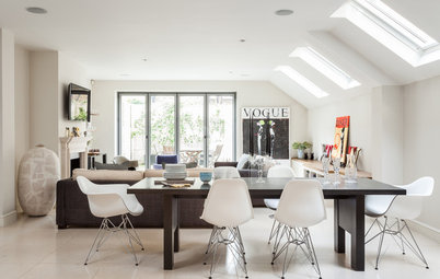
Color was at the heart of the recent Maison & Object trade fair (Sept. 8-12) in Paris featuring the latest furnishings, accessories, textiles and tableware. “Today color is a powerful antidote against the incessant waves of crises,” says trend forecaster Elizabeth Leriche in the introduction to Color Power, her exhibit in the fair’s What’s New space. Houzz editors explored this colorful environment to bring you the newest trends in the use of colors in interiors.
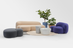
Jade Nuances
Still sought-after and popular in interiors, greens appeared in elements of various collections presented at the fair. Trend forecaster François Bernard, who put together the Kaleidoscope exhibit in the What’s New space, highlighted one particular hue: jade.
“Like celadon, jade comprises a very broad spectrum: it is more or less gray- or blue-tinged, and more or less green.” This shade is notably used in tableware, decorative glass and synthetic materials.
From Mauve to Purple
We had seen mauves and purples in small details in previous Maison & Objet fairs. The colors gained prominence at this fair, in accessories, in color blocking on walls and contrasted with other bold colors.
We had seen mauves and purples in small details in previous Maison & Objet fairs. The colors gained prominence at this fair, in accessories, in color blocking on walls and contrasted with other bold colors.
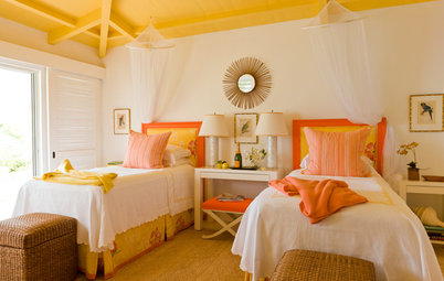
Yellow Ocher
Ocher yellows brighten the palette, bringing in lots of light without taking center stage.
Ocher yellows brighten the palette, bringing in lots of light without taking center stage.
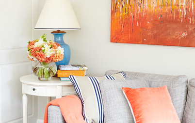
From Brick to Burgundy
There were also bolder tones, ranging from lively orange to brick. Brick and burgundy were relative newcomers at the September fair.
There were also bolder tones, ranging from lively orange to brick. Brick and burgundy were relative newcomers at the September fair.
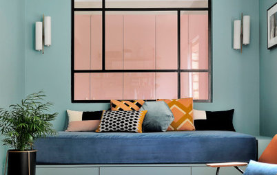
Soft Pink
Following the monochrome trend that we’ve observed for several years, brick and burgundy have found their counterparts in soft, pale pinks. These pastel hues bring in the softness people are seeking in their interiors.
10 Decor Trends From Maison & Objet 2022
Following the monochrome trend that we’ve observed for several years, brick and burgundy have found their counterparts in soft, pale pinks. These pastel hues bring in the softness people are seeking in their interiors.
10 Decor Trends From Maison & Objet 2022
In this trend toward calmer interiors, pinks are tending toward very light and barely pigmented, almost beige shades.
Papermint wallpaper
Beige
Beige is making its comeback to suit our desire for timeless interiors. Beige and brown evoke the colors of the skin, said forecaster Bernard. “We need these extensions of ourselves into our surroundings” as a counterpoint to “the dematerialization of the age,” he said.
Beige
Beige is making its comeback to suit our desire for timeless interiors. Beige and brown evoke the colors of the skin, said forecaster Bernard. “We need these extensions of ourselves into our surroundings” as a counterpoint to “the dematerialization of the age,” he said.
Color Power exhibit by Elizabeth Leriche
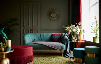
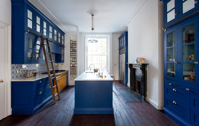
Blue Contrasts
Another color we have yet to mention, but which still has a place among interior decor and furniture this year: blue. “Another favorite combination associates geometric applique with undulatory curves in tones of electric blue, burgundy or light blue,” says Leriche, describing her exhibit.
Diffused Colors
To finish off, we’ll go back to another technique mentioned by Leriche. “Diffused colors are a must for this season. Their hues evoke daybreak and dawn, but also a rainbow palette, with halos of pleasant effects,” Leriche said.
More on Houzz
Read more design stories
Find design and remodeling professionals
Shop for home products


Color Blocking
One of the techniques Leriche highlighted in her exhibit was color blocking, the practice of juxtaposing blocks of contrasting colors for original and joyful interiors. Balancing these bold combinations, the trend forecaster also spoke of monotone or ombre palettes, which create softer transitions.
Find an interior designer near you