


Houzz Tour: Toronto Row House Reconfigured for a Family
Architects create more functional areas by thoughtfully shifting spaces around
Becky Harris
November 6, 2022
Houzz Contributor. Hi there! I live in a 1940s cottage in Atlanta that I'll describe as "collected."
I got into design via Landscape Architecture, which I studied at the University of Virginia.
Houzz Contributor. Hi there! I live in a 1940s cottage in Atlanta that I'll describe... More
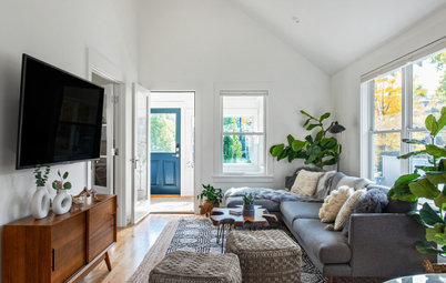
This couple with two young children felt that their 14½-foot-wide row house in Toronto was bursting at the seams, so they called CAB Architects to talk about renovating and adding on to it. “In the schematic phase, we discovered that they didn’t need more space, they just needed to reconfigure the space that they had,” architect Charisma Panchapakesan says.
Downstairs, the full renovation included creating a proper entry; moving the dining room, kitchen and living room around; and adding new windows. Upstairs, Panchapakesan found space to add a primary bathroom while maintaining the existing bedroom count of three. The new, more open vibe serves the family’s busy lifestyle well, and even with no change in footprint, the home feels much more spacious.
Downstairs, the full renovation included creating a proper entry; moving the dining room, kitchen and living room around; and adding new windows. Upstairs, Panchapakesan found space to add a primary bathroom while maintaining the existing bedroom count of three. The new, more open vibe serves the family’s busy lifestyle well, and even with no change in footprint, the home feels much more spacious.
Photos by Scott Norsworthy
House at a Glance
Who lives here: A couple and their two young children
Location: Toronto
Size: 1,300 square feet (121 square meters); three bedrooms, 2½ bathrooms
Architects: Brian Hagood and Charisma Panchapakesan of CAB Architects
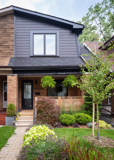
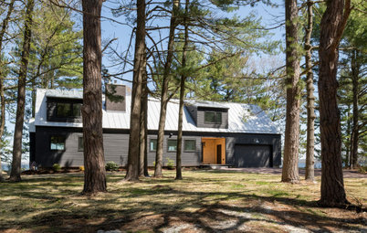
Here’s the front of the row house. Its 14½-foot width makes it one room plus a hallway wide. In getting to know their clients’ needs and style, Panchapakesan and her husband, architect Brian Hagood, had lots of conversations with them. They also studied the couple’s inspiration photos. Then they created 3D renderings to share what they had in mind. While giving the house a fresh look, they were also sensitive to the home’s existing features, working with elements such as the oak hardwood flooring and wood trim.
Find a local architect on Houzz
House at a Glance
Who lives here: A couple and their two young children
Location: Toronto
Size: 1,300 square feet (121 square meters); three bedrooms, 2½ bathrooms
Architects: Brian Hagood and Charisma Panchapakesan of CAB Architects
Here’s the front of the row house. Its 14½-foot width makes it one room plus a hallway wide. In getting to know their clients’ needs and style, Panchapakesan and her husband, architect Brian Hagood, had lots of conversations with them. They also studied the couple’s inspiration photos. Then they created 3D renderings to share what they had in mind. While giving the house a fresh look, they were also sensitive to the home’s existing features, working with elements such as the oak hardwood flooring and wood trim.
Find a local architect on Houzz
Before Photo
Before: “In many of these Toronto row houses, the living room is in the front, the kitchen is in the back and the dining space is in between,” Panchapakesan says. “But the problem is, in winter we need somewhere with a tiled floor to take off boots and heavy coats as we come in, and it can make an adjacent living room space feel messy.”
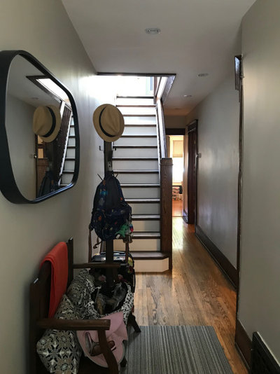
Also, note the wall that created a narrow hallway along the staircase in this photo — the architects removed it to open up the floor plan.
Also, note the wall that created a narrow hallway along the staircase in this photo — the architects removed it to open up the floor plan.
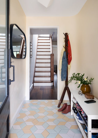
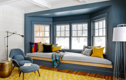
After: The architects designed a front entry with room for shoes and coats. It measures 4 feet, 9 inches by 8 feet, 6 inches. “These clients love pattern and color, so we used diamond-shaped tiles in three colors to create the pattern,” Panchapakesan says. The light fixture plays off the shape of the tiles, and the buttery yellow walls add a cheerful touch.
Before Photo
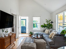
Before: Here’s the front living room before the remodel. The family didn’t have enough space to hang out together in here. The next room in the center of the plan was the dining room, with the kitchen at the back of the house.
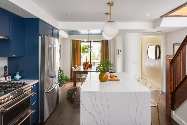
After: The windows seen in the previous photo are the windows seen here. To give the living room more space, the architects placed the dining room at the front of the house, the living room in the back and the kitchen in the middle. They removed some walls to give the home a more open and airy feel.
They also designed a curved wall for the entryway, seen on the right side of this photo. “The challenge in these row houses is that daylight only comes in from the front and back. We wanted the rooms to feel distinct but also keep things open to share that light,” Panchapakesan says. “The curved wall wraps the light and takes it around the corner. It also helps to make the narrow space feel more dynamic.”
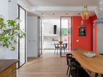
One way the architects delineated the spaces was through the ceilings. At the same time, they integrated the ductwork in a way that felt intentional. “We made those bulkheads look purposeful, which made things more quiet,” Panchapakesan says. In the dining room, they integrated a bulkhead into a tray ceiling design. Then they painted the ceiling a greenish blue-gray color.
They also designed a curved wall for the entryway, seen on the right side of this photo. “The challenge in these row houses is that daylight only comes in from the front and back. We wanted the rooms to feel distinct but also keep things open to share that light,” Panchapakesan says. “The curved wall wraps the light and takes it around the corner. It also helps to make the narrow space feel more dynamic.”
One way the architects delineated the spaces was through the ceilings. At the same time, they integrated the ductwork in a way that felt intentional. “We made those bulkheads look purposeful, which made things more quiet,” Panchapakesan says. In the dining room, they integrated a bulkhead into a tray ceiling design. Then they painted the ceiling a greenish blue-gray color.
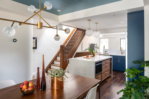
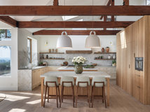
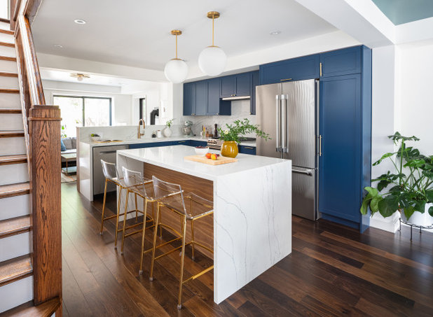
A sculptural chandelier also helps define the dining room, and the globe pendants over the island help delineate the kitchen.
When looking through her clients’ inspiration photos, Panchapakesan noted that they liked the idea of mixing wood, a color and stone in the kitchen. So she and Hagood found a way to balance marble-like quartz, blue cabinetry and walnut accents. “Using the walnut on the island base tied it in with the flooring and the stairs,” she says. “We wanted the new design to be consistent with the existing house.”
Shop for a modern chandelier
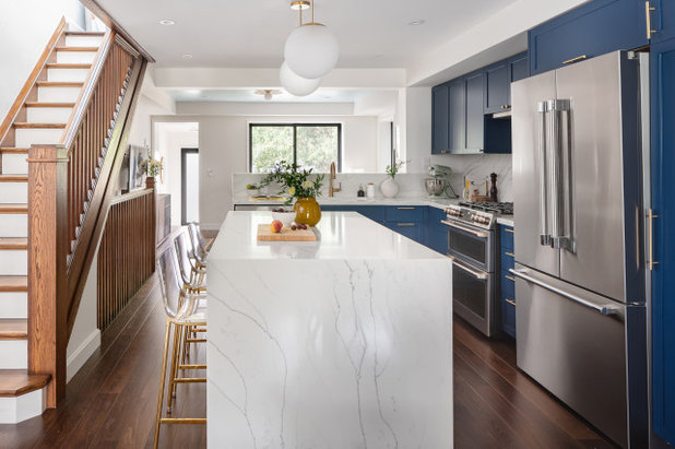
The island’s waterfall counter delineates the kitchen space and gives it a clean edge to view from the other rooms. “The island is an object on its own,” Panchapakesan says.
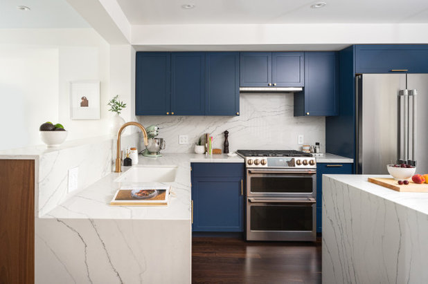
Using the quartz on the waterfall island, the backsplash and to wrap the side of the cabinetry created a clean and cohesive look.
A high backsplash behind the sink provides separation from the living room. “It also allows them to retire to the living room without having to look at a mess of dishes after dinner,” Panchapakesan says.
Before Photo
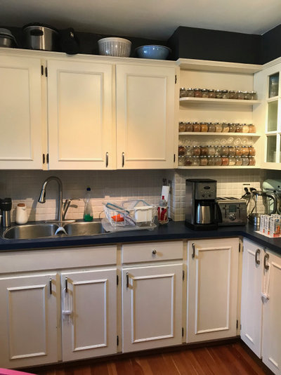
Before: The kitchen was at the back of the house and was closed off from the adjacent dining room.
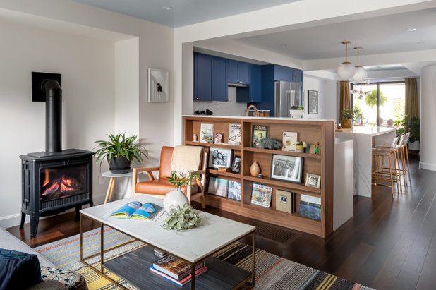
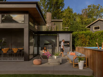
After: Now the living room enjoys the larger space at the back of the house. A new gas stove keeps the living room toasty. The marble coffee table plays off the quartz in the kitchen. And the rug adds color and a playful stripe pattern.
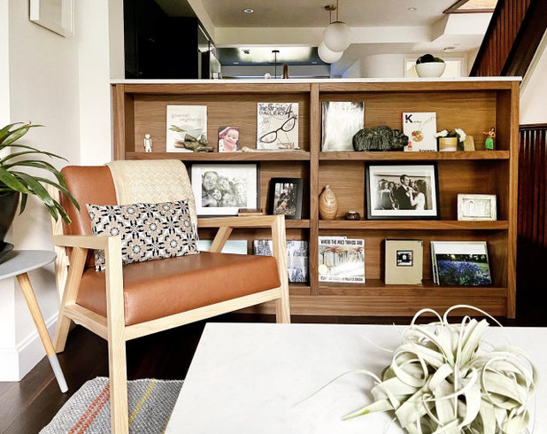
The back side of the kitchen backsplash provided a good spot for display, something the house had lacked before. The walnut shelves are shallow — had they been as deep as standard bookshelves, they would have taken up too much space in the living room. Instead, they function more like picture rails.
Hire a local carpenter
Hire a local carpenter
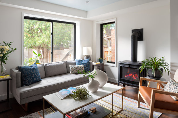
The architects also added larger new windows to let in more light. They’re double-glazed aluminum-clad wood windows. “These windows are good quality and retain the heat,” Panchapakesan says.
Windows: Marvin
Windows: Marvin
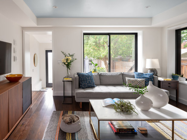
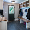
Pale blue paint on the ceiling serves to further define the living room space. To the left, a mudroom leads out to the garden.
Browse coffee tables in the Houzz Shop
Browse coffee tables in the Houzz Shop
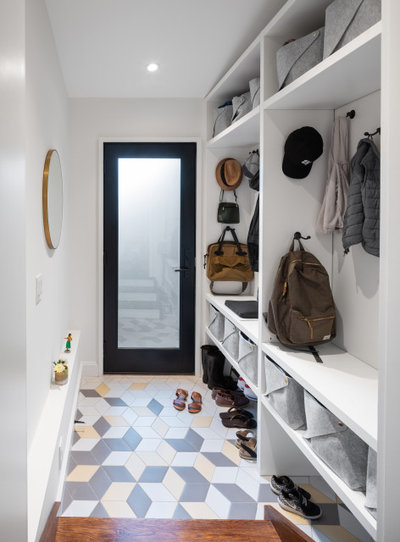
The mudroom was existing but Panchapakesan freshened it up with new tile and built-ins. “We nodded to the entry by using the same tile pattern but switched the colors to gray and yellow,” she says. A new glass door brightens the space with natural light.
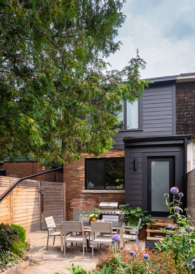
Here’s how the new windows look on the back facade of the house.
Not sure where to start on your home project? Click here to learn the basics
Not sure where to start on your home project? Click here to learn the basics
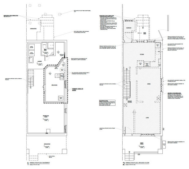
Before: The drawing on the right shows the demolition plans for the main floor. The living room was in the front (at the bottom of the plan), and the kitchen was at the back (on the top of the plan), with the dining room between them. The walls the architects removed are marked with dashed lines.
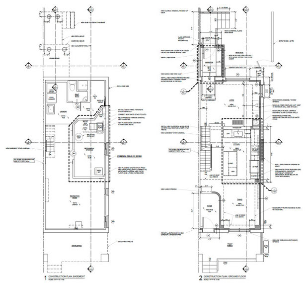
After: The plan on the right shows the new layout, with the new curved entry wall and dining room at the bottom, the living room in the back and the kitchen between the two.
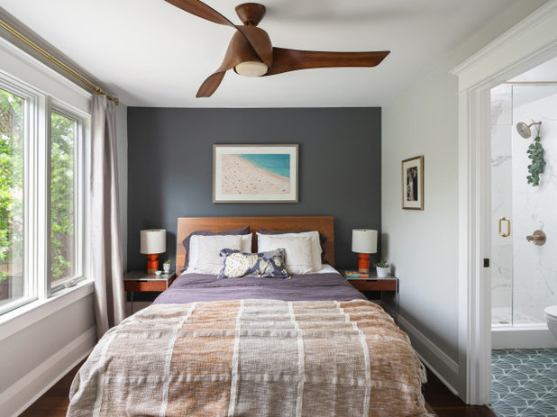
Upstairs, there had been three bedrooms and just one family bathroom off the hallway. One of the main reasons the couple originally wanted to add on to the house was to gain a proper primary suite. The architects moved the couple’s bedroom from the front of the house to the back and reconfigured the existing hall bathroom to be en suite. Then they reconfigured the other spaces to make room for a new hall bathroom for the children.
“This bedroom is compact but it had enough room for their queen-size bed, and now they have the primary bathroom they wanted,” Panchapakesan says. They also gave the room larger new windows and a wall of closets.
“This bedroom is compact but it had enough room for their queen-size bed, and now they have the primary bathroom they wanted,” Panchapakesan says. They also gave the room larger new windows and a wall of closets.
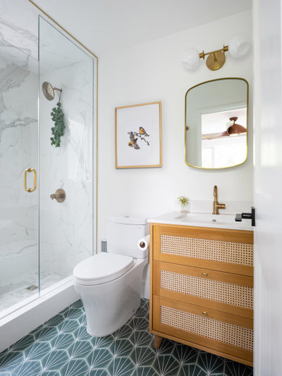
“They wanted a coastal beachy feel in their bathroom,” Panchapakesan says. She designed a custom white oak vanity with caning, and the couple chose a geometric green tile for the floor. The fixtures are satin brass.
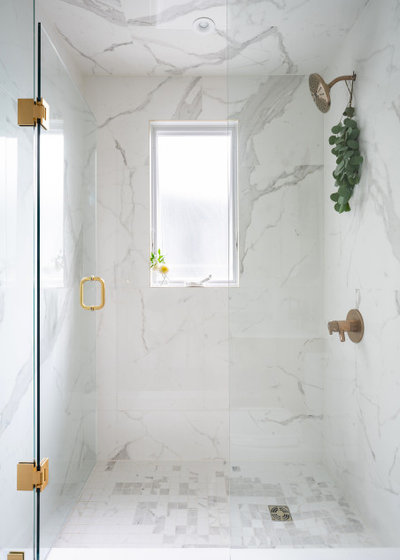
The tiles in the shower are large-format porcelain, digitally printed to look like marble. They also cover the ceiling for a clean look. A clear glass enclosure lets the whole room enjoy the light from the frosted window.
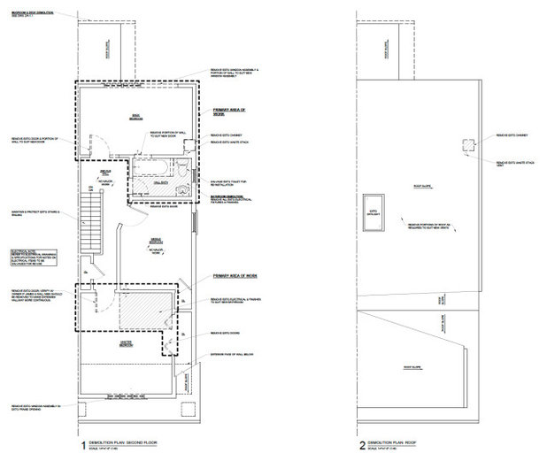
Before: The drawing on the left is the demolition plan for the second floor. The bold dashed lines represent the areas where the architects made changes.
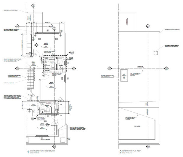
After: The plans on the left emphasize the locations of the bathrooms with bold dashed lines.
“This renovation was a more modest way to give them the space they needed without having to add on,” Panchapakesan says. Now the house is filled with light and warmth and better suits the family’s lifestyle.
More on Houzz
Tour more homes
Hire a local design pro
Shop for your home
“This renovation was a more modest way to give them the space they needed without having to add on,” Panchapakesan says. Now the house is filled with light and warmth and better suits the family’s lifestyle.
More on Houzz
Tour more homes
Hire a local design pro
Shop for your home


Related Products


Ferguson showrooms are where your plans of a dream home turn into a reality. Ferguson showrooms are the place to... Read More
Related Stories
Guesthouses
Houzz Tour: Light-Filled 704-Square-Foot Modern Cottage
By Becky Harris
An architect and a designer create a light and airy feel, cozied up by layers of textures
Full Story
Houzz Tours
Houzz Tour: New Home Gets a Midcentury Modern Makeover
By Julie Sheer
A designer in Boston reworks the kitchen and primary suite and adds style with furnishings, lighting and more
Full Story
Homes Around the World
Houzz Tour: Family Says No to Relocating in Favor of Remodeling
An architect helps a family in Rome bring light, color and natural materials into their apartment
Full Story
Houzz Tours
Houzz Tour: Modern Home With Awesome Views in Big Sky Country
A home overlooking the Missoula Valley is designed for both family time and large gatherings
Full Story
Houzz Tours
Houzz Tour: Modern Mountain Home in the Cascades
By Becky Harris
A designer and an architect mix clean lines with natural colors and materials to create a warm and inviting home
Full Story
Rustic Style
Houzz Tour: Rugged Modern Style on a Montana Lake
By Becky Harris
Architects design a home, a guesthouse and outdoor areas that capture the site’s magic and stunning views
Full Story
Vacation Homes
Houzz Tour: California Wine Country Retreat for Family and Guests
By Julie Sheer
Architects found on Houzz design a multigenerational vacation home and ADU with vineyard views
Full Story
Houzz Tours
Houzz Tour: Architects Bring Order to an 1,100-Square-Foot House
By Becky Harris
A remodel and new addition improve a Toronto home’s flow while adding storage and maximizing natural light
Full Story
Houzz Tours
Houzz Tour: Japanese Calm on the Outside, Drama on the Inside
By Becky Harris
An architect infuses a midcentury home in San Francisco with dramatic and otherworldly moments
Full Story
Vacation Homes
Houzz Tour: Modern Design Meets Local Character on Lake Champlain
Clean lines, a claw-foot tub, a sunken living room and a fresh palette mix it up in a lakefront home in Vermont
Full Story
@BeckyHarris, way to make lemonade out of lemons!😂 Yes, I know it’s just a fact in all these narrow row homes, Toronto, Philly, Baltimore….we are just used to having more space. (But I did grow up in a house where we only had one potty for 4 family members….how did we do that?) I was really thinking of guests having to look for the loo on another floor etc. We have 4 full baths in our (almost 5000 sf) house, but no powder room, which is very annoying for my son and DIL, I’m sure, when we have larger gatherings….they always have to neaten up their bathroom for other guests. (The bathroom is an en suite that also opens to the hallway.) Even with 2500 sf on the main level there is no way to squeeze in a powder room…As my daughter would say: first world problems, Mom!
@coray, haha! And back in the day, a lot of row houses around the world only had an outhouse out back, right? This family, like a lot of others in similar homes, have a finished basement with a bathroom too, so I imagine that would be a good one for guests to use.
Yes, Becky, I’m sure that’s fine with guests and still fairly convenient. When i was a child (70s) we would go visit my dad’s family in East Germany, where his sister’s home had only an outhouse…..it was so creepy to me! And one of my (West) German friends lived in a rural area and also had only an outhouse….and now we’re all so pampered! (Myself included☹️)