


Tired of White Walls? How to Add Color With Confidence
Five experts share design ideas for transitioning from all-white walls to rooms infused with color

If your plain white walls are getting you down, perhaps it’s time to dip your toes into the world of color. Does the thought of it sound terrifying? Fear not — we spoke with five color and design experts to find out how to go about it.
Homeowners are often nervous about venturing beyond white walls, says Frances Cosway, design director at White Pebble Interiors. “They worry the color will date. They’re also unsure how to blend and coordinate colored walls with other elements in the room.”
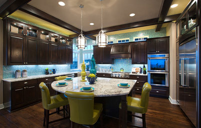
Color as a Decorating Tool
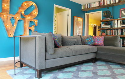
In addition to lifting the mood of a room, color can also detract from less-than-perfect features or highlight ones you love, says Bec Farrow, interior design consultant at Elska Interiors. “When you paint the wall around a window in a dark tone, for example, the wall appears to recede and the view becomes a focal point.
In addition to lifting the mood of a room, color can also detract from less-than-perfect features or highlight ones you love, says Bec Farrow, interior design consultant at Elska Interiors. “When you paint the wall around a window in a dark tone, for example, the wall appears to recede and the view becomes a focal point.
“Contemporary furniture can be paired with historical architecture when the building is painted in a modern color palette, and vice versa. Open-plan spaces can be given depth by using different colors in the different zones, and you can soften the line between inside and out by running the same color through both areas,” Farrow says. “Color is without a doubt one of the most useful tools in your design kit.”
Boosting Your Color Confidence
“Here’s the thing with paint — if you get a color wrong, you can always paint over it,” Fleming says. “Ideally, you won’t have to, but knowing this can give you the confidence to experiment with new things, which can sometimes lead to unexpected and happy surprises. The key to getting color right is to test it with swatches and larger patches on your walls first.
“Be sure to look at these samples at different times of day and with the lights on and off, as the colors and tones will change in different light conditions,” he says.
A Little Goes a Long Way
Fear not, you don’t need to use color on every wall to make an impact, says Alexandra Ferguson, creative director at Alexandra Marie Interiors. “Small amounts of color can inject warmth, personality and energy into a space and are sometimes all you need to refresh a scheme without having to go to the trouble or expense of a full decorative overhaul.”
Fear not, you don’t need to use color on every wall to make an impact, says Alexandra Ferguson, creative director at Alexandra Marie Interiors. “Small amounts of color can inject warmth, personality and energy into a space and are sometimes all you need to refresh a scheme without having to go to the trouble or expense of a full decorative overhaul.”
Start Small
If diving into the world of color feels daunting, begin with baby steps, Farrow says. “Try soft, muted colors. … They will give you the satisfaction of color but are a gentle transition from a neutral.
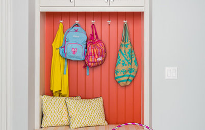
“The back wall of a study nook, a child’s reading area, a bathroom or powder room are all fantastic places to start adding color with paint or wallpaper without going gung-ho. If you’re keen to try the permanency of tiles, add them to a bathroom niche or laundry backsplash. They’re tiny spaces so the investment is small and the installation time fleeting,” Farrow says.
Shop for bathroom vanities on Houzz
If diving into the world of color feels daunting, begin with baby steps, Farrow says. “Try soft, muted colors. … They will give you the satisfaction of color but are a gentle transition from a neutral.
“The back wall of a study nook, a child’s reading area, a bathroom or powder room are all fantastic places to start adding color with paint or wallpaper without going gung-ho. If you’re keen to try the permanency of tiles, add them to a bathroom niche or laundry backsplash. They’re tiny spaces so the investment is small and the installation time fleeting,” Farrow says.
Shop for bathroom vanities on Houzz
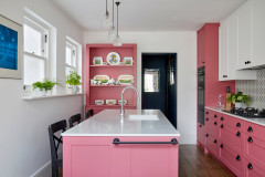
“If you want to push yourself and go bigger with color, consider adding wallpaper to one or more walls in your kids’ bedrooms, painting a wall behind a bed —try a fun shape like an arch or a house — or creating an ombre wall,” Farrow says.
“Adding a block of your favorite color to a bedroom wall, behind the television or the front door are all great places to start your color journey,” says Andrea Lucena-Orr, color and communications manager at paint company Dulux Australia. “Or add it to a home office, study or an often dim and overlooked spot such as a powder room.”
“Neutrals are a great alternative to white as they’re adaptable, will go with most colors and feel like a safe option if you’re looking to add color to your walls,” Lucena-Orr says.
How to Choose a Color
“Think about how you use the room, how much time you spend in it and what its main purpose is. This can dictate the direction you go with your color choices,” Fleming says. “For example, in a TV area that you only use in the evening, navy can create a sense of coziness.”
Farrow concurs. “If you’re choosing a color for a bedroom, a soft, quiet hue might be appropriate. Whereas a space like a playroom calls for some fun pops of color,” she says.
Fleming adds, “Also remember, rooms don’t have to all be the same color — each serves a different purpose and deserves its own personality.”
And don’t forget the influence lighting has on color, Farrow says.
Considerations include:
Considerations include:
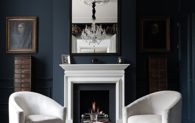
- If your room is dark and north-facing, adding a dark color will enhance this, which is fine if you’re looking to create a room filled with drama.
- Consider whether you need to soften the light bounced back into the room or enhance it. Adding light, bright colors will help bounce light back into a space.
- When choosing a color, take into account colors already in the room, such as the flooring, brickwork, sofa or adjoining kitchen cabinetry. Placing two colors together can reflect color onto the other surface. For example, a deep red might throw pink onto an adjoining wall or it could amplify a color in the other material, creating a clash.
Where to Look for Inspiration
No clue where to start when it comes to color? For ideas, Farrow suggests looking to:
No clue where to start when it comes to color? For ideas, Farrow suggests looking to:
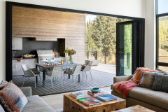
- Your natural environment. “The perfect place to find colors that ground and soothe your soul, whether it’s the turquoise of the ocean or a [tree] in your backyard.”
- Houzz. “When starting a project, I always ask clients to show me images they love on Houzz. You quickly start to see patterns emerging of the colors they love. A quick look at the photos on Houzz will not only give you ideas of where to start when it comes to picking colors, but it will also remove the options you don’t like.”
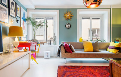
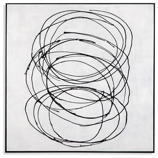
- Art. Painting your wall in one of the minor colors in an artwork can make the piece pop and give a curated, designer feel to a room.
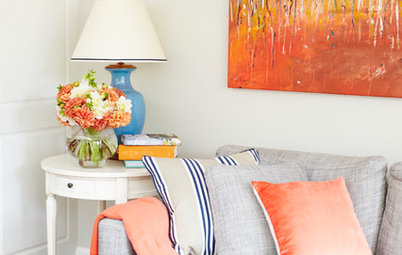
- Favorite fabric. If you have a favorite furniture piece upholstered in a colored fabric, create a tonal space by picking a wall color a shade away from it.
- Plants. If you’re a plant lover, look for a color that makes the green of your plants sing.
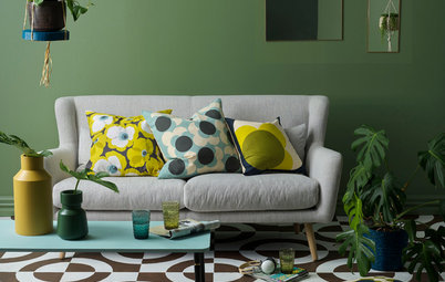
Trending Colors
Nurturing, grounded colors are popular in 2022, Farrow says. “The impact of global events over the past couple of years has seen people reaching for comfort and that’s playing out in interiors as well. While bright white won’t go away, it will take a step back to see warm whites, nature-drawn colors and earthy tones with a little charcoal take center stage.”
Nurturing, grounded colors are popular in 2022, Farrow says. “The impact of global events over the past couple of years has seen people reaching for comfort and that’s playing out in interiors as well. While bright white won’t go away, it will take a step back to see warm whites, nature-drawn colors and earthy tones with a little charcoal take center stage.”
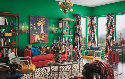
Greens are Farrow’s pick for 2022 whether your style is traditional, Scandinavian, contemporary or boho.
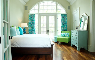
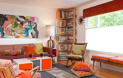
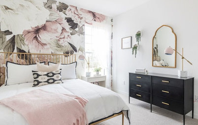
“A bit lower on the trend radar, and possibly fleeting, are retro color palettes of playful pastels and warm, muted ’70s colors,” she says.
“Regardless of trends, if you’re not planning to sell your home, whatever brings you happiness is where you should be heading.”
“A bit lower on the trend radar, and possibly fleeting, are retro color palettes of playful pastels and warm, muted ’70s colors,” she says.
“Regardless of trends, if you’re not planning to sell your home, whatever brings you happiness is where you should be heading.”
“Other colors coming through are deep, earthy browns, which add warmth to a space, and soft buttery yellow,” Fleming says.
Texture is another big trend, he says. “Lime washes, French washes and Venetian plasters are also having a moment, led by a desire to create homes that feel more organic. They are a beautiful and timeless way to add visual movement to a wall.”
Texture is another big trend, he says. “Lime washes, French washes and Venetian plasters are also having a moment, led by a desire to create homes that feel more organic. They are a beautiful and timeless way to add visual movement to a wall.”
Your turn: Have you added color to your walls? Tell us in the Comments which hue you chose and how it looks.
More on Houzz
Read more about designing with color
Get more home design ideas
Find and hire pros in your area
Shop for furniture and other products
More on Houzz
Read more about designing with color
Get more home design ideas
Find and hire pros in your area
Shop for furniture and other products


Find an interior designer or decorator near you