


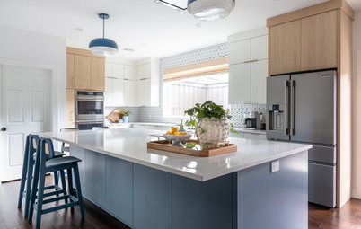
Before and After: 3 Kitchen Remodels That Go for the Green
See how vibrant shades of green on cabinets and islands bring energy to these kitchen makeovers

If you want a bold, energetic color for your kitchen cabinets and islands, green might be the way to go. Check out the before-and-after photos of the following kitchen makeovers and see how green livens up a galley kitchen, pairs perfectly with a copper hood and brings in lush outdoor views.
Let us know in the Comments if your future kitchen remodel might go for the green too.
Let us know in the Comments if your future kitchen remodel might go for the green too.
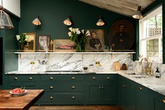
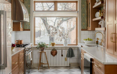
After: Jones pushed the wall near the staircase back a few feet to gain valuable space. The corner now accommodates more cabinet and counter space. With the exception of this small area, the footprint of the kitchen stayed the same. “I knew we weren’t going to do a big addition off the back of the house. So I couldn’t go out, but I could go up,” Jones says. “In larger kitchens, those high upper cabinets often are more for decoration. But in a tiny kitchen, they need to be accessible every day.”
Jones maximized storage in the lower cabinets by adding a blind corner insert that pulls out for easy access. Another smart storage solution is hiding in the fridge surround. It contains a slim broom cabinet, accessible by touch-release hardware.
Green cabinet paint: Webster Green, Benjamin Moore; white cabinet paint: Dover White, Sherwin-Williams

Need a pro for your kitchen remodeling project?
Let Houzz find the best pros for you
Let Houzz find the best pros for you
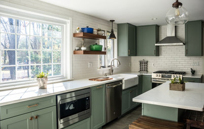
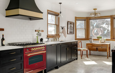
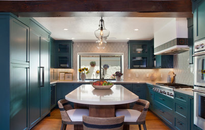
After: Jones moved the sink to the left to free up counter space next to the range. The new sink is a workstation model that comes with inserts such as racks and cutting boards that transform it into additional prep space.
The clients had recently invested in a vent hood that could be concealed behind cabinet doors. The hood allowed Jones to add more cabinets above the range, including two with brass mesh doors.
A brass railing and library ladder allow the homeowners to reach the top cabinets, eliminating the need for a step ladder.
Sink: 33-inch Contempo fireclay, Bocchi
Browse white farmhouse sinks in the Houzz Shop
Read more about this kitchen remodel
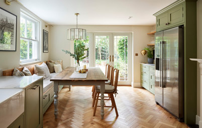
2. Pretty as a Penny
Kitchen at a Glance
Who lives here: A professional couple and their dog
Location: Riverbank, California
Size: 165 square feet (15 square meters)
Designer: Lindsay Kjellberg of LHK Interiors
Builder: Scott Monday of Kitchen & Bath Crate
Before: The homeowners loved the rich copper hood in their Northern California kitchen, but just about everything else needed to go. They wanted to ditch the knotty oak cabinets, laminate countertops and backsplash, red walls, aging appliances and brick flooring.
They hired designer Lindsay Kjellberg and builder Scott Monday to reimagine the space with a more modern color scheme, including two different shades of green, one for the lower cabinets and another for the island.
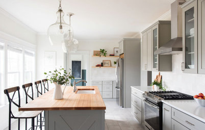
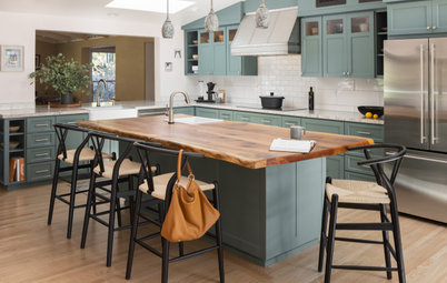
After: Kjellberg and Monday kept the range hood but removed everything else. They worked within the existing footprint but relocated some of the appliances.
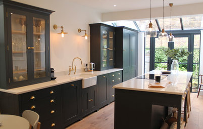
New custom Shaker-style cabinets feature a two-tone scheme. Light gray uppers (Worldly Gray by Sherwin-Williams) join white quartzite countertops and white zellige-style backsplash tile to give the space a bright look. Gray-green lower perimeter cabinets (Adaptive Shade by Sherwin-Williams) and a dark, rich green island (Rosemary by Sherwin-Williams) provide a moody base, while the red oak flooring anchors the room in warmth.
Knobs and pulls in an antique copper finish complement the range hood, as do the hammered copper shades of the pendant lights that descend from a skylight well. The shades have a patina with a good amount of green in it, Kjellberg says, which ties in with the green hues in the cabinetry.
Before: In the previous kitchen, cooking functions were split between a gas cooktop, shown here, and double wall ovens located out of view. The copper range hood was a big draw, but Kjellberg and the homeowners thought the switches just below it looked out of place.
How to Get Your Range Hood Right
How to Get Your Range Hood Right
After: Kjellberg and the homeowners chose to combine the cooking functions in a new 36-inch standard-depth stainless steel dual-fuel range. The appliance features a nonstick griddle and has Wi-Fi capability.
The remodeling team gave the copper hood a good cleaning and relocated the switches.
The zellige-style 5-by-5-inch white ceramic backsplash tiles have a smooth, glossy finish in varying shades. “I love that these tiles have different shades of white,” Kjellberg says. “Some are creamy undertones, some have gray. There are also bits of green, which I thought worked perfectly with the green we already had in the color scheme.”
Tile: Cloe in white, Bedrosians Tile and Stone
Read more about this kitchen remodel
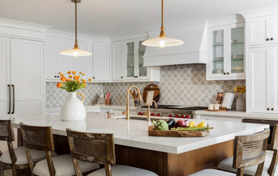
3. From Dark and Dingy to Open and Green
Kitchen at a Glance
Who lives here: Eugene and Janet Wang
Location: Oxnard, California
Size: 220 square feet (20 square meters)
Designer: Megan Paulson of 22 Design House
Before: While the G-shaped layout of their kitchen worked for these Southern California homeowners, that’s about all the space had going for it. The peninsula was too short. The wood cabinets were too dark. The white tile countertops, aging white appliances and worn-out linoleum flooring had seen better days.
But what made the kitchen feel more cramped than anything else were the upper cabinets that physically and visually separated the kitchen from the breakfast area.
The homeowners hired designer Megan Paulson to visually open up the kitchen to the breakfast area and use a color palette that would make the space feel more modern and connected to the verdant outdoor views.
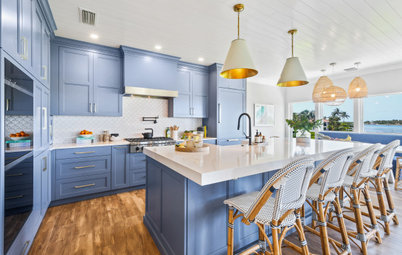
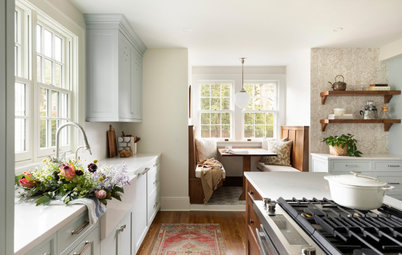
After: Paulson removed the old appliances, sink, faucet, flooring and some of the cabinets, including the upper units over the peninsula. She was able to repurpose some of the original cabinets. “With the original cabinets we kept, we sprayed them warm white inside to give them a fresh look and match the interiors of the new custom cabinets,” Paulson says.
The new custom paint-grade wood cabinets and drawers and the repurposed units are a welcoming shade of green (English Holly by Dunn-Edwards). “It has a richness to it without being too dark or too heavy,” Paulson says.
She also widened the peninsula to fit a new slide-in range and widened the openings into the breakfast area and TV room. “We couldn’t take down any walls to make it one grand space, and that’s not what she wanted anyway,” Paulson says. “This gives the illusion of an open space.”
Large-format (12-by-24-inch) sand-colored porcelain floor tiles have a matte textured finish and the look of limestone.
Custom cabinets: Julio’s Fine Cabinetry; flooring: Consulate, Daltile
Before: Heavy upper cabinets made the kitchen feel dark and closed off from the breakfast area and blocked light from a sliding glass door. The bright coral walls were also a little too intense for the space.
After: With the upper cabinets gone, the kitchen shares a better connection — and more light — with the breakfast area.
The 30-inch dual-fuel slide-in range has downdraft ventilation and a convection oven. “They just had an electric cooktop there before,” Paulson says. “I widened this peninsula almost all the way to the sliding door so we could have room for this range.”
Warm tan walls (Stucco Tan by Dunn-Edwards) and the off-white ceiling, trim and pocket door (Swiss Coffee by Dunn-Edwards) combine to create a neutral backdrop for the green cabinetry.
Read more about this kitchen remodel
More on Houzz
Read more kitchen stories
Browse kitchen photos
Hire a kitchen remodeler
Shop for kitchen products


Kitchen at a Glance
Who lives here: A couple
Location: Atlanta
Size: 150 square feet (14 square meters)
Designer and builder: Meka Jones of Copper Sky Design + Remodel
Before: This Atlanta couple love to cook and prepare almost all their meals in their 1930s bungalow home. Making their small galley kitchen as efficient as possible was a top priority when they reached out to designer and builder Meka Jones.
The former kitchen lacked cabinet and countertop space. “Everything was so out in the open that my clients never felt like the kitchen was clean, even right after they had just finished cleaning it,” Jones says.
Jones was also tasked with packing the room with lots of green, brass and a bold style inspired by the architecture of the bungalow and the homeowners’ love of Art Deco.
Hire a local design-build firm on Houzz