


Houzz Tours

Houzz Tour: Home Reimagined as a 3-Level Treehouse
A designer found on Houzz helps a couple bring nature views into their downtown Seattle home

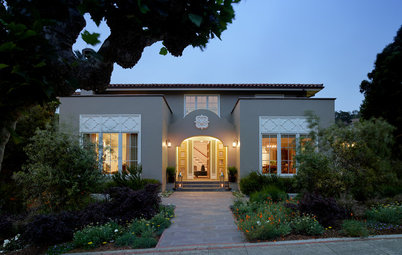
This three-level home in the Pacific Northwest is nestled in trees yet sits in the middle of a large city. The owners of the home in Seattle’s Central District had great views but craved even more. They wanted to create a kind of urban treehouse, and they enlisted designer Kristine Tyler of Treefrog Design to help. “The idea was they wanted to bring the outside in, really kind of accentuate the idea of being surrounded by trees and nature in the middle of downtown,” Tyler says. The home had burned down and been rebuilt in 1984 and was possibly remodeled in the early-to-mid-2000s, she says. The owners found Tyler on Houzz and hired contractor Jason Miller of Wall Tek to do the renovation and make the home more functional, with that sense of living amid the leaves.
Before: The kitchen had a wall cutout to the dining room, but it still felt closed in and there wasn’t much of an eating bar.
After: Removing the partial wall brought in much-needed light. Tyler used pleasing tones of aqua for the backsplash tile, light wood for the cabinets and pale gray counters to give the kitchen a more modern, airy feel and to help focus on the view of the trees. “We wanted to lighten the interior up and bring that feeling of nature into the kitchen,” she says.
Shop for wall tile on Houzz
Shop for wall tile on Houzz
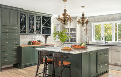
Before: The existing kitchen had dark cabinets, white stone countertops and a mid-1990s vibe. “The previous kitchen wasn’t horrible, but it didn’t reflect their taste at all,” Tyler says.
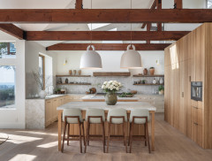
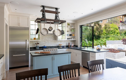
After: The team replaced the peninsula with a functional island that includes a larger eating bar, a dishwasher, a trash drawer and storage cabinets. The design allowed the owners to keep the existing double oven and add a new microwave with a powerful range hood over the cooktop. Tyler says the owner understood the space limits of the kitchen. “She was at peace with the fact that the kitchen was the space it is, and we said let’s make it as functional as possible.”
The team installed a skylight over the sink and a new pendant light to really brighten up the space. They replaced the windows with versions that provide even better views of the trees.
Tile: Fez in Emerald gloss, WOW; counters: Paloma, PentalQuartz; cabinets: Bellmont Cabinet
Tile: Fez in Emerald gloss, WOW; counters: Paloma, PentalQuartz; cabinets: Bellmont Cabinet
Removing the partial wall allowed for a better connection between the kitchen and dining area, where the team painted, replaced the windows and flooring, added cabinetry and installed a new chandelier.
This photo shows the other side of the kitchen and dining room, as well as the walkway that bisects the kitchen. Before the remodel, the refrigerator partially blocked the area between the dining room and kitchen. The new design allowed for a built-in fridge, in the same location but better suited to the space. “We built it in and made it flush to the wall. There is still a wall that separates the refrigerator from the pantry, but we wrapped it with a cabinet panel to keep the built-in look,” Tyler says.
Before, there was a closet with shelving that served as a pantry. “Things were getting lost in the back,” Tyler says. “We replaced the closet with tall built-ins with rollout shelving for a more customized look and a better storage solution.”
Before, there was a closet with shelving that served as a pantry. “Things were getting lost in the back,” Tyler says. “We replaced the closet with tall built-ins with rollout shelving for a more customized look and a better storage solution.”
This is the floor plan for the second-level kitchen and dining area. It also includes a newly remodeled powder room.
Tyler created a jewel box of a powder room. “Everything was replaced,” she says. “We painted, got new lighting, hardware and flooring.” She riffed on the treehouse theme with a textured melamine vanity in a driftwood finish, with a chunky fireclay sink and a foliage-green handmade tile backsplash.
Vanity: Mpro 28-inch vanity with basin and organizer in Driftwood, Crosswater London; tile: Pratt + Larson
Vanity: Mpro 28-inch vanity with basin and organizer in Driftwood, Crosswater London; tile: Pratt + Larson
Before: The living room before the remodel had a fireplace in one corner, next to a sliding glass door leading to a patio. A television dominated one of the walls. It wasn’t a terrible space, but it wasn’t the vibe the new homeowners were seeking.
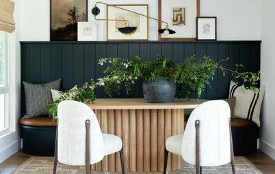
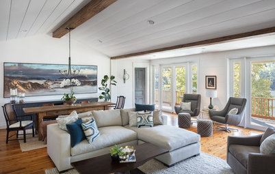
After: The homeowners were fine with removing the fireplace and adjacent wall to add more windows. “This brought in a lot of light and opened up the view,” Tyler says. The team replaced the flooring, wrapped an existing ceiling beam in wood and added another beam over the French doors, which lead to a home office surrounded by windows. New floor-to-ceiling windows provide the requisite tree canopy views from a cozy reading nook and multiple seating areas.
“They said, ‘We’re not fireplace people; we want a reading nook and want windows so it feels like we’re reading in a treehouse.’ That area there with the trees and the skyline is a really beautiful place to sit,” Tyler says.
“They said, ‘We’re not fireplace people; we want a reading nook and want windows so it feels like we’re reading in a treehouse.’ That area there with the trees and the skyline is a really beautiful place to sit,” Tyler says.
There’s plenty of natural light and treetop views through a new corner window in the living room’s reading nook, located where the fireplace used to be. The homeowners had the window shades replaced throughout the living area.
This corner of the living room made a perfect spot for a conversation area with cozy club chairs and coffee table.
Pro tip: Tyler advises getting samples of materials to test in your space, rather than relying on how something looks in a store, online or in an artistic rendering. A color may look entirely different in the ambient and natural light of your home.
Pro tip: Tyler advises getting samples of materials to test in your space, rather than relying on how something looks in a store, online or in an artistic rendering. A color may look entirely different in the ambient and natural light of your home.
This scenic spot is the landing between the second and third levels. The team installed a larger window to bring in natural light and gave the space new flooring and paint. A twisted wood table is a natural accent, and gallery walls display the husband’s photos from the couple’s world travels. “I love the landing because they brought in a bigger window that went to the floor and it’s centered on another tree. I felt like that really accomplished what they set out to do,” Tyler says.
Before: On the third-floor landing, a door to the left went to the primary bedroom and a hall to the right led to a “passage room” with a primary closet on one side and bath on the other. “The master bath and walk-in closet needed to be replaced,” Tyler says.
After: The layout changed pretty dramatically on the third level. “They reframed a lot of things to get what they wanted,” Tyler says. The existing closet in the primary bedroom was turned into a dressing room with additional closet space. The old passage room and primary bath were converted into one large primary bath with a walk-in shower replacing the tub-shower combination.
Before: The primary bath area before the remodel consisted of a passage room with a small skylight and dresser and a bathroom with a tub-shower combo, small vanity and toilet.
After: The primary bathroom layout was reconfigured into one big space, with a new walk-in shower and bench, new window, an alcove for the toilet, a towel warmer and vanities on opposite walls. “They wanted a spa bathroom, with a large walk-in shower, and wanted his-and-hers vanities,” Tyler says.
She worked closely with the homeowners on the design to get exactly what they wanted. “There was a lot of tile and decisions made in that bathroom,” she says. She kept the treehouse theme going with rift white oak cabinets and an accent wall of tile in varying shades of green, focusing on details like a tiled border around the mirrors with built-in lights.
Vanity cabinets: rift white oak in Bourbon Finish, Bellmont Cabinet; countertop: Cuddington, Cambria; makeup mirror: Aptations
Before: This shot of the primary bath before the renovation looks through the doorway from the shower to the passage room.
After: This photo was taken from the shower looking toward the entrance to the bathroom. The new primary closet is on the other side of the new frosted glass door.
Before: Though the primary bedroom had commanding views of the downtown Seattle skyline through sliding glass doors, the room’s features and decor were in need of updating.
After: The new primary bedroom takes full advantage of treetop and city views through new and additional windows and French doors that replaced the slider. The team also painted and installed new carpet.
More on Houzz
Tour more homes
Find design and remodeling professionals
Shop for your home
More on Houzz
Tour more homes
Find design and remodeling professionals
Shop for your home


House at a Glance
Who lives here: A couple
Location: Central District of Seattle
Size: 2,120 square feet (197 square meters); two bedrooms, 2½ bathrooms
Designer: Kristine Tyler of Treefrog Design
Contractor: Jason Miller of Wall Tek
“They wanted it to be where, when you entered at ground level, that’s like the roots of the tree, so we brought in some taupe and brown tones, and they wanted it to be more green as you went up,” Tyler says. Starting at the ground level, she made sure the guest bath, shown here, had that blend, with taupe and green tile and woodsy cabinetry. “The whole thing is supposed to be earth tones, accenting the outside when inside,” Tyler says.
With its praline stain wood cabinets and glossy mix of tile, the guest bath is a fitting introduction to the tree house theme. “We wanted to spruce it up, make it feel special,” Tyler says. The first level also includes an office and a laundry room.
Cabinets: Bellmont Cabinet; counter: Cuddington, Cambria; upper wall tile: Café Moroccan Mint Blend, Walker Zanger; lower wall tile: Shadebox collection in ShadeBrick Taupe, Sant’Agostino
Find an interior designer near you