


Trending Color Palettes for 2022 at Maison & Objet
Houzz France editors share four key color schemes for interiors at the iconic trade fair in Paris
Claire Tardy
April 1, 2022
Rédactrice en chef et éditrice pour Houzz France. Journaliste spécialisée dans la rénovation.
Rédactrice en chef et éditrice pour Houzz France. Journaliste spécialisée dans la... More
The iconic Maison & Objet decor and design fair was held in March for the first time this year, having been postponed from its usual January date due to COVID-19 restrictions. The Houzz France editorial team was on site at the Paris trade show to glean the latest interior design trends and see new products.
We begin with the four most popular color palettes this year. Moving away from uniform and monochrome decor, combinations of contrasting shades are bringing some fun into interiors.
We begin with the four most popular color palettes this year. Moving away from uniform and monochrome decor, combinations of contrasting shades are bringing some fun into interiors.
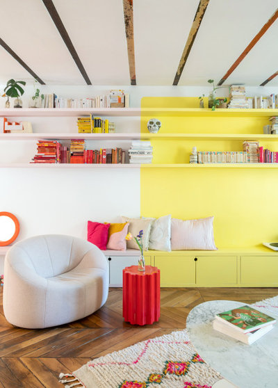
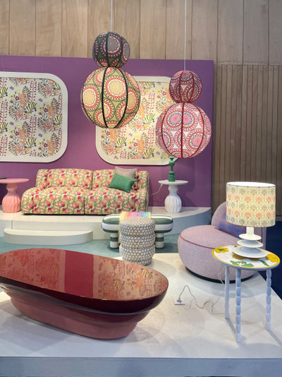
Pop Palette
The first palette that caught our eye at Maison & Objet was without a doubt inspired by pop culture. A wave of nostalgia that plunges us back in the ’70s and ’80s has seized decor, furniture and a variety of finishes.
Yellow. Easy to spot, this palette dares bright and tart colors. So, yellow, which has been forgotten a little over the last few years, makes a marked return with sunny, almost fluorescent shades.
Learn about Houzz Pro all-in-one business software
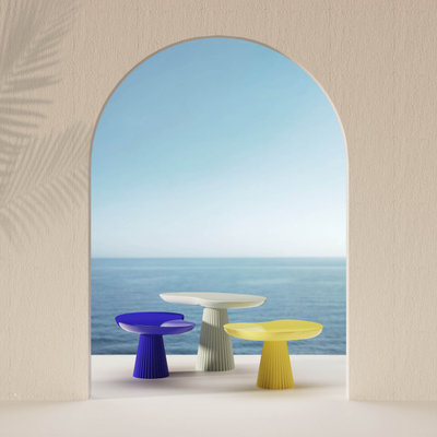
Mira side tables by Thomas Dariel. Maison & Objet
Klein blue. Pop style is also famous for playing up contrasts and daring combinations of vibrant colors. Therefore yellow, however radiant, is readily combined with shades as present and pronounced as Klein or electric blues.
40 Home Design Trends That Will Shape 2022
Klein blue. Pop style is also famous for playing up contrasts and daring combinations of vibrant colors. Therefore yellow, however radiant, is readily combined with shades as present and pronounced as Klein or electric blues.
40 Home Design Trends That Will Shape 2022
Pouenat. Maison & Objet
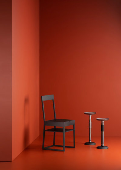
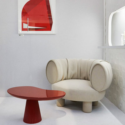
Blood red. Red strides boldly into this palette and becomes one of the protagonists of designers’ contrasts. After first making a timid appearance at the September 2021 edition of Maison & Objet, it is now a marked presence in this year’s palettes.
Maison & Objet 2021: Trending Colors for the Coming Year
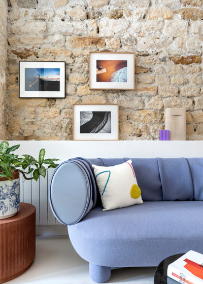
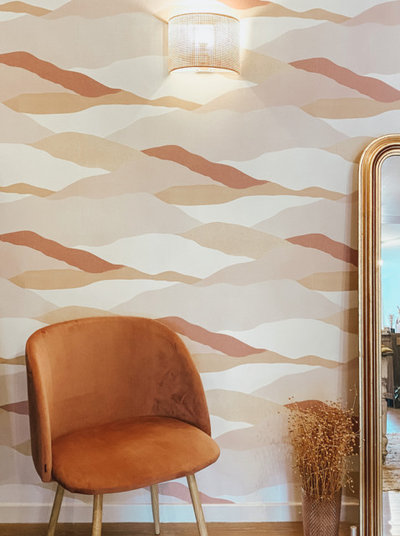
Mauve. We should have known. Pantone selected Very Peri, a periwinkle with a violet undertone, for its color of the year for 2022. Mauves are also increasingly present in this year’s collections. Never used alone, they also mix well with other vivid shades like orange or yellow to create pop decor worthy of the name.
Pantone Picks a Periwinkle Blue for Its 2022 Color of the Year
Pantone Picks a Periwinkle Blue for Its 2022 Color of the Year
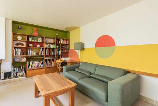
Orange. Nostalgia for the ’70s has already come up in this pop palette, but it is even more evident in compositions mixing khaki and burnt orange. The latter creates a lasting retro ambiance associated with vintage furniture and iconic design pieces.
Also noteworthy is the way these shades are combined in geometric color blocks with simple contours.
New Life-Sized Walkthroughs Feature Transforms 3D Floor Plans
Also noteworthy is the way these shades are combined in geometric color blocks with simple contours.
New Life-Sized Walkthroughs Feature Transforms 3D Floor Plans
Popus. Maison & Objet
Pastel Palette
Maison & Objet trend watcher Elizabeth Leriche told Houzz that starting this season there will be an increase in pastel colors, particular in the mauve to violet spectrum. Our trips through the design trade fair confirmed the pronounced presence of pastel tones this year.
Violet. Violet is everywhere among the new products on the stands this year, like a vernal iteration of the aforementioned mauve. It is also used in contrasting palettes alongside pinks and pastel yellows, but this time much more softly.
Maison & Objet Trend Watcher on Looks to Expect in 2022
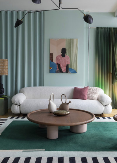
Green. Pinks and purples are perfectly matched with all pastel greens. Celadon, lime and sage are the big winners of this chromatic spectrum.
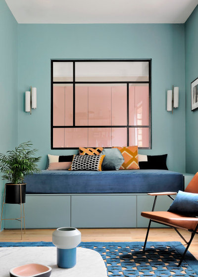
Blue. The French favorite par excellence, blue obviously also figures to soothe this pastel palette even more. We saw it especially in icy shades like azure or sky blue.
Ginger & Jagger. Maison & Objet
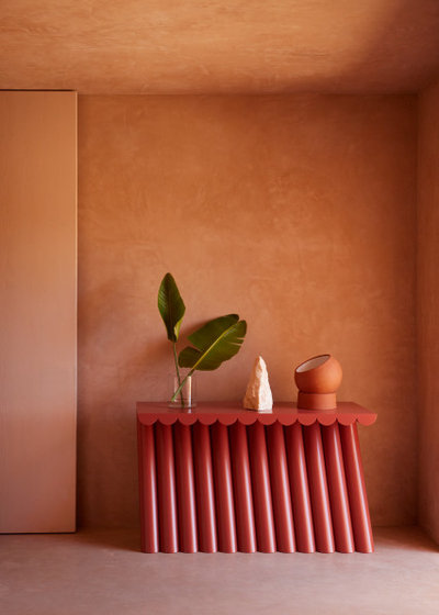
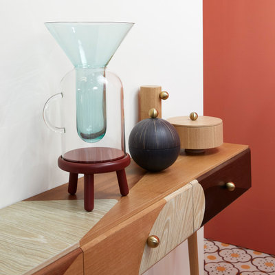
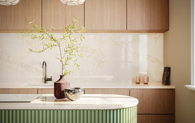
Natural Palette
Not surprisingly, we are still drawn to nature. Botanical and earthy colors continue to be some of the most requested palettes in interiors, as manufacturers are clearly aware.
Natural Palette
Not surprisingly, we are still drawn to nature. Botanical and earthy colors continue to be some of the most requested palettes in interiors, as manufacturers are clearly aware.
Maison Dada. Maison & Objet
Ocher and terra cotta. This palette is notable for combinations of earthy tones, like different shades of ochre or terra cotta, which have been favorites in interiors for many years.
See how the Houzz Pro 3D Floor Planner and Mood Boards can help you share designs with clients
Ocher and terra cotta. This palette is notable for combinations of earthy tones, like different shades of ochre or terra cotta, which have been favorites in interiors for many years.
See how the Houzz Pro 3D Floor Planner and Mood Boards can help you share designs with clients
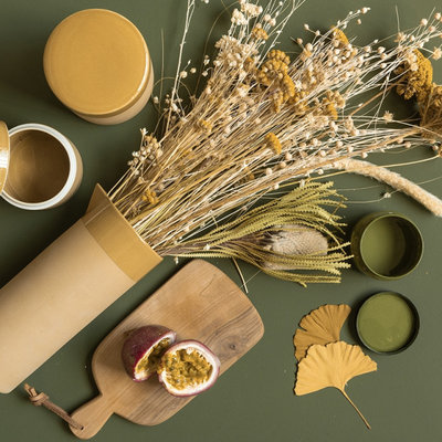
Khaki. Natural though this palette may be, it also plays with the contrasts that are so trendy this year. So, earth tones are perfectly matched with botanical greens like moss, sage, fir and lichen.
Beiges and browns. As though to soften the marriage of contrasts, sand, brown and beige tones insert themselves perfectly between two bold colors. They are the final aspect of this palette, a nod to the natural materials that have seduced so much of the decor world at the moment. They are likewise soothing in these troubling times.
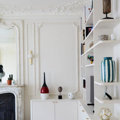
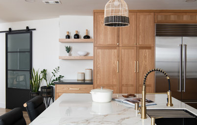
Neutral Palette
Refined, comforting decor in dark colors and neutral materials is everywhere in the design world at the moment. It is therefore not surprising that the final palette we spotted at the fair is made up of neutral and pleasant tones that lend themselves to a timeless ambiance.
Refined, comforting decor in dark colors and neutral materials is everywhere in the design world at the moment. It is therefore not surprising that the final palette we spotted at the fair is made up of neutral and pleasant tones that lend themselves to a timeless ambiance.
Hall 7 Signature. Maison & Objet
White. Thus, white was more present this year than in the last few editions of Maison & Objet. Matched with other neutral tones or in blocks next to bright colors, white was used widely in the new collections.
White. Thus, white was more present this year than in the last few editions of Maison & Objet. Matched with other neutral tones or in blocks next to bright colors, white was used widely in the new collections.
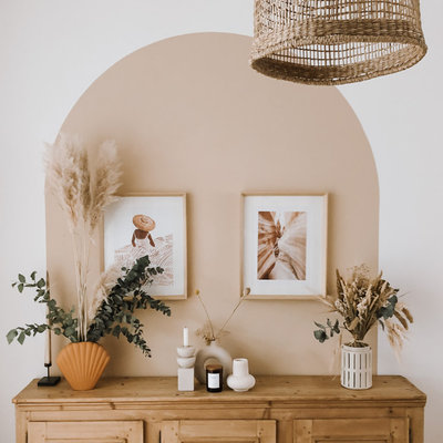
Ecru. Alongside white, we notice another spectrum revolving around ecru, which gives a bit more depth in refined decor. It works well as a base for natural materials and fibers.
Your turn: What color palettes do you anticipate using in your home projects? Share your thoughts in the Comments.
More for Pros on Houzz
Read more stories for pros
Learn about Houzz Pro software
Talk with your peers in the Pro-to-Pro discussions
Join the Houzz Trade Program
Your turn: What color palettes do you anticipate using in your home projects? Share your thoughts in the Comments.
More for Pros on Houzz
Read more stories for pros
Learn about Houzz Pro software
Talk with your peers in the Pro-to-Pro discussions
Join the Houzz Trade Program
What are you working on?

Related Products


Related Stories
Latest News for Professionals
Builders Share Ways Designers Can Help Them Deliver Great Work
Contractors on Houzz offer tips on how architects and interior designers can help residential projects run smoothly
Full Story
Industry Research
Pros Remain Somewhat Optimistic Despite Slowed Activity
More construction and design firms expect business growth than expect a decline, the Houzz Q2 2024 Barometer shows
Full Story
Latest News for Professionals
Designers Share 4 Ways Builders Can Help Deliver Great Work
Architects and interior designers on Houzz offer tips on how contractors can help residential projects run smoothly
Full Story
Latest News for Professionals
10 Spring Home Upgrades to Recommend to Your Clients Now
Boost business and customer confidence by suggesting home improvements that are tailored to the season
Full Story
Latest News for Professionals
Outdoor Flooring, Turf and Tile Products for 2024
By Julie Sheer
See the latest materials for patios, decks and yards on display at the recent Surfaces trade show
Full Story
Latest News for Professionals
Homeowners Spend More on Remodels Despite Slight Dip in Activity
Also, planning time far exceeds building time and pro hiring remains strong, the 2024 U.S. Houzz & Home Study reveals
Full Story
Latest News for Professionals
6 Pros Share the Time-Saving Practices They Rely On
Want to be more efficient with your time? Pros reveal the indispensable methods and tools they turn to again and again
Full Story

Latest News for Professionals
Design Pros Share 10 Favorite Creamy White Paints
By Becky Harris
These off-white color choices include versatile tones, warming hues and pleasingly soft shades
Full Story
Latest News for Professionals
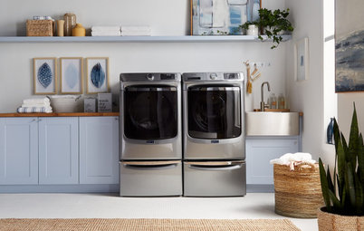
5 Fresh Laundry Appliance Trends for 2024
Check out the lean, green, powerful and smart washers and dryers showcased at the KBIS 2024 trade event
Full Story
Latest News for Professionals
5 Trends in New Engineered Countertops and Surfaces for 2024
See the latest styles and features for quartz, porcelain and sintered stone showcased at the recent KBIS 2024 trade show
Full Story
I LOVE IT ALL! And, yes, I grew up in the 70's. I love that another generation can enjoy these styles too.
Ecru. So serene.
Blush pink with various soft greens and terra cotta. Yummy