


Houzz Tour: Redesign Makes a Big House More Comfortable
A designer uses woodwork, furnishings and other elements to bring balance to large-scale rooms
Becky Harris
February 27, 2022
Houzz Contributor. Hi there! I live in a 1940s cottage in Atlanta that I'll describe as "collected."
I got into design via Landscape Architecture, which I studied at the University of Virginia.
Houzz Contributor. Hi there! I live in a 1940s cottage in Atlanta that I'll describe... More
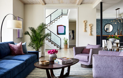
Let’s face it, sometimes there is no better word than “McMansion” to describe certain houses. And a lot of people who own them are stymied by the proportions of some of the rooms. “There was a time when homes were built big and cavernous just for the sake of being big and cavernous,” interior designer Kirsten Kaplan says. “My clients had been in this home for years but could not envision how to remodel it.” Kaplan used a mix of millwork, wallpaper and appropriately sized furnishings during the remodel. The results are a lesson in how to make the many existing houses that were built this way feel less cavernous and more comfortable.
Before Photo
“After” photos by Robert Radifera of Stylish Productions
House at a Glance
Who lives here: A couple whose nest is almost empty
Location: Fairfax, Virginia
Size: 6,487 square feet (603 square meters); five bedrooms, five bathrooms
Designer: Kirsten Kaplan of Haus Interior Design
Contractor: Dave Costopoulos of Dynamic Renovations
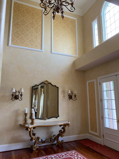
Before: Right inside the front door, the cavernous feeling begins. The space is two stories high, and it was making the furniture and the people feel Lilliputian in comparison.
Kaplan’s clients started out with only a kitchen remodel in mind. “But I warned them that once we got the kitchen right, the rest of their house, like this two-story entry, would look and feel wrong to them,” Kaplan says. While they couldn’t envision the changes at first, they quickly decided to expand the project to include most of the rooms in the house.
House at a Glance
Who lives here: A couple whose nest is almost empty
Location: Fairfax, Virginia
Size: 6,487 square feet (603 square meters); five bedrooms, five bathrooms
Designer: Kirsten Kaplan of Haus Interior Design
Contractor: Dave Costopoulos of Dynamic Renovations
Before: Right inside the front door, the cavernous feeling begins. The space is two stories high, and it was making the furniture and the people feel Lilliputian in comparison.
Kaplan’s clients started out with only a kitchen remodel in mind. “But I warned them that once we got the kitchen right, the rest of their house, like this two-story entry, would look and feel wrong to them,” Kaplan says. While they couldn’t envision the changes at first, they quickly decided to expand the project to include most of the rooms in the house.
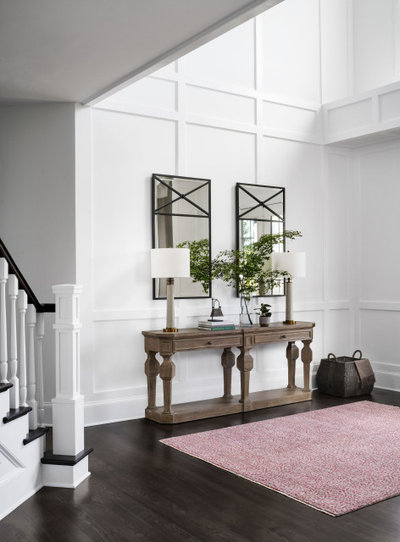
After: Kaplan knew that the right woodwork would be key to making the space feel more pleasing. And her clients had shared some inspiration photos with white moldings, so she worked with that. “This grid of millwork involved a lot of math because we were continuing these trim pieces from room to room,” Kaplan says. “We had to think about how they would meet the staircase, the columns, the soffits, the windows and more.”
She worked out the millwork design in software and at the site. “It’s so important to look at how it looks in person and to have a contractor who gets it. I’ve been working with Dave Costopoulos of Dynamic Renovations for many years and he was such a huge help,” Kaplan says. “He’d mock up different boards and nail them to the walls to help us figure it out.”
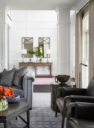
She also used a long console table, two tall mirrors and a pair of tall lamps to stand up to the imposing height of the space. The geometry of grids and X shapes are motifs Kaplan used throughout the home; here, the mirrors bring in a pair of Xes. The cranberry-and-gray rug adds color and softness to the space.
Wall and trim color (throughout the first floor): Super White, Benjamin Moore; rug and stair runner: C.G. Coe & Son
Find an interior designer on Houzz
She worked out the millwork design in software and at the site. “It’s so important to look at how it looks in person and to have a contractor who gets it. I’ve been working with Dave Costopoulos of Dynamic Renovations for many years and he was such a huge help,” Kaplan says. “He’d mock up different boards and nail them to the walls to help us figure it out.”
She also used a long console table, two tall mirrors and a pair of tall lamps to stand up to the imposing height of the space. The geometry of grids and X shapes are motifs Kaplan used throughout the home; here, the mirrors bring in a pair of Xes. The cranberry-and-gray rug adds color and softness to the space.
Wall and trim color (throughout the first floor): Super White, Benjamin Moore; rug and stair runner: C.G. Coe & Son
Find an interior designer on Houzz
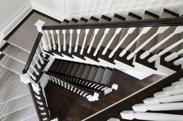
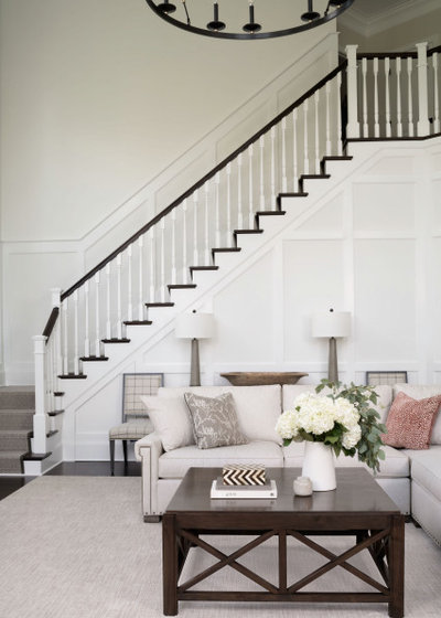
The designer replaced the posts on the staircase, restained the treads and added a new runner. “This is a 100% wool basketweave gray-and-white rug with charcoal edges,” Kaplan says. “It plays off the geometry of the grid and it’s just so beautiful.” All the flooring on the first floor was replaced with rift-sawn white oak.
Browse hall and stair runners in the Houzz Shop
Browse hall and stair runners in the Houzz Shop
Before Photo
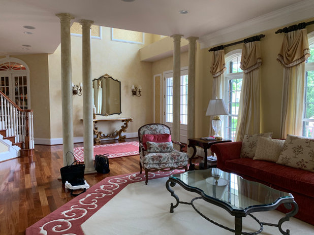
Before: Four awkwardly scaled columns separated the foyer from the living room. This is an example of how remodeling one room made it necessary to remodel the next one. The new foyer would have looked at odds with the existing living room.
After: Kaplan designed two rectilinear columns and sized them to stand up to the large scale of the space. She continued the lines of the millwork, wrapping it around the columns.
The designer had the walls painted Benjamin Moore’s Museum Piece and chose drapes one shade lighter. This helped give the formal room a soft and subdued look.
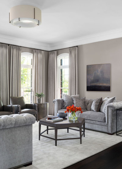
The home’s architecture has hexagonal and octagonal shapes, so Kaplan nodded to them with a hexagonal coffee table and hexagonal patterns on some of the throw pillows. She balanced the straight lines with curves on the arms of the sofas, the light fixture and the side tables. “I especially love the two cylindrical pyrite side tables from Bernhardt. They have a mica-like iridescence to them,” Kaplan says.
The home’s architecture has hexagonal and octagonal shapes, so Kaplan nodded to them with a hexagonal coffee table and hexagonal patterns on some of the throw pillows. She balanced the straight lines with curves on the arms of the sofas, the light fixture and the side tables. “I especially love the two cylindrical pyrite side tables from Bernhardt. They have a mica-like iridescence to them,” Kaplan says.
Before Photo
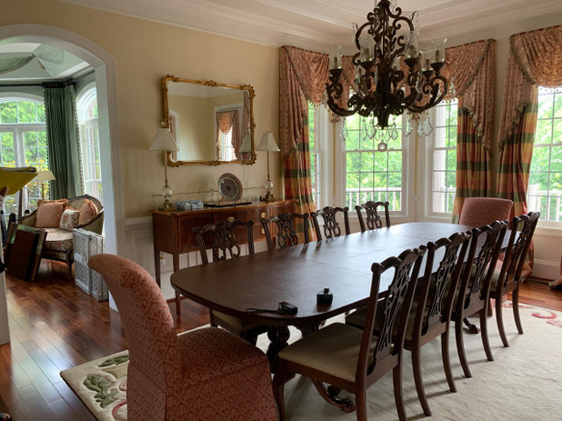
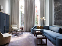
Before: The formal dining room is open to the music room on the left. The style of the space was too fussy to fit in with the new transitional style of the home.
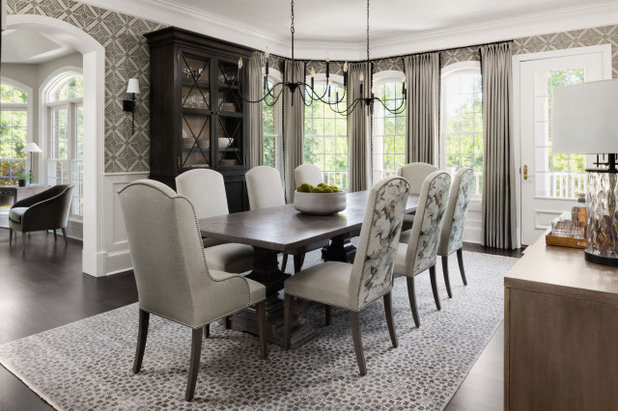
After: Kaplan captured an elegant feel that’s less ornate than the previous dining room. The long pedestal table suits the scale of the space, and she knew it would need a pair of chandeliers rather than one to match its proportions. The curves of the chairs and chandeliers play off the arched windows. And the drapes add softness without being too fussy — black fringe trim by Schumacher adds just the right amount of flair.
The music room is just visible on the left. “We kept everything in there simple, clean and elegant,” Kaplan says of that space, which accommodate’s the couple’s piano. The husband is a pianist who teaches students there, so Kaplan added the comfortable armchair for him to sit in while listening to them.
The music room is just visible on the left. “We kept everything in there simple, clean and elegant,” Kaplan says of that space, which accommodate’s the couple’s piano. The husband is a pianist who teaches students there, so Kaplan added the comfortable armchair for him to sit in while listening to them.
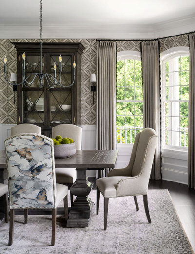
Kaplan also added a printed grasscloth wallcovering in the dining room that brings in more X shapes. “The X shapes on the cabinet doors play off the wallpaper,” she says. “And the watercolor geese pattern on the back of the chairs adds a nice organic touch that contrasts with all the straight lines.”
Find a wallpaper installer in your area
Find a wallpaper installer in your area
Before Photo
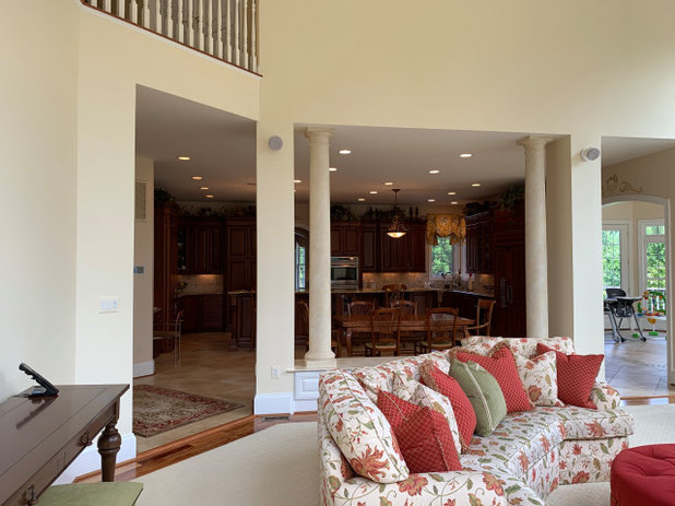
Before: More columns that were scaled too small appeared between the family room and kitchen. They sat atop a base that blocked the flow between rooms.
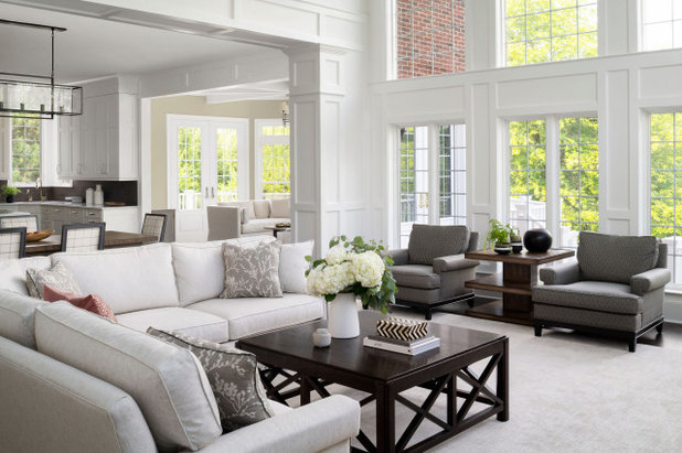
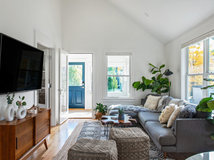
After: Kaplan removed the base and replaced the columns with a cased opening. This eased the flow from the kitchen to the family room. The opening is wrapped in woodwork that matches the other rooms. The millwork design creates a more comfortable scale in the soaring two-story space. The dark colors on the furniture along the window wall also bring the eye down.
The designer also played some tricks with furniture scale. For example, the table between the two gray leather chairs is higher than the arms of the chairs. “Usually a side table would not be higher than the arms of the chairs,” Kaplan says. “But I did this deliberately because the room is so big.” The large coffee table fits the sectional sofa and the size of the room nicely, and its base repeats the X motif.
Find the right sectional sofa for your home
Before Photo
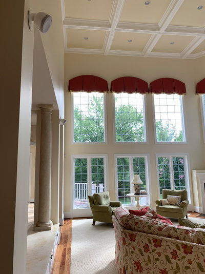
Before: The height of the family room was overwhelming. “The red shades looked like eyebrows over the windows and drew attention to the fact that the room was so enormous,” Kaplan says.
There’s only a small glimpse of the fireplace at the right side of this photo, but you can see that the surround looked disproportionately short for the tall room.
There’s only a small glimpse of the fireplace at the right side of this photo, but you can see that the surround looked disproportionately short for the tall room.
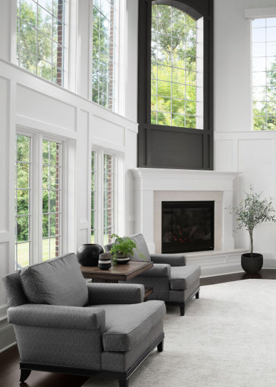
After: Millwork helped make the room feel more comfortable. “We emphasized the molding at the bottom of the upper windows to make the eye stop there,” Kaplan says. “It makes the room feel more appropriately scaled.” And a new fireplace surround with dark paint above it gives it a greater presence in the large space.
Another important part of the layout was leaving enough room for the clients’ grandchildren to play on the floor. Kaplan left a good amount of space on the rug empty of furnishings for this purpose.
Fireplace accent color: Iron Mountain, Benjamin Moore
Another important part of the layout was leaving enough room for the clients’ grandchildren to play on the floor. Kaplan left a good amount of space on the rug empty of furnishings for this purpose.
Fireplace accent color: Iron Mountain, Benjamin Moore
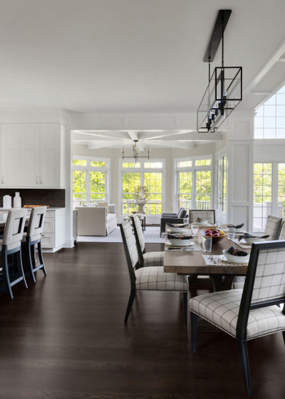
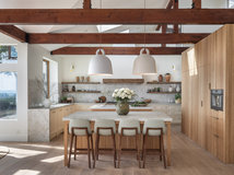
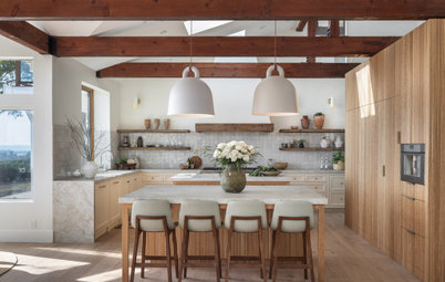
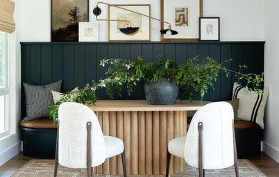
In this photo, the kitchen is on the left, the sunroom is at the back and the family room is on the right. With the odd columns and their base removed, Kaplan opened up space for a large eat-in kitchen table that seats eight. “These clients were planning to have big family meals with their adult children and their grandchildren,” she says.
On the chairs, Kaplan used kid-friendly Crypton fabric that will stand up to spills. She chose a windowpane pattern to repeat the gridded geometry motif. “I also repeated the square shape on the back of the kitchen counter stools,” she says.
On the chairs, Kaplan used kid-friendly Crypton fabric that will stand up to spills. She chose a windowpane pattern to repeat the gridded geometry motif. “I also repeated the square shape on the back of the kitchen counter stools,” she says.
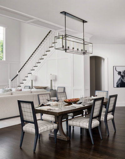
The linear chandelier is sized right for the long dining table. This photo also shows how the living room and eat-in area relate to the back staircase.
Shop for modern and contemporary linear chandeliers
Shop for modern and contemporary linear chandeliers
Kaplan placed two extra dining chairs on either side of a console table against the back staircase. Two tall table lamps add height to that area.
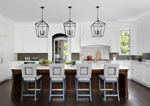
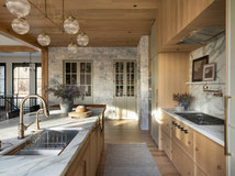
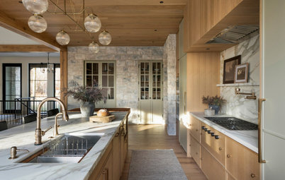
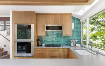
The homeowners wanted white cabinets and counters in the kitchen. “The doors on the cabinetry were the initial inspiration for the millwork,” Kaplan says. “They didn’t want a farmhouse look, so we gave them timeless molding that has a traditional but light feel.”
Kaplan designed an extra-long wood island that fits the scale of the space. Accordingly, she added three large lantern pendants over it. The island is 141 inches long by 56 inches wide. The legs on the corners of the island play off the hexagonal and octagonal shapes seen in the architecture of the house.
The backsplash is a dark gray limestone in a brick pattern. “It has really pretty warm gray tones to it,” Kaplan says. The range backsplash is a geometric pattern that mixes marble and limestone.
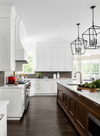
“Having a sink in the island helps break it up,” Kaplan says. It also makes it a great prep zone. There’s a second sink in the corner underneath the window.
The clients opted for white quartz on the countertops because of its durability and easy maintenance. “One warning regarding an extra-long island is that most slabs are 126 inches long. So unless you choose a slab that comes in a jumbo size, you will have a seam because you’ll need to use more than one slab,” Kaplan says. The choice of materials available in a jumbo size is limited.
Rutt Ruskin-style island and Rutt Regency Oak Park painted cabinets: Jack Rosen Custom Kitchens; cabinet hardware: Water Street Brass; counters: Pietra Danae, Polarstone
Before Photo
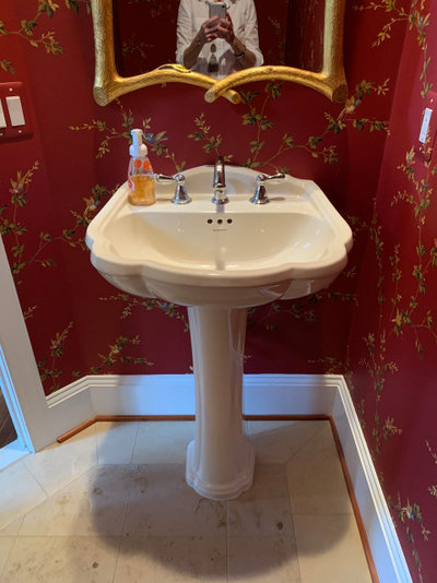
Before: The powder room had a dated look.
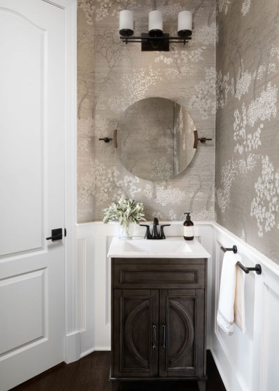
After: “The powder room was large, but because of the door swing and the placement of the plumbing, I knew we had to use a small vanity,” Kaplan says. “So the wainscoting and the printed grasscloth wallpaper keep it from feeling like there’s too much extra space in here.” The wallpaper has a lovely shimmer to it. And the designer played off the round tilted mirror with curved details on the vanity.
Before Photo
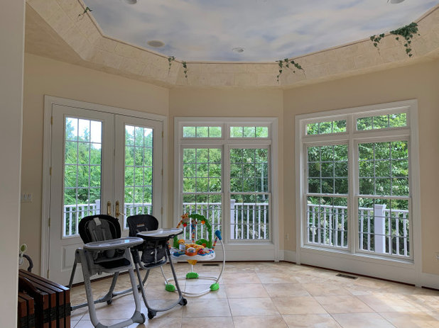
Before: “My clients hadn’t really come up with a use for their sunroom,” Kaplan says. “It was just a place where they kept their grandchildren’s high chairs.” This was a waste of a space filled with wonderful natural light. The room is octagonal and had faux painting on and around the ceiling.
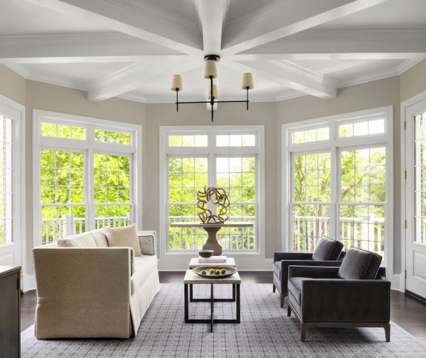
After: Knowing her clients loved the idea of beams, Kaplan emphasized the octagonal shape of the room with a spoke pattern on the ceiling. “Now this is a spot where they love to have their coffee in the morning while they watch the news,” she says. A beautiful rug nods to the grid motif, while a driftwood sculpture atop a travertine-topped table adds curves and a natural element to the room.
Wall color: Pale Oak, Benjamin Moore
Wall color: Pale Oak, Benjamin Moore
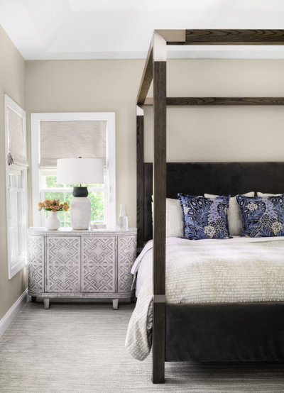
This is the primary bedroom. “The homeowners fell in love with this canopy bed and the blue pillows with peacocks on them that we found,” Kaplan says. She chose carved wood demilune cabinets for the nightstands and table lamps that are taller than the headboard in order to get the scale just right.
She cozied up the room with an elegant rug. “This was a huge space, so the striated pattern on the rug makes it feel more cozy,” she says.
Check out our beginner’s guide to get started on your home project
She cozied up the room with an elegant rug. “This was a huge space, so the striated pattern on the rug makes it feel more cozy,” she says.
Check out our beginner’s guide to get started on your home project
Before Photo
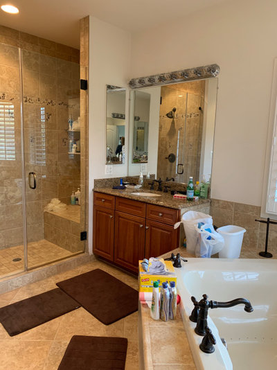
Before: The finishes in the primary bathroom were past their prime. And the large deck around the bathtub intruded on the space.
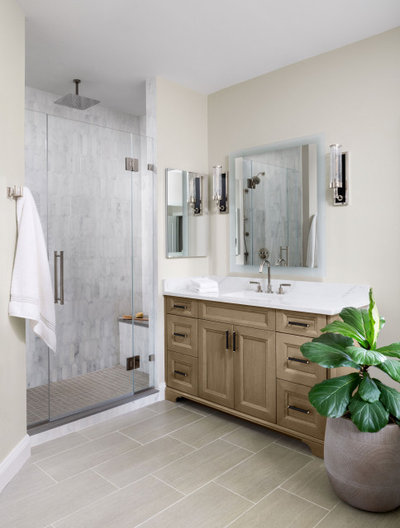
After: The down-to-the-studs bathroom renovation lightened up the space with a lovely marble picket tile in the shower and LED lighted mirrors. Elegant sconces add another layer of light.
Cabinetry: Jack Rosen Custom Kitchens
Cabinetry: Jack Rosen Custom Kitchens
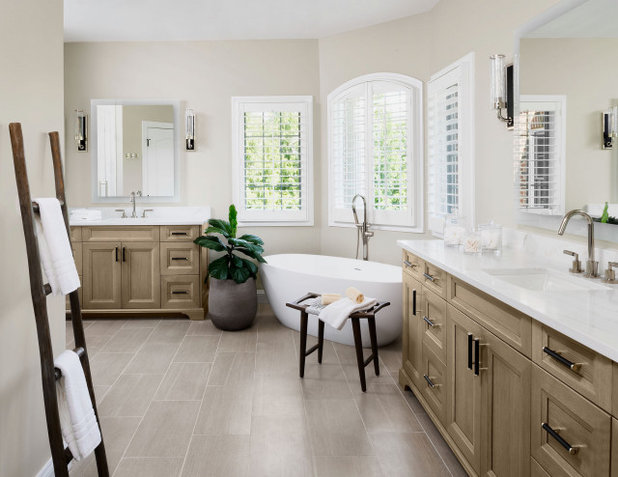
A large sculptural bathtub lends a much prettier look to the room. Its curves play off the arched window. Kaplan centered the floor-mounted tub faucet on that window.
The new heated bathroom floors are a porcelain plank tile with a stone-like look. “These look so nice and are very durable, yet are quite budget-friendly,” Kaplan says.
The new heated bathroom floors are a porcelain plank tile with a stone-like look. “These look so nice and are very durable, yet are quite budget-friendly,” Kaplan says.
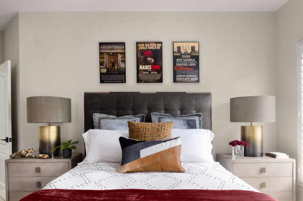
As the homeowners continued to marvel at the improvements, they asked Kaplan to take on their son’s room toward the end of the project. “He was in college, studying abroad at the time, and they wanted it to be a homecoming surprise,” she says.
Three posters from productions that the musical theater student had performed in inspired the color palette and received prominent placement over the headboard. Metallic lamps add some shimmering texture to the room.
Three posters from productions that the musical theater student had performed in inspired the color palette and received prominent placement over the headboard. Metallic lamps add some shimmering texture to the room.
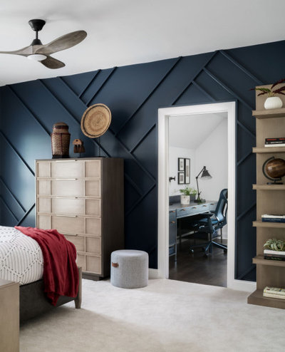
“In this room we decided to go with a younger, more energetic take on millwork,” Kaplan says. The zigzag stitching on the duvet plays off the lines on the wall. She also turned an extra oversize closet into an office space for him.
Wall color: Hale Navy, Benjamin Moore
Wall color: Hale Navy, Benjamin Moore
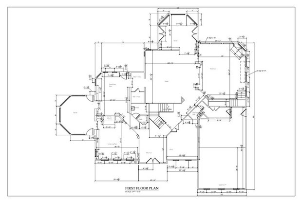
It’s challenging to form a mental floor plan of this large house. The foyer is in the center on the bottom, with the front stairs at the top of it on the plan. The living room is to the left and the dining room is above it. Kaplan added a new two-sided open fireplace between the living and dining rooms that wasn’t photographed but can be seen on this plan. The octagonal room on the left is the music room, and the one at the top center is the sunroom. The family room is in the top right corner.
More on Houzz
Tour more homes
Hire a local design pro
Shop for your home
More on Houzz
Tour more homes
Hire a local design pro
Shop for your home


Our well qualified and certified team of hard working craftsman and specialists have a proven record of quality... Read More
What are you working on?

Related Products
Scott Davidson founded Davidson Builders in 1998. Scott graduated from Michigan State with a BS in Construction... Read More
Related Stories
Houzz Tours
Houzz Tour: Organic Style on an Avocado Ranch
By Becky Harris
A designer uses a soft neutral palette, handmade tile and reclaimed wood to update a 1980s contemporary home
Full Story
Houzz Tours
Houzz Tour: Elegant, Earthy Ranch House for an Empty-Nest Couple
Design styles, warm neutral colors and special details blend in a Minnesota ranch-style house with a finished basement
Full Story
Houzz Tours
Houzz Tour: Classic Meets Modern in a Designer’s 1900 Home
Designer Sara Swabb revives a stately row house for her family in Washington, D.C.’s Georgetown neighborhood
Full Story
Houzz Tours
Houzz Tour: Designer Infuses a 1950s Ranch House With Personality
By Becky Harris
Architectural salvage, reclaimed light fixtures and English pub inspiration add character in this remodel and addition
Full Story
Houzz Tours
Houzz Tour: Making the Most of Every Inch in 1,250 Square Feet
By Becky Harris
Designers use meticulous space planning, minimalist style and custom features to open up and brighten a duplex
Full Story
Houzz Tours
Houzz Tour: Dark and Moody Contrast With Serene and White
By Becky Harris
A design team working remotely brings dramatic contrast, style and comfort to a family’s Southern California home
Full Story
Houzz Tours
Houzz Tour: Home Reimagined as a 3-Level Treehouse
By Julie Sheer
A designer found on Houzz helps a couple bring nature views into their downtown Seattle home
Full Story
Houzz Tours
Houzz Tour: Bold Colors and Art Energize a New Family Home
A designer found on Houzz curates a Washington, D.C., home for a fun-loving young family
Full Story
Houzz Tours
Houzz Tour: Old Stone House Gets a Youthful Makeover
A designer mixes periods and styles to turn a 1929 house into a colorful, contemporary family home for her daughter
Full Story
BRAVO! 👏 This is gorgeous! We live in Woodbridge, VA & we did a pretty big reno in 2020-2021 as well. Our new color pattern is also very similar to this house. I was wondering if you could share the name/brand of the wallpaper in the powder room. Love it! Thank you.
Returning to this story really increased my appreciation for this home. It is gorgeous and such an improvement! I love how the millwork and colors unite the home and create a beautiful and livable space. I wonder what they did with the window dressings that were removed? That would be treasure trove of gorgeous fabric to come across at the Habitat store!
Amazing amazing can hardly believe it’s the same home…so MUCH BETTER. Great job