


Before and After: 3 Kitchens With a Great Eat-In Space
See how designers created cozy spots for family meals in these kitchen areas

Eat-in spaces in the kitchen can be marvelous hubs. Families can gather for meals with a cozy ambiance, kids can do their homework, friends can come over for tea and homeowners can work on household paperwork. These three projects show how designers created three inviting eat-in spaces.
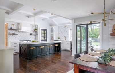
After: McGuill reused the clients’ existing expandable kitchen table. Its wood top and white base were a great fit for the style and space. But she swapped out their farmhouse-style chairs for something more easy-breezy in the form of light wood woven chairs. A statement brass pendant overhead adds a nautical touch.
The project also included replacing the windows in the bay. “These windows add so much beautiful architecture to the space — they have simulated divided lights that protrude on both sides,” McGuill says.
Browse dining chairs in the Houzz Shop
The project also included replacing the windows in the bay. “These windows add so much beautiful architecture to the space — they have simulated divided lights that protrude on both sides,” McGuill says.
Browse dining chairs in the Houzz Shop
The remodel included taking over a playroom space to gain exterior wall space. McGuill and architect Caitlin Struble knew bathing the formerly dark space in light would transform it. They used the same windows over the sink that they used in the eat-in area’s bay.
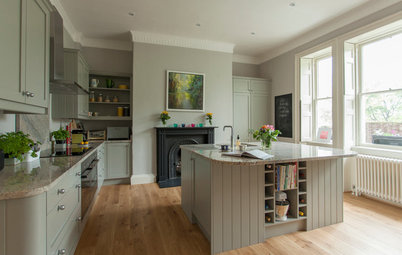
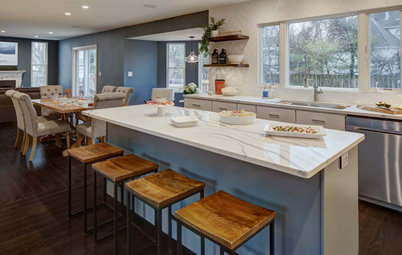
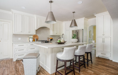
The homeowners were drawn to a transitional style with subtle coastal vibes. Beaded Shaker-style cabinetry, a farmhouse sink with a bridge faucet and subway tile bring in traditional elements, while the streamlined hardware and clean and light palette add modern touches.
The subtly coastal mood comes in through the color palette: a relaxing light blue on the island and sandy glazed subway tiles on the backsplash. There’s also a mix of metals — brass on the lanterns and hardware, stainless steel on the prep sink faucet and polished chrome on the bridge faucet. The updated eat-in space complements the work area of the kitchen beautifully.
See more of this kitchen remodel
2. Ho-Hum Breakfast Area Becomes a Special Space
Kitchen at a Glance
Who lives here: A couple with young children
Location: Clarendon Hills, Illinois
Size: 190 square feet (18 square meters)
Designer: Susan Klimala of The Kitchen Studio of Glen Ellyn
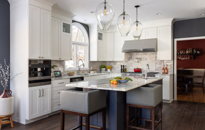
Before: The breakfast area in this suburban Chicago kitchen was perfectly functional. But it didn’t feel like a distinct place within the room. Its location is across a traffic path from the main kitchen. The existing built-in breakfast bar had stained wood cabinets, a dark granite countertop and an awkward space above the upper cabinets. Designer Susan Klimala could see the potential for this space to be more inviting.
Kitchen at a Glance
Who lives here: A couple with young children
Location: Clarendon Hills, Illinois
Size: 190 square feet (18 square meters)
Designer: Susan Klimala of The Kitchen Studio of Glen Ellyn
Before: The breakfast area in this suburban Chicago kitchen was perfectly functional. But it didn’t feel like a distinct place within the room. Its location is across a traffic path from the main kitchen. The existing built-in breakfast bar had stained wood cabinets, a dark granite countertop and an awkward space above the upper cabinets. Designer Susan Klimala could see the potential for this space to be more inviting.
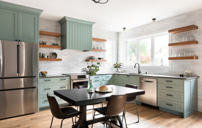
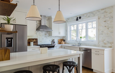
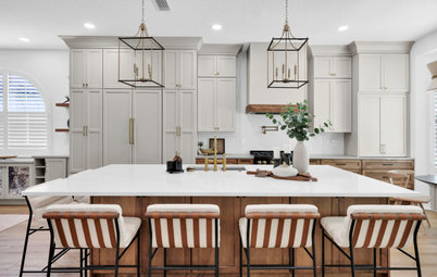
After: Klimala swapped in a round wood table with a pretty circular base, making the breakfast area feel cozier. Then she anchored it by adding a brushed brass lantern overhead. It provides better lighting during dinners and the brass finish adds warmth to the space. The fixture’s large scale denotes that the breakfast area is its own space. She repurposed her clients’ existing kitchen chairs, giving them a fresh coat of paint.
The designer also refreshed the breakfast bar, keeping the existing lower cabinets and painting them the same charcoal color she used on the kitchen island. However, she replaced the upper cabinets, swapping in units with reeded glass doors. Then she added molding that extends from the top of the cabinets to the ceiling. This eliminated the dust-gathering gap above the old upper cabinets.
She brightened up the space with lighter colors for contrast against the charcoal. She had the walls painted white and added white subway tile on the bar’s backsplash. And she replaced the bar’s dark granite countertop with white marble-like quartz.
Browse round dining tables
The breakfast bar is directly across from the kitchen island. Klimala repeated the island paint, backsplash tile and countertop quartz she used in the breakfast area. And the wood of the stool’s seats and other accessories ties into the new wood breakfast table. This creates a cohesive look between the main kitchen and breakfast area, while the use of a markedly different style of lighting over the breakfast table helps differentiate the two spaces.
Read more about this kitchen remodel
Read more about this kitchen remodel
3. Cozy Sun-Filled Eating Nook
Kitchen at a Glance
Who lives here: Nate and Ashley Fuller and their three young children (two toddlers and a newborn)
Location: North Park neighborhood of San Diego
Size: 245 square feet (23 square meters)
Designer: Hope Pinc Design
Before: Nate and Ashley Fuller loved their 1925 Craftsman house in San Diego, but their kitchen was tired and lacked counter space. And a giant fridge stuck out like a sore thumb, blocking the light from the windows. There was an existing eat-in area but it needed some oomph. The couple enlisted interior designer Hope Pinc to help them update the kitchen and make it more family-friendly for the young family of five.
See more of this kitchen remodel
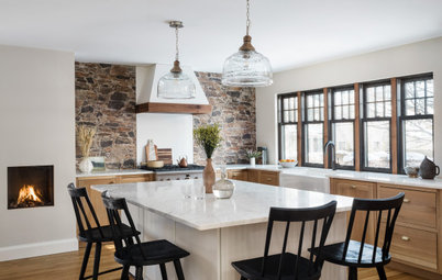
After: Pinc relocated the fridge to the opposite side of the room, which made the eat-in area feel more open and accessible. The cozy corner was a great spot for a wrap-around built-in bench. Drawers beneath the benches provide storage for games and toys.
“It created such a functional space for their family to gather for morning breakfast or a quick lunch,” Pinc says. “It really gave the room some added texture and color from the cushion fabrics and pillows, which pulled the colors of the backsplash and oak accents and flooring together.”
“It created such a functional space for their family to gather for morning breakfast or a quick lunch,” Pinc says. “It really gave the room some added texture and color from the cushion fabrics and pillows, which pulled the colors of the backsplash and oak accents and flooring together.”
Floating shelves instead of an upper cabinet next to the nook keeps the eat-in area light and the view out the windows open to the rest of the kitchen. An open lantern over the farmhouse-style table also keeps the obstructions minimal.
More on Houzz
Read more kitchen stories
Browse kitchen photos
Hire a kitchen remodeler
Shop for kitchen products
More on Houzz
Read more kitchen stories
Browse kitchen photos
Hire a kitchen remodeler
Shop for kitchen products


Kitchen at a Glance
Who lives here: A family of five
Location: Medfield, Massachusetts
Size: 500 square feet (46 square meters)
Designers: Kelly McGuill (interior design) and Caitlin Struble of Winslow Design (architecture)
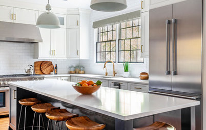
Before: This Boston-area family’s kitchen already had a great bay designated as an eat-in area. Interior designer Kelly McGuill made a few key tweaks to give it the chic coastal-inspired style she gave the rest of the kitchen during a down-to-the-studs remodel.
Find an interior designer on Houzz