


Kitchen of the Week: Addition Opens Up a Colonial
An architect separates the cook space from the kid space in this light and bright Massachusetts kitchen

Space was quite tight in this Boston-area family’s Garrison Colonial. So they hired architect Caitlin Struble to design an addition. Her design doubled the size of the kitchen, brought more light into the first floor and provided safer access to the backyard. After listening to how the busy family of five functioned at home, she strategically located a beverage bar and handwashing station to keep the kids out of the cooking and prep zone. She also thoughtfully planned how the kitchen would relate to the spaces around it.
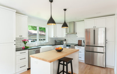
After: This photo doesn’t line up with the previous image, so imagine the exterior wall in the previous photo hitting about halfway through the length of the island. Everything seen between the faucet and the fireplace is part of the addition.
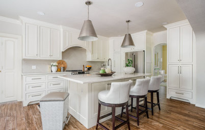
Struble carefully zoned the kitchen by focusing on the way the couple like to interact with their kids. Each child has their own counter stool. “All the kitchen work happens on the other side of the island,” she says. The island contains a dishwasher, trash pullout and everyday dish storage. Both ends also have storage. “They have a baby and two other young children, so the ends were a good spot to put toys and plastic cups and things like that,” Struble says. The ends also provide storage for cookbooks.
Beyond the kitchen, doors off the new family room offer easy access to the backyard. “They didn’t have good access to their backyard from the house before and their street is busy. Part of the project was making it safer. We also added a new deck back there,” Struble says.
Cabinet paint: Egret White, Sherwin-Williams; wall paint: Pale Oak, Benjamin Moore
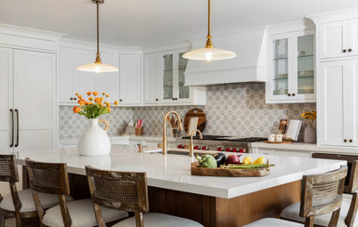
This side of the island forms an easy work triangle, with wall ovens on one side, the fridge on the other and the range and sink opposite each other in between. There’s ample counter space on either side of the range, and the drawers beneath it are ergonomic pot and pan storage. The pot filler makes it easy to fill pots while they sit on the range. It’s easy to pivot over to the sink across from the range to drain them.
“We were lucky to get a window on this wall, because the range wall is the only exterior wall in the room,” Struble says. “But the new windows and doors in the family room addition fill the kitchen with light.”
“We were lucky to get a window on this wall, because the range wall is the only exterior wall in the room,” Struble says. “But the new windows and doors in the family room addition fill the kitchen with light.”
With the kitchen located in the center of the new open plan, Struble had to create cohesiveness from room to room. The new family room is within full view of the kitchen, so she used matching millwork and window seats with the same drawer profiles as the kitchen cabinetry.
Looking toward the opposite end of the house, there’s a dining room with a fireplace. Along that fireplace wall is an oak mudroom door, pantry cabinets and a beverage bar.
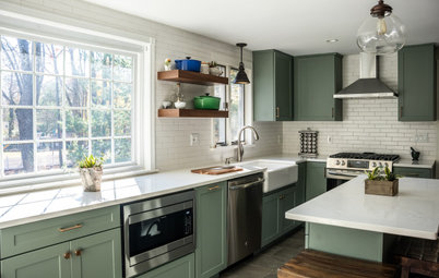
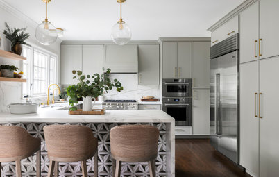
The designers at Beige and Bleu mixed cabinet colors and metal finishes in the kitchen. “We ended up going with antique pewter hardware — we liked how timeless it was without taking away from the gold pendants above the island,” interior designer Morgan Mackintosh says. “We like mixing metals to add in more dimension in a space.”
Island and cabinet paint: Stardew, Sherwin-Williams
The lower cabinet on the left is a beverage fridge. “Placing the bar out of the work triangle helps with circulation and makes it easy for everyone to grab a drink,” Struble says. “Also, the kids wash their hands here.” The glazed ceramic backsplash extends to the ceiling behind custom oak wine racks and a display shelf.
“They will set this up as a bar for parties, but most of the time the beverage drawers are full of juice boxes that the kids can grab themselves,” Struble says.
Backsplash tile: Cloe, Bedrosians Tile and Stone
“They will set this up as a bar for parties, but most of the time the beverage drawers are full of juice boxes that the kids can grab themselves,” Struble says.
Backsplash tile: Cloe, Bedrosians Tile and Stone
Struble added these built-ins as a nice transition between the bar in the kitchen and a wall-mounted TV in the family room. The cabinet profiles, feet and color match the kitchen cabinets. “We added these built-ins as an additional focal point, because it’s nice to have a focal point that is not a TV,” Struble says.
The renovation also included turning the existing living room into a dining space and opening it up to the kitchen. “Their living room was small, and because they added a new family room, we were able to transform it into a dining room,” Struble says. “Unless they are grabbing a quick breakfast or lunch at the island, they have most of their meals in the dining room. It’s not formal at all.”
The structural column marks where there used to be a solid wall between the kitchen and this space. Struble removed the wall and added cabinetry that serves both sides. The dining room side has storage for fancy china, serveware and linens. And the counter works as a buffet that serves the dining room. “The dining room is on a side of the house that doesn’t get much natural light. Removing the wall brought in the shared light from the addition,” Struble says.
The structural column marks where there used to be a solid wall between the kitchen and this space. Struble removed the wall and added cabinetry that serves both sides. The dining room side has storage for fancy china, serveware and linens. And the counter works as a buffet that serves the dining room. “The dining room is on a side of the house that doesn’t get much natural light. Removing the wall brought in the shared light from the addition,” Struble says.
Before: The wall behind the fridge is the one Struble removed to open the kitchen up to the dining room.
After: The new mudroom space is located along the side of the house. When the sliding barn door is open there’s a nice view of a charming Dutch door that leads to the driveway. “The Dutch door is great because they can let in the breeze but prevent little kids and the dog from getting out,” Struble says. A door to the right of the Dutch door opens to the new garage.
The mudroom includes a beautiful slate tile in a herringbone pattern. And built-in lockers keep outerwear, bags and shoes organized.
The mudroom includes a beautiful slate tile in a herringbone pattern. And built-in lockers keep outerwear, bags and shoes organized.
On the existing floor plan, the original kitchen is seen in the top left corner. The plan also shows the wall that divided the kitchen from the original living room (now the dining room).
The new addition begins about halfway through the original kitchen, with the family room at the top of the plan. The mudroom addition runs along the left side of the kitchen. The living room-turned-dining room is at the bottom of the plan. The element between the kitchen and the dining room is the two-sided built-in buffet.
See more of this project
More on Houzz
Read more kitchen stories
Browse kitchen photos
Hire a kitchen remodeler
Shop for kitchen products
See more of this project
More on Houzz
Read more kitchen stories
Browse kitchen photos
Hire a kitchen remodeler
Shop for kitchen products


Kitchen at a Glance
Who lives here: A couple, their three young children and their dog
Location: Needham, Massachusetts
Size: 250 square feet (23 square meters)
Designers: Caitlin Struble of Winslow Design (architecture); Morgan Mackintosh and Nicole Keys of Beige and Bleu Design Studio (interior design and photo styling)
Builder: D. McQuillan Construction and Fine Homes
Before: The existing kitchen was dated and about half the size of the new kitchen. Struble expanded the home beyond the sink wall seen here. She completed all the architectural plans and the kitchen layout. The interior designers at Beige and Bleu Design Studio helped the homeowners with the finishes and fixtures.
“At first one of the homeowners wanted to choose all the finishes herself. But then the pandemic happened, and she was a pediatrician first responder with three kids, so suddenly there was no time for that. Beige and Bleu Design swooped in and really saved the day,” Struble says.
The homeowners turned to Houzz to help communicate their style preferences. “We used Houzz to share ideas in the planning phases and then during the construction phase for finish selections,” the architect says. “The homeowner had multiple ideabooks for each space and continued to add to them over the course of the project.” Other spaces added on to the house were a family room and mudroom on the first floor; a garage; and two bedrooms, two bathrooms and a laundry room on the second floor.