


10 Ways to Add Blue to a Kitchen — and 10 Blues Worth Considering
Here are kitchen features to think about painting blue and beautiful blue paints for creating a stylish space
Jennifer Ott
April 5, 2021
San Francisco-based architectural color specialist and design writer. Jennifer's work has been featured in many print and online publications. Her recently-published book, "1000 Ideas for Color Schemes," is a beautifully illustrated and easy-to-navigate guide that takes the guesswork out of selecting the perfect color palette for your home or special event. For more information on Jennifer Ott Design, visit http://jenottdesign.com/.
San Francisco-based architectural color specialist and design writer. Jennifer's... More
Neutral tones of white, gray and beige continue to reign supreme when it comes to kitchen color trends. But I would argue that the next most popular color is blue. Whether channeling a tropical getaway with a vibrant watery blue or keeping it classic with navy, there are many shades of blue to choose from, and different ways to incorporate the color as a kitchen accent. Here are some of my favorite blue paint colors and areas to use them.
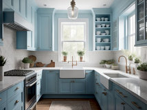
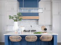
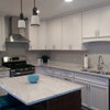
1. Base Cabinets in Soft Blue-Gray
Long gone are the days when your base cabinets had to match your upper cabinets. Many homeowners, in fact, are forgoing upper cabinets altogether and replacing them with windows.
Base cabinets, then, are the perfect spot to use a kitchen accent color. And if you aren’t necessarily a fan of bold, bright, in-your-face color, take inspiration from this lovely and light kitchen with super soft blue-gray base cabinets.
Find a kitchen designer on Houzz
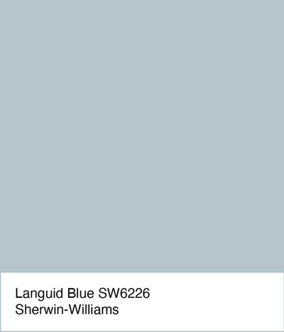
For a similar look: The trick to selecting a soft shade of blue that doesn’t look like it belongs in a nursery is to go for one that has a good bit of gray in it, such as Languid Blue from Sherwin-Williams.
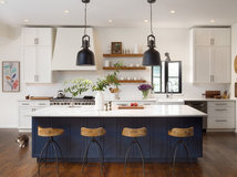
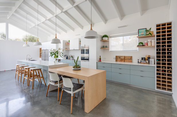
2. Island in Sea Blue
Another option is to keep your perimeter cabinets a neutral hue and give your island cabinetry the accent color treatment.
A blue island really becomes the focal point in a kitchen. But it’s important to consider how the blue color interacts with other elements in the room.
For instance, if you have wood floors, a blue island is going to stand in strong contrast to the warmer wood tone, which strengthens the visual impact of both elements. Additionally, warm wood or metallic tones can help warm up an otherwise heavily blue, gray and white kitchen.
Shop for kitchen island lighting
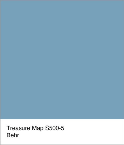
For a similar look: Treasure Map by Behr is a pretty midtone sea blue. It’s the perfect punch of color in a palette that comprises wood tones and light gray and white hues.
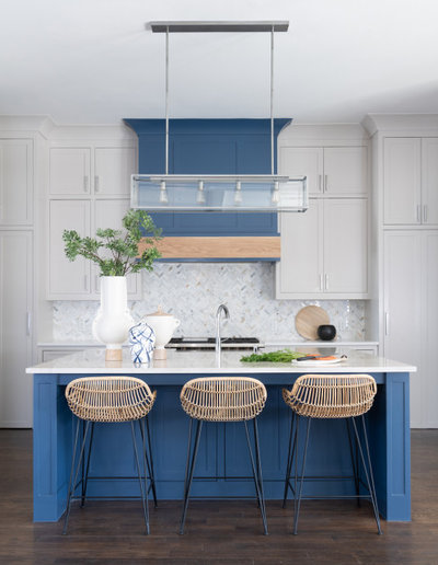
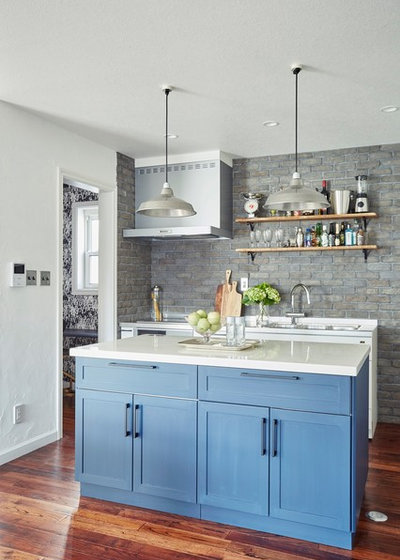
3. Vent Hood in Navy Blue
Of course, there’s no reason why base cabinets or the island alone should get the accent color treatment. Make a cohesive color statement by extending the use of blue to other, perhaps less-expected places, like the cladding for the ventilation hood.
I, for one, don’t mind making this workhorse kitchen appliance a focal point, especially when it’s been made such a visually appealing component of the space.
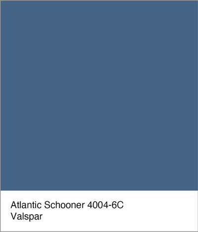
For a similar look: The almost-navy deep blue Atlantic Schooner by Valspar is an elegant, dramatic option for anyone looking for a deeper dash of color. It looks super crisp and clean when paired with neutral and cool white hues.
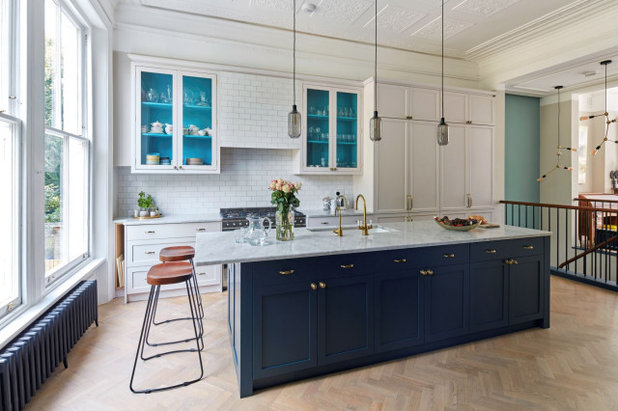
4. Cabinet Interiors in Bright Blue
The backside of the interior of a wall cabinet is another unusual spot for kitchen color. And I love the pinch of peekaboo color used this way. Such a vibrant tropical blue might be a bit much in large doses, but in this small and unexpected way it’s a delightful dash of fun color.
The backside of the interior of a wall cabinet is another unusual spot for kitchen color. And I love the pinch of peekaboo color used this way. Such a vibrant tropical blue might be a bit much in large doses, but in this small and unexpected way it’s a delightful dash of fun color.
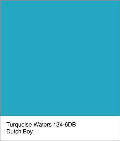
For a similar look: Turquoise Waters by Dutch Boy is the boldest and brightest blue of the blues features in this article. Because of its vibrancy, it’s best used in small doses or in areas that receive lots of natural light. Those caveats aside, it’s a carefree, happy color that brings to mind good times in faraway (and warm!) tropical places.
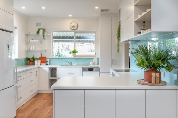
5. Backsplash in Sky Blue
A popular and common location for a dash of blue in the kitchen is the backsplash. Less typical is a backsplash made from back-painted glass. It makes for an easy-to-clean surface — no grout lines — and you can customize it using any color you desire. This pretty sky-blue hue helps bring an outdoor vibe indoors.
A popular and common location for a dash of blue in the kitchen is the backsplash. Less typical is a backsplash made from back-painted glass. It makes for an easy-to-clean surface — no grout lines — and you can customize it using any color you desire. This pretty sky-blue hue helps bring an outdoor vibe indoors.
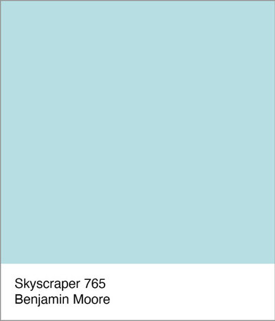
For a similar look: Skyscraper by Benjamin Morris is a soft shade of blue that has a touch of green in it, which nudges it from a simple baby blue to more of a sky blue or spring-invoking robin’s egg blue. It’s a fresh choice for anyone who favors lighter blues.
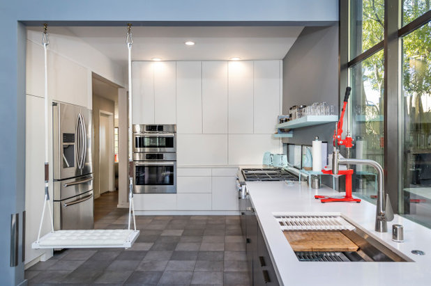
6. Architectural Element in Denim Blue
The most fun thing about this kitchen is definitely the swing. The second is arguably the swath of color on the blue-clad post and beam. When you have exposed or visible structural elements, you have to decide if they should be camouflaged or accentuated. I think it’s a brilliant choice to accentuate them here, because it frames the kitchen nicely, almost as if the space is a stage ready to host an entertaining performance.
The most fun thing about this kitchen is definitely the swing. The second is arguably the swath of color on the blue-clad post and beam. When you have exposed or visible structural elements, you have to decide if they should be camouflaged or accentuated. I think it’s a brilliant choice to accentuate them here, because it frames the kitchen nicely, almost as if the space is a stage ready to host an entertaining performance.
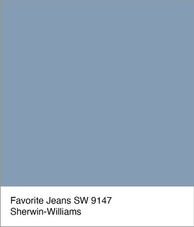
For a similar look: This faded denim color injects a casual and comfortable feeling into a space. And, similar to how you can pair any colored top with your favorite jeans, you can combine just about any other paint color with this easygoing hue.
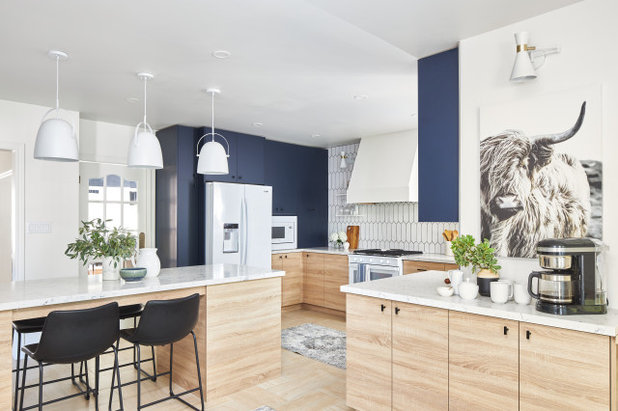
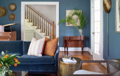
7. Accent Wall in Bright Navy Blue
One of the easiest and most affordable ways to add a dash of blue to a kitchen is via an accent wall area. Just be sure to specify paint with a bit of sheen to it, as flat or matte paint is difficult to wipe clean.
Navy hues have been popular, especially as a kitchen accent color, for a few years now. A brighter take on the color, like the one shown here, is a great idea for a kitchen with light wood tones and lots of white.

For a similar look: Hacienda Talavera by PPG is a bit brighter and bluer than typical navy, which gives it a bit more punch.
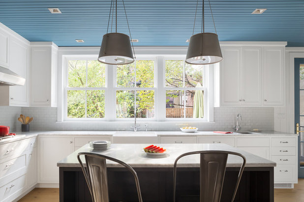
8. Ceiling in Midtone Blue
Walls shouldn’t get all the attention when it comes to applying fun hues. Your ceiling also deserves consideration for eye-catching color.
Blue may be an obvious choice for ceiling color, because it evokes an open-air vibe of clear skies above, but there are of course many shades to choose from. This is one application where I would avoid a dark blue with strong gray undertones, because it could feel too heavy, cold and ominous, as if storm clouds are gathered above. Instead, pick a medium to soft shade with plenty of blue pigment.
One important tip to keep in mind when selecting ceiling color is that the color you see on a paint chip or sampled up on a wall is likely going to look a bit darker on the ceiling. This is because ceilings are downward-facing horizontal surfaces that don’t get as much light reflected onto them as vertical and upward-facing horizontal surfaces.
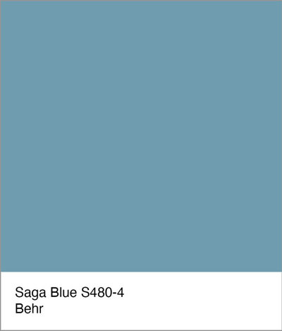
For a similar look: Saga Blue by Behr is a medium blue that’s a great choice for a ceiling color. It’s neither overly vibrant nor too dull.
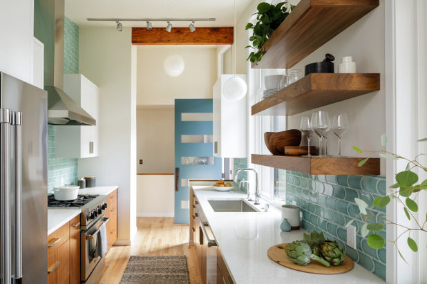
9. Door in Crystal Blue
No need to necessarily default to white when it comes to selecting a paint color for doors in and around your kitchen. And watery blue hues never fail to bring a feeling of serenity. The blue hue shown here is a beauty. Similar to the previous blue, it is neither too light, dark, vibrant or muted. It contributes nicely to the kitchen palette.
No need to necessarily default to white when it comes to selecting a paint color for doors in and around your kitchen. And watery blue hues never fail to bring a feeling of serenity. The blue hue shown here is a beauty. Similar to the previous blue, it is neither too light, dark, vibrant or muted. It contributes nicely to the kitchen palette.
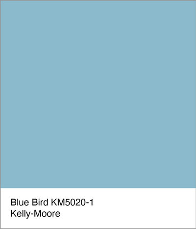
For a similar look: Blue Bird by Kelly-Moore calls to mind crystal blue waters and the matching sky above.
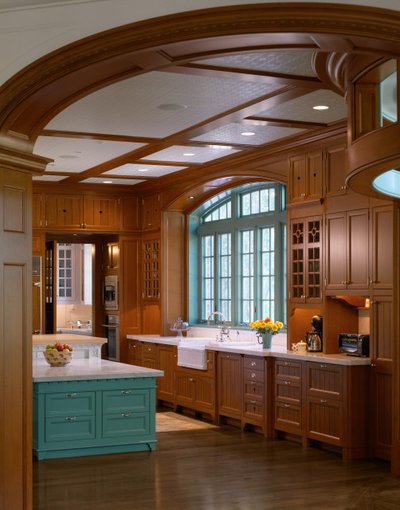
10. Windows in Turquoise Blue
I’m definitely guilty of defaulting to shades of white for window frames and trim. It’s easy, and oftentimes windows may not be of the highest quality or condition and therefore are best left to blend in with the surrounding wall.
But if you have good quality windows, such as shown here, then absolutely think about making them a focal point by having them painted an interesting hue such as blue. It will really draw the eye toward the windows, so make sure the view outside is equally appealing.
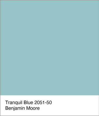
For a similar look: Tranquil Blue by Benjamin Moore is a pretty turquoise — a natural fit for window frames because it mimics the patina of copper, which traditionally was used as a durable window-cladding material in high-end construction.
Your turn: How have you added a dash of blue to your own kitchen? Please share in the Comments.
More on Houzz
The Most Common Kitchen Design Problems and Ways to Tackle Them
Hire a kitchen remodeler
Shop for kitchen products
Your turn: How have you added a dash of blue to your own kitchen? Please share in the Comments.
More on Houzz
The Most Common Kitchen Design Problems and Ways to Tackle Them
Hire a kitchen remodeler
Shop for kitchen products


Peabody Landscape Group was founded in 1979 by Douglas & David Peabody. Our commitment is to carefully listen and... Read More

Related Products
As a full-service, family-owned remodeling company in New Albany, OH, we strive to bring our clients incredible... Read More
Related Stories

Decorating Guides
Design Pros Share 10 Favorite Creamy White Paints
By Becky Harris
These off-white color choices include versatile tones, warming hues and pleasingly soft shades
Full Story

Kitchen Countertops
What Kitchen Countertop Colors Should You Choose?
By tidgboutique
Consider these popular colors and styles to get the look you want — no matter what material you use
Full Story

Colors of the Year
Pantone Picks a Peach for Its 2024 Color of the Year
By Jennifer Ott
See how to use this juicy hue to create calm yet flourishing spaces inside and outside the home
Full Story

Decorating Guides
5 Ways Designers Are Working With Rich Warm Tones Right Now
By Becky Harris
Interior designers describe their strategies for using rich warm colors to create an inviting home
Full Story

Colors of the Year
10 Paint Colors Ready to Take Over in 2024
By Jennifer Ott
Blue is huge, but dark hues and warm tones also find favor among major paint companies’ 2024 Color of the Year picks
Full Story
Decorating Guides
How to Mix Colors and Make It Work
By tidgboutique
Don’t want to confine yourself to neutrals but lack the confidence to embrace colors? Check out this pro advice
Full Story

Events
7 Color Trends for 2024 at Maison & Objet
By Claire Tardy
New harmonies and unexpected pairings at the fall 2023 trade fair set the tone for next year’s interiors
Full Story

Decorating Guides
9 Ways to Layer Warm Neutral Colors for Comfortably Refined Rooms
By Becky Harris
Design pros share advice for building an inviting palette, introducing high contrast and mixing textures
Full Story

Decorating Guides
How to Create a Cohesive Color Flow Throughout Your Home
By Erin Carlyle
Designers share eight techniques for avoiding a choppy feeling in your spaces
Full Story

Decorating Guides
How to Get Your Ceiling Paint Color Right
By tidgboutique
Here’s how to tweak the shade of your ceiling paint to get the effect you want
Full Story
SW Deep Sargasso Sea (greenish-blue) on doors that lead from my kitchen/dining area to an outside covered patio. It's a great turquoise, which is what I was going for.
@hsmegan Thank you! It is readily available at The Tile Shop (chain). It is ceramic with a crackle glaze and I chose "cast iron" as the grout color. Love it so much I put it in our current house!
I love the color blue - my fav - but not so much for kitchens - it is an appetite and conversation suppressor psychologically. Now on the exterior - heck yeah. In a boring subdivision - thought there must be a strong HOA - I'm working on it now. 3D cubism with a nod to De Stijl possibly later on - it is evolving - I'm having to hold the client back after his initial hesitancy. "It doesn't go with the neighborhood - as he grinned. The back is the same grey green I have on our home to blend with the landscape - where everyone here spends their time.