


Dreaming in Color: 8 Pretty-in-Pink Bedrooms
Don't be afraid to rethink pink: Try softer hues for soothing comfort or bolder tones for a touch of drama
Jennifer Ott
November 18, 2013
San Francisco-based architectural color specialist and design writer. Jennifer's work has been featured in many print and online publications. Her recently-published book, "1000 Ideas for Color Schemes," is a beautifully illustrated and easy-to-navigate guide that takes the guesswork out of selecting the perfect color palette for your home or special event. For more information on Jennifer Ott Design, visit http://jenottdesign.com/.
San Francisco-based architectural color specialist and design writer. Jennifer's... More
I was recently paging through design writer Jude Stewart’s new book ROY G. BIV: An Exceedingly Surprising Book About Color and was indeed surprised to learn that it has only been within the past 60 years or so that we’ve associated pink with girls and blue with boys. In fact, before this period, boys were often dressed in pink (seen as a softer version of the “masculine” red), and girls in soft blues.
Gender-based color conventions aside, pink is a fun, versatile hue that also happens to flatter most skin tones, making it a great choice in bathrooms and bedrooms — where we get dressed and primp and preen. To help you get inspired to think pink, I’ve pulled together a collection of beautiful pink bedrooms along with tips for using the hue in your own room.
Gender-based color conventions aside, pink is a fun, versatile hue that also happens to flatter most skin tones, making it a great choice in bathrooms and bedrooms — where we get dressed and primp and preen. To help you get inspired to think pink, I’ve pulled together a collection of beautiful pink bedrooms along with tips for using the hue in your own room.
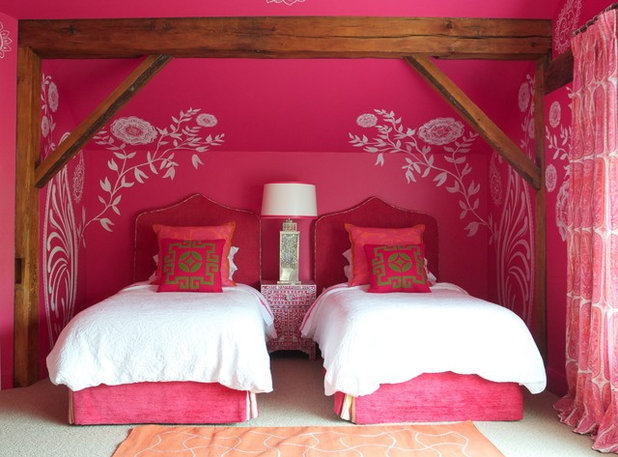
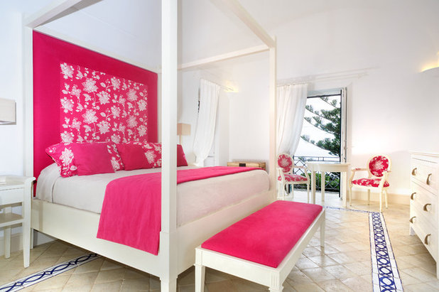
Go high impact with a red raspberry hue on the walls. The white floral accents on the wall really pop against the hot pink background in this fun bedroom. It’s wise to keep the palette simple with such a bold color dominating the room.
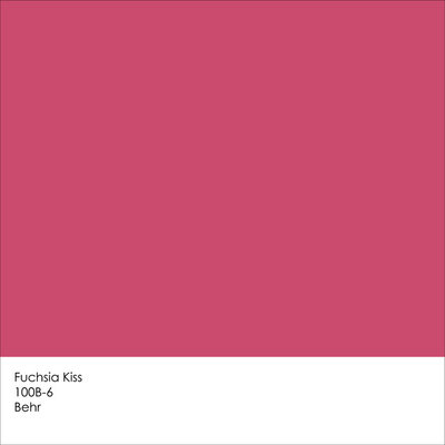
Get a similar look with Fuchsia Kiss from Behr.
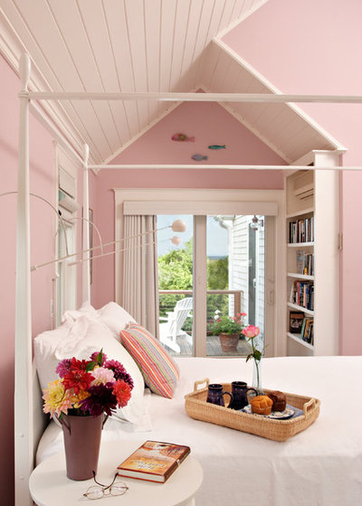
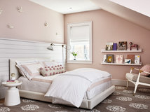
This shade of pink has a touch of brown, making it less pastel and more neutral. It’s a sophisticated soft pink for grownups. Paired with plenty of white-painted wood, the room has a charming and comfortable vibe — perfect for a guest room.
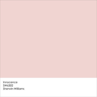
Get the look with Innocence from Sherwin-Williams.
Make your headboard wall an accent wall by adding a splash of shocking pink via paint, wallpaper or fabric. Pick up the hue in bits and pieces around the room for balance and visual rhythm.
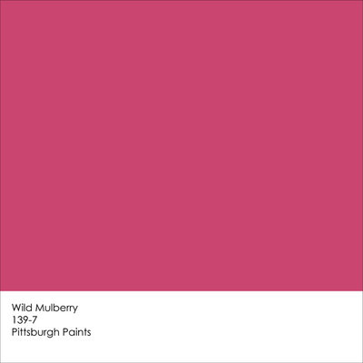
Get a similar look with Wild Mulberry from Pittsburgh Paints.
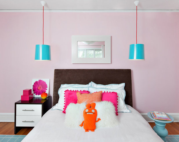
I love the contrast between the sweet pale pink on the wall and the smattering of punchy blue, orange and hot pink. This is a fun palette for a kid’s room.
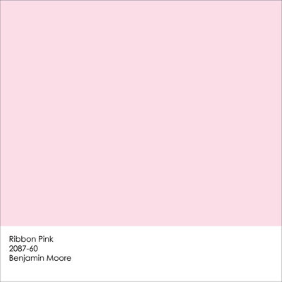
Get the look with Ribbon Pink from Benjamin Moore.
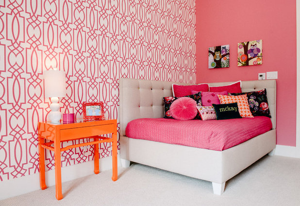
Go glam with a pink-hued wall covering on one wall in your bedroom. Pick up the pink color on an adjacent wall to balance it out. This room showcases one of my favorite bedroom color palettes: pink, orange and white.
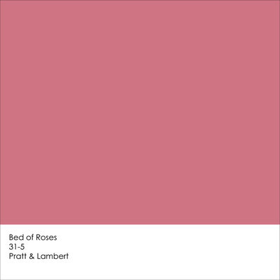
Get a similar look with Bed of Roses from Pratt & Lambert.
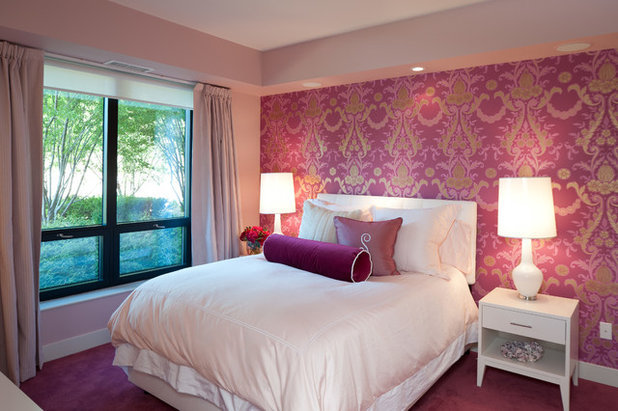
Here’s another fetching pink wall covering, used to create a fantastic accent headboard wall that anchors the bed. This particular pink has a bit of purple, giving it a sophisticated, regal feel. Again, a pink hue was pulled from the wall covering and painted onto the adjacent walls. This lighter pink wall color nicely bridges the white and darker pink colors in the room.
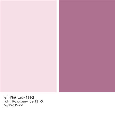
Get a similar look with Pink Lady and Raspberry Ice, both from Mythic Paints.
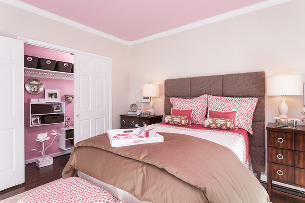
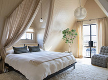
Don’t overlook your bedroom ceiling and closet as places to add fun color. Just keep in mind that colors often appear darker on the ceiling versus walls because of how light hits the different planes. Closet walls, too, are often not lit as well as bedroom walls. If you find a color you like but want to go a smidge lighter, you can have your paint retailer lighten it. The pink paint color you see here was knocked down to 75 percent strength.
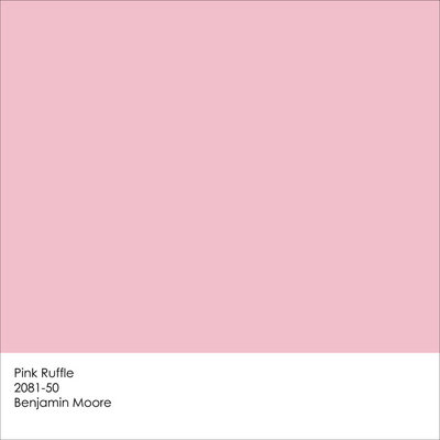
Get the look with Pink Ruffle from Benjamin Moore. (Note: The color was lightened to 75 percent strength in the previous bedroom image.)
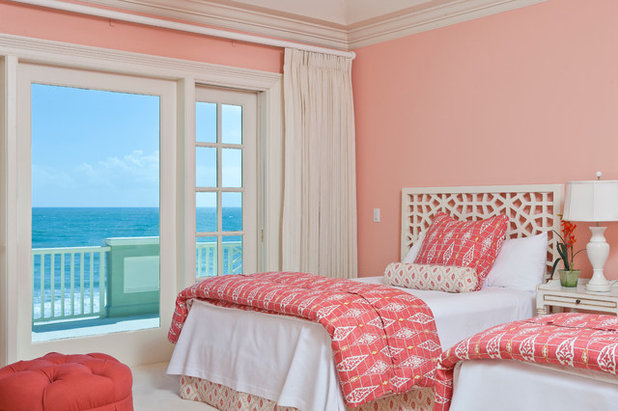
If you happen to have a stunning view from your bedroom window, you can make it really stand out by cladding your bedroom in a complementary color — a hue opposite on the color wheel. Orangish-pink is a complement to greenish-blue, so this wall color frames and showcases the sea view perfectly.
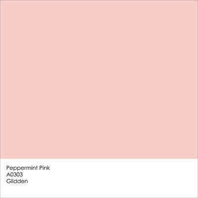
Get a similar look with Peppermint Pink from Glidden.
Tell us: What do you think of pink for bedrooms?
Tell us: What do you think of pink for bedrooms?


We design, build and renovate in the most exquisite of fashions. Our team of revolutionaries is dedicated to... Read More
What are you working on?

Related Products

Related Stories

Decorating Guides
Design Pros Share 10 Favorite Creamy White Paints
By Becky Harris
These off-white color choices include versatile tones, warming hues and pleasingly soft shades
Full Story

Kitchen Countertops
What Kitchen Countertop Colors Should You Choose?
By tidgboutique
Consider these popular colors and styles to get the look you want — no matter what material you use
Full Story

Colors of the Year
Pantone Picks a Peach for Its 2024 Color of the Year
By Jennifer Ott
See how to use this juicy hue to create calm yet flourishing spaces inside and outside the home
Full Story

Decorating Guides
5 Ways Designers Are Working With Rich Warm Tones Right Now
By Becky Harris
Interior designers describe their strategies for using rich warm colors to create an inviting home
Full Story

Colors of the Year
10 Paint Colors Ready to Take Over in 2024
By Jennifer Ott
Blue is huge, but dark hues and warm tones also find favor among major paint companies’ 2024 Color of the Year picks
Full Story
Decorating Guides
How to Mix Colors and Make It Work
By tidgboutique
Don’t want to confine yourself to neutrals but lack the confidence to embrace colors? Check out this pro advice
Full Story

Events
7 Color Trends for 2024 at Maison & Objet
By Claire Tardy
New harmonies and unexpected pairings at the fall 2023 trade fair set the tone for next year’s interiors
Full Story

Decorating Guides
9 Ways to Layer Warm Neutral Colors for Comfortably Refined Rooms
By Becky Harris
Design pros share advice for building an inviting palette, introducing high contrast and mixing textures
Full Story

Decorating Guides
How to Create a Cohesive Color Flow Throughout Your Home
By Erin Carlyle
Designers share eight techniques for avoiding a choppy feeling in your spaces
Full Story

Decorating Guides
How to Get Your Ceiling Paint Color Right
By tidgboutique
Here’s how to tweak the shade of your ceiling paint to get the effect you want
Full Story
Love this hot pink !