


Houzz Tours
Colorful Milan Apartment Inspired by Le Corbusier
An architect uses a palette from the French designer’s 1931 manifesto on color to bring a sense of balance to this home

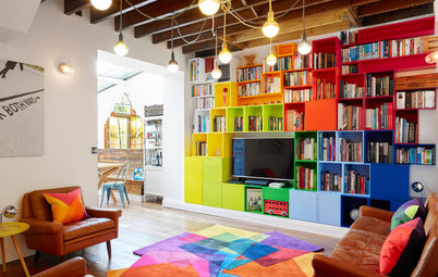
Architect Betti Sperandeo transformed this 1939 apartment in Milan, Italy, into a “pictorial project” for her sister’s family, employing a clever and measured use of color to imbue the spaces with life and harmony. The beautiful chromatic balance seen in the zones of the apartment was inspired by Polychromie Architecturale, the 1931 manifesto on color by iconic modernist architect Le Corbusier.
The eclectic home’s spaces flow into one another and complete each other in a dynamic yet functional mix, with color itself acting as an architectural feature. Sperandeo and her clients were on the same page from the get-go, and their shared vision resulted in a welcoming and comfortable home where the family now loves to get together in the evening to let loose and relax.
The eclectic home’s spaces flow into one another and complete each other in a dynamic yet functional mix, with color itself acting as an architectural feature. Sperandeo and her clients were on the same page from the get-go, and their shared vision resulted in a welcoming and comfortable home where the family now loves to get together in the evening to let loose and relax.
“It was a head-to-toe renovation, and there’s almost nothing left from before, since the original layout was very poorly done,” Sperandeo says. “As this is a family of three, the request was to have two bedrooms and two bathrooms — the old design had only one bathroom — well separated from each other, as well as a spacious living area.
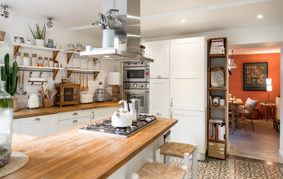
“To fulfill this latter request, I came up with the idea of creating a kitchen within a transparent geometric structure inside the living room. They enthusiastically and appreciatively accepted this idea.”
“To fulfill this latter request, I came up with the idea of creating a kitchen within a transparent geometric structure inside the living room. They enthusiastically and appreciatively accepted this idea.”
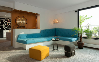
The green velvet sofa and the leather ottoman were made by an upholsterer based on the architect’s design.
“Color has always been a crucial part of my projects,” Sperandeo says. “Since I am also a graphic designer, color plays a fundamental role in whatever I design. I always start from the geometry and distribution of spaces, which is then completed and accentuated with color. It’s through color that I can create emotional suggestions.
“My style is eclectic — I love mixing things and adding objects. It has to convey the idea of a warm and welcoming home while being practical and functional.”
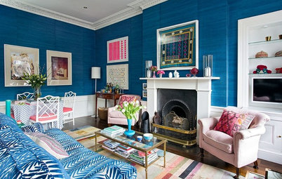
The inspiration for the colors used in the apartment came from the palettes and chromatic variations found in the Le Corbusier’s Polychromie Architecturale. Sperandeo focused on one palette in particular, which centers on green, rust and dove gray.
Her sister and brother-in-law gave her free rein in her design.
Her sister and brother-in-law gave her free rein in her design.
The colors alternate in studied balance in the spaces, working to complement the finishes and furnishings.
“The space itself determined the placement of the colors,” Sperandeo says. “In the hall, for example, I chose a warm rust — I wanted a color that would create a sort of envelope for this area that is a place of transit.”
“The space itself determined the placement of the colors,” Sperandeo says. “In the hall, for example, I chose a warm rust — I wanted a color that would create a sort of envelope for this area that is a place of transit.”
Except for the kitchen and bathrooms, the floor is dark wood throughout. This is the only feature of the old design that Sperandeo kept, as she liked the contrast it provided with the new wall colors. She had the floors sanded and treated with a water-based varnish.
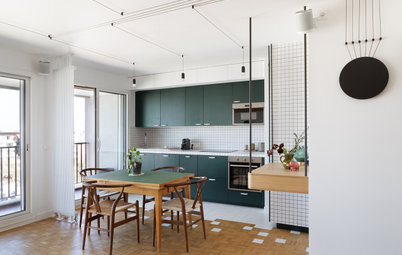
The choice to have a large living room snuggled around a kitchen that’s partitioned but not hidden was motivated by the fact that the family, especially the son, loves having friends over.
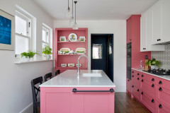
The trapezoidal kitchen structure has a passthrough to the living room. The custom partition was made by a local craftsman in black-lacquered iron and glass. It can be completely closed if needed, but it can also be easily opened up to the living room.
The countertop overhangs on both the living room and kitchen sides.
The countertop overhangs on both the living room and kitchen sides.
The kitchen floor was created based on the architect’s sketches, using commercially available tiles. The pink, black and white porcelain tiles are reminiscent of the designs of iconic Milanese architect Piero Portaluppi.
“The kitchen floor was an opportunity for me to create something different but not dominant, which goes well with everything else,” Sperandeo says. “The many strong elements in the kitchen are perfectly balanced.”
“The kitchen floor was an opportunity for me to create something different but not dominant, which goes well with everything else,” Sperandeo says. “The many strong elements in the kitchen are perfectly balanced.”
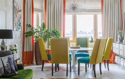
The table and chairs are vintage pieces from the 1960s that were restored and painted black. They were reupholstered in a mustard yellow fabric, and the table was given a new glass top with an aqua-green tint.
Although the apartment is on the ground floor, it’s quiet and bright thanks to the large windows — four in the living room alone — that open onto two internal courtyards.
Although the apartment is on the ground floor, it’s quiet and bright thanks to the large windows — four in the living room alone — that open onto two internal courtyards.
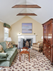
As part of her plan to create color continuity throughout the home, Sperandeo used the intense green of the kitchen wall units in this bedroom, on a wall that doubles as a headboard. Instead of a walk-in closet, the room is outfitted with a double built-in wardrobe designed by the architect.
Next door is the spacious master bathroom.
The couple chose to install a whirlpool bathtub and a large shower.
More on Houzz
Read about other homes around the world
Find an interior designer near you
Shop for home products
More on Houzz
Read about other homes around the world
Find an interior designer near you
Shop for home products


Apartment at a Glance
Who lives here: The architect’s sister, her husband and their 20-year-old son
Location: Repubblica/Central Station area of Milan
Size: 1,076 square feet (100 square meters)
Architect: Betti Sperandeo