


Kitchen of the Week: Smart Space Planning and Bold Style
A designer gives a kitchen an open layout to fit her clients’ lifestyle and a hip vibe to suit their tastes

These homeowners wanted to transform the chopped-up main floor of their 1930s Atlanta bungalow with an open-concept plan that established the kitchen as the heart of the home. They turned to interior designer Whitney Jones to make the public spaces more functional for their lifestyle. As to the look they were after, one of the homeowners told Jones, “Wow me!”
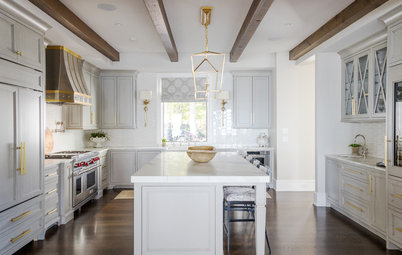
Jones did the space planning first, then tailored the design to suit her clients’ tastes. “They are young and hip and have great taste. They told me they liked light and bright and that they weren’t afraid of bold ideas, color or contrast,” she says. The overall look of the kitchen, their new family hub, is a mix of industrial and midcentury modern with a hip, funky vibe.
Jones did the space planning first, then tailored the design to suit her clients’ tastes. “They are young and hip and have great taste. They told me they liked light and bright and that they weren’t afraid of bold ideas, color or contrast,” she says. The overall look of the kitchen, their new family hub, is a mix of industrial and midcentury modern with a hip, funky vibe.
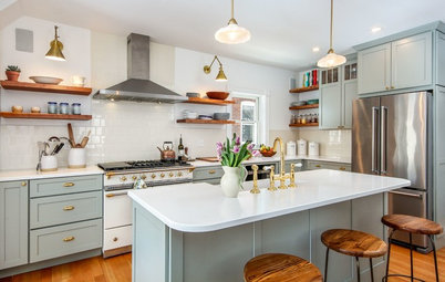
The custom cabinetry in the island and around the perimeter of the kitchen includes two slim pullout racks for spices and oils, a U-rollout at the sink base, utensil inserts in drawers flanking the range, a vertical tray divider, cutlery and flatware dividers, deep drawers for pots and pans and slotted compartments for pot and pan lids.
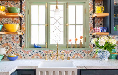
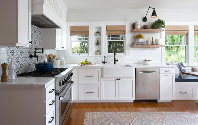
Shaws Original Lancaster kitchen sink: Rohl; Litze faucet in luxe gold and matte black: Brizo; island pulls in Golden Champagne, Amerock Hardware
Browse white farmhouse sinks in the Houzz Shop
Shaws Original Lancaster kitchen sink: Rohl; Litze faucet in luxe gold and matte black: Brizo; island pulls in Golden Champagne, Amerock Hardware
Browse white farmhouse sinks in the Houzz Shop
Floating walnut shelves keep the area around the 48-inch Wolf range open and airy. Elongated subway tile nods to the home’s 1930s vintage in an updated way. The veining in the Ranier quartz countertops has the look of classic marble.
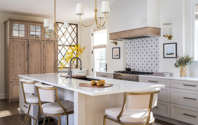
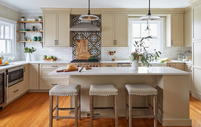
The left edge of the fridge can be seen at the right in this photo. It forms an easy work triangle with the range and sink. There’s a generous amount of counter space around the range and on the island.
Backsplash tile: Sobu in Cotton 4-by-12 gloss: Specialty Tile; Hopewell pull in matte black: Top Knobs; countertop fabrication: Inman Park Marble
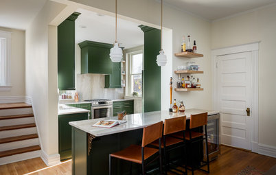
“The kitchen and the dining room were both compartmentalized, boxy spaces,” Jones says. She removed walls to open up the first floor, creating a clear view through the house from the front out to the backyard.
She designed a built-in banquette with storage beneath the bench. Above the bench, walnut shelves separate the dining area from the living room.
She designed a built-in banquette with storage beneath the bench. Above the bench, walnut shelves separate the dining area from the living room.
“There are cabinets practically from corner to corner along this entire wall,” Jones says. “My clients are very neat and tidy. They appreciate having a place for everything and they keep everything in its place.”
She incorporated wine chillers in the dining room cabinetry as well as more walnut on the countertop and shelves. And she brought in the island’s paint color here to distinguish the dining area cabinets from adjacent kitchen cabinets while also creating cohesion between the spaces. To the left of the cabinets she designed a built-in workstation that’s just off the front entry.
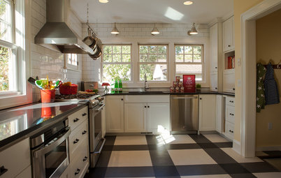
Jones was able to save the original oak floors by lacing in new pieces where needed. She updated them with Minwax’s Provincial stain.
She incorporated wine chillers in the dining room cabinetry as well as more walnut on the countertop and shelves. And she brought in the island’s paint color here to distinguish the dining area cabinets from adjacent kitchen cabinets while also creating cohesion between the spaces. To the left of the cabinets she designed a built-in workstation that’s just off the front entry.
Jones was able to save the original oak floors by lacing in new pieces where needed. She updated them with Minwax’s Provincial stain.
“The area in the center was a great opportunity to rev up the space with a bold wallpaper and shelves for display,” Jones says. “My clients were not interested in glass doors, so I distinguished these cabinets with wire mesh. Mixing materials fit with their funky style.”
Atacama wallpaper: Farrow & Ball
Atacama wallpaper: Farrow & Ball
The living room is on the other side of the dining room’s open shelves, which have matching walnut drawers beneath them. These custom built-ins were part of a clever solution to a challenge. Moving some existing plumbing pipes that service the second floor would have had a big impact on the budget. So Jones hid them in a column, added a matching column on the other side, and filled the space between them with the custom cabinetry and shelves. “This kept an open concept with delineation,” she says.
“This was fabricated by Itage Design Group,” Jones says. “They got down to the nitty-gritty details and hand-selected every board. And they painstakingly matched the graining.” The pulls are a mix of bone and brass, which adds another funky factor.
Hire a cabinet pro
“This was fabricated by Itage Design Group,” Jones says. “They got down to the nitty-gritty details and hand-selected every board. And they painstakingly matched the graining.” The pulls are a mix of bone and brass, which adds another funky factor.
Hire a cabinet pro
The family room is located between the kitchen and the backyard. New accordion doors open up the views to the outside. The new layout makes it possible for Mom and Dad to watch their son in the backyard.
It can be tough to work in “funky” and still make a space feel cohesive. “We accomplished this by keeping a tight materials schedule — we used similar materials in different ways throughout the house,” Jones says. In the family room, the built-ins are in the home’s signature blue. And the millwork wall on the right picks up on the deep teal of the dining room’s wallpaper.
It can be tough to work in “funky” and still make a space feel cohesive. “We accomplished this by keeping a tight materials schedule — we used similar materials in different ways throughout the house,” Jones says. In the family room, the built-ins are in the home’s signature blue. And the millwork wall on the right picks up on the deep teal of the dining room’s wallpaper.
The family room, kitchen, dining area and workspace run along the bottom of this plan, from the back of the house, left, to the front, right. One area that wasn’t photographed is the 65-square-foot pantry, which is part of the kitchen and dining area’s total of 365 square feet. It’s located across from the island under the stairs. The photo and elevations at the top illustrate the transformation of the back facade of the house.
See more of this home
More on Houzz
Read more kitchen stories
Browse kitchen photos
Hire a kitchen remodeler
Shop for kitchen products
See more of this home
More on Houzz
Read more kitchen stories
Browse kitchen photos
Hire a kitchen remodeler
Shop for kitchen products


Sponsored
Columbus Area's Luxury Design Build Firm | 17x Best of Houzz Winner!
Kitchen at a Glance
Who lives here: A couple and their young son
Location: Grant Park neighborhood of Atlanta
Size: 365 square feet (34 square meters), including the dining area and pantry
Designer: Whitney Jones of Wynter House Designs
Contractor: Alair Homes Decatur
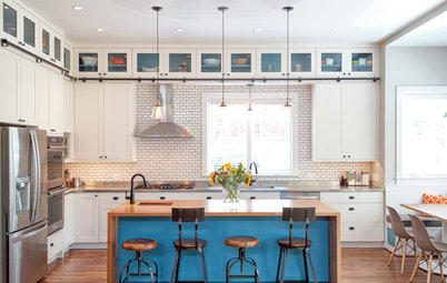
The homeowners knew they wanted a large island in the kitchen. “This fit their lifestyle and their aesthetic,” Jones says. The island is packed with functional features, including the sink, the dishwasher, storage and seating, as well as shelves for cookbooks. The designer placed the island so that whichever parent is working in the kitchen can keep an eye on their young son, whether he’s in another room or in the backyard.
The deep blue color of the island, the statement faucet and the large vintage-style pendant lights provide the “wow” the homeowners craved. The large-scale pendants work well with the size of the island. “I loved the idea of using two. The sink is off-center, so it didn’t feel right with three pendants or a long bar fixture,” Jones says.
Island paint color: Naval, Sherwin-Williams
Find an interior designer on Houzz