


Tiny Home With Genius Storage and a Bed in a Drawer
A designer finds smart ways to get the most out of 215 square feet in a studio apartment outside Paris

When this young woman decided to buy her first home, she fell for a 215-square-foot studio apartment with an open-plan kitchen and a comfortable bathroom. Although it’s a small space, it’s in a pretty building ideally situated in the center of Lamorlaye, just north of Paris.
The studio needed a complete overhaul. The owner realized that the living room’s unusual angles presented a challenge that would require an expert’s touch. She found interior designer Patricia Coignard on Houzz, who immediately set to work tackling the structural quirks of the space while fulfilling the owner’s wish to turn her first home into a cozy and trendy nest.
The studio needed a complete overhaul. The owner realized that the living room’s unusual angles presented a challenge that would require an expert’s touch. She found interior designer Patricia Coignard on Houzz, who immediately set to work tackling the structural quirks of the space while fulfilling the owner’s wish to turn her first home into a cozy and trendy nest.
Before: Coignard spotted the owner’s main concern on her first visit: “When I entered the living area, a sharp angle caught my eye. It visually reduced the size of the room and caused a lot of grief.”
This “before” floor plan shows the apartment’s layout. The entry is on the middle left marked “215 ENT.” The bathroom is at top left. The living room with the sharp angle is bottom right, and the kitchen is bottom left.
Despite the apartment’s difficult geometry and compact size, the owner asked Coignard to find a solution that would fit a living room, a full-fledged double bed and storage space. She also wanted to revamp the kitchen. And the end result had to be very “her,” a place where she and her beloved cat could feel good.
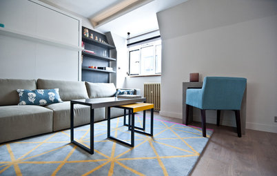
After: The owner wanted “a cocooning, bright, Zen atmosphere with Scandinavian inspiration,” Coignard says. Together, the two decided on a soft look in white and wood.
Coignard turned to a clever color trick to add a bit more character and create a sense of space and well-being. “I went for a trompe l’oeil technique: Using a very dark color in the entrance hall made the living room much brighter and therefore seemingly larger by comparison,” she says. “Optical effects are very effective for resizing rooms.”
Coignard turned to a clever color trick to add a bit more character and create a sense of space and well-being. “I went for a trompe l’oeil technique: Using a very dark color in the entrance hall made the living room much brighter and therefore seemingly larger by comparison,” she says. “Optical effects are very effective for resizing rooms.”
Coignard also thought about durability when designing the entryway and chose wood-look porcelain flooring. It matches the oak floor in the living room, which was sanded to lighten its tone and then treated with a matte finish.
The original bathroom door was replaced with an opaque glass one to let in natural light. It also emphasizes the graphic feel of the overall design.
Coignard also added a cat flap into the door of the closet opposite the bathroom. You can see it framed in white near the floor to the left of the front door in the previous photo. “This is how we solved the problem of the cat litter, which was a major issue. This cat is the owner’s inseparable companion, and I saw right away that its well-being was also part of the requirements,” Coignard says. She notes that it’s her job to meet all her customers’ needs, even when they aren’t explicitly stated.
Before: This photo of the remodel in progress was taken from the living room and looks toward the front door and entry hall. On the right in the living room is a built-in column and a cabinet with ovens that had been temporarily moved out of the kitchen.
This view of the living room shows the built-in column, which stuck out 24 inches. The wall also has a service duct by the window on the right. The entry hall is out of view to the left.
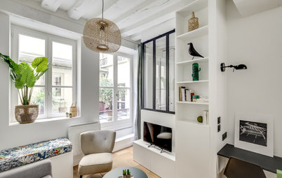
After: Coignard used the wall to install lots of storage in a studio that had almost none. “The owner was alarmed when I suggested covering this entire section of wall with a floor-to-ceiling, full-width unit. She thought it would make the space feel cramped, but she trusted me,” Coignard says.
The unit helps hide the columns, with the television taking center stage in an oak niche, framed at the top and bottom by cupboards that store books, the internet router and other living room staples.
On the sides are two closets with hanging rods and drawers. On the right, open oak niches liven up the composition.
The owner wanted to be able to watch television from her living room, bed or kitchen. Coignard came up with a solution: “The screen is mounted on an arm that allows you to move the TV out from its niche, bring it closer and adjust it,” she says.
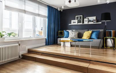
Before: Opposite the TV wall was the studio’s pain point: a very pronounced recess, a “prominent and oppressive angle, so unusual that it drew all attention, making the room seem tiny,” Coignard says.
After: “That was the real challenge in this project, because it had to be ‘erased’ in the process of integrating various functions into this cramped space,” Coignard says.
The owner asked her to create a cozy sitting area where she could hang out with friends, a comfortable double bed that could magically disappear and lots of storage.
The owner asked her to create a cozy sitting area where she could hang out with friends, a comfortable double bed that could magically disappear and lots of storage.
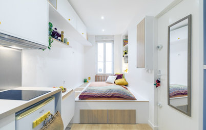
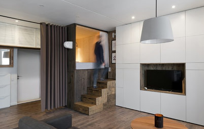
It was clear that they would need a tailor-made solution to accommodate both the geometry of the space and the owner’s requests. “We started with a [2-foot-tall] wooden platform, with a very comfortable double bed that slides underneath,” Coignard says. “The platform can be accessed by three steps, each about 8 inches tall. The living room space is structured by two partitions.”
The bed frame and high-end mattress operate like a drawer. “Equipped with wheels, the system slides on ball bearing rails positioned on the sides of the structure,” Coignard says. “I had two requirements: that the bed should pull out easily and that it could be stored again with all of the sheets and pillows still on it, to make it easy for the young woman.”
As shown here, the bed can be pulled out without moving anything in the living area. This is why the platform was built to match the geometry of the walls.
Coignard added a second drawer to the right of the bed for additional storage. “I start from the principle that a flat is for living in and not just for looking beautiful in photos,” she says.
“You should never sacrifice practicality for aesthetics.”
“You should never sacrifice practicality for aesthetics.”
The steps at the foot of the platform hide more storage.
Slatted screens warmly delineate the living space without blocking light.
Slatted screens warmly delineate the living space without blocking light.
The owner keeps her shoes in the platform steps.
Before: Here’s a wide shot of the living room during renovation.
After: The owner wanted to erase the room’s inside angle visually, which can’t be done with furniture arrangement alone. Once again, a trompe l’oeil technique came to the rescue.
Coignard resized the angle with dark paint — highlighting the left side and painting the corner darker makes it recede from view. The trick is well known among interior designers, but you need to know how to use it: “A triangle that stands out too much painted on the wall can have the opposite effect,” Coignard says.
Coignard resized the angle with dark paint — highlighting the left side and painting the corner darker makes it recede from view. The trick is well known among interior designers, but you need to know how to use it: “A triangle that stands out too much painted on the wall can have the opposite effect,” Coignard says.
There was also decor to select. “My client picked it based on my recommendations: a chic [60-inch-wide] love seat, adjustable lights, round objects to compensate for the clean lines of the platform, a cozy carpet and a comfortable, fancy kennel for her cat,” Coignard says.
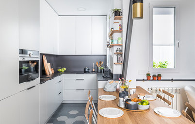
Before: The kitchen was in fairly good condition. The owner wanted to keep it to save on costs, but still wanted to give it a new look and more character.
After: Coignard added four game-changing features: new floors, new lighting, an improved peninsula table and a well-thought-out wall unit that serves as a link between the kitchen, the living room and the entry.
The white kitchen cabinets were taken down temporarily to paint the walls blue. The shade is a bit lighter than the one used in the entry hall. The boiler and furnace in the rear left corner disappear behind a box painted the same color as the rest of the wall. A dropped ceiling and new floor tiles with a geometric design create a sharp visual division between the kitchen and the rest of the space. LED spotlights and black pendants provide illumination.
The original peninsula was pretty basic. “We enlarged it and redesigned it with an oak counter, which has turned it into a comfortable table for lunch,” Coignard says. “The waterfall counter also clearly sets out the entrance to the kitchen.”
The original peninsula was pretty basic. “We enlarged it and redesigned it with an oak counter, which has turned it into a comfortable table for lunch,” Coignard says. “The waterfall counter also clearly sets out the entrance to the kitchen.”
Coignard wanted to hide functional parts of the kitchen as much as possible from the view from the living room. The counter on the left hides the sink. The faucet was replaced with a fancier model.
Before: In the original kitchen, the oven column and refrigerator were against the wall on the right.
After: Coignard used another trick to hide the fridge and ovens, and to match the waterfall peninsula. “I designed and then had made to measure an end unit in oak and white laminate to mark the entrance to the kitchen and create a transition between it and the living room decor. To hint at the former, we painted the backs of the niches the same blue as the kitchen. This unit gives the project a real through line,” she says.
To make the most of a space like this, they had to conduct an in-depth analysis and order custom furniture. This increased the budget somewhat, but thanks to the quality materials and finishes, the owner should be able to enjoy her cozy nest for many years to come.
More on Houzz
Tour other homes around the world
Find a pro near you
Shop for home products
More on Houzz
Tour other homes around the world
Find a pro near you
Shop for home products


Apartment at a Glance
Who lives here: A 24-year-old woman
Location: Lamorlaye, in the south of the Oise department of France
Year renovated: 2018
Size: 215 square feet (20 square meters)
Designer: Patricia Coignard of Atmosphères Design
Budget: $47,000 for the work, plus $5,900 for furniture and other decor