


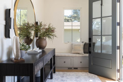

New This Week: 7 Hardworking Mudrooms and Entryways
Stylish custom storage and durable materials create beautiful, functional spaces that keep everything organized

The best way to fight clutter in a home is by stopping it from the start. And the best solution for that is a hardworking mudroom or other entryway feature with smart storage. The following spaces show how various designers tackled the challenge. Custom storage and clever cubbies, hooks and other devices organize bags, boots, clothes and more, while eye-catching materials and colors create a welcoming vibe worth coming home to.
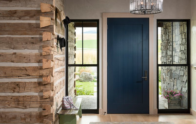
2. Yellow Cabinets and Exposed Brick
Designers: Ryan and Christine Harper of Harper Design Build
Location: Brooklyn, New York
Size: 144 square feet (13 square meters); 8 by 18 feet
Homeowners’ request. A mudroom to serve a family of five with varying schedules, needs and storage requirements.
Main feature. Vibrant yellow storage system with open shelves and drawers. “This mudroom serves as the entrance to a four-story townhome and is intended to be a bright and fun entrance for this family with three teenage kids,” architect Christine Harper says. “The storage is easy to access, and a variety of depths and types of storage was used to suit the different needs of the family. The hook area provides a place for everyone to quickly move in and out of the home.”
Other special features. “The brick wall reminds you when entering the house that you are entering a historic home,” Harper says. “Exposing the 100-year-old brick wall was a way to mix the old with the new cabinetry.”
Designer tip. “For this mudroom, we had to think outside of the box,” Harper says. “The 8-foot-wide space was narrow and would not fit traditional closets with doors. We tiered the depths of the storage from 12 inches at the bench area to 18 inches at the deepest shelves. This was done to accommodate the existing front door location and to maximize storage. As you get deeper into the mudroom and house, the depth increases to allow storage for larger items.”
Millwork: H & H Architectural Woodwork
Shop for wall organizers on Houzz
Photo by Lisa Russman
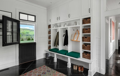
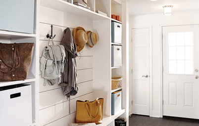
3. White Shiplap and Gray Shelves
Designer: Christina An of Greenacre Development
Location: Wyckoff, New Jersey
Size: 112 square feet (10 square meters); 8 by 14 feet
Homeowners’ request. “This project was a spec home, but one where we as the builder and designer put a lot of thought into the function and details of each space,” says designer Christina An, who used Houzz to collect photos to inspire this design. “We pictured a young family living in this home, one that would appreciate simplicity in design. The challenge with this mudroom is that it is a fairly small space that connects to so many other key spaces: the garage, the exterior side door, the back stairway, the walk-in pantry and the kitchen. The design had to be clean and uncluttered, and the functionality of the space had to stand up to this level of activity.”
Main feature. “The jumping-off point was the nook we built for the bench,” An says. “We floated the shelf and laid shiplap on the back wall to give it dimension. We wanted it to be the focal point of the room. The bench and shelf were painted gray [Chelsea Gray by Benjamin Moore] to contrast with the white shiplap wall and to connect with the floor underneath. That way there is both contrast and harmony in the color scheme. It all comes together when you add the pops of color with the pillows and decorative elements, and great texture with the jute rug.”
Other special features. “The porcelain tile has the look of slate, which connects to the blue slate used on the exterior of the house,” An says. “It comes in 12-by-19-inch-size tiles, which is not a standard size for porcelain tile, making it look more like natural slate. We love it for mudrooms because it’s hard-wearing and easy to clean. It’s the perfect choice for a busy mudroom.”
Designer tip. “We never forget about featuring trimwork in a mudroom,” An says. “Whether it’s panel molding or, as in this case, shiplap, incorporating special trimwork instantly elevates a mudroom.”
“Uh-oh” moment. “The initial design of this room had more traditional cubbies spanning the entire length of the wall,” An says. “But the portion behind the side door would be blocked, and it was looking too stifled. We came up with the idea of building out a closet behind the door for closed storage — so you can hide at least some of the mess — which then created a nook, where we built a more open-style bench and shelf. The result is that the room feels tidier and more casual at the same time.”
Paint: Olympic Mountains (walls), Simply White (shiplap and trim) and Chelsea Gray (bench and shelf), all by Benjamin Moore
4. Midnight-Blue Cabinets and Hickory Wood
Designers: Nathan Taylor of Obelisk Home (interior design) and hdesigngroup (architecture)
Cabinetmaker: Cabinet Concepts by Design
Location: Springfield, Missouri
Size: 30 square feet (2.8 square meters); 5 by 6 feet
Homeowners’ request. An attractive solution for storing backpacks, shoes and coats at the entrance to the home of a busy family of four.
Main feature. Custom frameless cabinets in deep blue (Moscow Midnight by Sherwin-Williams).
Other special features. Hickory wood wraps the wall and forms the bench and slab for hooks.
Designer tip. “Extra hooks — because you can never have enough,” designer Nathan Taylor says. “Also, use hardwood in spaces that get a lot of use.”
“Uh-oh” moment. “We had to make the decision on-site to wrap the entire walls and sides in wood for even more durability,” Taylor says. “The trim carpenter had to get creative to incorporate this into the design so that it didn’t look like a last-minute addition.”
5. White Cabinets and Bench
Designer: Courtney Thomas Design
Location: La Cañada Flintridge, California
Size: 200 square feet (19 square meters)
Homeowners’ request. “The homeowners wanted a brighter entry, but it wasn’t until we started asking questions about their access in and out of the house that we learned they used their front entry more than their back kitchen door off the garage,” says designer Courtney Thomas, who collaborated with her clients using Houzz ideabooks. “With their three boys and lots of sports gear, we suggested replacing the underutilized dark stained cabinets and closets at the foot of the stairs with a mudroom bench. This allowed us to address not only the function of the space but also the closed-in feeling the dark stained cabinet was creating. A mudroom bench and a fresh coat of white paint (White Dove by Benjamin Moore) opened up the space significantly.”
Main feature. “Painting out the old, stained paneling drastically changed the entry and unified all the other changes we made to update its look,” such as new fixtures and stair spindles, Thomas says.
Designer tip. “Some structural elements cannot be removed to open up a space, but they may be adapted to better suit your needs,” Thomas says. “Consider tweaking built-ins to give you the impact and everyday use you’ll enjoy.”
“Uh-oh” moment. “Over the staircase is a large two-story blank wall,” Thomas says. “I wanted to panel it and add art, but it was going to be a larger undertaking than the homeowners were willing to explore. So we decided to add wall sconces and some simple art over the staircase instead. This turned out to be a happy compromise, since the additional lighting was what they needed more than the architectural detail of paneling, and the smaller art meant it could be more easily swapped out as the homeowners grew out of it.”
Photo by Jon Friedrich
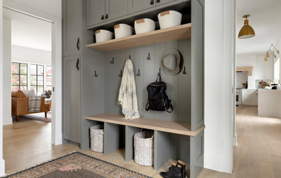
6. Slate-Look Floor and Simple Built-Ins
Designer: Larina Kase Interior Design
General contractor: Edward Rudloff of Rudloff Custom Builders
Location: Wayne, Pennsylvania
Homeowners’ request. A place where the family could organize coats, backpacks and shoes to prevent clutter from accumulating in the home.
Main feature. “This is a 1920s stone Colonial, so we wanted to stay in keeping with the old-home charm yet add modern convenience,” builder Edward Rudloff says. “The contractor was able to integrate the existing architecture with simple and practical built-ins. The contractor also made the floor level with the kitchen so the family could walk seamlessly into the home.”
Other special features. “The couple has two young girls, and we needed hooks for their bags and jackets,” Rudloff says. “Since this is in the Northeast, a bench for putting boots on and taking them off is a must, as are baskets for storing hats and gloves. We selected a faux-slate tile for the floors.”
Designer tip. “The main idea with this space was to consider function first, because just about anything can be made beautiful,” Rudloff says. “In this space, the window and views to the outside and simple design make it a great transition from outdoors to indoors.”
7. Graphic Floor Tile and White-and-Wood Storage Unit
Designer: Lauren Lerner of Living with Lolo
Location: Scottsdale, Arizona
Homeowners’ request. A mudroom for storing backpacks and strollers and that could also function as a laundry room. “Initially, our client wanted a modern-farmhouse look, and we pushed her outside of her comfort zone by introducing fun patterns and colors,” designer Lauren Lerner says. “She is very happy that we did.”
Main feature. “The first finish we selected for this room is the fabulous tile,” Lerner says. “It has a cement tile look but is actually a porcelain tile, which we love because it is durable and easy to take care of.”
Other special features. White storage unit with wood bench, cubbies and hooks. Light purple wall paint.
Designer tip. “Keep your laundry room and mudroom fun!” Lerner says. “This is a space you and your family will be using a lot, and you want it to bring joy to your life. Introducing a fun tile and a bold wall color is a great way to give the space an element of fun.”
More on Houzz
How to Design a Marvelous Mudroom
50 Marvelous Mudrooms With Ample Storage
Browse entryway ideas
Find a pro in your area
Shop for home products


Designer: Ricardo Bilonick of LDa Architecture & Interiors
Location: Newton, Massachusetts
Homeowners’ request. An addition on the rear of the home to include a new mudroom and kitchen. “The main goal was to create a space that felt connected, open and bright but didn’t compromise the design,” architect Ricardo Bilonick says. “With a growing family, the clients wanted a mudroom equipped with ample storage, connected to the rear deck and that flowed into their new kitchen.”
Main feature. “As part of a larger addition, the kitchen and mudroom were designed to be connected and open to one another,” Bilonick says. “Upon entering the mudroom, your eye is immediately drawn to the navy blue star tile, which is a focal element, and pans up to the ceiling, where the walnut accent is revealed. [The kitchen and mudroom lack] a singular wall to define each room; the mudroom cabinetry leads up to the kitchen, doubling as a countertop. We love this feature because it shows that you can have definition between two spaces without segmenting them with walls.”
Other special features. Bench, coat cubbies, tall cabinet behind doors and storage for firewood. “Our design process always starts with Houzz,” Bilonick says. “We will have clients start a Houzz account and include any images that inspire them. The spirit of the projects comes from the collections they make.”
Designer tip. “Five percent cool was the goal,” Bilonick says. “In this case, we knew that the space didn’t warrant a funky paint color, so we kept our color palette clean and focused on a more minimal approach. We painted the walls and cabinetry a bright white, which highlights their surrounding landscape and brings the outdoors in. We wanted the finishes and colors to be traditional, and let certain key moments be the star, like the walnut ceiling and the eye-catching star-patterned floor tile the clients selected. This is an easy tip that any homeowner can apply — even in small spaces.”
“Uh-oh” moment. “The struggle during a remodel of a home this vintage is dealing with a house that has settled,” Bilonick says. “New construction is square and plumb; the old house is not. Hiding these discrepancies is fun but challenging. In this project, the kitchen and mudroom straddled the line of old house and new. We decided to jack up the sagging center of the house to bring the floors back to level and so appliances, doors and ceiling treatments were all straight.”
Find an interior designer near you