


7 Spicy Kitchen Color Palettes Worth a Try
See how a dash of tangy green, orange, yellow or red can energize your space
Jennifer Ott
March 3, 2020
San Francisco-based architectural color specialist and design writer. Jennifer's work has been featured in many print and online publications. Her recently-published book, "1000 Ideas for Color Schemes," is a beautifully illustrated and easy-to-navigate guide that takes the guesswork out of selecting the perfect color palette for your home or special event. For more information on Jennifer Ott Design, visit http://jenottdesign.com/.
San Francisco-based architectural color specialist and design writer. Jennifer's... More
Colors other than white and gray are finally, slowly making their way back into kitchens. But that doesn’t mean you have to go completely over to the dark side if that’s not a look you love. You can keep the space light and bright with shades of white, gray or tan and then add in small dashes of spicy hues. For those in the process of renovating or simply repainting their kitchens, here’s a handful of flavorful palettes, as well as examples of them in actual kitchens, to spark color inspiration.
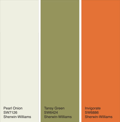
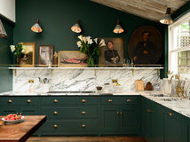
Palette 1: Tropical Spice
A lush, leafy green paired with a saturated orange is a winning combination in a kitchen because both hues stimulate the senses and have an appealing, appetizing quality.
The deep green helps ground the brighter orange, and when paired with a light neutral such as Pearl Onion by Sherwin-Williams, the effect is colorful and chic.
Find a kitchen designer near you
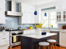
Here’s a kitchen sporting a similar palette. The tropical green is in the form of tile, but you could easily paint this hue on your cabinets or as an accent area and get a comparable wash of color.
This is a smart way to use bright orange — small, concise and focused. It really brings the eye into the heart of the kitchen.
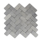
Shop for mosaic kitchen tile
This is a smart way to use bright orange — small, concise and focused. It really brings the eye into the heart of the kitchen.
Shop for mosaic kitchen tile
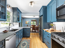
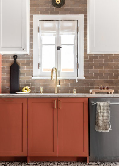
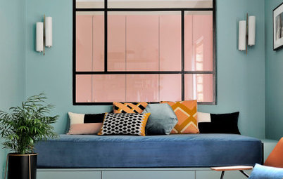
Palette 2: Vibrant Spice
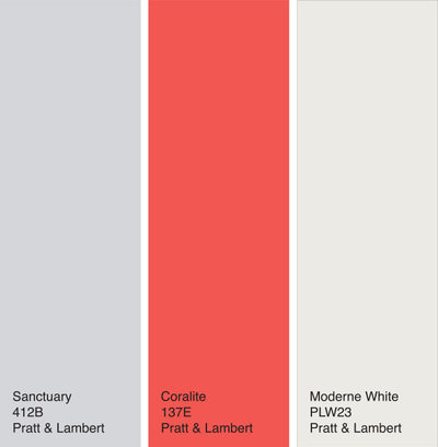
This palette features a super juicy red-orange hybrid as the star. Coral hues have been trendy the last few years, but this one is no soft and muted salmon or blush.
Because of its vibrancy, the color is best used on items or elements that you really want to stand out. Try pairing it with a supporting cast of light neutrals. Here it’s shown with a soft purple-gray and a warm white.
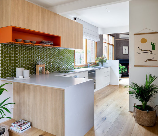
This contemporary kitchen has a similar color scheme. Notice how your eye goes right to the accent wall painted in the bright coral, but then you take in the pretty cool gray cabinets and warm light wood floor, walls and ceiling. This illustrates a brilliant way to play with color contrasts: vibrant with mellow and warm with cool.
Palette 3: Lightly Spicy
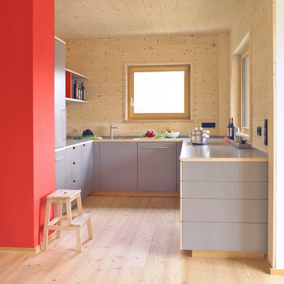
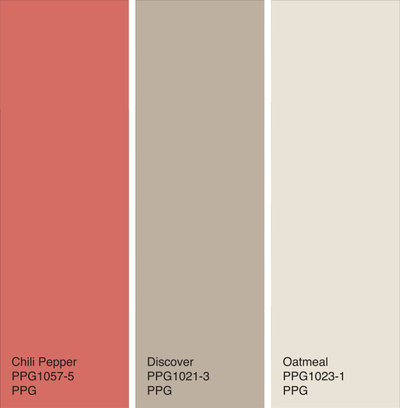
If you need a palate cleanser after the last bold option, here’s a softer yet still stimulating color combination. Instead of a bold coral, we’ve got a more muted red pepper hue. And instead of an icy complement, it’s paired with warm shades of taupe and oatmeal.
If you need a palate cleanser after the last bold option, here’s a softer yet still stimulating color combination. Instead of a bold coral, we’ve got a more muted red pepper hue. And instead of an icy complement, it’s paired with warm shades of taupe and oatmeal.
This lovely kitchen uses the palette nicely. The rich colors still have an airy vibe because of the white upper cabinets and window trim. They reinforce the traditional-modern hybrid look of the space.
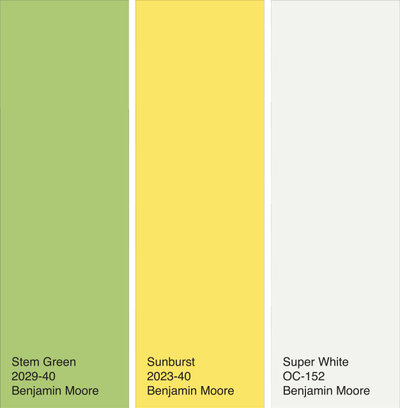
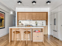
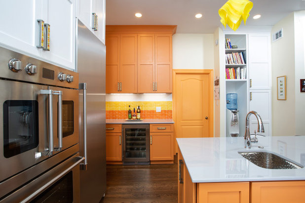
Palette 4: Crisp Spice
Whenever I have a client struggling with kitchen color choices, I’ll ask them what their favorite foods are. It’s often a good starting point for selecting a winning color scheme.
A crisp green such as the Stem Green shown here is often a solid choice. It reminds me of pears or green apples, or fresh salad greens — definitely a delicious color. Add even more snap by pairing it with a sunny yellow, then keep everything light and bright with plenty of pure white.
This happy-hued kitchen just makes me smile. This is the perfect palette for those living in an overcast and rainy climate, or for the non-morning people among us. Who needs caffeine when you can get a visual lift just by walking into your kitchen?
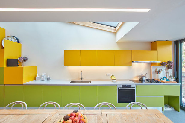
Palette 5: Citrus Spice
Here’s another happy palette, this time featuring orange and sunny yellow. Warm colors are thought to stimulate conversation as well as appetites, which makes them excellent choices for the kitchen.
If this palette is too much color for you, you could easily drop one of the brighter hues and use the other with the light warm white for a slightly less zesty look.
This citrusy space uses the colors well. Not too much, but enough to bring a cheery vibe.
Striking palettes like this work well in minimalist kitchens, where you don’t want the colors fighting with other decorative elements. Consider keeping things simple if you want to bring in big color.
Striking palettes like this work well in minimalist kitchens, where you don’t want the colors fighting with other decorative elements. Consider keeping things simple if you want to bring in big color.
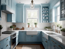
Palette 6: Bold Spice
For those who favor darker colors, here’s an example of sunny yellow paired with ever elegant and neutral grays.
There’s been a bit of a backlash against gray lately, but I still like it as a neutral backdrop to more assertive colors, such as a vibrant yellow.
For those who favor darker colors, here’s an example of sunny yellow paired with ever elegant and neutral grays.
There’s been a bit of a backlash against gray lately, but I still like it as a neutral backdrop to more assertive colors, such as a vibrant yellow.
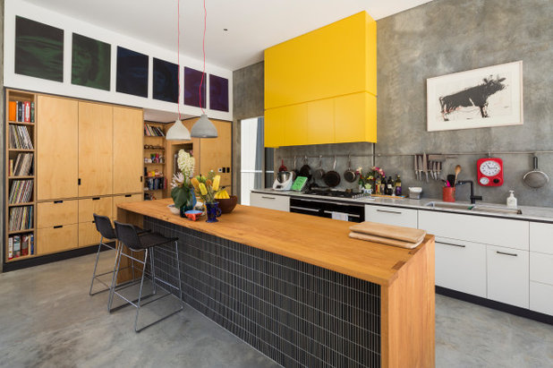
Pure black with bright yellow or orange can look harsh — there’s a reason those colors are used for warning signs. But if you knock the black down to dark gray, the combo goes from “danger” to dignified. It’s an elegant palette that works well in any style kitchen.
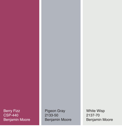
Palette 7: Luscious Spice
Here’s an appetizing palette featuring a ripe raspberry hue with a pretty lavender-gray. I’ve been spotting lots of saturated pinks for interiors lately, perhaps as a reaction against heavily white and gray spaces or a progression from long-popular muted millennial pink.
If you want this ripe hue to take center stage in your kitchen, try pairing it with cool and warm neutrals for balance.
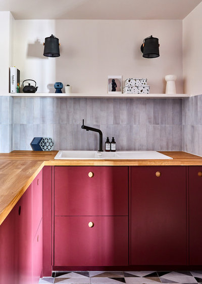
This gorgeous kitchen wears the colors beautifully. Pure, saturated reds or purples can sometimes come on too strong, but this pretty in-between hue really boosts this tiny kitchen in a big way.
Your turn: Which colors are you considering for your kitchen? Please share in the Comments.
More on Houzz
5 Fresh Kitchen Color Palettes
A Baker’s Dozen Colors for Kitchen Cabinets
Get more kitchen design ideas
Find home design and building professionals
Shop for products
Your turn: Which colors are you considering for your kitchen? Please share in the Comments.
More on Houzz
5 Fresh Kitchen Color Palettes
A Baker’s Dozen Colors for Kitchen Cabinets
Get more kitchen design ideas
Find home design and building professionals
Shop for products


What are you working on?


Related Products


Scott Davidson founded Davidson Builders in 1998. Scott graduated from Michigan State with a BS in Construction... Read More
Related Stories

Decorating Guides
Design Pros Share 10 Favorite Creamy White Paints
By Becky Harris
These off-white color choices include versatile tones, warming hues and pleasingly soft shades
Full Story

Color
Pantone Picks a Peach for Its 2024 Color of the Year
By Jennifer Ott
See how to use this juicy hue to create calm yet flourishing spaces inside and outside the home
Full Story

Colors of the Year
10 Paint Colors Ready to Take Over in 2024
By Jennifer Ott
Blue is huge, but dark hues and warm tones also find favor among major paint companies’ 2024 Color of the Year picks
Full Story

Events
7 Color Trends for 2024 at Maison & Objet
By Claire Tardy
New harmonies and unexpected pairings at the fall 2023 trade fair set the tone for next year’s interiors
Full Story

Decorating Guides
9 Ways to Layer Warm Neutral Colors for Comfortably Refined Rooms
By Becky Harris
Design pros share advice for building an inviting palette, introducing high contrast and mixing textures
Full Story
Exteriors
10 Off-White Paint Colors for Home Exteriors
Pros share the off-white shades they used to complement the architecture of these remodeled and new-build homes
Full Story

Color
Pantone Chooses a Vibrant Magenta for 2023 Color of the Year
By Jennifer Ott
Viva Magenta is a bold, cool red hue meant to promote optimism and joy. See how to use it around your home
Full Story

Colors of the Year
7 Paint Colors Set to Be Big in 2023
By Jennifer Ott
See the soft neutrals, warm pinks and deep blue-greens defining major paint companies’ 2023 Color of the Year choices
Full Story
Events
Color Trends for 2023 at Maison & Objet
By Claire Tardy
Interior spaces get infused with colors both soft and bold
Full Story
Events
Trending Color Palettes for 2022 at Maison & Objet
By Claire Tardy
Houzz France editors share four key color schemes for interiors at the iconic trade fair in Paris
Full Story
How refreshing! I went with a "tuxedo" kitchen and it is delightful to work in but these colors are very inspiring. Especially 1, 2, 3,4, and 7.
I really like the green tile in the first kitchen....but that's all I like.To each their own, but none of these kitchens are my cup of tea.
Palette 3 , LOVE IT , LOVE IT