


5 Fresh Kitchen Color Palettes
Get cooking with a captivating color scheme

Are you ready for a kitchen-color reboot? While white remains a popular choice for kitchens, homeowners are embracing other colors, mostly cooler hues such as navy, gray and earthy greens. But if you’d rather not jump from one color trend to another, here are some less common color combinations, along with examples of how they look in a kitchen.
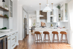
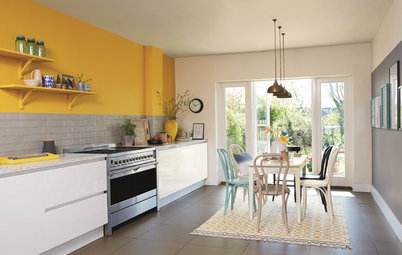
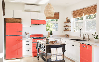
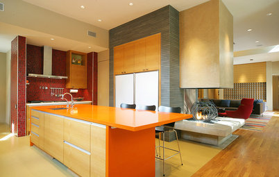
Because it helps to see a color palette used in an actual space, here is a kitchen with a similar scheme. Note how the most vibrant hue, orange, is used very sparingly. And besides that and the sunny yellow, the colors in the kitchen are light and neutral. This creates a fun, happy vibe without overwhelming the eye.
Shop for range hoods
Shop for range hoods
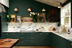
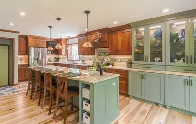
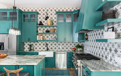
Palette 2: Lush Tropical
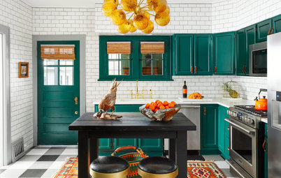
Here’s a bold option for those who favor cooler hues. Shades of green pulled from the tropics bring an exotic vibe to kitchens regardless of the perhaps less-than-exotic location of the spaces.
You can warm up the palette by pairing the colors with a warm white, such as shown here, or stick to the cool side with a light gray. Either way, these two greens need a good bit of white to offset their vibrancy.
The contemporary kitchen pictured here sports similar hues. Because it’s a minimalist space, with not much in the way of decor, the bold colors really step up to provide an interesting focal point.
Palette 3: Pretty in Pink
Not everyone wants bold and bright colors in the kitchen, but that doesn’t mean you have to default to white, gray or beige hues only. This palette features soft, muted tones that avoid looking like juvenile pastels because they have a good bit of gray in them.
Not everyone wants bold and bright colors in the kitchen, but that doesn’t mean you have to default to white, gray or beige hues only. This palette features soft, muted tones that avoid looking like juvenile pastels because they have a good bit of gray in them.
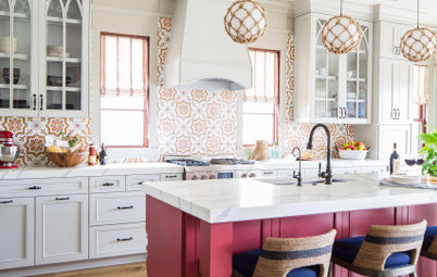
It’s a pretty palette that feels warm and welcoming without coming on strong with color like the first two examples do. And because all of these hues are soft, you can easily inject them in large doses, such as shown in this beautiful kitchen that has a comparable color palette.
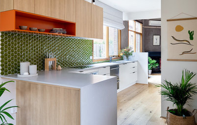
Palette 4: Crisp and Airy
Here’s another palette featuring a light minty green, but this time it’s paired with a deeper cool green and a soft sky blue.
This palette offers a nice mix of bold and mellow. Depending on which vibe you prefer, you can use more or less of the deep green.
Here’s another palette featuring a light minty green, but this time it’s paired with a deeper cool green and a soft sky blue.
This palette offers a nice mix of bold and mellow. Depending on which vibe you prefer, you can use more or less of the deep green.
This palette works well in a warm climate. The colors are all cool and fresh and, as you can see from the kitchen here with a similar scheme, create a soothing ambiance.
Palette 5: Purple Reign
This sophisticated scheme is admittedly unusual for a kitchen, but if you desire to be different, using purple will set your kitchen apart from the all-white pack.
It’s definitely a bit on the chilly side, but you could easily warm it up by pairing it with warm wood elements or going with warmer gray accent colors.
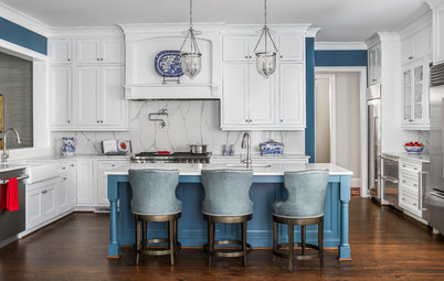
Check out the comparable scheme here. This is a clean and modern neutral kitchen that gets a boost from the purple backsplash. If you prefer to use purple in an easier-to-change-out way, you could paint an accent wall or just the island instead.
Your turn: Are you considering a colorful kitchen? What hues do you plan to use?
More on Houzz
Will These 9 Paint Colors Take Over Homes in 2020?
Maison & Objet: 10 Color Trends for Home Design in 2020
Get home design ideas
Find design and building professionals near you
Shop for furniture and other home products
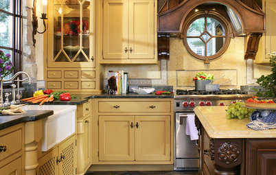
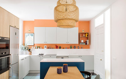


This palette goes out to all the people residing in cold climates and facing the remaining chilly months of winter. Being cocooned in warm-colored spaces can indeed make us feel warmer, so consider bringing sunshine hues of yellow and orange into your kitchen if you could use the temperature boost.
This is also a great color palette for kitchens that lack natural light. A dash of sunny yellow or mandarin orange nicely brightens a space.
Find a kitchen designer