


Kitchen of the Week: Family-Friendly With Modern Farmhouse Style
A San Diego couple with small children work with their designer to reconfigure and brighten a Craftsman kitchen

Nate and Ashley Fuller spent a year looking for their forever home in San Diego. Eventually they fell in love with a historical Craftsman home built in 1925, in what’s now the city’s trendy North Park neighborhood, which features hip coffee shops, upscale restaurants and indie boutiques. The couple wanted to put their own stamp on the home and spent another year looking for living room furniture with their designer, Hope Pinc, before turning their attention to the kitchen and its tired cabinets and limited counter space.
With three children under the age of 5, Nate and Ashley wanted to create a family-friendly kitchen with modern farmhouse style, better storage, more countertops and improved lighting. Working with Pinc, they created their stylish dream kitchen with a more efficient layout and a user-friendly breakfast nook where they can share casual meals together.
With three children under the age of 5, Nate and Ashley wanted to create a family-friendly kitchen with modern farmhouse style, better storage, more countertops and improved lighting. Working with Pinc, they created their stylish dream kitchen with a more efficient layout and a user-friendly breakfast nook where they can share casual meals together.
After: They moved the refrigerator to the wall opposite the sink (you can see a sliver of the appliance in the right foreground of this photo) and replaced what was an awkward short section of countertop and cabinets, significantly opening up the layout. This design move created more counter space and storage on the sink wall and allowed the family to make better use of the adjoining breakfast nook.
Custom solid paint-grade maple cabinets and drawers, painted an off-white color with a cool undertone (Snowbound by Sherwin-Williams), give Nate and Ashley the user-friendly storage they wanted. The cabinets and drawers feature bronze knobs and pulls. “We loved the sturdiness of the pull and knob,” Pinc says. “It has a clean look but a very organic feel.”
The light-tone cabinets and drawers and misty gray walls (Foggy Day by Dunn-Edwards) with crisp white wainscoting and trim (Extra White by Sherwin-Williams) offer contrast for the new stained 2½-inch oak plank floor that adds warmth and was designed to match the existing hardwood floors throughout the home. “Before, there were two different types of wood in this floor, and it felt like the room was chopped up,” Ashley says.
Shop for cabinet hardware
Before: This photo shows what the breakfast nook looked like before the renovation — about enough room for a two-person table and chairs. Even with windows on two walls, the placement of the large refrigerator made the space feel closed off and tight.
After: With the refrigerator relocated, the upgraded breakfast nook feels more open and airy, with a built-in bench and royal blue cushion that helps expand seating and offers storage below for games and toys. “It created such a functional space for their family to gather for morning breakfast or a quick lunch,” Pinc says. “It really gave the room some added texture and color, from the cushion fabrics and pillows, that pulled the colors of the backsplash and oak accents and flooring together.”
Table: custom
Table: custom
This view looking into the kitchen from the breakfast nook highlights the improved lighting. A cage lantern with an oil-rubbed bronze finish over the table in the breakfast nook and an industrial-style 1-light adjustable sconce on the sink wall support all the natural light that now comes into the space. Undercabinet lighting illuminates task areas by the range. “There wasn’t recessed lighting before, just randomly placed ceiling lights that weren’t right for the space,” Ashley says.
Adjustable sconce: Morland 1-Light in English Bronze, Savoy House
Adjustable sconce: Morland 1-Light in English Bronze, Savoy House
Pinc had the existing windows and original open shelves over the sink area repaired, sanded down and repainted, then adorned the windows with inside-mount woven shades that help block light when needed but keep the frame exposed as part of the interior design. “We wanted to keep some of the nice features when we could,” Ashley says.
A stainless dishwasher with integrated control panel sits to the right of the undermount farmhouse sink, which features a pull-down faucet in an oil-rubbed bronze finish. A paneled pullout trash center with recycling sits to the right of the dishwasher. To the left of the sink, large drawers with inserts hold pots and pans. “The biggest difference is having a lot more counter space and good flow,” Ashley says.
A stainless dishwasher with integrated control panel sits to the right of the undermount farmhouse sink, which features a pull-down faucet in an oil-rubbed bronze finish. A paneled pullout trash center with recycling sits to the right of the dishwasher. To the left of the sink, large drawers with inserts hold pots and pans. “The biggest difference is having a lot more counter space and good flow,” Ashley says.
Stained floating oak shelves to the right of the farmhouse sink match the updated wood floor and offer display space for decorative items, bowls and cookbooks. “We didn’t want to block any more of the window that was previously blocked with the refrigerator there,” Ashley says. “This keeps it a lot more open and airy. And I like being able to have a little decoration in there too.”
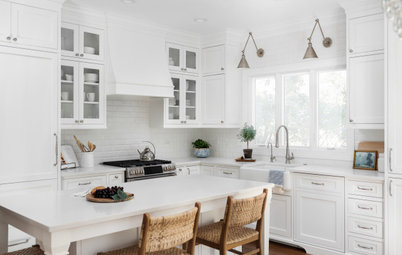
This photo highlights the glossy white tile backsplash and the white quartz countertops that mimic Calacatta Gold marble, with its gray and gold veining. “In general, I like the cleanliness of the white. It just feels bright and clean,” Ashley says.
Before: While the Fullers were happy with the existing range, they wanted to address how the exhaust for the range hood stuck out on top of the short upper cabinets and eliminate the gap left between the top of the cabinets and the ceiling.
After: Pinc designed an enclosed paneled hood above the existing range that blends with the upper cabinets, which now go all the way to the ceiling and feature molding on top for a finished look. Nate and Ashley added a pot filler behind the range surrounded by decorative porcelain tiles that add a pop of color and pattern to help define the cooking zone.
Before: This floor plan of the existing kitchen shows how the space felt chopped up and lacked good flow, with a refrigerator (bottom center) that protruded into the layout. This drawing also shows a center line that separated two different types of wood flooring.
The door seen on the left side of this floor plan leads to the backyard that opens to their garage. The door by the range opens to the dining room, and the door by the pantry leads to the home’s hallway and bedrooms.
The door seen on the left side of this floor plan leads to the backyard that opens to their garage. The door by the range opens to the dining room, and the door by the pantry leads to the home’s hallway and bedrooms.
After: These floor plans show how the renovated kitchen space is now more efficient and user-friendly, from the built-in bench in the breakfast nook (bottom left) to the new broom cabinet and appliance garage by the relocated refrigerator (center) that help keep the countertops and space clean. Also notice the hooks added on the wall by the door to the backyard (top left) to hang jackets or coats before entering the kitchen and the enlarged pantry cabinet with pullout drawers (top right).
The updated look and better function has turned the renovated kitchen into a popular hangout spot for the family. “It’s a space we all enjoy being together in, and it’s definitely a space we’re utilizing a lot more,” Ashley says. “It’s a nice, bright space now.”
More on Houzz
Read more kitchen stories
Hire a kitchen remodeler
Shop for kitchen products


Kitchen at a Glance
Who lives here: Nate and Ashley Fuller and their three young children (two toddlers and a newborn)
Location: North Park neighborhood of San Diego
Size: 245 square feet (23 square meters)
Designer: Hope Pinc Design
Before: While Nate and Ashley didn’t hate the look of the white cabinets and soapstone countertops in their existing L-shaped kitchen with its butter-yellow walls, the couple found the soapstone difficult to maintain. Several layers of paint covered the cabinets, and the existing drawers often got stuck when opened or closed, due to old wood glides.
Two additional problems the couple wanted to address were a lack of countertop space and a large stainless refrigerator that stuck out like a sore thumb on the sink wall and loomed over the adjoining breakfast nook. “There was a lot of usable floor space that was not taken advantage of with the existing layout,” Pinc says.
Find an interior designer on Houzz