


Kitchen of the Week: Walnut and Quartz in a View-Worthy Room
A designer takes down a wall and opens up a dark, compact kitchen for better function and flow

He loves to cook and socialize while doing so; she loves to sew. He’s drawn to contemporary style; she leans more traditional. But one thing they agreed on was that their cramped, closed-off and dated kitchen wasn’t doing it for either of them. Enter interior designer Sherry Hope-Kennedy, who created a kitchen that made it easy for these two busy doctors, their young daughters and their frequently visiting parents to gather, cook meals and enjoy time together.
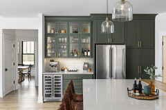
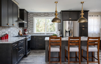
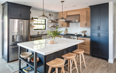
Opening the kitchen to the eat-in area and the great room meant it needed to provide a lovely view. The island, which delineates the working part of the kitchen, is painted at the base in Pewter by Benjamin Moore. Hope-Kennedy continued this color in the adjacent butler’s pantry, which can be seen through an opening to the left of the fridge. The designer chose a large undermount sink to hide dirty dishes. New floors installed throughout the first level are walnut.
The quartz on the countertops waterfalls down the sides of the cabinets and island and extends all the way up the walls to the ceiling. “This makes the kitchen an interesting focal point,” Hope-Kennedy says. “And down the sides of the cabinets, the quartz has a lighter look than wood would have.”
Making the quartz, with its regular vein patterns, look more like marble, which has irregular veining, took a designer’s skillful eye. “I played a lot with the templates while at the stone yard to make the patterns look more random,” Hope-Kennedy says.
Shop for modern walnut counter stools
Here’s a closer look at the veining on the quartz. A small wine rack breaks up this row of cabinets. Though most of the food is stored in the pantry, the family keeps some of it in these cabinets for quick access.
Custom cabinetry: Yates Woodworking; counters: Vadara Quartz Surfaces
Hire a cabinet pro
Custom cabinetry: Yates Woodworking; counters: Vadara Quartz Surfaces
Hire a cabinet pro
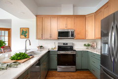
Hope-Kennedy’s design improved the flow and circulation between the kitchen and other rooms. “He wanted to be able to face his guests or the TV when cooking, so he opted to put the range in the island,” she says. Located across from the sink, fridge and two wall ovens, the island completes a functional work triangle.
Browse range hoods in the Houzz Shop
Browse range hoods in the Houzz Shop
The range is 48 inches wide and has six burners. The island has a pullout for oils and spices, drawers for utensil storage, deep drawers for pots and pans and a trash pullout that makes it easy to slide scraps straight off the counter into the bin. With the necessary vent hood anchoring the island from overhead, Hope-Kennedy kept the rest of that space clear of pendant lights for an uncluttered look.
Off the end of the island, Hope-Kennedy tucked in a work area for her client’s sewing. The walnut she used matches the cabinetry. The simple desktop, chair, stool and streamlined task lamp play up the contemporary aspects of the space. This shot was styled for the photo shoot, but the designer provided her client with two roomy baskets for storage that will sit on the shelf above the desk.
To the right of the desk is a coffee bar complete with coffeemaker and cabinets for beans, mugs and other java-related accoutrements. Its placement outside of the main work triangle makes it easy to fetch coffee without getting in the way of the breakfast cook.
To the right of the desk is a coffee bar complete with coffeemaker and cabinets for beans, mugs and other java-related accoutrements. Its placement outside of the main work triangle makes it easy to fetch coffee without getting in the way of the breakfast cook.
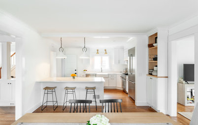
To the left of the fridge is the large butler’s pantry, which holds a microwave, food storage and counter space for small appliances. “The goal was to keep the kitchen uncluttered while being able to function well,” Hope-Kennedy says. She transformed an existing closet next to the dining room into a bar, convenient for serving when entertaining.
Cabinet color: Pewter; wall and trim paint: White Dove, both by Benjamin Moore
Cabinet color: Pewter; wall and trim paint: White Dove, both by Benjamin Moore
The formal dining room is off the kitchen. “Because the kitchen is more contemporary for him, I wanted the dining room to be more traditional and elevated for her,” Hope-Kennedy says. The walnut table and chairs create cohesion with the kitchen, while the homeowners’ beloved existing crystal chandelier sets the upscale tone for the room. The sculptural console, pleated satin drapes and intricately patterned rug add elegance.
Paint color: White Dove by Benjamin Moore
Paint color: White Dove by Benjamin Moore
The kitchen’s eat-in space is a favorite spot for the girls to do their homework. “Often by the time it’s time to buy furniture, money is running low,” Hope-Kennedy says. She found some great deals on floor models — these purple chairs, the rugs in here and in the dining room, the dining room console and other pieces came straight from the furniture store’s floor.
Before: The eat-in area’s location can be seen at the back left corner of this photo. Previously, the living room was sunken, which created a hazard for the homeowners’ parents. The renovation raised it to the same level as the kitchen. Removal of the wall and using the same walnut flooring as the rest of the first level also made the spaces cohesive and created better flow.
Hope-Kennedy removed walls that divided the kitchen and eat-in area from the living room. A wall was previously located where the ceiling height changes here.
After: The pantry is in the bottom left corner, the dining room is beneath it and the eat-in area is at the top right.
More on Houzz
Read more kitchen stories
Hire a kitchen remodeler
Shop for kitchen products
More on Houzz
Read more kitchen stories
Hire a kitchen remodeler
Shop for kitchen products


Kitchen at a Glance
Who uses it: Three generations of a family: a doctor couple with two young daughters and parents who visit often
Location: San Francisco
Size: 450 square feet (42 square meters) plus butler’s pantry
Designer: Sherry Hope-Kennedy of Studio SHK
This San Francisco kitchen redesign was part of a greater remodel of the first floor. The scope was down-to-the-studs — Hope-Kennedy removed walls and raised a sunken living room’s floor up to the same level as the other spaces to make it safely accessible to the homeowners’ parents. Three generations of the family are often gathered here, so an open feel and good circulation were key. “One of my clients is a collector,” Hope-Kennedy says. “So while we did some purging, we also worked in lots of storage.”
As for style, the designer found ways to honor the husband’s preference for contemporary style and the wife’s love of traditional style and the original architecture of the home. “The house has 1970s modern style, so it called for something more contemporary,” Hope-Kennedy says. Creating storage solutions for everything maintains a clean, uncluttered look. Walnut, flat-panel cabinet drawers, streamlined style, counter stools and a globe light fixture nod to contemporary, while the use of Shaker-style cabinet doors, bin pull hardware, blue-gray paint and a quartz that looks like marble adds traditional touches.
Find an interior designer on Houzz