


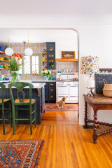

Open-Plan Kitchen Gains Light and a Connection to Nature
A bright and colorful London addition replaces a ‘falling apart’ sunroom, a kitchen and a living room

A design incorporating the principles of biophilia (love of nature) was at the heart of this north London kitchen addition, particularly the desire to increase daylight and connect the new room to the backyard. The aim was to replace a falling-down 1980s sunroom, a kitchen and a separate, dark living room with a new daylight-filled space that worked for the whole family.
The addition is north-facing, so architect Yaniv Peer had to work extra hard to introduce as much light as possible. His design includes an abundance of skylights in the unusually shaped ceiling, with additional windows above the bifold doors and behind the sink. The result? Loads of light in the spacious new room.
The addition is north-facing, so architect Yaniv Peer had to work extra hard to introduce as much light as possible. His design includes an abundance of skylights in the unusually shaped ceiling, with additional windows above the bifold doors and behind the sink. The result? Loads of light in the spacious new room.
Before: This is the part of the space — the dated sunroom — that was in disrepair before work began. “It was literally falling apart,” Peer says. “The back of the property is north-facing and daylight quickly became our driving factor.
“We ran a daylight modeling analysis on the design, so we knew where the sun was at different times of the day, and it was about trying to maximize light in the morning and late afternoon, when the family needed it most,” he says.
Before any of that, though, the first hurdle was to get planning permission for the project. “These 1930s properties have a rear projection, almost an L-shape, which meant the extension couldn’t be a simple shape, so we went for a full planning application,” Peer says. “Once you go down that route, you may as well go for a [few extra feet], as it doesn’t cost that much more, relatively speaking.”
Peer made the leap from his previous job to open his own practice as this project unfolded, using Houzz to research how others had tackled similar additions.
“When we started the project, the owners had two boys under 7, but halfway through the detailed design phase, they found out they were expecting their third child. It put a bit more pressure on the project, I won’t lie!” Peer says.
The project, which also included an attic conversion, was completed a week after the baby arrived. “We’ve since become friends,” Peer says, “and I now have three other projects on the same road.”
The project, which also included an attic conversion, was completed a week after the baby arrived. “We’ve since become friends,” Peer says, “and I now have three other projects on the same road.”
“We designed the kitchen from scratch and it was handmade,” Peer says.
The cabinetry is birch plywood. “The surround edges are all faced and beveled,” Peer says. “The aim of seeing the exposed grain is to connect back to nature, and they are covered with a water-resistant oil stain. The fascias are spray-painted in colors the owners chose.” The panels above the window behind the sink slide, so the owners can hide clutter and display attractive items.
The backsplash window is another light source for the room, and the owners have since added a planter just outside it, making the greenery in it visible from indoors.
The engineered wood flooring adds another natural element to the design. “We chose it for its 14.2-millimeter [approximately half-inch] oak surface, which allows for three sanding layers — key with three kids!” Peer says.
Panel paint: Proud Peacock by Dulux and Victorian Eclectic 4 by Crown Trade
Behind the white door, under the clock, is a utility room, which frees up more space for storage in the kitchen — and there’s plenty of it. The island is almost 8 feet long and 4 feet deep. The side facing the dining table features shelf space, and on the other side are three 2-foot-wide drawers for pots and pans. For a minimalist look, the cabinets forgo handles in favor of niches routed out for easy opening.
The dining table adds yet more wooden warmth to the space; it belonged to the grandparents of one of the homeowners.
The dining table adds yet more wooden warmth to the space; it belonged to the grandparents of one of the homeowners.
In this closer view, you can see there are three holes in the plinth of the first cabinet on the far left. “The owners wanted to store vegetables in there, so we added these for ventilation,” Peer says.
The sleek cooktop is flush with the island’s quartz work surface. “The cool thing about it is that it takes up only the space of one top drawer, so you’re left with lots of storage space,” Peer says.
The center of the cooktop has a ventilation fan, whose duct goes down through the island and under the floor. It runs over to the window and comes out on the other side of the wall at left.
Before: In the original layout, the living room lacked natural light.
In the new living space at the far end of the addition, Peer designed touch-catch cupboards and lots of cubbies, some with lighting, for storage and display. They’re lined in birch plywood to tie in with the kitchen.
The doors are bifold, and the right-hand leaf functions as a single door if the owners don’t want to open up the whole wall.
The glass above the doors follows the line of the roof to take advantage of morning and evening light. “I think the M shape gives the extension a quirky look, a bit like a face with one eyebrow a little raised,” Peer says. It’s not purely aesthetic, though. Rather than going with a flat roof, Peer designed the addition to maximize the light coming in above the bifolds.
If you scroll back to previous photos, you’ll see there’s a very small post between the top of the bifolds and the roof. “This supports the central valley of the roof,” Peer says. “My business partner is also a structural engineer, which is why we don’t have many internal structural supports. It was quite a challenge, and that tiny post was the key to making it work.”
Each of the wood skylight pieces is also important to the support of the roof, Peer says. The pieces are clad in birch plywood to match the kitchen.
These views of the addition roof from an upstairs window and from higher up (next photo) show how the structure works.
The addition is a hip-to-gable design and features a central gutter, which allows rain to drain like a waterfall and to percolate into the ground. “It was quite a pain to convince building control to allow this,” Peer says, laughing. “We made a [model] and ran a hose so they could see exactly how it would work.”
The addition is a hip-to-gable design and features a central gutter, which allows rain to drain like a waterfall and to percolate into the ground. “It was quite a pain to convince building control to allow this,” Peer says, laughing. “We made a [model] and ran a hose so they could see exactly how it would work.”
“Biophilic design is very much what the project was geared around,” Peer says. “It means lots of natural daylight, natural patterns, materials and textures, and lots of greenery. It’s a design approach to elevate people’s well-being.”
The end of the gutter seen in the center of the previous photo is visible here, above the central point of the glass.
Before: The old sunroom before Peer and his team got to work.


Kitchen at a Glance
Who lives here: An opera singer, a conductor and their three young children
Location: North London
Size: 400 square feet (37 square meters); 16 by 25 feet
Designer: Yaniv Peer of Iguana Architects
“The original brief was to create a space that worked for the family, so [the parents] could see the kids while they were cooking and so on,” Peer says. “They also wanted to get a bit more light in and make it less chaotic.”