


Decorating Guides
Why Calming Colors Are Trending for the Home
After this month’s Design Chicago conference, experts reflected on color trends that emphasize calm in a chaotic world

In the face of rapid-fire headlines and cultural overstimulation, colors in the home seem to be moving in a more tranquil direction. Presentations and conversations at this month’s Design Chicago conference, along with just-announced colors of the year, suggest that major paint brands, designers and homeowners are gravitating toward muted, calming palettes and design choices in general. While world events and the public’s mood aren’t the only factors driving the popularity of soothing colors, experts say people do seem to be looking for comfort and solace at home and that color trends are following suit.
Those palettes — meant to “bring joy, serenity and focus to the mind, body and spirit,” according to Sherwin-Williams — include Mantra, a collection of dusty pinks and warm beiges influenced by minimalism, serenity and sanctuary, and Haven, a set of richer but still muted blues, greens and grays that draws from simplicity and “beckons to those seeking an oasis,” among others. Other influences Plank touched on in his lecture include the comforting concepts of healthy living, sustainability and even JOMO, the homebody cousin of FOMO (fear of missing out); it stands for “joy of missing out.”
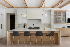
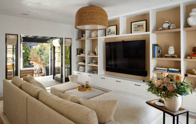
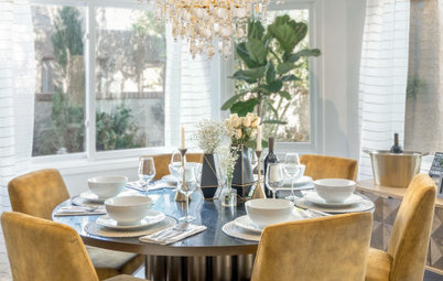
Arch paint: Breathless, Sherwin-Williams; gray wall paint: Software, Sherwin-Williams
Is a Kitchen Designed for Wellness the Key to a Healthier You?
Arch paint: Breathless, Sherwin-Williams; gray wall paint: Software, Sherwin-Williams
Is a Kitchen Designed for Wellness the Key to a Healthier You?
At the conference, design representatives from Benjamin Moore expressed similar sentiments about their 2019 palettes in comparison to those of recent years. In a Design Chicago presentation about the evolution of Benjamin Moore’s palettes over the past five years, color experts demonstrated how 2019’s colors have a more minimalist feel overall, with fewer highlighted colors than in previous years’ palettes, and the colors themselves include more whites, grays and pale blues. Instead of 2018’s bold red Caliente, a soft gray called Metropolitan is featured for 2019.
“For 2019, we observed a shift where quietude and a retreat from noise and chaos seemed to pervade the mood,” Hannah Yeo told Houzz. Yeo is a color and development expert at Benjamin Moore. “There’s a need to pause and enjoy not only moments of quiet and tranquility, but also the small details that we may otherwise overlook when we are immersed in the hustle and bustle of the day. Our research signaled a balance between strength and softness, presented in a subtle yet powerful manner.”
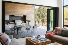
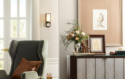
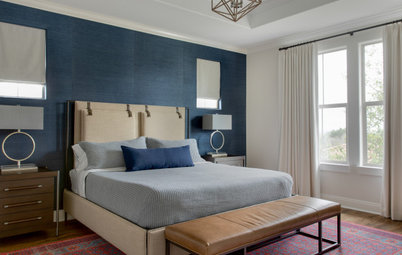
Wall paint: Windmill Wings, Benjamin Moore
Maison & Objet: 7 Color Trends to Watch in 2019
“For 2019, we observed a shift where quietude and a retreat from noise and chaos seemed to pervade the mood,” Hannah Yeo told Houzz. Yeo is a color and development expert at Benjamin Moore. “There’s a need to pause and enjoy not only moments of quiet and tranquility, but also the small details that we may otherwise overlook when we are immersed in the hustle and bustle of the day. Our research signaled a balance between strength and softness, presented in a subtle yet powerful manner.”
Wall paint: Windmill Wings, Benjamin Moore
Maison & Objet: 7 Color Trends to Watch in 2019
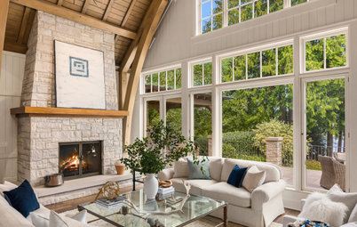
The company’s 2020 Color of the Year — the soft, rosy shade called First Light shown here — was released on Oct. 11, a week after Design Chicago concluded.
“First Light 2102-70 reflects a new definition of the home — a shift in mindset from the material to satisfying the core needs in life: community, comfort, security, self-expression, authenticity and ultimately, optimism,” said Andrea Magno, Benjamin Moore’s director of color marketing and development, in a press release.
Wall paint: First Light, Benjamin Moore
Interior designers who attended or presented at Design Chicago and spoke with Houzz said they’re seeing this attraction to calm simplicity manifest itself in client color and design requests.
“I have found my clients craving visual rest in their homes,” designer Sarah Coe said. “This is achieved by creating rooms that are monochromatic in theme — rooms that are all light or all dark. They are never boring or oversimple; if anything, it demands the eye to look closer to find interest in texture, trim and material.”
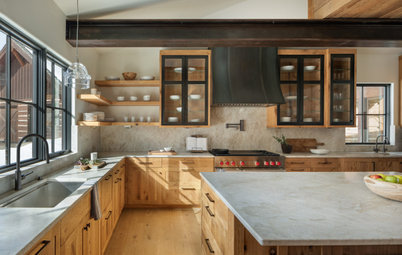
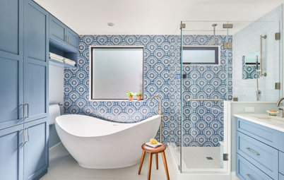
Wall paint: Verde Marrón, Sherwin-Williams
Find an interior designer near you
“I have found my clients craving visual rest in their homes,” designer Sarah Coe said. “This is achieved by creating rooms that are monochromatic in theme — rooms that are all light or all dark. They are never boring or oversimple; if anything, it demands the eye to look closer to find interest in texture, trim and material.”
Wall paint: Verde Marrón, Sherwin-Williams
Find an interior designer near you
Designer SuzAnn Kletzien covered color trends specifically for the kitchen in her Design Chicago presentation, and told Houzz she’s seen a trend that her clients are wanting less stuff, though color preferences can lean toward quiet or loud depending on the homeowner.
“I’ve had a repeat client that had very dramatic contrasts — although not necessarily strong color — request a very muted palette in their second home. This was because they have four young children and wanted as serene a backdrop as possible,” Kletzien said. “On the other hand, I’ve had clients hire me recently specifically for my use of strong and saturation colors. They had a very dull home before, however, so perhaps the blandness drove the color requests.”
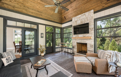
Wall paint: Granite Peak, Sherwin-Williams
“I’ve had a repeat client that had very dramatic contrasts — although not necessarily strong color — request a very muted palette in their second home. This was because they have four young children and wanted as serene a backdrop as possible,” Kletzien said. “On the other hand, I’ve had clients hire me recently specifically for my use of strong and saturation colors. They had a very dull home before, however, so perhaps the blandness drove the color requests.”
Wall paint: Granite Peak, Sherwin-Williams
When bolder colors did appear in Sherwin-Williams’ 2020 predictions, they did so in a spirit of escapism and nostalgia, according to Plank. This suggests that even homeowners and designers who are using strong colors may also be using them to create a comforting, reassuring space.
Designer Summer Thornton said her clients are still embracing the drama of maximalism, which got a lot of buzz at last year’s Design Chicago event, but that she is seeing a growing interest in a West Coast aesthetic that emphasizes airiness and light. Thornton said she tries to steer clear of trendy colors in general to keep her work timeless.
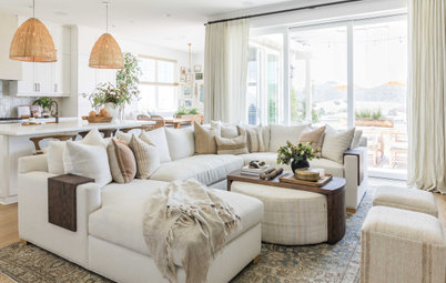
Wall paint: Pure White, Sherwin-Williams
Read more about maximalism at last year’s Design Chicago event
Designer Summer Thornton said her clients are still embracing the drama of maximalism, which got a lot of buzz at last year’s Design Chicago event, but that she is seeing a growing interest in a West Coast aesthetic that emphasizes airiness and light. Thornton said she tries to steer clear of trendy colors in general to keep her work timeless.
Wall paint: Pure White, Sherwin-Williams
Read more about maximalism at last year’s Design Chicago event
For all the emphasis on colors that offer respite from an overwhelming outside world, looking forward, designers and homeowners may be glad to know that the latest palettes are also rooted in optimism. Colors like Benjamin Moore’s First Light and even hues from companies abroad, like Dulux’s just-released 2020 Color of the Year — the pale green Tranquil Dawn — evoke a sense of peaceful new beginnings in their names and their aura.
Background wall paint: First Light, Benjamin Moore
More on Houzz
5 Trends That Got Pros Excited at Design Chicago
See more inspiration photos of muted color palettes
Background wall paint: First Light, Benjamin Moore
More on Houzz
5 Trends That Got Pros Excited at Design Chicago
See more inspiration photos of muted color palettes
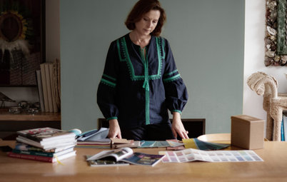
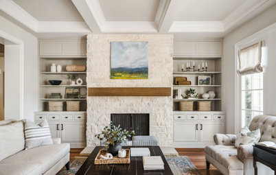

Shelf paint: Acacia Haze, Sherwin-Williams