


Houzz Tours

Historic Brownstone Infused With Personality
A designer helps a young family showcase vintage details and add playful elements in this New York home

The move from a small city apartment to a roomy historic brownstone can require a lot more than just a few new pieces of furniture. When a young Brooklyn, New York, family enlisted interior designer Jennifer Jean Morris to make the roughly 4,000-square-foot house they’d just moved into a home, there were several logistic and emotional considerations at play. The couple were expecting their second child, navigating a comparatively sprawling but narrow new space with a toddler and eager to personalize their new home before officially becoming a family of four.
“They’re sort of managing the emotions of all this while they’re trying to figure out how to lay out the space, which had a lot more room,” Morris says. That required thoughtful design choices that showcased the turn-of-the-last-century house’s vintage character and layout, channeled their personalities and were functional for the energetic, growing family.
“They’re sort of managing the emotions of all this while they’re trying to figure out how to lay out the space, which had a lot more room,” Morris says. That required thoughtful design choices that showcased the turn-of-the-last-century house’s vintage character and layout, channeled their personalities and were functional for the energetic, growing family.
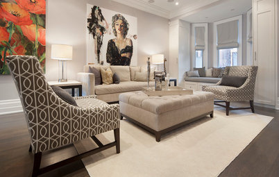
Opening Up the Living Spaces
Morris’ design vision was largely focused on the main parlor floor. Much of the home’s architectural redesign, including the removal of several walls and painting the remaining walls white, had already been done by a developer by the time Morris joined the project.
“Historic brownstone layouts are typically very compartmentalized,” she says. “All the rooms are segmented in very specific roles and tasks. One of the biggest features of this project, which is not uncommon, was the removal of all these interior walls to sort of bridge these gaps in the more modern way people live their lives.”
Without the interior walls, more natural light made for a more open flow, which Morris embraced in her design. She used colorful pieces as a bold through line, linking the front sitting area to the central dining table and the dining space to the kitchen at the rear. Each area was made distinct but flexible enough that, for example, one family member could be cooking yet still chat with someone lounging in front of the TV in another area. Even the lighting choices, such as the modern fixture shown here, encourage this loft-style living.
“The lights in the living and dining areas are shared and overlap, so the asymmetrical and organic cluster of lights helps not lock down where furniture needs to sit below it,” Morris says.
The new, more open space presented a blank slate design-wise, but Morris still had to work around the narrow, vertical layout of the property. Making the rooms feel lounge-y and livable was tricky within those constraints, she says. In the seating area, she fit in a pair of chairs that echoed the colorful original stained glass bay windows and could be rearranged as the family — the children in particular — needed.
“Keeping that space free and clear was very important to me, and having soft edges was also very important as they learn to navigate space,” Morris says.
Rich pops of color throughout the house, such as this berry-colored chair beside the ornate mantel, keep things feeling dynamic. The mantel itself links the living room and central dining area, which is marked by its retro bar cabinet and eye-catching painting seen here.
Dining Area at the Center
Morris wanted the dining area to be welcoming and a little more subdued. Aside from the colorful art on the wall, the space is accented with neutral modern chairs and warm wood. The custom, Caesarstone-topped dining table serves as a grounding anchor between the vibrant front seating area and the bright details in the kitchen.
Browse dining room chairs
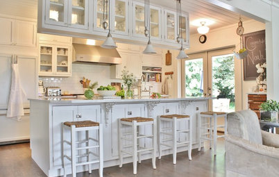
The kitchen gets its punches of color by way of the teal bar stools (glimpsed at bottom right), continuing the larger open area’s playful palette. The oversize marble island and brass cabinet pulls mirror the glam elements seen in the powder room.
The compact powder room just off the kitchen was an opportunity to add some understated drama.
Read about more jewel box powder rooms
Read about more jewel box powder rooms
Morris opted for glam wallpaper, a mirror and a hanging pendant light tied together with gold, plus a tiny corner sink.
A Calm Oasis for the Parents
Upstairs, Morris relied on a more muted palette in the master suite.
“Our approach to the bedroom was to create calm,” she says. The full wall of drapery and floral pillowcases add pattern and richness. The walnut in the dresser and bedside tables was chosen for its natural texture and warmth. Morris purposely looked for pieces for the modest-size room that were tailored and didn’t overwhelm the space, to keep things feeling serene.
A guest bath on the same floor incorporates charcoal subway wall tiles, Art Deco-style floor tiles, a marble sink and an unexpected jolt of copper in the floating shelf.
Playful, Adjustable Details for the Kids
The home’s top floor is a dedicated kid zone. In both the son’s and daughter’s rooms, Morris used the ceilings as creative canvases.
The home’s top floor is a dedicated kid zone. In both the son’s and daughter’s rooms, Morris used the ceilings as creative canvases.
The blue-and-gold starry-night-themed wallpaper in the boy’s room and the complementary radiating light fixture are youthful without dominating the space.
Playing up the ceiling is “a really interesting, great way to make a statement in a room but not inundate the entire architecture,” Morris says. “You’re really just adding a decorative touch.”
Shop for wallpaper
Playing up the ceiling is “a really interesting, great way to make a statement in a room but not inundate the entire architecture,” Morris says. “You’re really just adding a decorative touch.”
Shop for wallpaper
The little girl’s room features a daintier, birds-and-butterflies wallpaper on the sloped ceiling.
“With the ceiling in this motif, I feel like it’s very safe and user-friendly for several years, into maybe even their preteen years, depending on how specific the child’s tastes end up developing,” Morris says. “I just thought this is such a great thing for kids to look at as they shut their eyes, both of these papers.”
“With the ceiling in this motif, I feel like it’s very safe and user-friendly for several years, into maybe even their preteen years, depending on how specific the child’s tastes end up developing,” Morris says. “I just thought this is such a great thing for kids to look at as they shut their eyes, both of these papers.”
Imaginative touches like a rainbow-colored polka-dot area rug, a hexagon shelf and a metallic striped tent round out a space that can grow with the kids.
See more kids’ room inspiration photos
See more kids’ room inspiration photos
A small separate playroom on the same floor continues the whimsical vision with a green book tree.
The design process was piecemeal and stretched throughout the homeowner’s pregnancy, which could have been an issue but wasn’t, Morris says, as the client was able to see the larger goal.
“We did not do turnkey,” Morris says. “We definitely brought things in as we found them, but that also can be problematic, as one piece comes in and people don’t understand the context. But she was someone who really understood the vision, which is rare and wonderful. So as piece after piece came in, we adjusted and tweaked.”
More on Houzz
Read more stories about historic homes
10 Things to Do for a Smooth Renovation
Find a home pro near you


House at a Glance
Who lives here: A couple with two young children
Location: Brooklyn, New York
Size: 4,000 square feet (372 square meters); four bedrooms, 4½ baths
Designer: Jennifer Jean Morris of JMorris Design
Morris wanted the lively juxtaposition of historic charm and modern energy to start as soon as someone walks in the front door (or even peeked through the windows). Accordingly, a romantic blue watercolor wallpaper greets guests in the house’s entryway.
“The space was gorgeous as is, but we really wanted to personalize it with wall coverings and just add that next decorative layer that really spoke to them and who they were, and that started in the entryway,” Morris says. “It’s just such a great moment to really go for it. You’re walking through it, so the opportunity to get sick of a paper or regret something is so minimized by the fact that it’s just sort of a transitional space.”
Find an interior designer on Houzz