
Mauve: Americaʼs New Most Wanted?

Offensive? Check! Dated, tacky, Grandma, bad 1980's. Check, check, check, check.
For nearly 15 years, one taboo tone has perched itself atop the list of America's Most
Unwanted, and it's spelled M-A-U-V-E. The Reagan Era Wonder's dusty-rose-like
qualities often send me running for a blindfold to protect my very own hazel eyes.
Why the hell has this lilac-in-pink's-clothing outcast been deemed atrocious for so long?
Answer: how it's used. After perusing hundreds of designer portfolios and front-of-the-
book sections of shelter magazines, it became apparent that mauve's tarnished
reputation is a classic case of guilty by association. Mauve with black lacquer, gold and
forest green? Sure, if you're a South Jersey High Class of '84 senior portrait. Mauve
with pewter, violet, white and charcoal? Can you say "Elle DECOR cover shot"?
My point, and I do have one, is that mauve, once distanced from any element of Blanche,
Dorothy, Rose or Sophia, can be fresh, subtle, stunning and spectacular. Now as far as
wall-to-wall forest green carpet goes—check back with me in another 15 years.
In the seating area of a lofty master bedroom suite, this bold shade of mauve was used to playfully mediate between the cold, gray tone of the concrete floor and the warm, silver-brown tone of the leather club chairs. Good example that mauve, when done right, can be masculine and un-1980s. Yeah, it looks purple; however, it was I who did this space and I assure you the paint name included the word "mauve." Okay?
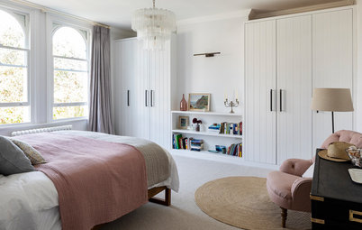
Got commitment problems? Maybe you're a better fit for simply DATING mauve. This bedroom demonstrates how impactful the tone can be when introduced through linens and accessories set against a neutral backdrop.
Layering color has been a designer trick for years but with the right eye, it's rather easy to non-decorators and non-designers to pull off. Pair a deep shade of mauve with plums and violets to tone it down to the point where you can simply pass it off as purple.
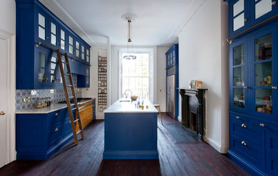
Un-beige kitchen cabinetry? This designer and I obviously speak the same language. I like it; I like it A LOT. They took a huge, expensive risk going mauve with modern kitchen cabinetry, and it totally paid off. I sure hope they keep permanent stock of grape jelly, prune juice and eggplant; if so, this will be the best color-coordinated space on the planet.
If Mauve's not the gal you wanna bring home to meet Mom (either as a roommate or a love interest), she's got a great-looking older sister, Violet. The royal shade is often bolder than mauve and works as a great base to build from when interested in using our featured color in small doses. Other accent colors ideal for this space would be hot pink, turquoise, coral and grass green.
Tori Mellott's New York apartment has been an inspiration to me for years. Her effortless use of grape, plum and lilac with mauve undertones against an otherwise all black and white backdrop has been tacked up on my inspiration board since 2008...along with every issue of Domino that was ever printed. Saddie face :(
This is a dining room. It is not mauve, it is grape. But this is my idea book and I want it in here. That is all.
A super light lilac/mauve tone on walls in rooms packed with natural light adds just a hint of color so the other elements can take center stage.