


Kitchen of the Week: French Industrial Style in Black and White
Parisian pastry shops inspire a New Jersey kitchen’s marble countertops, tile walls and professional look

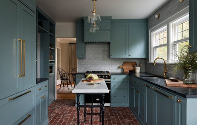
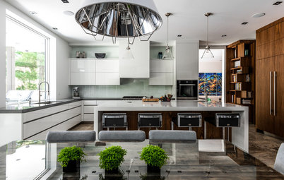
Striving for Symmetry
“My client loved the idea of symmetry, and I love to bring symmetry into a kitchen too,” Griffin says. The cabinet run on the left threw things off, so the designer added a tiled niche with open glass shelves over the countertop to help her create the symmetry on the range wall. After centering the range on the wall, she centered the islands on the range.
The island in the foreground is close to the family room and serves as the social hub, with room for six to gather around it. It also contains a microwave drawer. The second island is a cook’s work station. It is convenient to the range, has a prep sink and contains a trash bin and specially outfitted storage.
Shop for industrial-style counter stools
Metalworkers at Amoré Design Factory in New Jersey made the range hood in white enamel and polished stainless steel. It creates a strong focal point with European style. They also fabricated the steel shelf underneath it.
There is a pullout cabinet for spices and oils to the left of the 48-inch range and a steam oven to the right.
Allia round fireclay sink: Rohl
There is a pullout cabinet for spices and oils to the left of the 48-inch range and a steam oven to the right.
Allia round fireclay sink: Rohl
Letting the Windows ‘Breathe’
These existing windows provide beautiful views to the backyard. “My clients had felt so closed in before that we wanted to let the window breathe,” Griffin says. “This meant tiling the entire wall and adding sconces rather than adding upper cabinets here.” Window frames and muntins painted black play off other black elements in the room and provide strong graphic contrast to the bright white.
The large sink, flanked by panel-front dishwashers, is serious business. It is the Ideal Workstation 4 by The Galley and has all sorts of inserts and functions that transform it into an efficient prep station and a serving buffet. The size of the sink necessitated a cabinet bump-out, which was a wonderful form-follows-function moment since it breaks up the long run of cabinets. The bump-out also created enough room under the sink for trash and recycling bins.
The black window paint, the stainless steel cabinet hardware and Schluter finishing strips along the edges of the window tile and the niche tile bring an industrial component into the room. The 18-inch-tall polished stainless steel faucet also has professional kitchen style.
Cabinets: Wood-Mode; cabinet design: Canterbury Design; faucet: Waterstone Faucets; Merchant double wall lights: Thomas O’Brien for Visual Comfort
Find a faucet with a pull-down sprayer in the Houzz Shop
The fridge used to be in the back right corner of the room. This meant that people grabbing drinks often got in the way of the cook. That location also was next to a mudroom off the garage, which is the main entry for the family.
Now a professional-style stainless steel fridge stands at the edge of the space. The location is convenient to the social island and to the French doors, left, leading to the patio. It’s also just a few steps from the prep area.
Find a kitchen remodeler near you
Now a professional-style stainless steel fridge stands at the edge of the space. The location is convenient to the social island and to the French doors, left, leading to the patio. It’s also just a few steps from the prep area.
Find a kitchen remodeler near you
It’s Not Entirely White
The black accents and the material palette help keep the kitchen from being too stark. “The statuario marble has lots of medium gray tones in it. We matched the grout in the subway tiles to this gray, which breaks up the white tiled walls,” Griffin says.
The window, the chalkboard pantry wall and other elements, such as the stool legs and the pendant lights, punctuate the space with black. “The black pendant lights were my client’s idea, and they are strong accents,” Griffin says.
Polished marble countertops: PMI International Stone Importers; countertop fabrication: Bridgewater Marble & Granite Works; Fulton pendant lights: Ralph Lauren for Circa Lighting
Pantry Wall
“The homeowner absolutely loved the idea of using chalkboard paint and a sliding barn door,” Griffin says. This wall opposite the windows was just the spot to use them. “Usually it’s a lot more colorful than this because the boys love to draw on it,” she says. This wall infuses the room with unexpected industrial style and contrast.
The homeowner found the barn door made by Rustica Hardware. It is a patchwork of metal pieces framed by light maple. Inside the pantry, Griffin repeated the maple detail, which also ties to the original hardwood flooring. The alcove behind the door serves as a coffee bar and an overflow pantry space. Griffin designed it so that it looks beautiful when the barn door is open.
To create enough room for the large islands, Griffin borrowed a little space from the mudroom so that she could recess the pantry alcove.
Again, she achieved pleasing symmetry by replacing the plain door that leads to the mudroom, on the left side of the chalkboard wall, with double French doors and a transom. She did this to match an existing door to the butler’s pantry, just out of view on the right side of the chalkboard wall. “And a dark wall like this needs a place to end. By adding the transom and millwork on the left, we trimmed it out,” she says. She also centered the barn door track on the wall.
Check out more photos of kitchens with sliding barn doors
Floor Plan
The range wall runs along the bottom of this plan. The sink and the fridge are on the right side. The chalkboard wall with the pantry alcove is on the left side of the kitchen, with the mudroom behind the pantry on the far left. At the top of the plan is the eat-in area; it lies between the kitchen and the family room and wasn’t photographed.
Takeaways
- Share your ideas with your designer by creating ideabooks. Not only will it help you communicate your vision, but also his or her trained eye may see other details you are drawn to that you may not have noticed.
- Consider whether two islands would create a better flow than one large island.
- Place a fridge in a spot where people can access it without getting in the cook’s way.
- If you have wood floors, create a few wood accents to play off them. This can be as easy as choosing counter stools with wood bases or adding some wood cutting boards to your countertops.
More on Houzz
Read about other Kitchens of the Week
Find a home pro
Shop for kitchen and dining products


Sponsored
Columbus Area's Luxury Design Build Firm | 17x Best of Houzz Winner!
Kitchen at a Glance
Who lives here: A family of four
Location: Bernardsville, New Jersey
Size: 452 square feet (42 square meters)
Designer: Alison Griffin of Griffin Designs
This young family in Bernardsville, New Jersey, realized that its kitchen, at 452 square feet, was generously sized. But an awkwardly placed refrigerator and an oversize island with little room around it were impeding the flow. The room was dark, and the cabinetry and finishes were dated. Nothing in the kitchen suited the couple’s lifestyle and that of their two active young boys.
“My client had a strong vision of the look she wanted — French patisserie-inspired style with subway-tiled walls, bright white cabinets, some open shelving and accents of black and metal — but needed help putting it together,” says kitchen and bath designer Alison Griffin. “As someone who worked in marketing, she had a great eye for strong graphics and design but needed help with fixing the layout problems. This was a true collaboration between us.” The homeowner also had a love of chalkboard paint, especially for her boys, and wasn’t a fan of upper cabinets.
Griffen used her expertise to make the kitchen functional, cohesive and beautiful. This included improving the flow, creating zones and providing attractive symmetry. Although her client initially leaned toward having another long island, Griffin came up with a two-island design that would keep the flow more open so everyone could enjoy the kitchen at the same time without getting in one another’s way. She also suggested a graphic black-and-white twist on French bakery design.
The designer and her clients shared their visions through Houzz ideabooks. “Houzz has been a very important tool for getting a feel for what clients like and to show them ideas,” Griffin says. “And I can analyze the photos they like to see things they may not have realized they wanted, such as this client’s preference for inlay cabinetry over overlay cabinetry.”
Find a local kitchen designer on Houzz