


Houzz Tour: 2-Story Paris Apartment Has a Garden Feel
This bright French home features a plant-filled sitting room, clever storage and a daring bathroom

This Parisian couple moved into a new apartment after their children had left the nest. To ensure that they would get exactly the home they wanted, they reached out to interior designers before starting on their property hunt. Because they had been dissatisfied with a previous designer, finding the right professional was an important concern. So they turned to Houzz. After seeing Atelier Daaa’s project photos and reading reviews, the couple decided to work with the design studio.
“They liked our style, our decor sensibilities and the fact that we put an emphasis on nature in many of our projects,” says interior designer Richard Guilbault. The fruitful collaboration led to a bright and airy space that’s just perfect for its owners.
“They liked our style, our decor sensibilities and the fact that we put an emphasis on nature in many of our projects,” says interior designer Richard Guilbault. The fruitful collaboration led to a bright and airy space that’s just perfect for its owners.
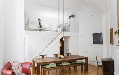
The apartment consists of the sixth floor and attic of a 19th-century building. With its two-level layout and double-height living room, it already had a loft look — a feature the interior designers wanted to enhance. “One of our main ideas for the work was to maximize the brightness in all the rooms by tearing down partitions, especially on the second floor. We renovated everything and emphasized the decor, but we didn’t actually move any of the rooms,” Guilbault says.
The entrance to the apartment is actually on the fifth floor, at the bottom of these stairs, where there is a closet. To give the home a contemporary base, the designers painted the walls white, and they went for a light-colored oak floor and a black steel railing.
The entrance to the apartment is actually on the fifth floor, at the bottom of these stairs, where there is a closet. To give the home a contemporary base, the designers painted the walls white, and they went for a light-colored oak floor and a black steel railing.
Lower Level
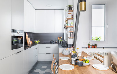
On the living floor of the apartment, a small hallway leads to the tiny kitchen, which overlooks the building’s courtyard. “You can see the beautiful courtyard on the north side and also have a view over the roof of the Pompidou Center,” says Guilbault, referring to the cultural center that houses the National Museum of Modern Art, a public library and a music and acoustics research center.
An area above the stairs conceals a hot water tank and a washing machine.
“We created this partitioned utility space on metal joints we installed above the stairwell. Its door is made of folded sheet metal, which has holes to provide ventilation while still looking good,” Guilbault says.
White cabinets and a Silestone engineered quartz countertop help make the kitchen bright.
The owners chose good-quality kitchen cabinetry and asked an acquaintance install it.
“A touch of eggplant and light oak shelves lend the room some character,” Guilbault says.
Kitchen Counters: Stunning, Easy-Care Engineered Quartz
The owners chose good-quality kitchen cabinetry and asked an acquaintance install it.
“A touch of eggplant and light oak shelves lend the room some character,” Guilbault says.
Kitchen Counters: Stunning, Easy-Care Engineered Quartz
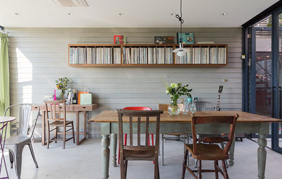
The dining room is just behind the staircase to the upper level and partially open to the living room.
“We enhanced this cocoon effect by placing the furniture in the center and lowering the pendant lights over the table. To add some fun and color to the secluded room, we dug into the owners’ painting collection — they are great art lovers — and, with their help, selected this lovely risqué nude,” the designer says with a smile.
The owners’ sense of humor and willingness to be daring were driving forces in this project.
The oak table’s metal base adds a welcome industrial feel. The wire chairs match this aesthetic.
Find wire dining chairs in the Houzz Shop
Find wire dining chairs in the Houzz Shop
There is another utility closet toward the living room. “Here, [a 23½-by-23½-inch] column drain presented a basic constraint. We used it to attach a second structure of the same size, which houses all the video and sound devices, namely the router and the amp that controls a 5.1 surround system by Bose,” Guilbault says. “For the sake of design, we played with positive and negative spaces and installed an openwork door, which is also convenient for ventilating the appliances.”
The door of this closet is also made of painted perforated sheet metal. A 45-degree fold on the side makes for an easy grip and a better fit for the design than a handle.
The door of this closet is also made of painted perforated sheet metal. A 45-degree fold on the side makes for an easy grip and a better fit for the design than a handle.
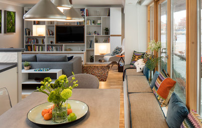
The long and narrow living room is divided into two sections by the central staircase to the upper level.
“As the room was not wide, we couldn’t design it like a typical living room. What’s more, there was a structural barrier [one of the building’s beams] under the windows along the entire length of the room, which meant we couldn’t put a traditional couch there. We turned things over in our heads and decided to create two areas: a warm and cozy indoor living room around the fireplace and then another area, designed like an outdoor living room,” Guilbault says.
“As the room was not wide, we couldn’t design it like a typical living room. What’s more, there was a structural barrier [one of the building’s beams] under the windows along the entire length of the room, which meant we couldn’t put a traditional couch there. We turned things over in our heads and decided to create two areas: a warm and cozy indoor living room around the fireplace and then another area, designed like an outdoor living room,” Guilbault says.
The interior designers did their best to take advantage of the beautiful double-height ceiling on both sides of the room.
On one side, a built-in bookcase reaches to the upper level. To let this corner breathe and to highlight it as part of the decor, they abandoned the easy but space-consuming solution of placing a TV stand there and opted for a lighter option instead: the Serif TV, designed by Ronan and Erwan Bouroullec for Samsung in 2015. From the side, it looks like a serif capital I.
On one side, a built-in bookcase reaches to the upper level. To let this corner breathe and to highlight it as part of the decor, they abandoned the easy but space-consuming solution of placing a TV stand there and opted for a lighter option instead: the Serif TV, designed by Ronan and Erwan Bouroullec for Samsung in 2015. From the side, it looks like a serif capital I.
The original fireplace was in working condition but covered in bricks and ceramic tiles. The team covered it in plaster molding instead to give it a more contemporary look.
“We played with the black-and-white contrast, which we based on Art Deco style,” Guilbault says.
Roots of Style: Art Deco and Art Moderne
“We played with the black-and-white contrast, which we based on Art Deco style,” Guilbault says.
Roots of Style: Art Deco and Art Moderne
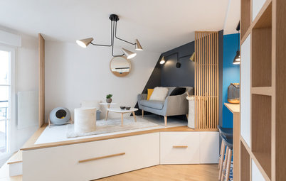
The second sitting area is designed to look like an outdoor spot.
“The concept behind this living room design was to transpose the idea of a greenhouse into the interior,” Guilbault says. “We were inspired by the south-facing dormer windows that overlook the St.-Jacques Tower. We also worked the colors and vertical aspects of the space to make it feel like you’re really outdoors.”
Find an interior designer on Houzz
A wide step under the windows hides one of the building’s structural beams. The designers fitted this with two adjoining banquettes, which make the room look wider.
“We split them into two [6½-by-3¼-foot] modules. One is for the fireplace side, and the other is on the green lounge side. These serve as two extra beds when the owners have people over,” Guilbault says.
“We split them into two [6½-by-3¼-foot] modules. One is for the fireplace side, and the other is on the green lounge side. These serve as two extra beds when the owners have people over,” Guilbault says.
The banquettes were custom-made by upholsterer Patricia Barbot. In between, a coffee table offers a tidy place to stow laptops or tablets or to lay a book when taking a break from reading. There is storage underneath.
Find an upholsterer for your project
Find an upholsterer for your project
This “outdoor” living room plays on the trend of bringing nature into the heart of urban homes. It has become the owners’ favorite reading corner.
The original plan for greening this corner was more radical. “Originally, we had imagined a [10-foot-tall] tree on this side of the living room to emphasize the ceiling height,” Guilbault says.
Because it was difficult to bring large items up the small stairwell or into the tiny elevator, however, the designers found other tricks to pull the eye upward: plants hanging in macramé planters, a hanging chair and wallpaper with a tropical theme.
The light-colored greenery and the macramé create the perfect atmosphere, halfway between Scandinavian and bohemian.
Browse hanging chairs
Browse hanging chairs
The central staircase provides additional casual seating when the owners entertain guests.
The staircase has changed a lot since the owners’ first visit.
“It had been covered with brown laminate that we took off. The concrete underneath looked like it had seen better days. We had it completely re-covered with a new layer of concrete that we then varnished to protect it,” Guilbault says.
The staircase has changed a lot since the owners’ first visit.
“It had been covered with brown laminate that we took off. The concrete underneath looked like it had seen better days. We had it completely re-covered with a new layer of concrete that we then varnished to protect it,” Guilbault says.
Upper Level
The upper floor contains the master bedroom, dressing room and landing, which the designers transformed into an office corner “to give it a function,” Guilbault says.
The upper floor contains the master bedroom, dressing room and landing, which the designers transformed into an office corner “to give it a function,” Guilbault says.
“We enjoyed transforming part of the mezzanine handrail into a [20-inch-wide] desk. We placed it at the right height for sitting behind, [29½ inches], which, from below, looks better than seeing a standard-height railing of [43 inches],” Guilbault says, because it leaves more of the room visible.
As a bonus, the office faces the Velux skylight, so the owners can look out as they work.
As a bonus, the office faces the Velux skylight, so the owners can look out as they work.
Just behind the desk is the couple’s walk-in closet, which ends with a chair on the landing.
The bedroom is next to this walk-in closet.
To the left of the bed is the completely redesigned bathroom.
“This was the crux of the apartment renovation. The room had been completely partitioned, which made it gloomy and darkened the living room below,” Guilbault says. “We proposed this daring layout to let light through, and the owners trusted us and agreed with us completely. The idea for this space was to create a ‘greenhouse within a greenhouse,’ making it possible to take a shower while enjoying the view of nature, as if you were outside.”
“This was the crux of the apartment renovation. The room had been completely partitioned, which made it gloomy and darkened the living room below,” Guilbault says. “We proposed this daring layout to let light through, and the owners trusted us and agreed with us completely. The idea for this space was to create a ‘greenhouse within a greenhouse,’ making it possible to take a shower while enjoying the view of nature, as if you were outside.”
The bathroom really breaks the rules with its two glass walls, which leave the shower visible from both the living room and the bedroom.
“It didn’t bother the owners, who live here alone and like the grins this arrangement brings to their guests’ faces,” he says with a smile.
“It didn’t bother the owners, who live here alone and like the grins this arrangement brings to their guests’ faces,” he says with a smile.
The interior designers made the glass partitions with an industrial-style frame and alternating clear glass panes and panes with printed 3D patterns, to play on the contrast between transparency and opacity. These panes open to both sides for better ventilation.
10 Reasons to Go for Black-Framed Shower Doors
10 Reasons to Go for Black-Framed Shower Doors
The four-month-long, $150,000 renovation was a rewarding experience for both the owners and the designers. They even became friends during the project.
“They relied on us fully, and everything went as well as possible. For our part, we thank them for giving us our first opportunity to design a loft and for going along with our unusual suggestions,” Guilbault says.
More
How to Find Your Renovation Team
Tour other remodeled apartments
“They relied on us fully, and everything went as well as possible. For our part, we thank them for giving us our first opportunity to design a loft and for going along with our unusual suggestions,” Guilbault says.
More
How to Find Your Renovation Team
Tour other remodeled apartments


Sponsored
Professional Remodelers in Franklin County Specializing Kitchen & Bath
Apartment at a Glance
Who lives here: A couple in their 50s
Location: Paris
Size: About 810 square feet (75 square meters), with about 540 square feet on the sixth floor and 270 square feet on the seventh
Designers: Richard Guilbault, Julien Ensarguet and Pierre Petit of Atelier Daaa
The rapport between designer and client can make or break a project. “We instantly had good chemistry with the owners, who trusted us on the choice of apartment,” Guilbault says. “We visited several properties and indicated our preference for this [810-square-foot], two-level loft, which faces the St.-Jacques Tower in the heart of Paris. We knew right away that it was the ideal place to create the cozy green nest the couple wanted.”