


Orange You Glad This Doesn’t Look Halloween-y?
Pops of orange don’t have to stop once trick-or-treating does. Here are some ways to make the bold color work anytime
Gwendolyn Purdom
October 22, 2018
Lover of architecture, history, dogs, the Chicago Cubs, crowded bookshelves, and homes with a story. Former editor at Preservation mag and Culturess.com.
Lover of architecture, history, dogs, the Chicago Cubs, crowded bookshelves, and... More
It’s the color of pumpkins and candy corn — and at this time of year, it’s everywhere. But bright, bold orange shouldn’t be limited to jack-o’-lanterns. If you love the energy and warmth the color embodies, check out these ways from interior designers on Houzz to use orange in your decor year-round without screaming “boo!”
Make It Pop
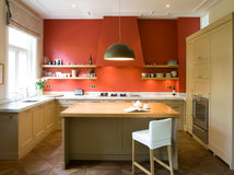
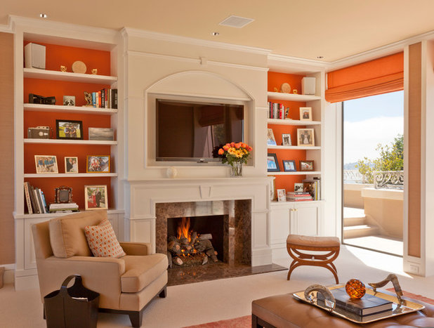
Designer Ann Brown says she loves working with orange because it’s warm and bright and goes with neutrals and other eye-catching colors, like hot pink. In this Sausalito, California, living room, Brown used a citrusy orange to make the fireplace wall and built-in cabinetry stand out. “I love orange as in the color of a real orange, not a brown-orange, which I think gets too serious and a little depressing,” Brown says.
For balance, the orange shelving ties the room together with the Roman shades and the oversize woven rug, swirled with corals and blues.
See more inspiration photos with orange living rooms on Houzz
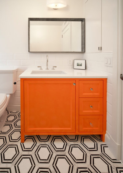
Pairing shades of orange with too much black can make Halloween come to mind, Brown says, but in this New York City bathroom, the clean geometric pattern of the tile and stark white walls give the space just enough edge for the vibrant vanity.
Find an interior designer near you
Find an interior designer near you
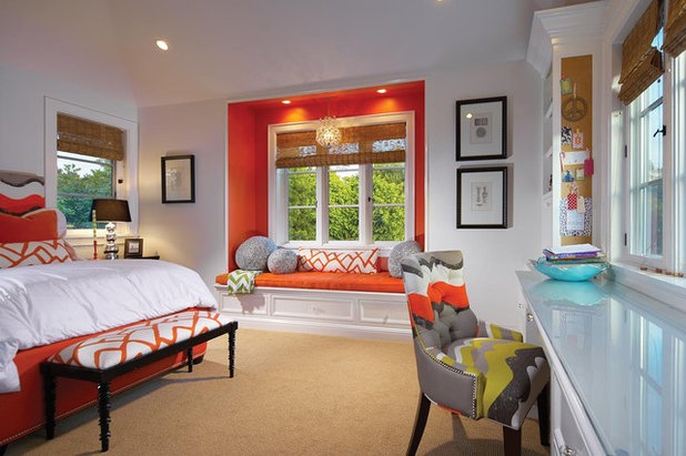
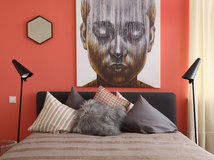
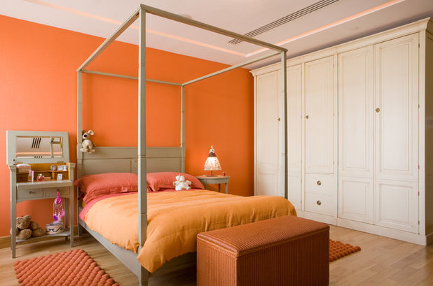
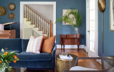
The orange window seat in this bedroom again feels unexpected and rich next to bright white walls (Dunn-Edwards Paints’ Often Orange and Whisper, respectively) and white bedding.
Pair It With Neutrals
For a jolt of orange that’s not quite as sharp, interior designer Holly Kauffmann of HKW Designs suggests combining orange pieces with warm neutrals.
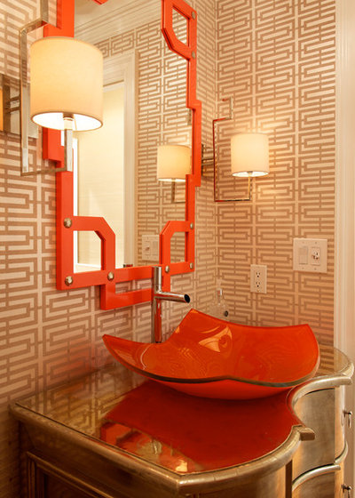
In this New York powder room, the unusually shaped vessel sink and mirror work with the pearlized champagne-colored wallpaper (Osborne & Little’s Kikko Trellis) to make the small space feel cozy and inviting.
Browse neutral wallpaper
For a jolt of orange that’s not quite as sharp, interior designer Holly Kauffmann of HKW Designs suggests combining orange pieces with warm neutrals.
In this New York powder room, the unusually shaped vessel sink and mirror work with the pearlized champagne-colored wallpaper (Osborne & Little’s Kikko Trellis) to make the small space feel cozy and inviting.
Browse neutral wallpaper
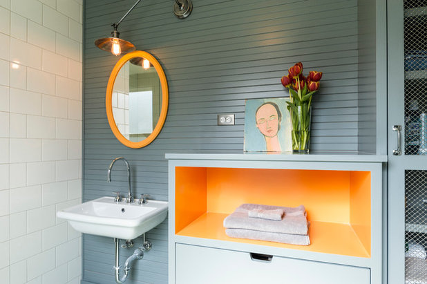
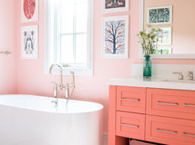
In this Seattle bathroom, the design team went with creamier orange accents that brighten up the subdued blue-gray walls (Pratt & Lambert’s Florida Gold and Blue Slate, respectively). Against the texture of the narrow wood strips on one wall and semigloss white tile on another, the color combination is striking without being overbearing.
Find Statement Pieces
Orange may feel like too bold a choice for some homeowners, but Brown says she’s found that even clients who are hesitant to use orange usually come to appreciate the statement-making shade once they see it next to other colors in the finished product. “It takes a client who loves color and wants some bold accents,” she says.
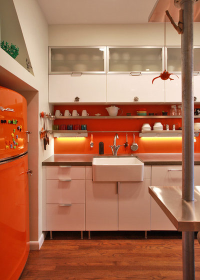
If you’re going to go bold with a few select pieces, it’s smart to choose ones that will make the most impact. In this case, the homeowners of this Washington, D.C.-area kitchen opted for a retro-cool orange Big Chill Slim refrigerator. Instead of stopping there, the team at Kingston Design Remodeling anchored the whole room in orange by using the hue above the custom stained concrete countertops as well.
Orange may feel like too bold a choice for some homeowners, but Brown says she’s found that even clients who are hesitant to use orange usually come to appreciate the statement-making shade once they see it next to other colors in the finished product. “It takes a client who loves color and wants some bold accents,” she says.
If you’re going to go bold with a few select pieces, it’s smart to choose ones that will make the most impact. In this case, the homeowners of this Washington, D.C.-area kitchen opted for a retro-cool orange Big Chill Slim refrigerator. Instead of stopping there, the team at Kingston Design Remodeling anchored the whole room in orange by using the hue above the custom stained concrete countertops as well.
Consider a Custom Color
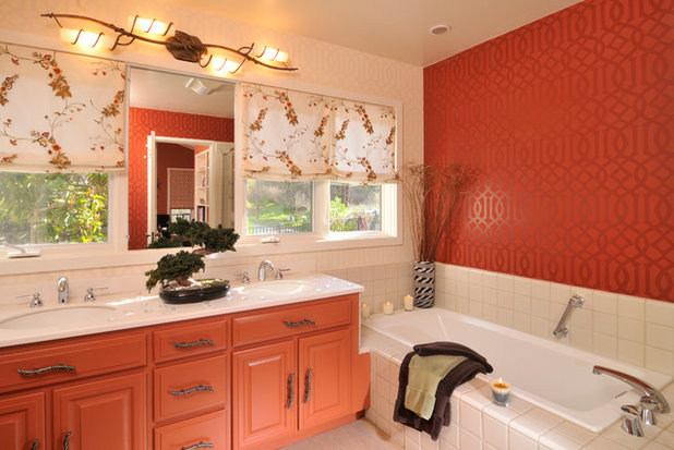
With a daring color like orange, finding the right shade can make all the difference. Kauffmann advises homeowners to lean toward oranges with deeper blue or red undertones to keep things from feeling too pumpkin-y. And if the perfect color can’t be found, a custom approach might be your best bet.
In this Northern California bathroom, for instance, Kauffmann and her team focused on a redder orange once they landed on a wallpaper they liked. The entire space evolved from the wallpaper, as they were working with the room’s existing tile, cabinetry and countertop. “Since the colors on the existing materials were so neutral, we thought orange would be the perfect color to really spice things up,” Kauffmann says. The cabinetry was painted a custom shade to match the walls.
Your turn: How did you incorporate orange into your decor? Tell us in the Comments.
More
Falling for Color: 9 Ways With Pumpkin Orange
Find an interior designer on Houzz to help plan your color palette
We know that how a home functions parallels its design, and we immerse ourselves in the details to ensure that... Read More
What are you working on?


Related Products

Related Stories

Decorating Guides
Design Pros Share 10 Favorite Creamy White Paints
By Becky Harris
These off-white color choices include versatile tones, warming hues and pleasingly soft shades
Full Story

Kitchen Countertops
What Kitchen Countertop Colors Should You Choose?
By tidgboutique
Consider these popular colors and styles to get the look you want — no matter what material you use
Full Story

Colors of the Year
Pantone Picks a Peach for Its 2024 Color of the Year
By Jennifer Ott
See how to use this juicy hue to create calm yet flourishing spaces inside and outside the home
Full Story

Decorating Guides
5 Ways Designers Are Working With Rich Warm Tones Right Now
By Becky Harris
Interior designers describe their strategies for using rich warm colors to create an inviting home
Full Story

Colors of the Year
10 Paint Colors Ready to Take Over in 2024
By Jennifer Ott
Blue is huge, but dark hues and warm tones also find favor among major paint companies’ 2024 Color of the Year picks
Full Story
Decorating Guides
How to Mix Colors and Make It Work
By tidgboutique
Don’t want to confine yourself to neutrals but lack the confidence to embrace colors? Check out this pro advice
Full Story

Events
7 Color Trends for 2024 at Maison & Objet
By Claire Tardy
New harmonies and unexpected pairings at the fall 2023 trade fair set the tone for next year’s interiors
Full Story

Decorating Guides
9 Ways to Layer Warm Neutral Colors for Comfortably Refined Rooms
By Becky Harris
Design pros share advice for building an inviting palette, introducing high contrast and mixing textures
Full Story

Decorating Guides
How to Create a Cohesive Color Flow Throughout Your Home
By Erin Carlyle
Designers share eight techniques for avoiding a choppy feeling in your spaces
Full Story

Decorating Guides
How to Get Your Ceiling Paint Color Right
By tidgboutique
Here’s how to tweak the shade of your ceiling paint to get the effect you want
Full Story
I love orange - and it's not just for the interior!
I was one of the first people in my group that used bright orange. I painted one wall this color and the rest bright white. I hung up my kit kat clock and black and white art work on the orange wall. It never failed to get compliments.