


Kitchen of the Week: A Casually Elegant Eat-In Space
A designer studies her clients’ style and brings a touch of red to their expanded transitional-style kitchen

For the new kitchen, pictured here, Circle Design Studio removed a wall between it and a formal dining room. The wall had been about in the middle of where the kitchen island is now. “Their dining room was so small that the table was pushed up against the wall and they mostly used it for paying bills,” John says.
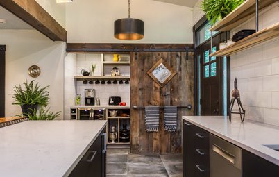
This change meant that the front door would be located just off the entrance to the kitchen. So they created a landing area that includes a built-in desk and these new bookshelves. The red floral urn in the bookcase influenced the color choice for the island stools, a key part of the design.
This change meant that the front door would be located just off the entrance to the kitchen. So they created a landing area that includes a built-in desk and these new bookshelves. The red floral urn in the bookcase influenced the color choice for the island stools, a key part of the design.
Paying Bills and Staying Organized
This built-in bench and hooks are across from the bookshelves and serve as the home’s landing zone next to the front entry. “We placed a desk here for them for bill paying since they were used to doing that while sitting at the dining table and looking out the window,” John says.
To keep the counters uncluttered, they created cabinets for the small appliances to the right of the desk. “Their kitchen was so small before that some of these things had been stored in the basement,” Theresa says.
Wood and Red Warm the Room
To get a sense of her clients’ style, Theresa looked around the house and saw pops of red, studied their Houzz ideabooks and “observed them in their natural habitat.” “You have to ask why they are selecting a certain photo and figure out why they are drawn to something,” she says. The kitchen’s new shade of red, introduced on the counter stools, got an update — it went from a brick hue to a coral red hue.
“Our clients are very casual people and liked the idea of informal dining at the island,” John says. Knowing that a white-and-gray palette could skew too sterile, the Dorlinis prevented that with a warm shade of gray on the cabinetry, significant wood touches and of course that coral red shade on the stools. The fabric is a transitional pattern, and if they later crave a new look in the kitchen, the chairs would be easy to reupholster.
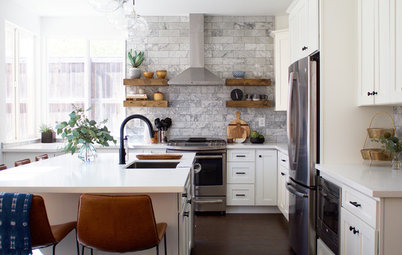
Also worth noting in this photo is the way the fridge, ovens and pantry cabinetry are all concentrated on this wall. This kept those appliances within close range of the sink and the working end of the island.
Find transitional counter stools in wood and red
To get a sense of her clients’ style, Theresa looked around the house and saw pops of red, studied their Houzz ideabooks and “observed them in their natural habitat.” “You have to ask why they are selecting a certain photo and figure out why they are drawn to something,” she says. The kitchen’s new shade of red, introduced on the counter stools, got an update — it went from a brick hue to a coral red hue.
“Our clients are very casual people and liked the idea of informal dining at the island,” John says. Knowing that a white-and-gray palette could skew too sterile, the Dorlinis prevented that with a warm shade of gray on the cabinetry, significant wood touches and of course that coral red shade on the stools. The fabric is a transitional pattern, and if they later crave a new look in the kitchen, the chairs would be easy to reupholster.
Also worth noting in this photo is the way the fridge, ovens and pantry cabinetry are all concentrated on this wall. This kept those appliances within close range of the sink and the working end of the island.
Find transitional counter stools in wood and red
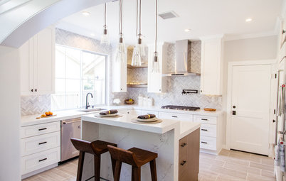
Balancing Modern and Traditional
The backsplash is composed of calming colors but is a dynamic mosaic of small pieces of polished stone, polished glass and frosted glass. It brings in a sparkly modern touch. Meanwhile the cabinets are classic Shaker but their full-overlay door style lends an updated look.
They opted for a warm gray on the lower cabinets and a warm white on the upper cabinets, the trim and the ceiling. “We wanted the island to pop from the perimeter and to serve as a focal piece, so we kept the perimeter neutral and light and made the island darker,” Theresa says.
Backsplash tile: CL13 Luna, Daltile; lower cabinet paint: Gray Matters, Sherwin-Williams; upper cabinet, ceiling and trim paint: Shoji White, Sherwin-Williams
Before: This was the view from the dining room into the kitchen. The door led to the backyard.
Letting In Light
They took out the door and window in the previous photo and created this bank of three windows. They moved the sink to this wall so the couple could enjoy views of the garden while working at the sink and prepping food.
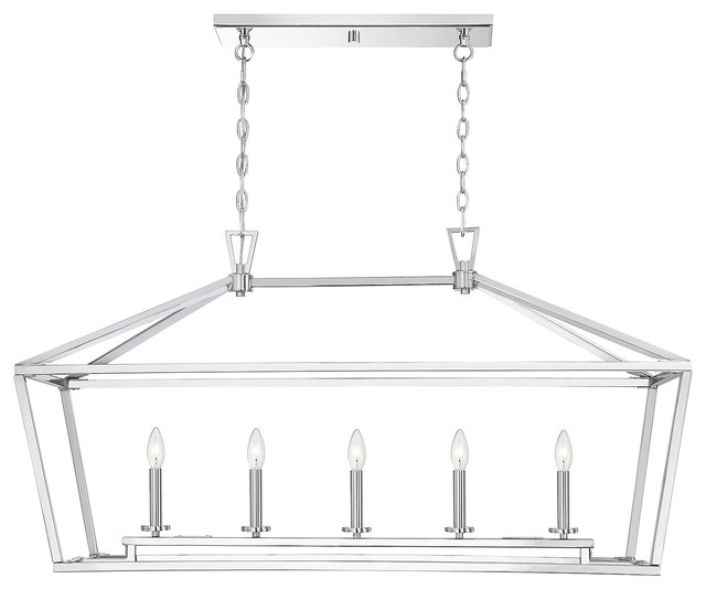
The faucet is a modern touch and the undermount sink lends a seamless look. The lighting is a combination of traditional and modern. “The pendants are a modern take on the traditional lantern. The exposed bulbs and satin finish give it an updated look while still speaking to traditional roots,” Theresa says. Also, they chose a more subtle style for the sconces because the pendants over the island serve as a focal point and are the stars of the lighting scheme.
Browse modern wall sconces
They took out the door and window in the previous photo and created this bank of three windows. They moved the sink to this wall so the couple could enjoy views of the garden while working at the sink and prepping food.
The faucet is a modern touch and the undermount sink lends a seamless look. The lighting is a combination of traditional and modern. “The pendants are a modern take on the traditional lantern. The exposed bulbs and satin finish give it an updated look while still speaking to traditional roots,” Theresa says. Also, they chose a more subtle style for the sconces because the pendants over the island serve as a focal point and are the stars of the lighting scheme.
Browse modern wall sconces
They chose an induction stove for its sleek look, the control it offered and the extra storage beneath it. “These cabinets helped us make up for the potential upper-cabinet space we lost to the windows over the sink,” Theresa says.
The countertops have large marble-like veining patterns in them but are a more durable engineered stone. Along with the shades of red in the island stools, warm grays in the veining help keep the kitchen from feeling cold.
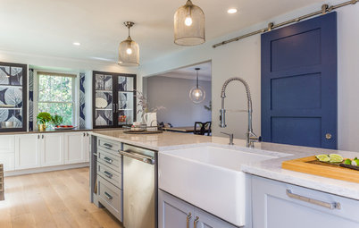
The Island Serves as a Centerpiece
The island is the heart of the kitchen and brings in loads of warmth through its English walnut-stained wood and cheerful red fabric. It has a work side and a social eat-in side. The homeowners wanted their everyday china storage to be located in lower cabinetry, so the designers placed it in the island. They also had to reinforce the island with a steel structure to support such a heavy slab of quartz.
Pendant lights: Downtown Deco, Kichler; see more pendants like this
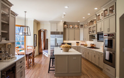
The corner cabinets provide space for their glassware. And since we’re getting a big peak into the new sun porch and it was part of the project, it’s only fair to provide a closer look.
New Dining Space With a View
The homeowners love to garden and wanted a sun porch with as much glass as possible where they could admire their handiwork. They knew they wanted the view and a meditative, contemplative space but weren’t sure of the full program. “Originally we planned to turn a formal living room into the dining room, but somewhere along the way we realized the new sun porch was the perfect place for their dining table and chairs,” John says. The couple has comfortable wingback chairs for visiting and reading, and a new spot to enjoy the view during meals. A contemporary orb chandelier balances out the traditional furniture, giving the room a transitional look.
The homeowners love to garden and wanted a sun porch with as much glass as possible where they could admire their handiwork. They knew they wanted the view and a meditative, contemplative space but weren’t sure of the full program. “Originally we planned to turn a formal living room into the dining room, but somewhere along the way we realized the new sun porch was the perfect place for their dining table and chairs,” John says. The couple has comfortable wingback chairs for visiting and reading, and a new spot to enjoy the view during meals. A contemporary orb chandelier balances out the traditional furniture, giving the room a transitional look.
An Indoor-Outdoor Feeling
The floor is slate, which lends an outdoor porch or patio feeling to the indoor room. They gave what was once the exterior brick a whitewash treatment to blend it into the interior. Toward the top of the wall is a mini split heating and cooling system, and the floor has radiant heat.
The floor is slate, which lends an outdoor porch or patio feeling to the indoor room. They gave what was once the exterior brick a whitewash treatment to blend it into the interior. Toward the top of the wall is a mini split heating and cooling system, and the floor has radiant heat.
Floor plan. The kitchen is in the space marked 1 and the new sun porch is marked 4. The front door is to the right of the kitchen on the bottom of the plan. Worth noting about the demolition floor plan is the horizontal line in the middle of it that marked the wall between the kitchen and the dining room.
Takeaways
Find Your Dining Style: 9 Strategies for Eat-In Kitchens
16 Scrumptious Eat-In Kitchens and What They Want You to Serve
Find a kitchen designer on Houzz
Takeaways
- Find a designer who seems dedicated to decoding your design DNA and learning how you function at home, not one who just pops in all the latest trends. You will get a good sense of this from your first meeting by the kinds of questions they ask you.
- If you like to keep the household organized from the kitchen, designate a space for it, like the desk in this kitchen.
- Warm up a white-and-gray palette by choosing a warm gray and by incorporating dashes of color and textures like wood.
- The natural-stone-and-glass mosaic backsplash is one of the prettiest things we may see all week. It sparkles in the light.
- A good way to accomplish transitional style is to go with a traditional style on cabinetry like Shaker but to update it with a full-overlay door style and more modern hardware.
- Remember that a large stone slab may require extra structural support in an island.
- Slate is a nice choice for a sun porch because it lends an indoor-outdoor look.
Find Your Dining Style: 9 Strategies for Eat-In Kitchens
16 Scrumptious Eat-In Kitchens and What They Want You to Serve
Find a kitchen designer on Houzz


Kitchen at a Glance
Who lives here: A married couple whose two kids are in college.
Location: Roanoke, Virginia
Size: 200 square feet (19 square meters)
Designer: Circle Design Studio
“I never want my clients to get caught up in trends and not consider what’s in their design DNA,” says designer Theresa Dorlini. These Roanoke, Virginia, homeowners had two kids in college and were ready for a change. They hired Circle Design Studio, run by Dorlini and her husband, John Dorlini, to help them remodel their kitchen, rearrange rooms and add a four-season sun porch onto their 1940s central-hall Colonial-style home. This included removing the wall between the small formal dining room and compact kitchen and making it all one space, as well as opening up the kitchen to the new sunroom addition. The firm handled everything from architecture to interior design to contracting.
Before: The goal was to update and brighten the kitchen, which was outdated and dark. To determine the style of the remodeled kitchen, Theresa paid attention to what the homeowners had around their home and liked. “They kept showing us neutral kitchens they liked, but they seemed too far away from their core. They’d committed to red cabinets in the past and had red accents all over their home. I knew we’d need to integrate that color into the design somehow, because it was in their design DNA,” she says. The new style is transitional — a modernized take on the traditional style of the house.
Find a design-build firm in your area