


Houzz Tour: Replacement Addition Is Smaller but Feels Roomier
Layout tweaks and bright colors mean better flow, updated style and a closer indoor-outdoor connection for a London home

The maxim “less is more” is often used to warn against filling a room with furniture or a surface with accessories. For this London row house, the adage instead proved true of the square footage. Architect Richard Skinner replaced an old addition with a smaller one, which confoundingly made more room (scroll to the end of this story to see the floor plans). “Space wasn’t required, but making space was,” he says.
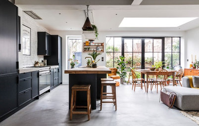
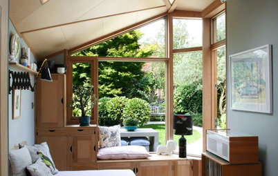
As with many homes of the late Victorian and early Edwardian eras, the house had been added to as lifestyles changed. The resulting utility room at the back severed the living space from the yard. The original configuration of separate reception rooms also felt dated. The key was to make the whole ground floor flow better by creating an open-plan kitchen-dining room that linked to the outside space, and by combining the reception rooms into one living room.
As with many homes of the late Victorian and early Edwardian eras, the house had been added to as lifestyles changed. The resulting utility room at the back severed the living space from the yard. The original configuration of separate reception rooms also felt dated. The key was to make the whole ground floor flow better by creating an open-plan kitchen-dining room that linked to the outside space, and by combining the reception rooms into one living room.
Before: Unlike many homes of its time, the row house retained attractive period features, including in this front reception room. “The house was in brilliant condition in terms of its Victorian-ness, apart from the [unplasticized polyvinyl chloride windows] and horrible extension,” Skinner says.
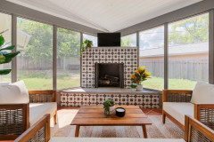
The homeowners wanted to still have a fireplace in the living area, but it got a modern makeover. “We like to keep traditional Victorian elements where they’re good and add the contemporary in a complementary way,” Skinner says.
A wood-burning stove was a must-have for the homeowners, and the architect found a design that’s modern but with a retro twist to set the tone for the space.
Bollente wood-burning stove: Stovesonline
Find freestanding stoves in the Houzz Shop
A wood-burning stove was a must-have for the homeowners, and the architect found a design that’s modern but with a retro twist to set the tone for the space.
Bollente wood-burning stove: Stovesonline
Find freestanding stoves in the Houzz Shop
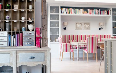
Built-in shelving, designed in conjunction with the homeowner and the builder, displays the owners’ 1980s pieces. “It’s playful and contemporary,” Skinner says.
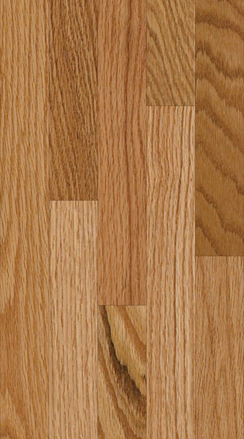
The flooring here and in the hallway is wood parquet. Skinner chose it because adjustments to make it fit aren’t obvious. “It’s more forgiving than boards in small and awkward spaces, and with walls that aren’t parallel or square,” he says. “You don’t question the cuts.”
The flooring here and in the hallway is wood parquet. Skinner chose it because adjustments to make it fit aren’t obvious. “It’s more forgiving than boards in small and awkward spaces, and with walls that aren’t parallel or square,” he says. “You don’t question the cuts.”
The back part of the living room is less formal than the front and includes seating and desk space, seen in the previous photo. With the joining of the two rooms, light from the patio now reaches the front of the space.
Originally, two doorways led from the hallway to the front and the back reception rooms. Now the one at the front is blocked off and this rear one remains.
As far as the owners know, this door is original to the house, which, having been built between 1891 and 1901, was just on the cusp of the Edwardian era. Maybe that’s why it doesn’t look obviously Victorian. It got a 1980s-inspired hit of pink.
As far as the owners know, this door is original to the house, which, having been built between 1891 and 1901, was just on the cusp of the Edwardian era. Maybe that’s why it doesn’t look obviously Victorian. It got a 1980s-inspired hit of pink.
Before: The old dining room’s bay window looked out at the side yard. Beyond the dining room is the old kitchen — the two rooms were separate.
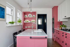
A new kitchen occupies the space where the dining room used to be. The cabinets are from Ikea, but the doors, in a gray wood-fiber material called Valchromat, give them an individual finish. Valchromat is impregnated with color, not just coated with a veneer.
“The units are really practical in terms of the modules and fittings you can put inside them,” Skinner says.
The work surfaces are Corian. “It’s typically the [faucet], sink and worktop we recommend people spend money on,” Skinner says. The white solid surface contrasts with the gray cabinets, and it wraps around the island as well as forming the counters.
Gray porcelain tiles cover the floor here and on the patio. “The owners were really keen on an inside-outside flow of flooring material,” the architect says.
Valchromat cabinet doors: James Latham; tiles: Refin
Before: The kitchen’s bay window and the back reception room’s doors opened to the side yard.
A yellow radiator in the kitchen’s bay window creates a burst of sunshine where there isn’t much of a view. The radiators throughout the house now sport colorful and characterful designs.
Roma radiator: Apollo Radiators; small Amp pendant lights: Normann Copenhagen
Roma radiator: Apollo Radiators; small Amp pendant lights: Normann Copenhagen
The size of the induction cooktop called for a wide exhaust fan, so the builder adapted the upper cabinet with a shallower shelf to accommodate the ducting.
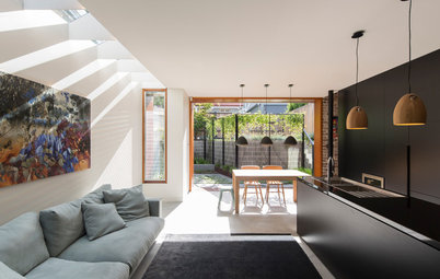
The kitchen-dining room is now one open space, but since the owners like to entertain, Skinner wanted to give the areas a sense of separation. “The idea is that you’re not still sitting in the kitchen,” he says.
Bar stools: Cox & Cox
Bar stools: Cox & Cox
More Valchromat, in the form of blue paneling, distinguishes the dining area from the kitchen. “It’s a reference to Victorian paneling, which would normally stop at a picture rail or dado,” Skinner says. Here, it lines the room on one wall and runs across the ceiling to strengthen the separation.
Valchromat paneling: James Latham; recessed downlights: Aurora; Copenhague series round table: Hay; Loft collection floor lamp: Jieldé; Agnes medium shelving: SCP
Valchromat paneling: James Latham; recessed downlights: Aurora; Copenhague series round table: Hay; Loft collection floor lamp: Jieldé; Agnes medium shelving: SCP
Skinner recommended both the paneling and the color. “It’s a lovely material and kind of leathery,” he says of the engineered wood, whose fibers are impregnated with organic dyes and chemically bonded by specifically developed resins.
Roma radiator: Apollo Radiators
Roma radiator: Apollo Radiators
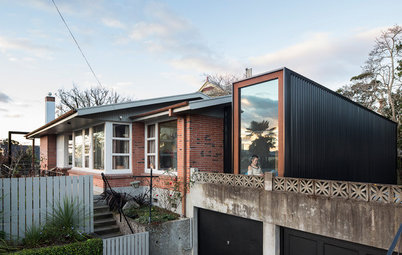
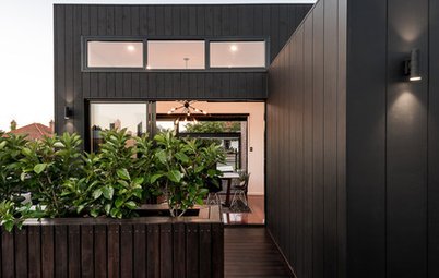
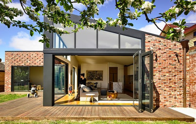
Before: The old utility room addition cut the house off from the yard.
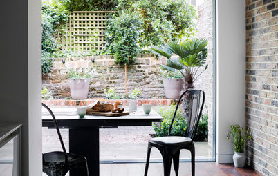
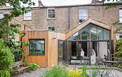
After: The new addition’s angled opening focuses the view down the yard. Although its interior space is about half that of the old addition (the new addition begins from the point where the bifold door is), the effect is to make the ground floor feel far more spacious.
The roof of the addition projects outward, covering some of the exterior area and allowing the bifold door to stay open in a wider range of weather than would be the case otherwise.
Bifold door: IDSystems
The roof of the addition projects outward, covering some of the exterior area and allowing the bifold door to stay open in a wider range of weather than would be the case otherwise.
Bifold door: IDSystems
The addition is subtly contemporary, with brick piers linking it to the original house. It’s covered in maintenance-free zinc. “It’s a practical system and looks modest,” Skinner says.
The blue paneling from inside the room continues on the underside of the overhanging roof.
The table and chairs can simply be moved outside to the patio when the weather’s good enough for alfresco dining, avoiding the need to fill up the space with extra furniture.
Quartz zinc siding: VMZinc
The blue paneling from inside the room continues on the underside of the overhanging roof.
The table and chairs can simply be moved outside to the patio when the weather’s good enough for alfresco dining, avoiding the need to fill up the space with extra furniture.
Quartz zinc siding: VMZinc
Before: The yard wasn’t the entertaining space the owners were after.
After: Like real lawn, artificial grass allows rainwater to drain through it. “They’d have loved to have had a [grass] lawn if it looked after itself!” Skinner says. The budget didn’t extend to replacing the shed, as the couple would have liked, so instead it was stained in same color as the new fencing.
At the rear of the space is a simple deck designed so that the owners can host small parties. The wood wraps up to create a bench for seating, and power in the shed now allows the owners to play music.
Artificial grass: Trulawn
At the rear of the space is a simple deck designed so that the owners can host small parties. The wood wraps up to create a bench for seating, and power in the shed now allows the owners to play music.
Artificial grass: Trulawn
Before: The hallway didn’t have much personality before the improvements.
After: With new parquet flooring, a radiator in a zingy shade and graphic coat hooks, the space now has loads of style.
Roma radiator: Apollo Radiators
Find multicolored hooks
Roma radiator: Apollo Radiators
Find multicolored hooks
Stealing a little space from the kitchen made space for a powder room under the stairs.
Hexagonal mosaic tiles cover the floor in the compact room. “Like the wood parquet, they add texture and grip but are easy to cut to fit,” Skinner says.
Toilet: Park Street Bathrooms; hexagonal mosaic tiles: Walls and Floors
Find hexagonal floor tiles
Hexagonal mosaic tiles cover the floor in the compact room. “Like the wood parquet, they add texture and grip but are easy to cut to fit,” Skinner says.
Toilet: Park Street Bathrooms; hexagonal mosaic tiles: Walls and Floors
Find hexagonal floor tiles
The daughter’s room features bold colors against a simple white backdrop, echoing the look of the rest of the house.
The original floorboards are exposed in the guest bedroom. The vibrant 1980s color palette continues in the furniture and soft furnishings.
Aerial pendant light: Habitat
Aerial pendant light: Habitat
New porcelain fixtures installed in the same arrangement bring the bathroom up to date without major cost. Dark tiles for the shower area and the backsplash are a fuss-free contrast to the white of the walls and fixtures. The owners chose cement tiles in a graphic pattern they love for the flooring.
Porcelain fixtures: Park Street Bathrooms; cement tile: Mosaic del Sur
Find an architect for your project
Porcelain fixtures: Park Street Bathrooms; cement tile: Mosaic del Sur
Find an architect for your project
These plans show the ground floor before the renovation, shown at the top, and after.
Here is the elevation for the kitchen, shown at left, and dining area.
More home tours: Apartments | Small Homes | Colorful Homes | Contemporary Homes | Eclectic Homes | Farmhouses | Midcentury Homes | Modern Homes | Ranch Homes | Traditional Homes | Transitional Homes | All
More home tours: Apartments | Small Homes | Colorful Homes | Contemporary Homes | Eclectic Homes | Farmhouses | Midcentury Homes | Modern Homes | Ranch Homes | Traditional Homes | Transitional Homes | All


House at a Glance
Who lives here: A couple and their daughter, plus their dog
Location: Nunhead, southeast London
Size: Three bedrooms, 1½ bathrooms
Architect: Richard Skinner of Archea
Two rooms became one when the wall between the reception rooms came down. The walls throughout the house stayed white, with injections of color standing out against the clean backdrop. “One of the owners is a graphic designer and has a strong and defined taste,” Skinner says. “They’re very 1980s colors.”
The floor lamp is a vintage design from a midcentury modern sale.
Classic vintage oak parquet flooring: Broadleaf; Landskrona collection sofa and armchair: Ikea