


Chicago Kitchen Shifts From Contemporary to Traditional
A second renovation infuses this kitchen with cozy, vintage-inspired charm honoring the era of the building

Before: The narrow 175-square-foot kitchen was galley-style with a short peninsula on one end, and the space was half the width that it is now. The back wall had a 36-inch-wide door that led to a small deck. As part of the renovation, the designers moved the right wall of the kitchen into what used to be a bedroom, giving them room to add a kitchen island.
The couple love to cook, and they dine in most evenings, so the kitchen needed to be highly functional. Rather than arrange the layout according to the traditional work triangle, the designers thought about splitting it into zones: the prep zone, cooking zone and clean-up zone.
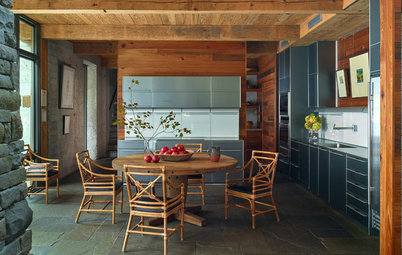
The island (see first photo) is where the couple preps meals. The far end contains a prep sink just a couple of steps from the refrigerator. The long side of the island on the end near the sliding doors has a drawer with the microwave. The working side of the island (which faces the range hood) has drawers where the couple can store items for prepping.
The couple love to cook, and they dine in most evenings, so the kitchen needed to be highly functional. Rather than arrange the layout according to the traditional work triangle, the designers thought about splitting it into zones: the prep zone, cooking zone and clean-up zone.
The island (see first photo) is where the couple preps meals. The far end contains a prep sink just a couple of steps from the refrigerator. The long side of the island on the end near the sliding doors has a drawer with the microwave. The working side of the island (which faces the range hood) has drawers where the couple can store items for prepping.
A Collection Sets the Style
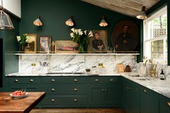
The couple didn’t specify a particular color palette they wanted for this room, but they made clear through inspiration images they shared with the designers that they wanted it to be a cozy and welcoming retreat from their long days at work. The homeowners have an extensive collection of Persian rugs that the designers used as style inspiration.
“The rugs played a really integral part in terms of the color palette and design motif,” Malyszko says. “We wanted to be able to integrate the pattern and color and liveliness of that in some way.” The cement tiles behind the sink reflect the richness of the rugs and set the color palette for the kitchen.
Details that Feel Like They’ve Been There a While
To give the cabinetry throughout the kitchen a vintage feel, the designers chose a classic style — inset Shaker with a bead detail— in quarter-sawn white oak. They stained the cabinets with a finish that has some gray in it to make it appear like aged weathered oak.
This side of the kitchen is the clean-up zone, and the 50-inch sink has an integrated sliding cutting board and accessories including a colander and various trays for cutting. The counter surrounding the sink is zinc, a material “used in old estates around the turn of the century” for its antimicrobial properties, Malyszko says.
An integrated cabinet panel to the right of the sink hides the dishwasher, and the couple store their everyday plates and salad bowls in the cabinets directly above it; cereal bowls go in the upper cabinet to the left of the sink.
The glass-front cabinet on the far left of this photo contains a fun surprise: an integrated window. This window was there before the renovation, and while the homeowners didn’t want to lose its light, they also needed this space for storage. So the designers kept the window and created a cabinet with an open back to let the light shine through.
Sink and faucet: Kohler; cement tile backsplash: Granada Tile; find more patterned cement tile
How to Choose the Right Sink
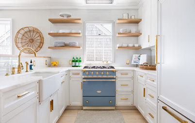
The drawers surrounding the range contain cooking utensils and pots and pans, as this is where the cooking happens.
The color for the orange backsplash tile behind the range was pulled from the patterned tile on the opposite side of the room. “We felt like adding that pattern around the range would be a lot,” Malyszko says. The designers customized the handles on the blue double-oven and range top to continue the orange-and-blue theme.
The range hood is made of zinc, a nice repetition of the counter material for the clean-up zone, and has studded detailing on its strapping. “We wanted to exude this element of history and have an industrial quality to it,” Malyszko says. The counters here and on the island are white engineered quartz with subtle veining that mimics marble.
The designers chose cabinet pulls with an antique brass finish, again to create a vintage vibe, with cup pulls on the drawers and knobs for the drawers.
Shiplap in the cooking niche gives the space character and fits with the style of the rest of the home, which has a lot of millwork. Since the ceiling is 9 feet tall and the designers did not want it to feel lower with too much heavy detail, they added shallow pieces of trim and beadboard insets to create a shallow coffered ceiling.
The rest of the apartment has herringbone wood floors, but the clients liked the idea of durable porcelain for this space, which is located off the mudroom. The tile mimics the look of bluestone, in four different sizes to create a patchwork effect. Radiant heat runs beneath the tiles.
The designers wanted to avoid can lighting because it feels too current and would create too sharp a stream of light, so they chose flush-mount ceiling lights and pendants with an antique nickel finish. Undercabinet LED strips provide task illumination.
White counters: Frosty Carrina, Caesarstone; trim and wall paint: Wool Skein, Sherwin-Williams; floor tiles: Crossville; range backsplash tile: Granada Tile
More
Photo Flip: Behold These Bold Kitchen Backsplashes
World of Design: How Modern Geometric Designs Are Reinventing Cement
Find kitchen designers and see their projects


Kitchen at a Glance
Who lives here: A couple who have lived in the building for about 25 years
Location: Logan Square neighborhood of Chicago
Size: 300 square feet (28 square meters)
The couple who own this Chicago duplex did a full renovation of their kitchen about 15 years ago, and at the time they chose a very contemporary style. But since then, their tastes have shifted to more traditional style. For this renovation, they wanted to replicate some of the charm that was original to their building (built between 1900 and 1910) by choosing finishes and materials that feel somewhat aged, says designer Filip Malyszko of steve + filip design, who designed the space with business partner Steve Somogyi. The full renovation expanded the size of the kitchen, changed its layout and brought in more light through new sliding glass doors.
Pendant lights: Thomas O’Brien, Circa Lighting; flush mount lighting: Circa Lighting; find more globe pendants with nickel finish