


Houzz Tour: Sydney Apartment Gets Heart and Soul
A designer uses contrast and texture to enliven a bland home, and offers bookshelf-styling advice that anyone can use

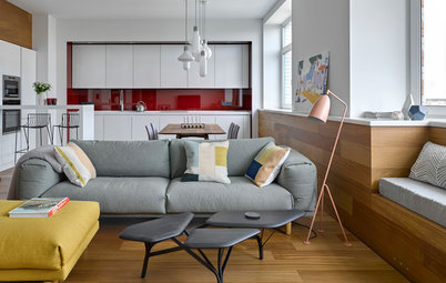
This Sydney apartment is the perfect example of a home that needed an interior designer’s touch. Jillian Dinkel turned a two-bedroom apartment devoid of detail and personality in a nondescript 1970s building into a luxe and comfortable home for her client, Steve Reid, to relax and entertain in.
“Steve is a busy creative professional who had lots of ideas and a vision of what he wanted, but not a lot of time to transform this into reality. I worked with Steve to take his ideas to a projectwide concept that carried through the custom [cabinetry], furniture selection and styling,” Dinkel says. “But first and foremost, the home needed soul.”
“Steve is a busy creative professional who had lots of ideas and a vision of what he wanted, but not a lot of time to transform this into reality. I worked with Steve to take his ideas to a projectwide concept that carried through the custom [cabinetry], furniture selection and styling,” Dinkel says. “But first and foremost, the home needed soul.”
First Impressions Count
The entry sets the tone for the house and is one of Dinkel’s favorite spaces to design. “Whether large or small, everyone needs serious organization at the front door,” she says.
Design Recipes for a Fun and Functional Entry
The entry sets the tone for the house and is one of Dinkel’s favorite spaces to design. “Whether large or small, everyone needs serious organization at the front door,” she says.
Design Recipes for a Fun and Functional Entry
A wooden bench in the long space is the place to drop bags and put on shoes, and the leather wall hooks are for hanging coats and jackets.
“I also included a large round mirror so Steve could give himself a final look-over on his way out the door,” Dinkel says.
Browse round wall mirrors
“I also included a large round mirror so Steve could give himself a final look-over on his way out the door,” Dinkel says.
Browse round wall mirrors
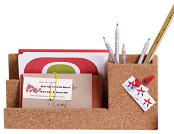
A custom console has drawers for mail, keys and coins.
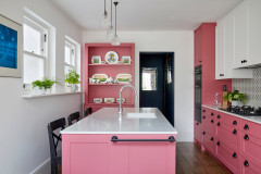
Dinkel kept the upper cabinetry in the kitchen and paired it with modern lower cabinets coated in Dulux’s matte Klavier paint. “Klavier has blue undertones that created the perfect balance with the warmth of the whitewashed timber floors,” Dinkel says.
Black appliances are integrated with the cabinetry, and gold-and-black hardware add contemporary metallic detail to the white cabinets.
Which Appliance Finish Should You Choose for Your Kitchen?
Which Appliance Finish Should You Choose for Your Kitchen?
Sharp black cabinetry is a hallmark of Dinkel’s designs, as are vintage items. “Vintage gives a room soul,” she says.
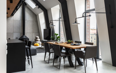
The dining area is packed with secondhand pieces, including an army-green metal dining table, which was Dinkel’s starting point. She added black leather-and-chrome chairs draped with soft tan sheepskins, and she dug through Reid’s extensive collection of concert and rock posters to select the Jimi Hendrix print for the end wall.
The dining area is packed with secondhand pieces, including an army-green metal dining table, which was Dinkel’s starting point. She added black leather-and-chrome chairs draped with soft tan sheepskins, and she dug through Reid’s extensive collection of concert and rock posters to select the Jimi Hendrix print for the end wall.
Three’s Company on Shelves
The wall shelves behind the dining table are made out of recycled railroad ties. They’re styled with a selection of Reid’s personal items, vintage art and greenery. “Shelf styling is an art form that brings a project to life,” Dinkel says.
So how to style a bookshelf? “Start with a clean slate. Remove everything from your existing bookshelves and stack them in piles of items that relate to each other. For example: books, vases, collectibles, artworks,” she says.
“Then I start with the largest items, which are usually coffee table books or stacks of magazines, and I randomly place these items on the bookshelves. I take a step back to see how it balances; then I progressively add the smaller pieces. It’s all about balancing color or lack thereof, size and shape. A good mix of textures and sizes works best with grouped items, and the ‘rule of three’ is a good starting point.”
According to the “rule of three,” objects look better displayed together in a trio. The easiest way to follow this rule is to group three similar objects that differ in size, shape and color. Or take the opposite approach and group three different objects that are united by size, shape or color.
“Remember that things can always be shifted and moved around. Keep playing with the placement of items until you’re totally happy,” Dinkel says.
Wall lights: Cedar & Moss; find similar lights
“Remember that things can always be shifted and moved around. Keep playing with the placement of items until you’re totally happy,” Dinkel says.
Wall lights: Cedar & Moss; find similar lights
Reid loves to entertain, so the living room furniture needed to be comfortable for relaxing alone and suitable for guests. Dinkel selected items with soft fabrics that speak to the beachside location. So does the black-and-white photograph of the ocean, which has a white frame to keep the space light and airy.
The sofa from MCM House is upholstered in a washed navy linen and paired with tan leather chairs. A large rustic coffee table sits on a vintage rug from a Moroccan market.
No room is complete without greenery. “A large Ficus exotica sits in prime position in front of the floor-to-ceiling windows,” Dinkel says.
High-Impact Houseplants for First-Timers
No room is complete without greenery. “A large Ficus exotica sits in prime position in front of the floor-to-ceiling windows,” Dinkel says.
High-Impact Houseplants for First-Timers
Getting the right mix of materials and textures is no easy task. “The best way to accomplish a good mix is to bring in lots of different textures and materials in a restrained color palette. Start with neutrals: creams, whites, grays and blacks. Then you can add punchier colors with pillows, throws and accessories,” Dinkel says.
The designer recommends working with samples if possible before committing to big purchases. “They can help you see how materials look together, as well as how they will look against your existing floors and in the natural light of your room.”
The designer recommends working with samples if possible before committing to big purchases. “They can help you see how materials look together, as well as how they will look against your existing floors and in the natural light of your room.”
A sliding glass door opens the living room to the outdoor area. This space was a key factor in Reid’s purchase of the apartment, so Dinkel needed to make the most of it.
The existing balcony was half the size it is now, with an overgrown garden that had little visual appeal. Dinkel removed the garden and extended the deck space to allow for outdoor seating.
She designed the built-ins with matte black surface-mounted lighting and upholstery fabric by Sunbrella. The stepped design allows for plenty of seating for guests, and the space is regularly used for entertaining friends and family.
Find a professional for your home project
Find a professional for your home project
“Steve’s bedroom was small and dark, and a lot of people’s first instinct might be to paint it the brightest possible white. However, it gave far more visual interest to paint a feature wall black and create a black open [closet],” the designer says. “The resulting room has so much more depth and really draws you in.”
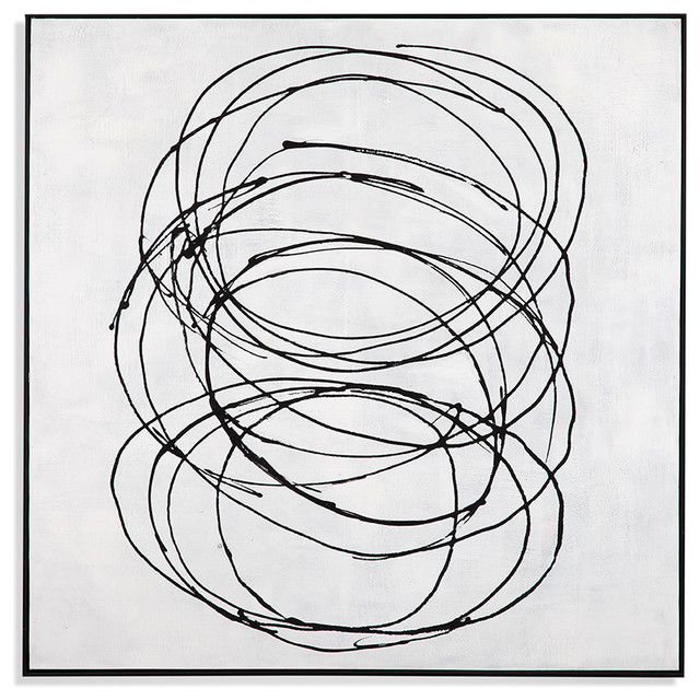
The linens are from In Bed and Pony Rider, and Dinkel and Reid collaborated on the art piece. “We found great inspiration photos of similar art pieces and made this ourselves.”
Bedside tables: Globe West; browse bedside tables
The linens are from In Bed and Pony Rider, and Dinkel and Reid collaborated on the art piece. “We found great inspiration photos of similar art pieces and made this ourselves.”
Bedside tables: Globe West; browse bedside tables
Letting It All Hang Out in the Closet
The feature wall and closet are covered in Dulux’s Klavier, the same paint that was used in the kitchen.
The existing closet was the ubiquitous built-in with mirrored sliding doors. “Steve really wanted to break the mold and do something dark and moody,” Dinkel says. He agreed to her open-closet concept, which has become a favorite feature of the design.
Dinkel designed the cabinetry based on Reid’s existing closet and what needed to be displayed or concealed. It includes open shelves, rods, drawers, cabinets and even space for his laundry basket, computer and stool. The leather pulls are by MadeMeasure.
The bathroom is the next stage of the project, and it also will feature matte black and crisp white surfaces layered with texture and greenery.
More home tours: Apartments | Small Homes | Colorful Homes | Contemporary Homes | Eclectic Homes | Farmhouses | Midcentury Homes | Modern Homes | Ranch Homes | Traditional Homes | Transitional Homes | All


Apartment at a Glance
Who lives here: Steve Reid, a creative director who is occasionally visited by Bruce, a French bulldog
Location: Queenscliff area of Sydney
Size: 753 square feet (70 square meters); two bedrooms, one bathroom
Designer: Jillian Dinkel Designs
The ground-floor apartment has a combined living-dining area, a separate kitchen, two bedrooms and a bathroom. It is also blessed with an outdoor space, which is unusual for the typical brick apartment buildings in the area.
Dinkel wanted to create a home that captured the light, bright airiness of the beachside location while invoking the drama of dark, moody spaces. She balanced the white and black with texture: handmade pieces, vintage furnishings, rustic wood and washed linens.